


mcrosby
-
Posts
2,704 -
Joined
-
Last visited
-
Days Won
30
Posts posted by mcrosby
-
-
2 hours ago, SportsLogos.Net News said:
Leaks Show Unconventional Puma Jersey Template Carrying Over to European Club Teams
May 1, 2021 - 15:43 PM
When Puma unveiled unconventional secondary jerseys for four countries competing in Euro 2020 this summer, there was speculation on whether we would see a similar template ported over to the major European soccer clubs that Puma outfits for the 2021-22 season. Well, that looks to be the case. Soccer blog
Yuck.-
 1
1
-
-
Really not a fan of these Puma templates.
I'm especially mad about the Austrian kit not having a proper crest because their new crest is so dang good. Some consolation in it being sublimated ALL OVER the kit.
-
6 hours ago, colinturner95 said:
I saw on Twitter that this is being worked out. Any luck with that?
Yeah, they paid me some money and Baccar has disappeared from just about all social media. Still working on getting him cut completely from Behance. Feel free to report him for being a thief.
-
8
-
-
3 hours ago, DTConcepts said:
it sucks seeing someone bootleg your bootleg.
I hate to say it, but this gave me a good laugh. Sucks, man. For what it's worth, your concept is fantastic!
-
4
-
-
Some guy on Behance stole my 2015 Ajax Amsterdam logo and has been claiming it as his own since 2019. He blocked me from commenting on Behance has been no help. Turns out now he's been selling it. If you're able to comment on his Behance page and report it, please do.
-
Can you link the original thread?
-
I'm just so sick of this.
-
1
-
-
I've toyed with the idea of an Iberian peninsula league so many times, now I have no idea how to make a league logo any better than what you've already done.
-
1
-
-
5 hours ago, tron1013 said:
Replacing the gold star in a circle with an * as below makes this accurate.
I get the recruiting hype train, but how does have 85 different "crests" promote the notion of a "uniform" jersey? And why are they relying on sub-Game of Thrones level "house" logos? Are these going to be helmet stickers? The whole thing is really bizarre and seems to promote individual players over the team.
Honestly, I hope it ends up on the helmet or as a jersey patch. This is a fantastic evolution of merit decals without feeling like they're copying Ohio State/FSU/etc. They all look similar enough that from afar they look like a standard piece of the uniform, but different enough that the individual players have something to show off. I generally lean towards classic when it comes to uniform, but this is something incredibly creative and new.
-
5
-
-
It seems like I have to express my utter disdain for Brandiose every 3 months whenever Citynicknamenobodyuses Adjective Nouns are announced and we get another logo traced over the Swingin' Friar. Their pitch of MERCH SALES MERCH SALES MERCH SALES!!! must go over incredibly well, but these looks are played out after a month and teams end up doing other ridiculous one-time brands to drum up that merch sales support one more time. They become dependent on Brandiose and come crawling back every time the look grows stale and people stop buying stuff. In reality it just creates weak brands and is part of the watering down of MILB that is causing its demise. I have no idea where half the teams play because I have no idea where Rocket City is, and Trash Pandas certainly doesn't provide any clues.
There are teams that haven't gone with a kitsch brand and are still doing great sales, hell my local summer collegiate club does consistently great with merch because they put out fresh merch instead of kitsch names and logos. It's possible, put out a brand that people want to wear repeatedly and they'll keep buying it. Put out 'city jerseys' and follow fashion trends. Screw it, do one night specials and rebrand your club for a couple Saturdays each year with a fun name to cash in on whatever Brandiose is pitching, but establish a respectable brand first.
Thanks for coming to my Ted Talk. I'll be giving it again next time Brandiose seduces some poor sap with the promise of merch sales.-
4
-
-
Looking to crowdsource some name ideas for a Solar System soccer league. Looking for name suggestions for the planets, possibly some dwarf planets. I'd like to avoid "Mars FC" and other incredibly boring names.
-
37 minutes ago, Eastport76 said:
Meh. I still prefer @mcrosby’s St Louis concept.
I updated it a smidge recently:
-
6
-
 1
1
-
-
I'm glad you decided to go with Madison. I'd probably avoid FLW inspired design for them though, as he was a terrible womanizer and generally not a great dude. I'd lean into the Georgia O'Keefe inspo.
-
-
Your jersey details are always so legit. Keep up the great work.
-
43 minutes ago, vtgco said:
The new crest takes the shape and colors of the OL logo, but adds the Reign crown, and incorporates the "Olympique" moniker by showcasing the nearby Olympic Mountains.
I've been reworking my NWSL rebrand for Reign with just this in mind. Now I've got to do it without stepping on your toes.
As usual, your work looks amazing!-
1
-
-
19 hours ago, CaliforniaGlowin said:
I missed this one. I love those colors.
The colors are great but that logo is amateur.
-
1
-
-
Some fantastic work here. Keep it up. Thanks for the tutorial on the topo map. I'm going to have to find a way to use this.
-
1
-
-
Can I ask how you made the topographic map? Just lots of time?
-
1
-
-
I'm thinking of taking on an enormous project, but lack the knowledge to complete it as it deserves. NYC has 5 boroughs with 329 neighborhoods. I'm considering a soccer crest for each neighborhood. If there's a better way to group neighborhoods to cut down on the total number or if you feel like you'd have some valuable input please let me know and I'll add you to a google sheets doc.
-
1
-
-
Love some ideas for National Women's Soccer League expansion. Looking for cities and names.
Sacramento
Atlanta
New England
Louisville
???
-
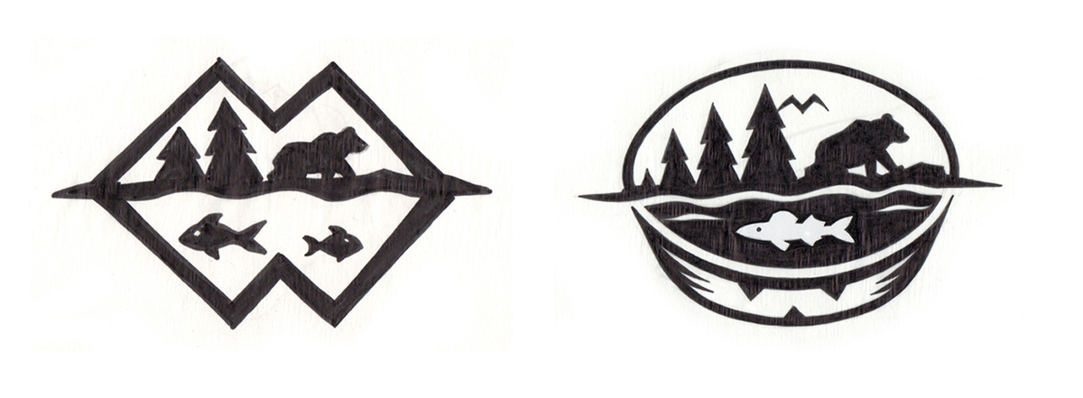
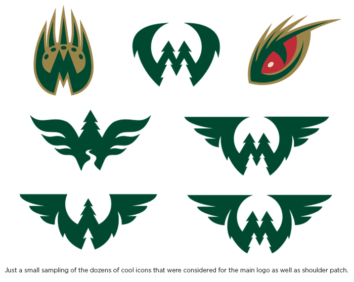
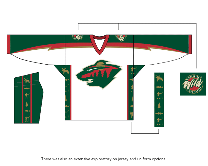
I don't think this has been posted yet: https://www.behance.net/gallery/42321255/Minnesota-Wild-Identity?tracking_source=for_you_feed_activity
-
8
-
-
If you're doing more than one Mexican team I think you should use the Rayos for a coastal city.
-
1
-
-


Minor/Independent/Collegiate League Baseball Logo/Uniform Changes
in Sports Logo News
Posted
The Madison Mallards of Northwoods collegiate league have rebranded. I'm incredibly disappointed in my hometown club. The wordmark and M are pretty great, but their attempt at 'vintage' looks more like 's*** clipart'. The cheese home plate, foot in each of Madison's lakes, and the circle of hot dogs is just too many kitsch things all in one place. The wordmark and the mascot look like two completely different identities.