


BrianLion
-
Posts
1,690 -
Joined
-
Last visited
-
Days Won
1
Posts posted by BrianLion
-
-
I hated the Rangers' "Lady Liberty" sweaters and really don't understand the folks who want to see them replace one of the most classic sweaters in the history of hockey. Most New Yorkers have only visited the statue once, on a middle-school field trip... how is that a good symbol for a team representing New York City?
Not to mention it technically sits in NJ's waters.
-
 1
1
-
-
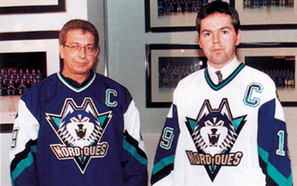
I think the entire Nordiques set was "OK" at best. I think nostalgia for Québec hockey is the only reason people love them so much. Personally, I think the planned update was ten times better:
Those colors ang logo just scream nineties like the Isle's fisherman and Cap's eagle did. What's worse is that they likely win a Cup in that look.
-
This has probably been mentioned, but I think this logo sucks.

I've always seen it as an elephant. I've never seen it as a an igloo or an N.
That logo always screamed "WHA" to me. It was like the NHL's version of the old Pacers logo. If QC does get a franchise again soon my hope is they go for a more updated look like the Jets did when they came back.

Players in the "wrong" uniforms
in Sports Logo General Discussion
Posted
I know he won a couple Cups there as well, but this still nauseates me.