


tron1013
-
Posts
413 -
Joined
-
Last visited
Posts posted by tron1013
-
-
The lack of a red stroke on the sole set of TV numbers, making the primary itself internally inconsistent, is the chef’s kiss of Nike stupidity.
-
 7
7
-
-
I like the “H-Town” concept but it looked to me like the Columbia Blue “H” on the helmet in your concept doesn’t match the updated font on the leaked away set. Not saying they wouldn’t have a mismatch but I hope if they use an “H” on the helmet that it is consistent with the revised font.
-
1 hour ago, MCM0313 said:
Split the difference - blue helmet and socks, red numbers and pants.
If you zoom in on the original and look at the reflection on the far right, is that a red stripe with white piping in the reflection?
-
9 hours ago, Rygi13 said:
Agreed! They should just take the Arizona look and make it orange. Maybe add the Block I on the collar too. I like that touch.
Those are basically Virginia
-
7
-
-
Arguably OT, but South Carolina is returning to its historic branding as USC, as opposed to the much maligned "UofSC" that was implemented in 2019.
And, yes, I'm aware of the other USC's claim to that name. That being said:
-
2
-
-
It appears South Carolina will be breaking out a “Block C” throwback helmet tonight when they host reigning Celebration Bowl/HBCU National Champion South Carolina State in a game that was moved from Saturday due to Hurricane Ian:
-
2
-
-
Isn’t it possible, if not probable, that USF will trot out at least one, if not two more helmets during the course of the upcoming season?
-
1
-
-
On 6/1/2022 at 3:48 PM, aawagner011 said:
Shameless plug.
This tool was made when block numbers were rumored so I used the non-outlined style from the 2020 alts before they released the updated design.
https://andrewwagner.wixsite.com/georgiauniforms
Nice site. I really like the silver helmet, my proposal would be to keep that striping consistent across all helmets and pants. I don’t mind the lack of a stroke on the jersey numbers either.
-
4 hours ago, WSU151 said:
Virginia Tech is now just literally "Virginia Tech". That's it.
They never officially dropped Virginia Polytechnic Institute and State University, they just try to not use it whenever they can. I'm a UVA fan but I don't blame them, VPISU is a mouthful.
From Tech's website: "Today: Virginia Tech is the university’s official nickname, used in all but the most formal situations:-
1
-
-
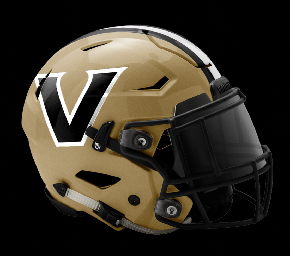
New Vandy helmet after the re-design.
-
1
-
 1
1
-
-
1 hour ago, VandyDelphia Mike said:
Vanderbilt evolving to a bevel? The conference mates in College Station must have served as inspiration.
Nope, that might just be the institutional mark. But, what do we get instead for athletics? Gradients!
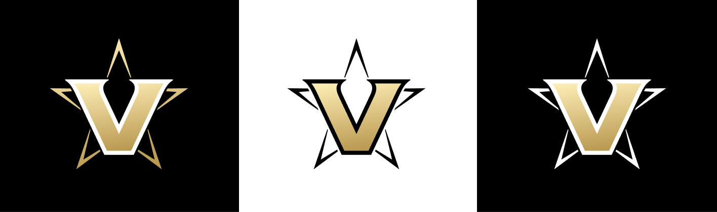
The bevel on the athletics logo, without the star, would be way, way to similar to the updated UVA “V-Sabre,” but the gradient is amateurish. Per Vandy’s website the “Star V” is only a secondary logo so we may see the gradient V on helmets. If so, yuck.
QuoteIs the “Star V” logo being retired?
Vanderbilt is elevating the new “Block V” as its primary athletics logo. An updated version of the “Star V” also will be available for use by teams and on merchandise.
-
2 hours ago, Carolingian Steamroller said:
Some but its pretty vague.
The identity article mentions fans and focus groups but doesn't mention Nike.
I keep looking at the shoulder cap on the away uniform. That's a very specific, intentional design. It's essentially a negative image of the home jersey stripes with empty space where the gold stripes are on the burgundy jersey but it also has the gradient pattern.
There's a story there.
It is a tale
Told by an idiot, full of sound and fury,
Signifying nothing.Not to mention that they sloppily copied the burgundy sleeve color rather than going with white, I think you are giving them way too much credit. The white jersey is incongruous and black for black's sake.
-
3
-
-
51 minutes ago, Ridleylash said:
It's Dan Snyder and his wife running the WFT, remember. Even Jim Irsay and company have more self-control than those two buffoons have ever shown.
Well, if these new allegations hold up perhaps both the Mrs. Snyder and the NFL will push Dan out of his controlling position. New Snyder Misconduct Allegations. Then a new, better owner can come in and we’ll get a new, better set of uniforms that are, you know, uniform by 2027.-
1
-
-
5 minutes ago, Crabcake said:
That black uniform easily is the worst uniform in the league. Like, it’s not even close. Nothing even approaches its zip code of awfulness (yes, that includes the bone). The BFBS-ness of it and the awful number font would be bad enough, but then add on to it the lines on the nameplate; stripeless, logoless (I think, someone correct me if I’m wrong) black yoga pants; and easily the worst, silliest, impossible-to-take-seriously helmet in the league’s history. It looks like it was designed by a toddler who had a blank black helmet and a bunch of stickers to put wherever they wanted.
I could write manifestos on why these suck so much. And for a team with all that tradition, too. Good job changing the one thing about your team that wasn’t completely depressing. I feel bad for my DMV friends who actually root for this team.
The entire black set is what would happen if Nike hired Dr. Wu away from Jurassic World and tasked him with splicing together the worst aspects of the Cardinals, the 2016 Jaguars, the alarm clock Bucs, and the Rams’ most recent uniforms with the inexplicable name tag.-
2
-
-
50 minutes ago, Lights Out said:
The white jersey would be a terrible option for any team.The whole thing comes across as rejected Cardinals rebrand: the jingoist embrace of the military, the nod to Arizona State's colors, the wacky striping, the BFBS.
-
3
-
-
27 minutes ago, Pharos04 said:
I can’t get over the Black helmet! The W on the front just seems so tacky. It’s like they saw Dartmouth and went “that looks fire” without understand what makes it so iconic. It’s closer to the Arizona Hotshots but that at least worked.
I’d call these a train wreck but train wrecks have some semblance of cohesion. These are just awful.
If the Badgers jumped off a bridge, I feel comfortable assuming Dan Snyder would too.
-
2
-
-
3 minutes ago, nuordr said:No stripes on the pants...this is awful:
The red mannequin looks like he’s trying to escape the press conference out of sheer embarrassment.
-
25
-
-
-
Very rough take on what the logo may look like on the burgundy helmet, given the image of the reflection in Rivers’s office didn’t appear to have a white stroke/outline separating the gold portions from the helmet’s base color.
-
1
-
-
12 minutes ago, kutztown said:
Anyone share this yet?
Looks like Washington Commanders is on the paper?
It's going to be Commanders.
-
9
-
-
3 hours ago, WSU151 said:
The team was established in 1932.
Thank you, I appreciate it.
-
1
-
-
4 hours ago, DCarp1231 said:
I mean, there’s 5 bird teams. 6 if Washington chooses “RedHawks”. One other team thats on the complete opposite side of the country with a number name isn’t going to hurt much.
San Francisco 49ers
Washington 32s
Sorry to be late to the party on this, but what is the significance of "32s" with regard to Washington? If it is a joke that the WFT is the worst of all the 32 NFL teams then I appreciate the sarcasm but if there is a real meaning could someone please share? Thanks!
-
The diamond pattern is obviously a throwback to the seminal Nike uniform previously worn by the DMV’s team with loudest fan base. The Hokies can now brag about their special relationship not only with the Yankees but also the WFT.
But seriously, I think they’ll claim it evokes the shape of the District before Retrocession.
-
6
-
-
1 hour ago, tBBP said:
Looking at the logo on their Twitter announcement--or as much of it as is there--I kinda had the same thought. If true, that would definitely lend itself to the name Armada. I don't know what else an implied "A" could be for, if that's they way they went.
Now, pivoting off the speculation angle for a bit, here's some screen grabs I got from the video:
Let us all be very glad we're not getting this.
I've seen this before. I'm also pretty sure I know who created this. But the fact that it's so blurred out leads me to believe this is either a potential finalist or an alternate logo.
Not your typical NFL logo at all--its more of a soccer-style badge--but I really like it for what it is. It seems they really worked this Redtails direction pretty far into it--and I'm guessing the R was inspired in part by the alternate R logo Joe Gibbs used to wear on his hat so often. I believe had they gone this route, I'm pretty sure the big R would've gone on the helmet, while thie shield would have been a patch on the jersey. But the double solid yellow stripes plays off the DC flag very well.
And finally...
Look all the way over there to the right. They were also working a literal bird angle, as well.
The blurred image in your post is this one, from the August video where they show some mock-ups to fans:
I like it and hope they use it as an alternate, because it does not appear to be the helmet logo shown in the reflection of this picture of Riverboat Ron:
-
2
-


2024 NFL Changes
in Sports Logo News
Posted
Adding a white stroke to the horns would do wonders for the mono red set