


tron1013
-
Posts
413 -
Joined
-
Last visited
Posts posted by tron1013
-
-
On 9/6/2020 at 11:15 AM, OHK said:
New / tweaked home and away uniforms for South Carolina? Did I miss an announcement?

https://twitter.com/GamecockSplash/status/1302397668770144259
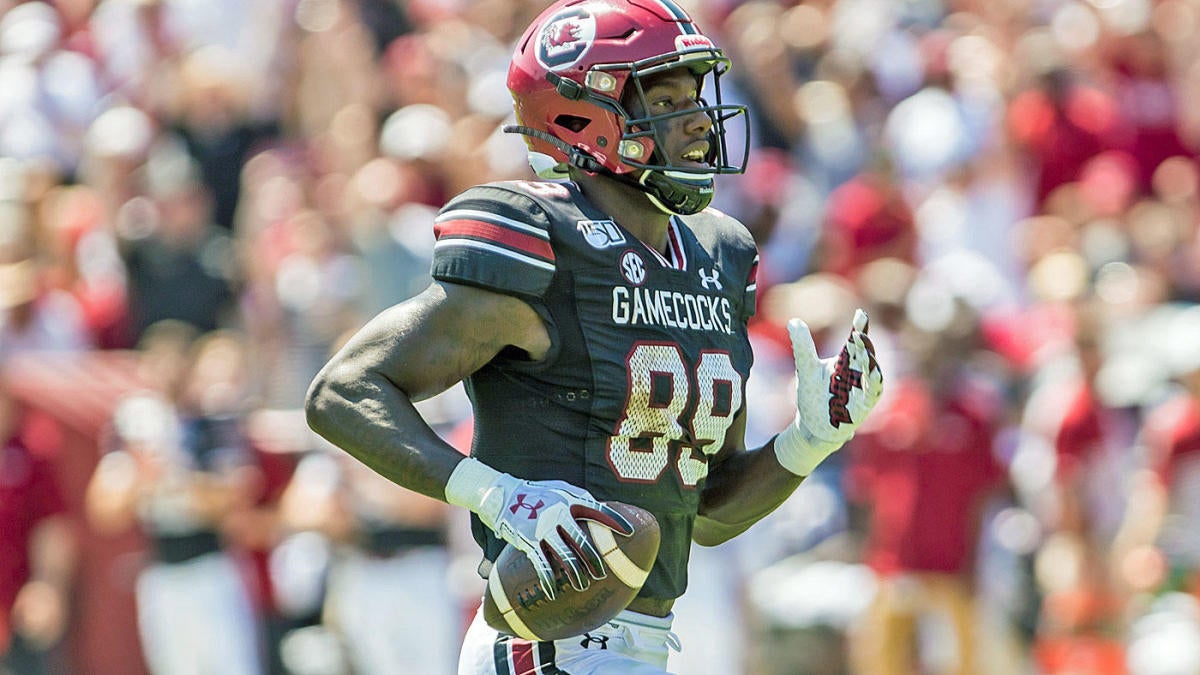
The numbers are apparently larger, but on the away jersey, the shoulder stripes match our throwback black alternate. Not sure if our home jersey has the same new striping, although I'm generally a fan of applying this throwback template to all of our uniforms, only removing the "jersey" numbers:
I both love and am terrified by these uniforms. They're the uniform I think of when I think Arkansas football, and by that, I mean the uniform I think of when I remember McFadden and Felix Jones running setting SEC single game rushing records against us.
The shoulder stripes on the white jersey don't match the the throwback jersey. The throwback is white-black-garnet-black-white, the new away is black-white-garnet-white-black, an unfortunate reminder of the Brad Scott era.
.
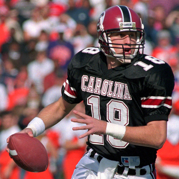
The only situation where the striping will be consistent on all elements is when the Gamecocks wear the new white jersey, last year's throwback white pants, and the existing black helmet. They could've updated the late 90's black jersey for consistency with the existing black helmet and the new white jerseys and pants, but of course they didn't.
The new garnet jersey has white-garnet-black-garnet-white striping, which does not match the garnet helmet, and even worse the new white jerseys and last year's white pants do not match the white helmets. It is a mismatched mess and a huge missed opportunity. This would be have been so easy to pull off (not my original concept or template, just a quick and dirty attempt to show how the matching striping could've worked SO much better):
OR
-
19 hours ago, MJWalker45 said:
That's the original layout.
The "V" on the 2020 helmet has the new beveling but I don't see any on the accompanying sabre helmet sticker. The updated logo 2.0, without the serpentine wall-esque blade handles, has beveling on the sabre itself (see below) so I'm wondering if they used an old sticker or Photoshop on the helmet shown above.
-
 1
1
-
-
59 minutes ago, MJWalker45 said:
Should've put the logo on both sides.
100% agree. Barring that, they should at least be consistent with the format of the numbering on the helmets and jerseys. I know they've revised the V-Sabre and the number font, but last year the helmet number matched the jersey number in both color and lack of an outline:
If they don't update the 2020 blue jerseys to have orange numbers with a white outline then it will be an unwelcome return to this type of inconsistency they used in 2016, but worse:
-
5
-
-
If accurate it looks like UVa has switched to orange numbers on the helmet decal to go along with the revised V-sabre, differing from last year.
-
13 hours ago, dont care said:
These look nothing like the flutie uniforms. If anything they mailed these in. Atleast Carolinas look accurate
Ehh... agree to disagree.
-
2
-
-
32 minutes ago, WSU151 said:
Where are the sleeve stripes that were on the Flutie jerseys?
They were able to put the stripes on the homes the last couple of years:
That's a good point and I admit that I missed the sleeve stripes when I first saw the BC jerseys. Still think they look a lot better than the SCAR offerings from UA.
-
2
-
-
Comparing them to these solid BC throwbacks really reinforces how badly Under Armour phoned in the South Carolina faux backs/updated 2020 jerseys.
-
2 hours ago, YankeeBaseball0934f said:
But how can Clemson be done with their game and at the same time be in the middle of another?
That's actually ESPN's highly advanced, "Inception"-esque neurotechnology which gives a direct view in the minds of Trevor Lawrence and Travis Etienne, both of whom were daydreaming about the 2019 CFB title game while they were getting pasted by LSU in the 2020 CFB title game.

-
1
-
-
2 hours ago, WSU151 said:
The stripes on the white helmet are different than the stripes on the white pants. So yes, they are mismatched. The inverted stripes on the jersey are fine.
The garnet jerseys don't match the garnet helmets (or the striping on the white helmets or the white pants, which are inexplicably different), just as the black faux backs don't match the black helmets. Mismatching, jumbled mess.
-
Not a fan of mismatched striping and use of “CAROLINA” unlike the black faux backs.
-
1
-
-
-
11 hours ago, cajunaggie08 said:
With Florida already being the Jordan Brand school in the SEC East, Nike has little reason to make South Carolina a Jordan school. Not meant to be a knock on South Carolina, but it wouldnt line up with how Nike is handling the brand up to this point as there has yet to be two Jordan schools in the same conference let alone division.
If Under Armor terminates the balance of the ten year, $7.15m/year per annum deal with South Carolina running through 2026 I suspect the Gamecocks want Nike over Adidas but aren’t even thinking Jordan brand. Plus, if Nike is going add a Palmetto State-based team to its Jordan cadre, it will be Clemson (which is in a different division than UNC so would not be minimizing the brand’s cache within the ACC FB setup too much). Many Gamecock fans would welcome having Nike handle all sports unis over UA. -
Probably photoshopped but still a better look at what UVa’s set will look like with the updates:
-
3
-
-
Clearer picture:
-
Football jersey looks pretty much the same. The MBB jersey seems to have switched to blue numbers.
-
5
-
-
10 hours ago, WSU151 said:
Looks like this tweet was deleted?
Anyone get a grab?
-
1
-
-
“Since A&M is dropping bevels let’s adopt them, and also use a Ninja Gaiden motif.”
-UVA Consultant
-
1
-
-
On 2/29/2020 at 11:54 PM, aawagner011 said:
Not to mention that teams are allowed 85 scholarships plus however many walk-ons, so it is very realistic to have over 100 players and not have enough numbers for everyone. This is not even getting into the fact that each position may wear certain numbers, dictating number availability. It wouldn’t be possible without duplicates.
There’s also the issue that pops up when schools retire a jersey in honor of former player and actually take that number out of circulation, as opposed to continuing to use it but having honorary patches on a current player’s uniform. -
9 minutes ago, DustDevil61 said:
All of these teams have great logos. I’m loving the Dragons name and colors for Seattle, as well as the Oilers callback with the Roughnecks name for Houston. Los Angeles’ name is meh (and the monogram is lacking in anything referring to a Wildcat), but that’s an awesome monogram.
What’s worse is that they could’ve just called the Houston team the Wildcatters and kept the same oil industry logo/motif and then come up with a non-generic Be for LA.
-
5 minutes ago, chrome14 said:
Hmmm...that Seattle dragon reminds me a little too much of the UAB dragon.
Yep:
-
1
-
-
-
Ballpark Digest has an article on possible team names for the relocating PawSox. Go Worcester Worcesters!
-
-
Charleston Boiled Peanuts arriving for one night only, July 28th. In honor of the late, great "Tony the Peanut Man," a ballpark fixture who passed away in 2016 after a battle with muscular dystrophy. A portion of the proceeds will go to research in to battling the disease.


 .
.


/cdn.vox-cdn.com/uploads/chorus_asset/file/19683742/1189832074.jpg.jpg)


Minor/Independent/Collegiate League Baseball Logo/Uniform Changes
in Sports Logo News
Posted
So is there any update on which teams will exist in 2021, in which leagues and with which parent clubs? I saw an Article from Johns Hopkins suggesting, for example, that at High-A Wilmington is moving to the Eastern League, Frederick Is folding, Charleston, Columbia, Augusta and Asheville are joining the Carolina League, amd Daytona and Florida of the Florida State League are folding. Another is somewhat similar but there the Article suggests that the Florida State and California Leagues drop to Low-A, the Sally League ceases to exist and is replaced by a Mid-Atlantic Low-A league and High-A is compromised of Sally-heavy Carolina League (adding Asheville, Augusta, Charleston, Columbia, Greenville, Hickory, Rome, and Tennessee from the Southern League) with only Fayetteville, Winston-Salem and Myrtle Beach as holdovers, along with a revamped Midwest League and Northwest League.