


tron1013
-
Posts
413 -
Joined
-
Last visited
Posts posted by tron1013
-
-
1 hour ago, kutztown said:
Can't help but feel like the logo is going to be some kind of W+A vector of some sort. Poor example, but maybe something along these lines from a design standpoiunt:

Don't hate the burgundy look, but the white ones are a head scratcher. The black helmet is probably just the throwback leather helmet with poor lighting, especially since they keep referencing their history. IMO, They should have just thrown the WFT "W" on the helmet with their old helmet stripes, kept that new wordmark and called it a day. They could have just gone by the Pigskins. Could still do the song with updated lyrics, could still call themselves the Skins, similar name/syllables to the old moniker, and it connects to both the Hogs, their history and the sport itself.
Make no mistake though, I'm 100% expecting little annoying intricacies that will bother us uni-nerds until the end of time.
Freeze frame of the helmet's reflect from someone on Twitter. Looks
-
 9
9
-
-
-
Carolina Disco Turkeys? Carolina Disco Turkeys!
-
3
-
-
1 hour ago, andycumbee19 said:
Nice try, but no. Thats not how the English language works.
Edit: We've done the whole "Cadet Dress Up" thing in years past. It was actually our previous set.
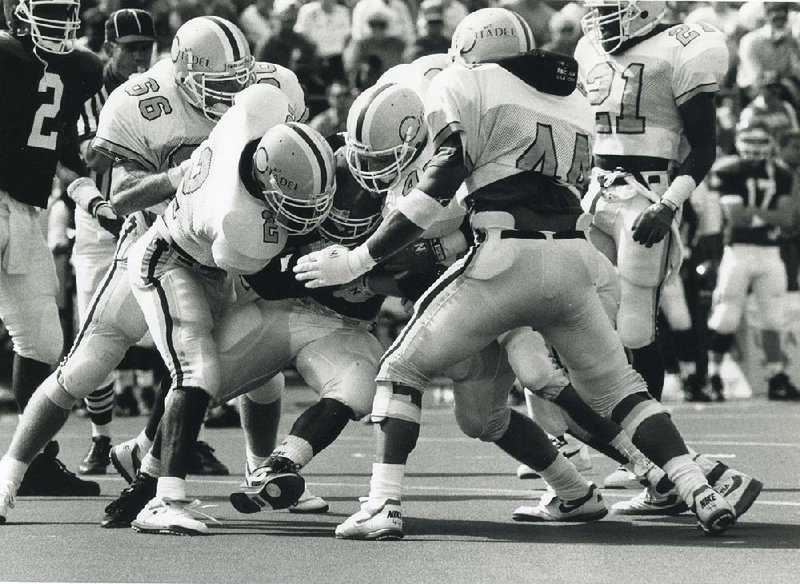
Welp, I'll admit that I didn't know that and I'm embarrassed since I live in the Charleston area. I think the Jack Douglas/1990's beat the Gamecocks and Razorback era set was pretty great as well, though maybe incorporate a little bit of gray to help further differentiate The Citadel from Chapel Hill.
-
2
-
-
If The Citadel wanted to make a move akin to what LSU does, and what Georgia Tech did before Collins took over, they could start wearing white tops at home, at least occasionally, and mimic the cadet attire shown below. A while helmet, white jersey with light blue shoulder stripes to mimic the epaulets (similar to the old Adidas Mississippi State and/or Manizel-era A&M uniforms), and dark pants (not sure if that is navy or grey) with a black stripe to match the cadets would look pretty good IMHO.
-
6 hours ago, kb105 said:
If Florida really wanted to wear these blue helmets again, they should have gotten a white version of the throwbacks with blue or white throwback pants and it would be much better.
8 hours ago, rmackman said:Looks like it's time to update the Gators page here on SportsLogos.net to include the white helmet, the white throwback from last year, the blue throwback from this year, and now this blue helmet: https://www.sportslogos.net/logos/list_by_team/675/Florida_Gators/
We’re going to get a color-on-color SEC Championship game where Bama is in it’s normal home set and the Gators are mono-blue, head to toe, aren’t we?
-
14 hours ago, -Akronite- said:
This seems likely and it's a nice look for an alt.
It would be nice if tOSU had consistency on the home and road jerseys like Florida does (I’m ignoring the orange set). Would be a fun one-off to have a white jersey and pants where the gray striping is swapped out for the white. They could add a gray outer stripe on the whites as an alternative as well and maintain consistency.-
1
-
-
South Carolina’s garnet jerseys have been revealed. Not a fan of the striping.
-
36 minutes ago, SSmith48 said:
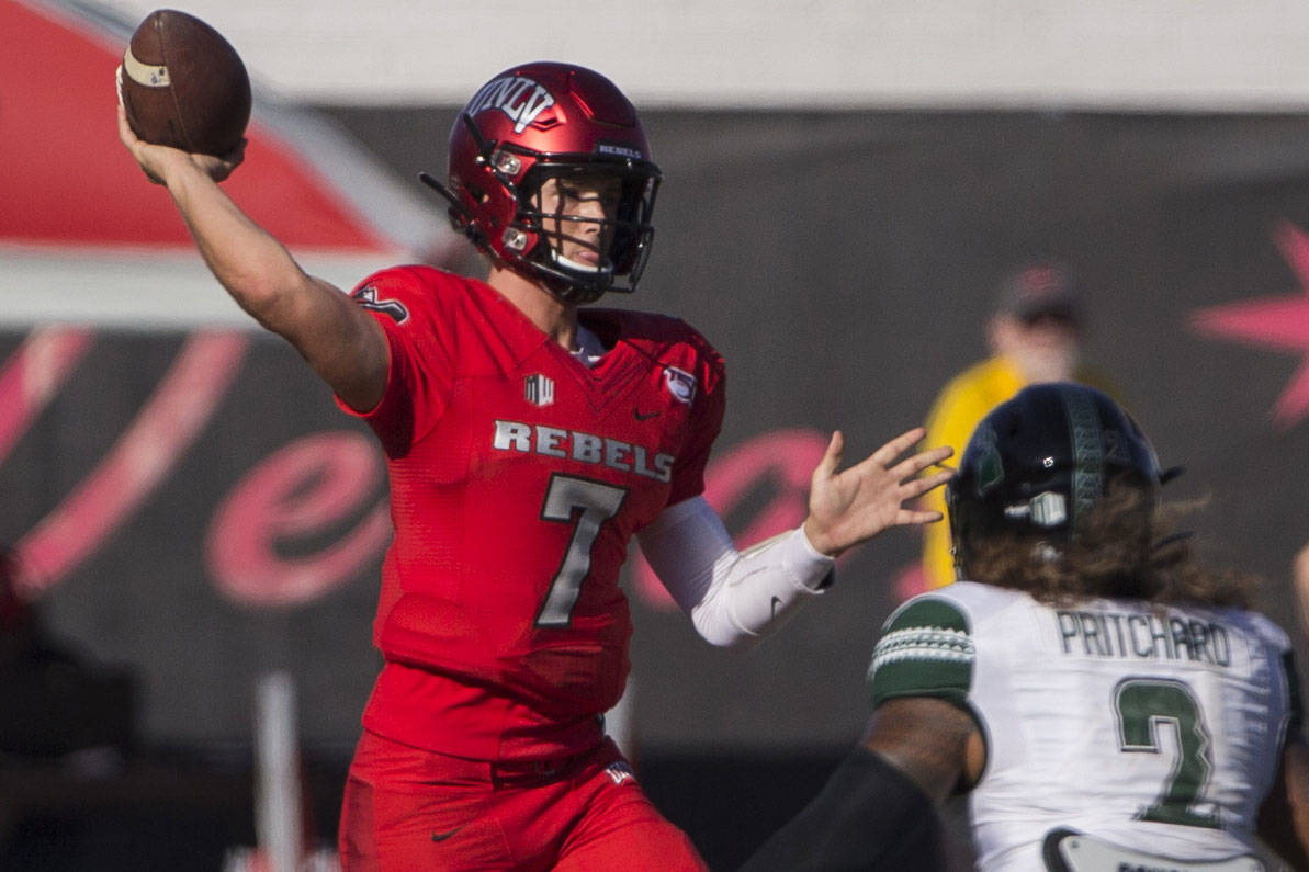
UNLV released a new set of uniforms featuring an eclectic collection of helmet options. Digging the helmet choices, especially the metallic red and gray (they match the flashiness of LV), but can't help but feel that they uniforms are a worse recolor of their previous set:
Previous uniforms for comparison:
And these make me somewhat nostalgic for this set for reasons I cannot explain:
These look like someone in the UNLV athletic department saw Wazzou’s set from last few years and then tried to mimic them in the Nike Custom Uniforms design-a-jersey website. The new numbering looks similar to the “Spartan” font Nike offers in its online DIY catalogue. Anyone know if Nike had much if any creative role in this update? -
3 hours ago, Buc said:
Sooo...is that to imply that the original white jerseys weren't NCAA compliant? And if not...you mean to tell me no one thought to check with the NCAA to see if the (re)design was compliant before unveiling them in the first place? And did they not learn from Florida State's blunder five years ago? (Speaking of blunders...yeah. I still don't know how that one got past the NCAA compliance people.)
I think this came up earlier in this thread, but one of the TV commentators in Charlotte's first game against App State was saying that they should've been penalized and lost a timeout in each half because the jerseys violated the NCAA's guidelines on contrasting colors. I think the officials let it slide since Charlotte apparently didn't get their jerseys until right before that first game on 9/12; they supposedly even had to have some of the players' moms helping sew the names on the back because they were so pressed for time. Due to the COVID cancellations and postponements, Charlotte did have 3 weeks between their first and second game so thankfully were able to find the above-noted vendor, who had ample time and did a bang up job remedying the perceived problem with the numbers.
-
1
-
-
On 10/3/2020 at 9:41 PM, SSmith48 said:
Looks like Charlotte was forced to change their numbers to green on their white jerseys. Looks MILES better.
Also FAU needs to just stick with the white helmet from here on out.
I like how they added double outlines to the numbers so it is still technically green-gold-green and thus technically consistent with with the shoulder stripes.
-
1
-
-
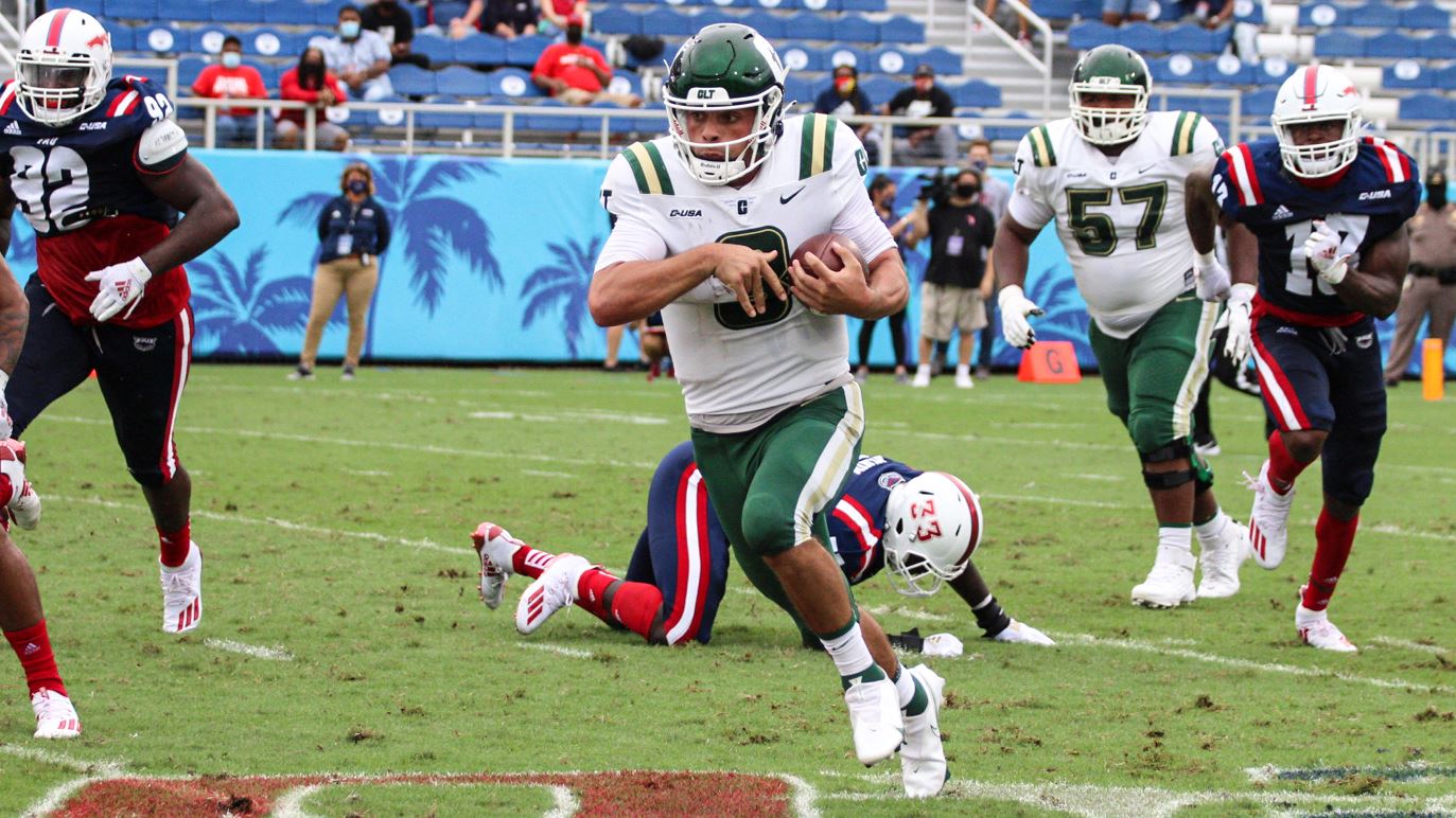
34 minutes ago, SSmith48 said:
FAU has released new uniforms, and the shoulder stripes are back.
Not a big fan of the red helmets with this set, but definitely an upgrade.
Just bring back the fantastic Schnellenberger-era set on newer templates, and throw in blue and red helmets if you want, so long as the striping is consistent.
-
4
-
-
12 hours ago, jerrylawless3 said:
Closer look at the helmet. Previous black helmet was matte, new lid is gloss with some serious gold flaking (which in itself is a throwback to when the black helmets were first revived years ago).
Is Vandy playing a day game? These are going to look awful and illegible unless they are under the lights at night.
-
Virginia going navy/white/navy as they travel to #1 Clemson in a rematch of the 2019 ACC Championship Game.
-
As anticipated, South Carolina has updated the striping on the white helmet to match the previously leaked new white jerseys and the fauxback white pants worn initially last season. They’ll get pasted this weekend in the Swamp but at least they’ll look good
-
6
-
-
17 hours ago, MJWalker45 said:
UCF has released their player's personal crests.
Replacing the gold star in a circle with an * as below makes this accurate.
I get the recruiting hype train, but how does have 85 different "crests" promote the notion of a "uniform" jersey? And why are they relying on sub-Game of Thrones level "house" logos? Are these going to be helmet stickers? The whole thing is really bizarre and seems to promote individual players over the team.
-
41 minutes ago, monkeypower said:
I assume they're trying to match the helmet numbers to the numbers on the corresponding colour jersey. The white jerseys have blue numbers, so the white helmets have blue numbers. Same thing with the blue jerseys having white numbers and blue helmets having white numbers.
That doesn't explain why the helmet numbers have outlines and the jersey numbers don't though...
Also doesn't explain going with a logo on one side and the numbers on the other. Just pick either, don't do both.
I agree and strongly advocate for the V-Sabre on both sides of the helmet AND tweaking the jerseys to add a contrasting outline/stroke to the numbers, so an orange outline for the white numbers on the navy jersey, a navy outline for the white numbers on the orange jersey, and going back to orange numbers with a navy outline on the white jersey, like so:
-
Closer look at Virginia’s updated set that will be on display against Duke on Saturday. Key points: 1) Updated V-Sabre one one side of the helmet, numerals, in the new font and with an outline (unlike the jerseys) on the other; 2) one of the new secondary logos is being used as a helmet achievement decal, which is a first for the program; and 3) the helmet’s back bumper features “VIRGINIA” in the new font.
-
Quote
South Carolina has updated the black helmet and black pants to match last year’s carried over fauxback.
-
6
-
-
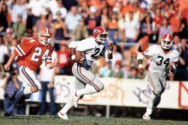
Georgia's throwback white jerseys will only be acceptable if they have the Lindsey Scott-esque tear away sleeve stripes:
-
Are the Snappers no longer among the 42 MiLB being contracted? I thought they were on one of the lists.
-
3 hours ago, Magic Dynasty said:
I'd argue the other way. Miami is an orange team first and foremost, so orange should be the dominant color in the stripe. Also, generally dark-light-dark looks better than light-dark-light when on a white background (although there are certainly exceptions to that - see the Browns).
The mismatching stripes don't look too awful on the home, but the away - with the pant stripes on the sleeves - looks quite bad. Those would also benefit from the swapping the stripes to be green-orange-green.
I agree, though my preference would be to use orange-white-green-white-orange or white-green-orange-green-white stripes on all helmets, jerseys and pants, akin to what Florida does. -
On 9/12/2020 at 3:34 PM, SSmith48 said:
I know huge numbers are a trend, but Charlotte, on top of the pale gold, have numbers that are obnoxiously colossal... double digits take up the whole back!
I wonder if making them smaller would've intensified the perceived legibility problem? I also didn't recall hearing anyone complain about Charlotte's CUSA-mate UAB's similar numbering against Miami.
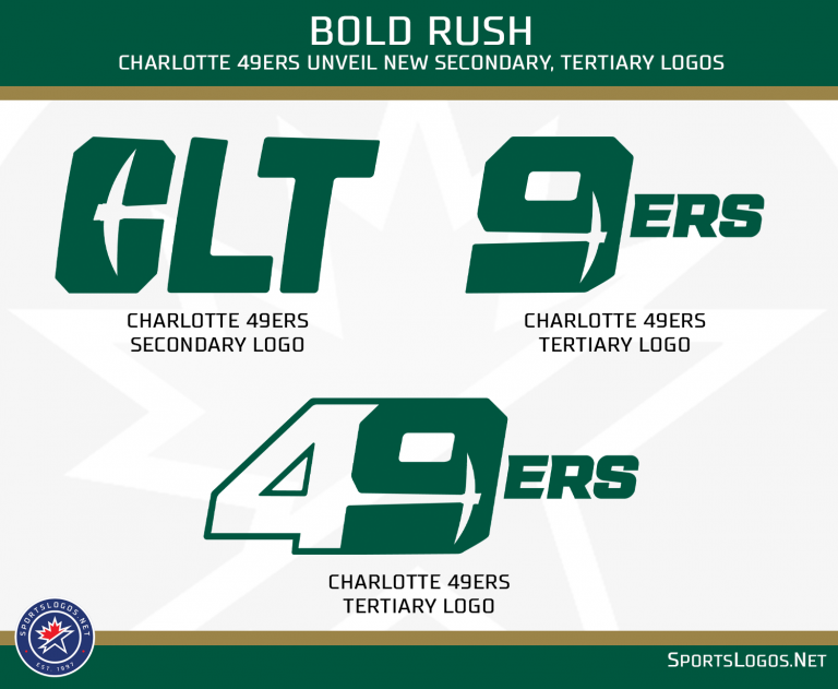
I like Charlotte's new uniforms, outside of the way the helmet stripe tapers on the back. I also think the C-Pickaxe logo would look better if it was outlined thinly in a contrasting color. Interested to see the home jerseys and any other pants/helmets in the new set, as well as if they use the new tertiary logo.
-
13 hours ago, NicDB said:
How are any of the names they've unveiled so far in any way more desirable than Snappers?
They aren't. Now, if/when they unveil the Beloit Bräts/ Beloit Beer Bräts (umlaut is unnecessary but don't want confusion with the Bratz tween girls toy line) that will be a horse of a different color:


Washington Commanders to debut new NFL identity
in Sports Logo News
Posted
I assumed that was the back of the jersey and the space where a player's last name would go.