

waltere
-
Posts
2,182 -
Joined
-
Last visited
Posts posted by waltere
-
-
Why on earth did that councillor start going on about his brother in the military?
-
Please tell me there is gonna be someway for me to watch the majority of this I missed
-
That guy just had to get someone to repeat the question 'how do you wish to vote?'.
These effin people...
-
Goddamnit why had I not become aware of this sooner!
-
I had that too, I managed to get round it by selecting the relevant notifications and deleting them.
-
Seeing Big Z in anything buy a Bruins #33 jersey is really weird

I'd 100% completely forgotten Chara's first Islanders' season was also the last of the Fishsticks
-
Oh for the love of @~
-
Just tried it again and now it's happening every single time I click a topic - and even after I click "back" to go back. It shows me the topic for a second then switches to women's health.
Not only that, but even when I click on forums (which doesn't cause the redirect like topics do) it launches tabs to advertiser sites.
I'm done with this on iPad. If it starts happening on phone i may need to be done all together since that's my primary posting method now.
I totally get the need for ads, but there's a difference between an advertisement and totally hijacking your device. I apologize if this is just a virus or something that's specific to my particular device, and I know that it's not like CC or whoever is sitting there consciously making this happen, but I hope it can stop.
I had the same thing happen to me as well. For me, it was on my laptop. No problems on the phone.
It stopped recently, though. I was finally going to make a post about it too before it stopped. Good to know it wasn't just me.
I had it happen a couple days ago on my iPad as well. Not sure what the heck would cause it.
I experienced this too, both laptop and Ipad, it lasted a few days and then stopped as quickly as it had started, very odd.
-
It is a uniform

Crazily enough, this is actually my main image of Kareem. That fact tells you everything you need to know about how I feel about Airplane and about how I feel about the NBA
-
 1
1
-
-
Every so and often when I click on internal board links I get randomly redirected to an advertising/clickbait type page, for some reason it seems particularly prevalent when opening sub-forums from the main page, whilst the rest of the internet seems fine. Is anyone else getting this, or is this something weird going on at my end?
-
I have no "connection" to the Carolina Panthers besides the fact that 4 year old me thought it would be cool to root for a team younger than he was and picked the Panthers over the Jags because of the color scheme; I've been a fan ever since.
Does this qualify me to be be hated in your world?
-
Take me out tonight
Because I want to see people and I want to see life
Driving in your car
So please don't drop me in Florida
-
Continuing on with my own unpopular opinions, being as I live in Wisconsin...saw a ball-in-glove sticker on a car yesterday. Royal blue and yellow looks so good compared to the Brewers' current bland logo.
Not sure how unpopular of an opinion that is around here... even those who hate the BiG usually acknowledge that the royal and yellow colors are much better than what they have now.
In that case chalk me up as having the unpopular opinion that, besides the overprevalence of alternates, the current Brewers look is the best in their history.
-
As long as that attachment simply consists of a load of photos of Paul 'Biz-Nasty' Bissonette going to town on some dry wall
-
That Pippins set is absolutely beautiful
-
Neither Taro Tsujimoto or the Tokyo Katanas ever existed.
That's the Tokyo Katanas... totally the right jersey for him.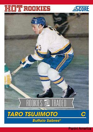

-
1
-
-
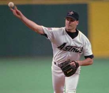
Those are boring. 1990s blandness at its finest.I think these are really, really underrated Astros uniforms

2 words I never thought I'd see used together in a uniform discussion context
-
He's not wrong
-
Yeah, adding the classic logo and getting rid of the front number goes a long way towards improving those. Still not as good as the originals, though. The originals are the best, while the current jerseys are second and I have a hard time deciding which is worse between the Goat Head and Buffaslug.
The Buffaslug is worse, it was genuinely ugly. The goat head in and of itself was fine, just not really appropriate for the Sabres
-
That number font is absolutely hideous.
Also not a fan of the word marks either. The fact they've squeezed the smaller letters into the bottom curve of the S at the end of 'Chihuahuas' makes it look really unbalanced, both the individual letter and the wordmark as a whole. On 'El Paso' the angle the bottom of the P is at makes my eye think the whole wordmark should be slanted like that, but its not.
-
^That would fit if there was a 'Players in the wrong number' thread
-
I'm not sure how unpopular this is, but I often see this uniform getting a lot of love.
I hate the Bulls black pinstripe alts from the 90s, absolutely hate them.
-
Can we just make the whole state of Arizona a parking lot?
How long before someone works out that they'd have to charge you to use it in order to make money?
-
In summary then, a town so in debt that it is 31 policemen and a whole fire station short of what it should have has voted to continue to pump money into a hockey franchise, in order that they can be anchor tenant on, and therefore 'save', a strip mall which is currently failing even with them there.


Interesting Sports Facts and Statistics
in Sports In General
Posted
I'm sure I've posted this around here before but it's always worth repeating:
In 1927 Babe Ruth and Lou Gehrig both individually had more home runs at Fenway Park than the entire combined roster of the Boston Red Sox