


Kevin W.
-
Posts
11,137 -
Joined
-
Last visited
-
Days Won
8
Posts posted by Kevin W.
-
-
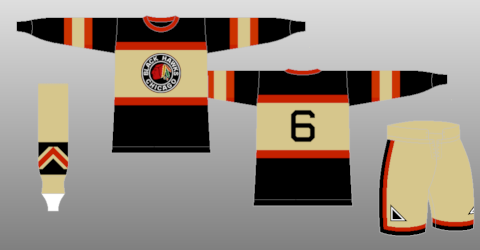
Vintage White or Tan, it was still ugly as sin.
Yes, because a Canucks fan can be trusted to be objective about the Blackhawks.
-
Yeah, an outline is definitely needed... but no ugly vintage white is a plus.
That wasn't vintage white on their old thirds/throwbacks. The uniforms they were based on really did use a tan colour.
Yep.
-
What font does Red Bull use for the city names in their soccer logos?
Anyone?
-

One of the best pro combats nike has done to date IMO.
YES
I disagree. It wasn't a terrible uniform, but I think it's one of the weaker Pro Combat uniforms, especially in comparison to their 2009 uniform.
-
Speaking of US sports logos, I must be the only person on here who doesn't hate the US Soccer Federation's logo.
-
What font does Red Bull use for the city names in their soccer logos?

-
The Islanders' Gorton's logo was not a bad logo. It only looked bad because the uniforms it was paired with were complete
 . Switch that logo to normal Islanders colors and it would look great as an alternate. Hell, it'd be an improvement over that atrocious black jersey.
 -
That's not a "nondescript blob."
-
Apart from the abhorrent piping, I like Nashville's uniforms. The yellow jersey is really cool.
-
Maybe they were each playoff appearance to that point. That's all I can guess.
No, that's not it, because they wore them starting in their inaugural season.
-
What's the deal with the victory stripes anyway? They wore them before they won the Cup.
The idea is that you raise your arms in victory after a win or goal and show off your glorious armpits of triumph. One of the dumbest uniform idiosyncrasies around.
O...k.
-
What's the deal with the victory stripes anyway? They wore them before they won the Cup.
-
Sorry, I wasn't trying to say that you specifically disrespected them. I just meant it in general.
-
You don't mess with the classics.
-
You know, I hate the Yankees as much as anyone but even I recognize that you do not disrespect their uniforms.
It's not a matter of opinion. If you think the Yankees' uniforms look bad, you are wrong. It's that simple.
-
I hated Oklahoma State's gray uniforms initially but they've grown on me. Something still bothers me about the all-black uniforms but the all-grays I can tolerate.
-
I would like to see more color vs color (jerseys) in football beyond the youth level. Nothing agaist white jerseys, but I'd really like to see some NFL matchup with both teams in their team color jersey. Just as long as their in no clashing.
I'd like to see it in all sports.
-
Not sure if this is unpopular persay, but I haven't really heard what people think about these... Personally I'm a big big fan of this set.
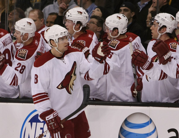
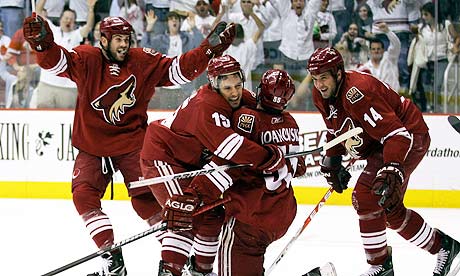
If it's unpopular, then I guess I share your unpopular opinion. I think that a lot of the dislike for the Coyotes' uniforms stems from a dislike of the Coyotes themselves, like from angry Quebecois hockey fans who want a second team.
-
I'd be interested to see how the results are now 14 months later.
-
Yeah, I realize that's a problem but I know there are some people who use programs like GIMP in conjunction with Paint which should solve the problem.
Anyway, thanks for that site. You do a great job and it's been incredibly useful to me.
-
I don't know if it's been posted here already, but I just found this set of NHL templates that should prove useful. I think it has every Edge jersey. It even has retired jerseys.
-
Touche, sirs.
-
Yeah, uh, the NHL gets a free pass compared to the NBA? Get back to me when someone pulls an Artest in the NHL.
-
I kinda like Maryland's new football uniforms. At least they're sticking with all school colors while trying to be Under Armour's Oregon.
 . Switch that logo to normal Islanders colors and it would look great as an alternate. Hell, it'd be an improvement over that atrocious black jersey.
Unpopular Opinions
in Sports Logo General Discussion
Posted
Well, I retract my statement then. Sorry.