


slapshot
-
Posts
14,476 -
Joined
-
Last visited
-
Days Won
3
Posts posted by slapshot
-
-
The fact of the matter is anything that's posted online can be copied and hosted on another website. Anything. Watermarks alone won't protect you.
This is an issue that comes up here every few years. There's a pinned thread about someone asking for ways to remove watermarks, it's funny but sad if you take the time to read it.
This has also led to a flood of poor concepts that were made even more illegible by giant watermarks running across them.
Artists/designers do have some protection. The second you create something, it has your copyright on it. Even though it's not legally necessary, simply adding a copyright line is a good first step to protect one's assets.
Of course, there are large gray areas with recourse; you really can't claim any monetary damages if someone lifts a concept you've made for an existing team, because those rights belong to the team or organization itself.
One of the best ways to protect your artwork from being lifted is to host your own site on its own domain, and use HTML coding to prevent visitors from "right-clicking" and copying the art to their desktops. It won't prevent screen shots, but one would have to be fairly crafty and knowledgeable to scroll through the source code and grab the HTML for the image file itself.
Flickr also gives users options to prevent downloading of displayed artwork, but again, if you're crafty enough to view your browser's developer tools, you can grab what you need.
-
Yes, but you won't get accepted if you act like an a$$ (as I found out).But I think that should only be the case if you're posts add value, not made solely to raise post count like Ilfhockey's are.

Or you could always just join a league on ESPN or Yahoo. Sites with dedicated fantasy sports.
-
 2
2
-
-
Commenting done on the mothership is run differently than on these boards. Not sure who holds mod powers for comments there.
But if it was a year ago, I'd let it go.
-
Alabama has used City Bold for a lot of its athletic branding, the same font as the San Francisco picture above.
This wordmark might be unique for basketball alone, just as Texas A&M has its own font for football.
-
It's custom to adidas. Here is an alphabet I drew from looking at pictures...
-
Delta Jaeger Bold
-
Not sure if anyone had made a post related with what I'm about to share. But which font (the numbers) is this, according to this jersey?

Conrad did this. I think it's the same.
https://drive.google.com/file/d/0B9XRkTNaMPBWcjYxTWI1aGd5bzQ/preview
So that font has no specific name whatsoever?
It's a custom font designed for Boston College. Not sure if it ever had a specific name.
-
While not minor-league, the new Worcester-based franchise in the Futures Collegiate Baseball League has announced the five finalists in its "Name The Team" contest. According to the team website, they are:
- Worcester Bravehearts - an homage to Worcester's brave men and women in uniform serving locally and abroad as well as a reference to "the Heart of the Commonwealth"
- Worcester Canal Diggers - a reference to Worcester's industrial history where scores of Irish immigrants dug the Blackstone canal through the region
- Worcester Freight Trains - a reference to Worcester's proud past and present operation of locomotives
- Worcester Mighty Caseys - a nod to the "Casey at the Bat: A Ballad of the Republic Sung in the Year 1888" poem written by Ernest Thayer on Chatham Street in Worcester
- Worcester True Blues - meaning "unwaveringly or staunchly loyal, especially to a person, a cause, etc.; the real deal" and a reference to Worcester's pride and blue collar heritage
Frankly, I can't say that any of them strike me as being particularly good. My gut tells me that they're going to go with Worcester Bravehearts. Of those five, I'd go with Canal Diggers. That said, my real preference would be to pay homage to Ernest Thayer's "Casey at the Bat" by naming the team the Worcester Nine. Barring that, I'd opt for the Worcester Blast in honor of the role the city has played in the fields of rocketry and space exploration (birthplace of rocketry pioneer Robert Goddard... home to David Clark Company, which has designed, developed, and manufactured air/space crew protective and communication equipment for the Mercury, Gemini, Apollo, and Space Shuttle programs... original home to Wyman-Gordon Company, one of the global leaders in forging aerospace parts... the first rocket propelled by liquid fuel launched in nearby Auburn, MA).
I know that due to problems with the previous franchise they're trying to get away from the Tornadoes, but there was a huge missed opportunity to name the team the Worcester Twisters.
The Worcester Tornado was a horrific event that killed 50+ people. While Hurricanes and other natural disasters hit areas across the country, that storm is officially called the "Worcester Tornado", and every time I heard the name, I thought of the storm, not the team.
Naming it the Twisters served a couple purposes...
1. Genericizing (made up word?) the nickname removes the reference to the specific storm, thus letting the nickname and team promote its own legacy.
2. Worcester Twisters rhymes! It's catchier and more fan-friendly.
I had an email conversation with Dan Simon about that, and he agreed Twisters would have been a better name. But it wasn't up to him for the name. He did design a great identity for them, however.
-
Brandiose is becoming the Phoenix Design Works of Minor League Baseball.
-
My roomate wants to make an account on the boards but i don't know if its allowed (we'd be using the same IP address, and with the whole Cody thing you guys might think i made two) Mods...... is it allowed?
Shouldn't be an issue. You're not creating a second account to bypass a punishment.
-
NHL on ESPN2, 1996-1998(?)

I remember these graphics when espn2 first came on the air in 1993.
-
As I visit this thread again, I still think a lot of people here are missing the point. Or maybe I am.
I wouldn't consider a logo "associated with failure" if it existed for 10+ years, even if the business it's associated with went out of business.
Examples show... Bradlees. That logo was almost 30 years old when the company shut down. It's not like the logo was brought in just before the liquidation.
Same thing for a few other companies,
Now, the circular Circuit City logo? Yes...barely lasted a year or two before the closures.
Purity (the heart/berry logo)? Yup. I worked for that supermarket chain, and that logo and branding barely lasted 4 years before we were bought out by Stop & Shop.
-
*pic snipped*
Can anyone point me towards a free font that's as close as possible to this one?
That's Compacta.
Actually, it's Tungsten Bold. But yeah, Compacta is freeware and will get you close enough.
No, it's Compacta. Tungsten is close, but a little more rounded.
-
I'll agree with Tank. Please leave the political commentary out of this thread.
-
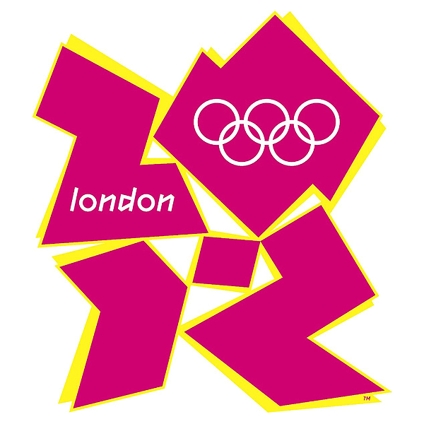
While this logo may have been a failure, I don't think the London Olympics as a whole were bad.
-
1
-
-
Any ideas on the text in white:

It's all a custom font, coincidentally called "McNeeseStAthletic"
-
Why is it that when a new poster's first post is spam, and moved to the graveyard, that acount isn't banned?
Any mod can move a thread to the graveyard, but only "Supermods" like myself, Yale, and the two admins, can actually ban an account. We're not here 24/7, but at least a mod can delete the thread or post in the meanwhile.
-
My favorite feature of Citizens Bank Park is the 360 concourse with full view of the action from anywhere. I never even thought about something like that being built into an indoor arena like that. That's f'ing fantastic
The Rock is built like that... Open concourse with a direct view of the ice from anywhere...
I only saw the open viewing area from the end zones. I remember the sidelines being enclosed like most other arenas. Is the open viewing just in the balconies?
Tsongas Center in Lowell, Mass was originally built like that (except for the concourse behind the press & luxury boxes) until they blocked off one end with a giant "club" room.
-
Looks like Stratum. http://processtypefo...tratum-1-and-2/
Nah, wouldn't be Stratum. It's close to it, I will say that.
Even WhatTheFont was no help.
Looks like Forza then
http://www.typography.com/fonts/font_overview.php?productLineID=100041&itemID=200132&cpuCount=
-
Looks like Stratum. http://processtypefoundry.com/fonts/stratum-1-and-2/
-
I just noticed how much the Columbus Blue Jackets # font looks like copperplate. I created a sample photo to show you guys:

Blue Jackets is on the top, copperplate is on the bottom.
It doesn't "look like" Copperplate. It is Copperplate.
It's just been squished and scaled.
-
I need your help folks! I'm trying to identify the font - or a free approximate - used on Bob Dole's presidential campaigns in the 80's. Either will do.
1988 is Italia
1980 is Antique Olive
-
Not sure if unpopular but I hate logos above the nameplate. Or replace a nameplate altogether.
Actually I think that's a very popular opinion. I think I have the unpopular opinion in that I don't mind when certain teams do this such as the Cardinals and Vikings b/c they had logos on the sleeves before but their new designs don't have room for them. However I don't like it for the Bills since they never had a logo on their jerseys before, so it seems strange for them to just suddenly stick a logo above their nameplates.
I wouldn't be surprised if more and more teams did away with this. There's really not much room, and more and more players have that area covered up by their hair anyway. I think it would be a better spot for the manufacturer logo, but the same issue woud arise.
-
Most (if not all) of the fonts used in Sports Illustrated are proprietary. If they are publicly released, it's usually not for a few years. The Champion Gothic family was set up like this, and now it's a commercially-available typeface.

Stolen Work
in General Design
Posted
Create your own domain, and post links with the [ url ] tag instead of the [ img ] tag.
Or use flickr and set it up so downloading is not available.