


slapshot
-
Posts
14,476 -
Joined
-
Last visited
-
Days Won
3
Posts posted by slapshot
-
-
But if one is crafty with PDF files, the full vector can be found in any current (2010-) Niketeam catalog.
-
It's not recommended because it's overused. It was originally designed for DePaul University. Somehow, it made its way to the realm of freeware fonts, and has been used in hundreds of logos, concepts and uniforms. Even the New Jersey Devils use it on dasher board advertising.
You can't unsee it.
-
The "American" text. I've seen this font in so many places. Television by Design, a TV graphics producer, loved to use it during the 1990s.
ITC Newtext
-
I've got a friend who REALLY wants to vote for me in the Concept Championship. Is it wrong for him to make an account and vote for me just for that purpose?
It should be. That's why there are limits set in the Logolympiad, where accounts need to be created before a certain date. It prevents users from making fake accounts for voting purposes.
-
I don't know that this is the proper forum to be discussing white stuff on merkins.
Zing!
-


The Narragansett/Gansett font.
That looks custom. I'm seeing some inconsistencies between similar characters, like the a and s. Even the two t's don't match exactly.
-
Sounds like a will power issue.
If YOU can't control entering threads and posting comments, OUR only option is to ban you outright, not just put a lock on the cabinet with all the poison inside.
You are not the first person who has requested this, and when those members could not control their actions, most of those accounts were banned.
You have repeatedly announced that you will only leave or stop commenting if forced out. At times, you have shown that you can reasonably offer different viewpoints and debates. Unfortunately, those cases are few and far between. While I do recognize that you have been baited into many an attack, you are ultimately responsible for your own behavior, and the history has shown that you don't have a good record at it.
I've talked with others and they say off the boards, you are much different, you're non-confrontational and not argumentative. Why haven't you been able to show that side around here more often?
-
SO once I post responses among topics, I can begin to start posting? I am a new member and very confused.
Once you reply to other posts, you can create your own. I think at 3 posts you should be able to start your own at this point.
-
There's a very similar freeware font called "Solemnity" here: http://famousfonts.smackbomb.com/fonts/neworleanssaints.php
The T needs to be modified from what I saw.
-
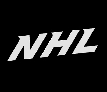
NHL-specific custom form of Myriad
-
Anyone? I tried WhatTheFont, but came up empty.
"Kirsty" is pretty close:
It's the closest one you'll find. I've never seen a full font, and can't confirm I may have seen that font set up for "Baseball" or "Soccer", etc. Numbers 0-5 are used on basketball jerseys. No other sport uses that font for numbers.
-

Been trying to find this. Lots of fonts are very similar, but the main difference is the C. Any help would be appreciated. Thanks!
Futura Bold Condensed.
-
Looking for the font that's used in the new primary for the Nats and by Vitamin World...
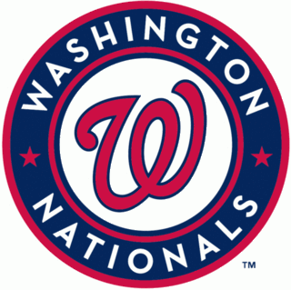
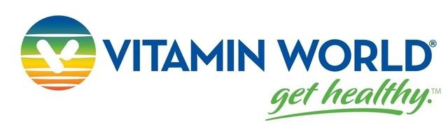
Neutraface
-
What is the name of the font used on the NHL hockey jerseys during the 2011 NHL All-Star Game? And who has it?
The lettering is Big Noodle Titling, a freeware font.
The numbers are modified Futura, also used in recent years on the Pro Bowl uniforms.
-
I can't start a topic so I'm writing something here.
Thanks for this very good site with so many many sport logos. And that we can use it at other forum with the URL link.
Good work!
Thank you very much!

bullsger
You need to make a few normal posts before starting a topic so we know you're not a spammer.
Which is also why there's a FAQ.
-
West Virginia's are a custom modification of Digital Sans by Elsner & Flake
-
Friz Quadrata
-
In order:
The NHL font is a customized modified form of Myriad.
The split number font is custom to Nike. You can find vectors of it in most any Nike uniform catalog.
-
Object -> Expand Appearance
-
Anyone know/have the font used by the New York Jets? I've always suspected it was custom, but on the other hand know it's been "out there" for decades, so I wonder if I could get my hands on it.
It is custom, and it's called "Jets Bold".
It's somewhat a meld between Imago Extra Bold Italic and Univers Extra Black Italic. Aside from the numbers, I'd say Imago is closer.
-
No surprises here. Soldier Field is a piece of crap and the media fears all things Detroit, so it was basically between Cleveland and Indy with the latter having more hotel space and being the established home of the mens hoops tourney.
Ford Field already hosts the MAC Championship game. Why give a field 2 conference championships?
If they're determined to host it in a neutral NFL stadium, how many other geographical FieldTurf choices are there? Cincinnati, Minneapolis, Indy or Detroit? How many BigTen teams play on grass? Penn State is one, maybe Purdue? Iowa? At most, three out of eleven. Makes sense to keep it on turf, especially if they want to use an NFL field. Otherwise, put the game in Pittsburgh or Cleveland.
-
Wasn't really sure where to post this, so I'll post it here.
Saw someone wearing this shirt at Pitchfork Music Festival last weekend. Sadly, it wasn't for sale.

Stolen, and going to Facebook. Thanks.

-
I cannot find the name to this magazine's title font anywhere. Any help?

There's a font in there? I only see Amy Adams.

-
what font is this that I see Fox Sports use all the time:

Particularly a the "Today @ 1:30PM ET" part
It's part of the "United" series from House Industries

Unpopular Opinions
in Sports Logo General Discussion
Posted
Bear in mind that in some of those cases, letters and numbers are simplified and made bolder to be easier to read from the stands.