


HOOVER
-
Posts
1,454 -
Joined
-
Last visited
-
Days Won
12
Posts posted by HOOVER
-
-
39 minutes ago, Cujo said:
Broncos leaked helmet -- Big yikes.
There's no way this is what Broncos the are doing. But the triangles match up with the what we saw on the jersey leak.


2 things that make me question this:
1. That paint finish looks like it came out of a Krylon can. It does not look like any paint finish I’ve seen in all my years of coaching or selling athletic equipment and apparel.
2. I’ve never seen helmet stickers use that material. Ever. It’s always a thicker, clear vinyl. These look like paper decals printed at your local sign shop.
EDIT: also, what is that at the bottom of the back of the helmet, below the stripe decal…is that a big scuff, as in the helmet was dropped on the ground? If so, they’d never use that for anything official. Unless this is a quick sloppy prototype, I’m not convinced.
-
 8
8
-
-
31 minutes ago, Cujo said:
Broncos leaked helmet -- Big yikes.
There's no way this is what Broncos the are doing. But the triangles match up with the what we saw on the jersey leak.
The Broncos are the new Browns.-
 1
1
-
-
1 hour ago, MCM0313 said:
Probably. I’d like it better if this were on their navy helmet though.
This. Red mask on (matte or satin) Navy helmet is a really underrated look. -
1 minute ago, BBTV said:
Unrelated to these unveilings, this article is among the most insightful ever of the interaction between a team (Jets), league (NFL), and supplier (Nike.). It costs $5 (but you would get the other two as well) which is well worth it for legitimate journalism rather than reading nonsense by nobodies on Reddit. Everyone's entitled to opinions, but reading these things would go a long way to making those "informed opinions", rather than spouting off stuff like people did about certain things in 2021 when everyone was a medical expert.
You will see the NFL's concept logos and "stories", which I think everyone here would love.
*I have no affiliation with PL or UW, just think it's one of the best interviews i've ever read in 20 years (JFC... it's been 20!) of being in the uni-community, and even longer of following UW.Seconded. All 3 interviews are must-reads for people like us and well worth a 1-month, $5 Substack donation to Paul (who is getting out of the biz next month, by the way).
-
11 minutes ago, henburg said:
The other 3 are good looking uniforms though, that's my point, and yet a lot of people are talking about them like they dropped another Buccaneers 2014 set on us.
They're gonna look like this most of the time.
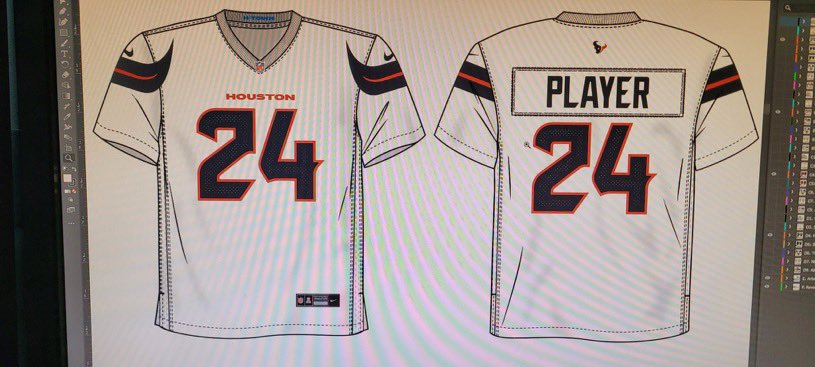
First of all, TV numbers on one jersey, no TV numbers on the other....and the TV numbers DON'T EVEN MATCH THE FRONT & BACK number. Absolutely no reason to have 1-color TV numbers and 2-color font/back numbers. And with that being the case, with White TV numbers and a White outline of the Texans sleeve logo, the Swoosh should be Red for contrast. -
2 minutes ago, coborjobs2010 said:
this is literally from the Concepts page here
10-4, thanks.
-
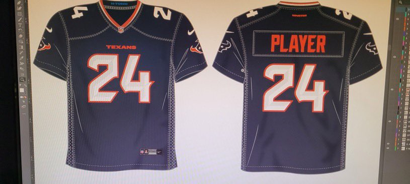
Another rumored take on the Texans:
-
 1
1
-
-
Dan Campbell lobbied for the Black jerseys to return.
-
1
-
-
If these leaks are accurate, Jesus Christ.
How do you nail it with the Jets and the Lions and then completely destroy all credibility with the Broncos and Texans? Who at the league level signs off on this and why are they employed?
-
23 minutes ago, Raith said:
Being at the reveal party, they for sure have a silver sheen to them that is not easy to see in most of the pictures.
I just listened to some of the videos taken from the reveal event, and the female interviewer did comment that the Silver pants have a sheen to them again. -
5 minutes ago, oldschoolvikings said:
No, I'm not.
You're wrong here in thinking every instance of striping within the uniform has to slavishly match every other instance. How about this... the stripes on the blue jersey match the stripes on the blue pants. The stripes on the white jersey match the stripes on the white pants. And the stripes on the silver helmet match the stripes on the silver pants. Round of applause, take a bow, high fives all around, end of story.
I agree with you, that's how I would do it. But when the team wants a Blue helmet with Black/Silver stripes to wear with a Black jersey, you can't wear Blue pants with Silver/White stripes. So, you either have 2 pairs of Blue pants, each with different stripe colors, or you have one pair of Blue pants with no stripes you can wear with the Blue, White, or Black jersey.-
1
-
-
7 minutes ago, BBTV said:
2. Do the pants have a little sheen to them? Or is it the same drab flat gray? Some of the pics make it look like they may be at least slightly metallic.
It looks like the Silver pants might:
-
10
-
 3
3
-
 1
1
-
-
1 hour ago, JustABallCoach said:
Cal confirms the leak, basically
Is the hat that crooked, or is this logo as unbalanced as I feared it was when I first saw the helmet leak?
This is going to be a disaster. -
1 hour ago, oldschoolvikings said:
I disagree to begin with. Striped pants are better than non-striped pants 10 out of 10 times. But the solution is easy. Just never wear mono-looks.
The Lions blue jersey-silver pants is amazing. The white jersey-silver pants is also amazing. Everything else is a miss.
You're wrong here because you simplified the problem. It's the 2nd/3rd/4th added pants colors that create the problem.As you said, Silver/Blue/Silver/Blue works perfect - as does Silver/White/Silver/Blue.
Now start mixing & matching (which I hate, btw).- If you have stripes on the Blue pants, they don't match the Silver helmet or White jersey. If you do decide to put stripes on the Blue pants, then they either have to match the Primary jersey stripes or the Alternate jersey stripes, or you lose a combination. So you make them solid and you can wear them with the Home, Away, or Alternate jerseys.
- If you have stripes on the White pants, they should match the Away jersey. But then, technically, they don't match the helmet. And if you want to, for some reason, wear them with the Blue or Black jerseys, you have mismatched stripes.So, I see why they went solid on the White, Blue and Black pants. Not that I love it, but I get it. In an ideal world, they wouldn't have Blue or White pants and they wouldn't have a Black uniform, but given the design challenge, this is the solution.
-
Just now, sky1324 said:
You can keep the silver, I just want the black and blue.
The Silver is what makes the Blue & Black look so good...Panthers fans just can't seem to get this.-
1
-
-
Just now, BJ Sands said:
If I buy Madden --- a big if for so many reasons --- the Lions will pair the white jersey with the silver pants.
Every time.
-
3
-
-
Just now, VDizzle12 said:
It's so odd to me that so many teams are doing away with pants stripes. My only thought is maybe they want to be able to mix and match with different jerseys. So lack of stripes keeps the consistency there? For the Lions, I'm surprised how much I like the blue/black/blue set and that's a good example. Blue pants with silver stripes definitely would have looked odd there. When neither the helmet nor jersey have silver stripes.
Yes, I mentioned this earlier today - mixing & matching with striped pants can get tricky, especially when both the helmet & jersey ahve the striping. And, it almost becomes too much, especially on mono-looks.
The key to offsetting the plain-ness of the pants woudl be to wear socks/leggings with the sleeve striping on them, but alas, we haven't been given that gift yet. -
I can just see Dan Campbell pacing the locker room looking at all of those Black uniforms with Metallica blowing out the speakers.
-
1
-
 6
6
-
-
I'd imagine the Carolina Panthers are looking at the Blue/Black uniform like

-
8
-
-
3 minutes ago, simtek34 said:
They got a full website for it. The gallery shows Blue on Silver, White on Blue, White on White, Black on Blue, and Black on Black. No White on Silver or Black on Silver seen.
https://uniforms.detroitlions.com
I'd be shocked if they never wore White on Silver, their classic away look.-
3
-
-
THE LIONS LOOK LIKE THE LIONS.
:censored:ing nailed it.
Would've preferred stripes on the White & Blue pants but I can live with it.
Black uniform is very surprisingly good with how the the Black mask & decals look on the Blue helmet.
Great stuff. That primary home uniform is *chef's kiss*.-
4
-
-
13 minutes ago, infrared41 said:
Now I know who to blame for that disaster.
You all really need to read the articles.The NFL came to Nike wanting something like this. They all collaborated and came up with Color Rush.
Part 3 of this interview series was really enlightening - it covered the Jets' last redesign process, which saw them pass over some awesome batwing concepts - but Tom also revealed the name of the former Nike designer who worked on them; same designer was also responsible for the Titans and Jaguars (assuming '13 set). So, if you're looking for someone to blame for bad design, there you go...-
1
-
-
5 minutes ago, aawagner011 said:
I was looking for this, too. Nothing on their site, Twitter, or their YouTube leads me to believe it’ll be streamed. Most reveals the last few years have been. Can’t recall the last one that wasn’t.
I believe someone shared something yesterday that it will *not* be livestreamed so that the Lions season ticket holders would be the first to see them uniforms at the unveiling event.So much for that.
I've got their X account & website up in case they drop something on us right at 7EST.
-
7 minutes ago, RedSeaHeath said:
Surely this is for the XFL right?
That’s an insult to the XFL.-
3
-


2024 NFL Changes
in Sports Logo News
Posted
You know, the old saying, “The Browns are gonna Browns.”
If this is the new helmet and the jersey leaks are real, this will be an all-time “shot yourselves in the foot” move by the Donkeys. Laughingstock stuff.