


HOOVER
-
Posts
1,454 -
Joined
-
Last visited
-
Days Won
12
Posts posted by HOOVER
-
-
6 hours ago, rfraser85 said:
What would be the right combos for a teal helmet? In my head, that would make the Jaguars look like a lighter version of the Eagles.
Definitely:
Teal/Teal/White/TealTeal/White/Teal/White
Teal/White/White/Teal or White
Possibly:Teal/Black/Teal/Black
Teal/Black/White/Black
Which means we’ll probably only get:
Teal/Teal/Teal/Teal
Teal/Black/Black/Black
-
 1
1
-
-
1 hour ago, tBBP said:

Silver numbers definitely work on Honolulu Blue.....if the font is bold enough to give the numbers enough surface area, which you can see in their Throwbacks above. The skinny, italicized numbers they use now are both too skinny/small and are the main negative of their current uniforms.
I could see the Jaguars doing a Teal helmet, certainly...though I wouldn't be surprised if they went with a White alternate so that they can do a full icy white/snow jaguar/Tony Khan's cocaine look. Perhaps enough other teams in the league are using White helmets/alternates that they'll back off that option. Teal helmets could work for them for sure, when worn with the right combos (of course). -
27 minutes ago, WSU151 said:
Well :censored:…as much as I don’t trust a guy like Brady2024 who makes up a lot of bizarre claims, the below doesn't sound too far off the rumors
Your NEW Denver Broncos uniforms:
-
6
-
 6
6
-
-
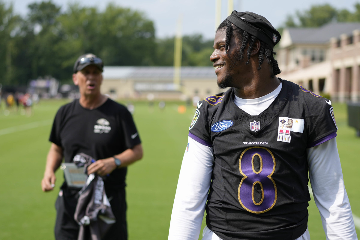
3 minutes ago, DustDevil61 said:
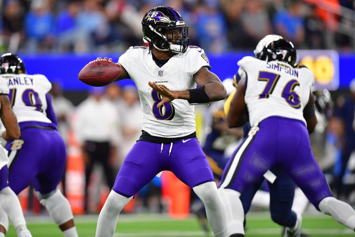
Paraphrasing: "The Ravens organization feel that it has maintained a classic look with the main home/road uniforms and don't plan on tinkering with them."
That might be the best news I've heard regarding NFL uniforms in a long time. Baltimore has their flaws, but I'd much, much rather keep everything--sad bird head with shoehorned B included (IMO the weakest part of the Ravens identity) the same, warts and all--over any drastic changes to the whole set. That statement also implies that nothing huge is happening to the alternates either, which should be good news overall.
If the Ravens just kept it limited to these two looks, fixed (or removed) their helmet stripe and updated their workmark, number font, and "B" logo on the hip, they'd have a modern classic. Unfortunately, those few elements severely date this set:
-
5
-
-
4 hours ago, bowld said:
A retailer has them listed as getting a new helmet for 2024 and uses a placeholder coming soon image
Couldn't that be for a new primary? Or does it specifically list it as a new alternate? -
4 hours ago, tigerslionspistonshabs said:
From the teaser, it looks like the Bronco head is stitched, implying that it's on the actual uniform? Will it be on the shoulders?
Safe to assume that's just a social media graphic. I wouldn't read too much into it.-
1
-
-
1 hour ago, bowld said:
Can confirm Lions will have at least 1 new helmet. Unsure of color but know a new helmet is coming. (might be new alternate or primary)
Interesting. How do you know that? -
28 minutes ago, bowld said:
Ravens wore these during practice last year- makes me wonder if they go this route with the black uni--
Best they've ever looked.
They're really just a number font, helmet stripe, and wordmark update away from being excellent (especially if they'd commit full-time to the Purple pants). This Purple fill, Gold outline look is really nice.-
1
-
-
5 minutes ago, Eszcz21 said:
I hope you are right but I'm definitely fearing that they're going to bring black back,
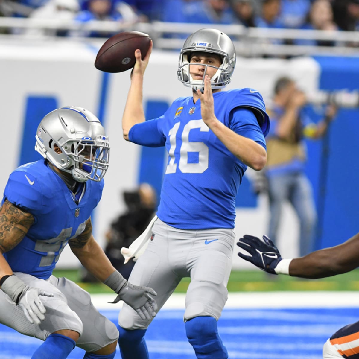
I’d be shocked if they did, as it would have been added back into the primary logo and it hasn’t been.Black as a Color Rush alt? Fair chance. But the logo still doesn’t jive - I would bet they’ll retain last year’s Blue alt helmet for whatever they do with that uniform.
Prediction: Barry Sanders-era primary Home & Away sets, longstanding Thanksgiving Throwbacks, and an all-Blue, modern Color Rush uni that works with last year’s Blue helmet.
-
2
-
-
15 hours ago, aawagner011 said:
Couple more looks at FSU’s turquoise. This looks like a lock to happen this year.
I hate FSU with a passion...but this jersey & color combo almost makes me want to like them. Unique in all of sports, with meaning to boot.-
3
-
-
2 hours ago, Ted Cunningham said:
Custom number fonts, especially of late, are an excellent encapsulation of "just because we can doesn't mean we should".
Since it used to be that suppliers (at least to a degree) dictated what number styles were available, there was more uniformity, at least in concept, among number sets. And differences in generally similar styles led to interesting (but tame) quirks and differences (like the "Champion" numbers essentially being "block" but with the curved 7, etc.). Because of certain teams sticking with styles over time, even after changing suppliers, we ended up with some teams with contextually unique numbers. (Two examples that stick out there are the Bears, and to a lesser degree, the Red Sox.) But somewhere around the mid-to-late 90s (I suppose starting with the Ravens, Eagles, and then Broncos), that changed. Those number sets were, at least, somewhat coherent in their designs though. Now, with numbers like the Texans, Dolphins, Seahawks, Titans, etc., it just seems like numbers are designed first and foremost to not look like other numbers, and then Nike et al back into some brand-speak, brand-related explanation for why they look like they do.
(That's not to say all modern numbers that are currently unique are like this. Cleveland's an example that seems a little more coherent and intentional. Though even there, the half-serif on the 7 is questionable.)
I have a theory that custom number fonts are one way that the manufacturers tried to deter bootleg jersey sales.
Easy to get China jersey online for $25 with accurate numbers when it’s full block; harder when those bootleggers don’t have a custom number font file to copy.
-
5 hours ago, Sec19Row53 said:
Not from the stands we aren't, nor from the broadcast booth.
70,000 watching in a stadium, 17 million watching from home.-
2
-
-
8 hours ago, stumpygremlin said:
Seriously... why do pretty much all the new NFL uniforms not have TV numbers? Cardinals, Patriots, Rams, Commanders, Chargers (they have helmet numbers), now Texans. I hate it.
1. Much less space on modern football jerseys.2. We’re all watching on 65” HDTVs.
-
4
-
-
1 hour ago, McCall said:
They literally wore red socks with the navy pants from the beginning of their existence. And looks light years better.
Yes, and they tied in with the Red numbers.
No Red numbers, no Red socks.
Too unbalanced.
-
 1
1
-
-
5 hours ago, CS85 said:
1000000% agree with the Red facemask, but those socks are too much. Save those for the Battle Red alt.
P.S. Outstanding Photoshop work by designedbyfranco-
2
-
-
16 minutes ago, Brave-Bird 08 said:
It's just not doing it for me. I mean, it's fine. White "socks" and navy numbers just makes what used to be a vibrant, beautifully color-blocked modern classic road uniform something that is now drab in comparison.
Bull horn motif > generic sleeve "slash" is a plus change
Every other change is lateral to a minus change for me.
Net meh.
Using "vibrant" and "Houston Texans uniforms" in the same conversation is a Texas-sized stretch.-
2
-
1
-
-
3 hours ago, sluggish_edgeboy said:
It's fine, but I sure wish they kept the red numbers. It helped them stand out from the Bills, Patriots, Broncos, Bears, and whatnot. More red is IMO what the team badly needs, and I'm surprised they didn't go with a red helmet, which seemed to have a lot of momentum.
I am pro-Dark Navy for the Texans. I may be in the minority but I strongly dislike their Red helmet & uniforms. Red, in this case, makes a great accent color to the Dark Navy, but as a primary, Dark Navy doesn't do anything for the Red as an accent.
I had hoped they'd drop the helmet for the White version, though. Using a Dark Navy facemask would've made it unique to the league, and it could've been swapped out with a Red facemask for an Oilers-tribute alt.
I still think the Dark Navy helmet would benefit from a stripe.
-
 1
1
-
-
Absolute upgrade. I actually really like the number font. Disappointing if that’s the same Houston wordmark though. Worried about how thick that Red stripe is….gotta wait & see.
Also love how the numbers are done. They’re not fully perforated and the Red trim looks glossy.
Can’t wait to see more. Only scary thing now is the claim that each uniform will be a different design…let’s hope they tie together somewhat.
-
18 hours ago, tBBP said:
Ooh...
And depending on how you count him, the last guy to full-time get away with it (unless you count Devin Hester)...
I'd be with that, too!!!
I'm a Chiefs fan and Skyy Moore is #24 and I cannot stand it. -
@BBTV Lot of good thoughts here.
I think most teams are shying away from retiring numbers anymore; they may not issue them for awhile, but they're keeping that flexibility by not officially retiring them. I think teams found out long ago that doing that limits being able to put players in numbers, especially with the increased (offseason & practice squad) roster sizes. So I do believe we'll see less and less of this being an issue as very few players have their numbers retired going forward.
Too many players now have access to 0-19, which creates the problem for QBs, Ks and Ps. This is why I think you've gotta remove some position groups from having the ability to wear them, and I think the obvious players that you remove from being able to wear singles & teens are IDL, LB, and possibly EDGE players, who could have new classification groups all their own:
K/P: 0-19
QB: 0-19
RB: 0-9, 20-49 (no RBs should be wearing teens, save these for WRs)
WR: 0-19, 80-89
TE: 40-49, 80-89
LS: 40-79
OL: 50-79
IDL: 50-59, 90-99
EDGE: 40-59, 90-99
LB: 50-59, 90-99
DB: 0-9, 20-49
To do this, the league, especially the NFLPA, would need to clarify position groups and that would relate to defensive system: if you're a 3-4 DE, you're an IDL; if you're a 4-3 DE, you're an EDGE. If you're an OLB in either system, you're an EDGE, and if you're an off-ball LB, you're an LB.
In my breakdown above, there are still too many rostered players fighting over 0-9, but by taking out IDL/EDGE/LBs from the equation, it alleviates the problem somewhat. Keeping those players out of 10-39 or even 10-49 also frees up more numbers for DBs, who may try to take 0-9 from QBs, Ks, Ps.
This probably makes things way too complicated. Unfortunately, the NFL had it right a few years ago when they just let WRs wear 10-19. All they had to do to really fix the system is let them wear 0-9 as well to free up what was becoming a logjam...everything else was perfect.-
2
-
-
2 hours ago, DCarp1231 said:
Considering college teams usually roster double the number of players as NFL teams, not likely.
The numbers will absolutely have to be amended again at some point, but double numbers won’t be a necessity.
Each position group should have access to a set of 30 numbers
K/P 20-49
QB 0-29
RB 10-39
WR 0-19, 80-89
TE 0-19, 80-89
OL 50-79
DL 70-99
LB 30-59
DB 20-49
Agree they need to adjust it again, but I prefer this.K/P: 0-19
QB: 0-19
RB: 0-9, 20-49
WR: 0-19, 80-89
TE: 40-49, 80-89
OL: 50-79
DL: 50-59, 90-99
LB: 0-19, 40-59, 90-99
DB: 0-9, 20-49
-
26 minutes ago, MCM0313 said:
You hardly ever see them anymore, but I loved RB numbers in the forties. John Riggins with the Indigenous Persons, Stephen Davis with the Persons and the Panthers, Mike Alstott with the Buccaneers…granted, Alstott was a fullback, Riggins was a fullback in a one-back offense, and Davis was a fullback-turned-halfback, but those numbers conveyed size and power to me.
40 & 42 are two of the best numbers in football but very underutilized. I miss power backs.-
 1
1
-
-
That top left is the best Texans concept I’ve ever seen.
EDIT - to save you the click:
Think I'd love it even more with a White helmet.-
5
-
-
8 hours ago, McCall said:
Michigan's "Plum" is pantone 505, a very common shade of maroon used by many colleges. You'd think, given how many schools use maroon in general, Under Armour would be able to create some maroon uniform that would be available for general usage.
I agree. I can't find a UA team color card with PMS codes. In my days in team sporting goods, Maroon was one of the trickiest colors across manufacturers; one college I outfitted, for example, called their color "Maroon"...but it was much closer to Nike's Team Cardinal than it was to Nike's Team Dark Maroon, so we chose Cardinal for all of their gear.Didn't help that the designer who rebranded the school - which had been Nike school for a very long time and still is - paid no attention to Nike's color palette when designing all of their new marks. The Maroon was not a match for Nike's Team Dark Maroon OR Team Cardinal, and the Orange was not a match for Nike's Team Orange or Bright Ceramic (Tennessee Orange). So, all of the campus & facility branding never perfectly matched the team apparel or uniforms, and if coaches did were not careful, things like helmet decals and other printed equipment or accessories would be off, too.


2024 NFL Changes
in Sports Logo News
Posted
This is most likely what it is. Aren’t they rumored to be doing a Throwback uni this season?