


HOOVER
-
Posts
1,456 -
Joined
-
Last visited
-
Days Won
12
Posts posted by HOOVER
-
-
1 hour ago, NH4 said:
I did some digging because I wanted to see how different the new logo was from some concepts and I found this by Empery Designs on Behance.

It's identical but it's a great logo so hopefully (if it is real) they paid him great
Yes, I'd hope they paid that man or he'll be making it up via a lawyer.
It's really the perfect logo for Denver and I hope they use it full-time at some point.-
 3
3
-
-
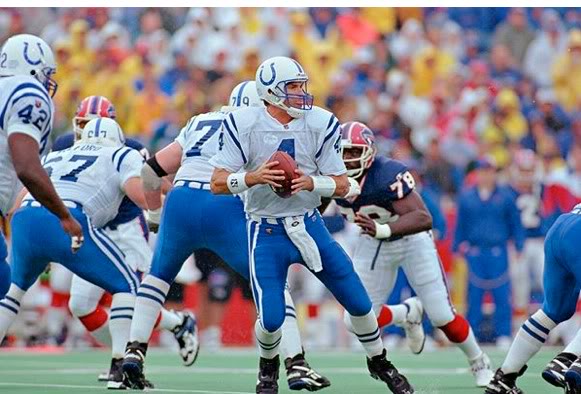
6 hours ago, The Impaler said:
As a Husker fan, couldn't disagree more. I love Nebraska's road look. And I think the Colts looked better above than they do now. Nothing wrong with that Cards uni combo either.
So you like these...
...over this?
Ok.-
 1
1
-
 1
1
-
 1
1
-
-
2 minutes ago, udubfan19 said:
the lions already have throwback helmets? their also gray.
Thank you for correcting me...my Jets example would be the better example. This new rule allows for a new physical 3rd helmet which can be a different color. So the Lions can keep the Silver, keep the Blue, and add...Black? White? Oof.
Unless the NFL says you can only have 3 total looks in helmets...which is probably how they'd enforce the rule. That would mean the Lions could have a primary look on Silver, a throwback look on Silver, and then a Blue or Black or White as the alt.Otherwise, a team could make multiple looks out of just decal changes on one color shell and have more than 3 helmet looks.
My guess is that the Lions will have 2 shells, but 3 looks (Primary Silver, Classic Silver, some other color for its Color Rush/Alt).-
 1
1
-
-
In quickly trying to digest this new 3rd helmet rule, the last line of the policy seems to be the most significant:
"Each alternate helmet color must be tied to a specific optional uniform and cannot be mixed/matched with primary uniforms or mixed/matched with another optional uniform."
So, for example, if the Lions debut new uniforms, they could do something like this:
1. Primary (New Home/Away) + Primary Helmet
2. Classic (Barry Sanders or Thanksgiving) + Classic Helmet
3. Color Rush + Color Rush Helmet
Or, the Jets can now have a Green Helmet for their home/away Sack Exchange uniforms, a White helmet for a Namath throwback, and a Black helmet for Color Rush.This may not be as horrible as it originally sounds.
-
13
-
-
Don't shoot the messenger:
-
2
-
1
-
1
-
 2
2
-
 1
1
-
 1
1
-
 1
1
-
 1
1
-
 1
1
-
 1
1
-
 1
1
-
1
-
1
-
-
1 hour ago, fouhy12 said:
These White/White combos don't suck at all...in large part because the teams wear White helmets.I always advised my clients: White helmet = White pants. If you wear a dark pant under a White helmet & White jersey, you're just going to have a very unbalanced, bottom-heavy look. The exception was teams that had a very light color that they wanted to use for a pant, such as the Chargers with Yellow pants or the Buccaneers with Creamsicle Orange pants, or the Dolphins in Aqua pants. Even then, it's slightly unbalanced and just doesn't look as good as White/White/White/contrasting sock.
Examples of this being a bad combination:
-
6
-
4
-
3
-
-
34 minutes ago, oldschoolvikings said:
Doubt it. That’s the kind of detective nonsense we seem to indulge in every year and it pretty much never happens.
I hope you’re right, because that number font is hot trash.-
1
-
-
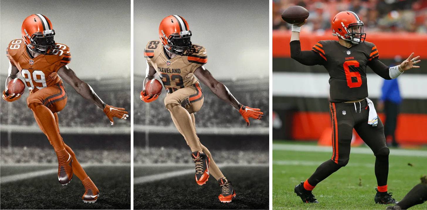
1 hour ago, MJWalker45 said:
I'm glad the Browns didn't go with the tan design. It's like trying to put two different shades of brown together and it doesn't work.
Agree. Tom said he was big on the Texas Orange version, which also would have been a debacle. To your point, Tan just doesn't fit with Cleveland.
I do still think Tan or Sand would make perfect sense for Arizona down the line, or maybe Jacksonville, if they wanted to lean into a Jax Beach theme (I can hear your collective groans, but I can totally see Tony Khan being for this). :censored:, I shouldn't have put that out into the universe. That'll be their City Connect uniform for sure in 2030.-
1
-
-
Also, for anyone who has wanted a Tan or Sand primary or alternate for a team, they pitched one for the Browns and it was beautiful:
Perhaps not right for the Browns, but swap out the Orange for Arizona's Cardinal Red, and that could've been a strong and unique look that made sense for that particular franchise.
Another fun note on that: they pitched the 49ers on an all-Gold uniform, but since the 49ers' Gold is so drab on the new matte fabrics, it didn't look great. That's why they pivoted to the Black Color Rush uni.-
4
-
1
-
4
-
-
One of the most fascinating parts of the Uni-Watch Tom Andrich interviews are his comments on helmets. Nike had nothing to do with them after 2012. The NFL took helmet design away from them and kept it in-house with the teams and league.
Not running to Nike's defense, but we pinned a decade's worth of bad helmet designs - Jags, Bucs, Browns, Titans, Commanders, Falcons, Jets, alternates for the Saints and many others - on the Swoosh, when in fact it was the teams and league who had final say.
Andrich says it was incredibly frustrating as they could not create a whole head-down design, only uniforms. The teams came up with what they wanted the helmet to be and sent them to Nike and Nike had to work with it.-
12
-
-
This was another one of those ideas that Andrich pitched and I have to say, I love the mixture of Silver/Gray into the New Orleans color pallete:
Of course, I'm a huge fan of when Army, Colorado, and UCF do it, so it immediately caught my eye. Would love to see the Saints adopt their home throwback/away CR uniforms as their primaries, with an updated Gold helmet to match, but a modern alternate for them could include some Gray/Silver/Anthracite to create a new era look for them.
To date, these are one of my favorite uniforms of all-time:
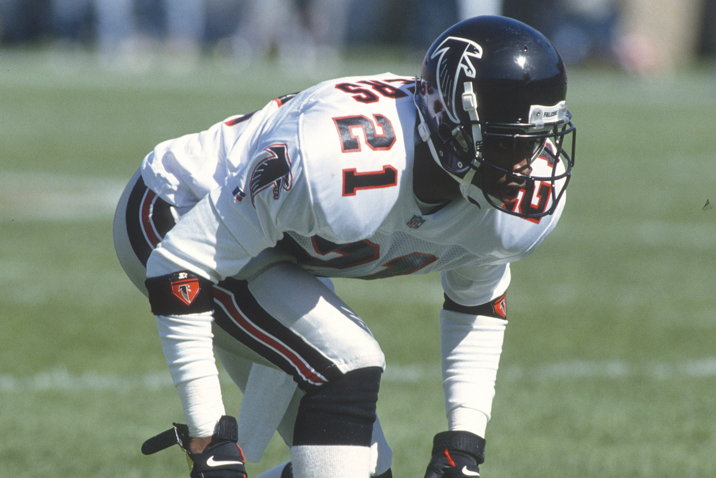
And I'm always pounding the table for Atlanta to bring Silver/Grey back in their next uniform redesign, essentially using the 90's Deion uniforms with the helmet below, swapping Red in for Gold:
Any way you shake it, Black + Grey makes an incredible base for almost any other color. -
6 minutes ago, ssj_homeslice said:
Finally ponied up the money to read Paul's substack, and the Nike NFL interviews are fascinating. I am also glad it dispells the "tail wagging the dog" relationship people seemed to think Nike has in regards to NFL uniform design; that never really made sense to me.
I did the same. Excellent content. And I'm going to post a few things from the 1st interview he did with Tom Andrich, because I believe that article is not behind the paywall.
The first one is something that, as soon as I saw it, I said..."oh no". This was one of multiple rough ideas Tom presented when the NFL came back to Nike a year after Nike nearly sabotaged the relationship by making a huge City Connect-type presentation to NFL execs. The NFL was not at all happy about the City Connect gimmick, but wanted to spike sales so they asked Nike for ideas. This ultimately led to Color Rush.
If we see snow-capped mountain sleeves on new Denver uniforms in a few weeks, perhaps this is where the idea was born.-
1
-
-
Holy :censored: we need a uniform leak.
-
3
-
1
-
8
-
-
6 hours ago, FiddySicks said:
Why the
 would Denver switch to a white helmet? Good Christ is that an infuriatingly bad idea. This has been a blue helmet team for like half a century now, and even before that they never wore a white helmet.
They’re about to sacrifice like 50 years of brand consistency for this tacky “icy” 5280/CoLoRaDo PrIdE nonsense.
Colorado has a dumbass flag anyway. I legit hate that goofy Cubs logo with a sun in it looking ass logo. “Well, Coloradans love it!” Don’t care. Then you’re all dumb with bad taste.
All-time great post. Love it.-
1
-
1
-
-
1 hour ago, Cujo said:
We 99.99% know is that the Cyberhorse is sticking around and that they'll have their 80s look as their alternate uni. Sounds more and more like white helmets are a done-deal, based on what people with connections have heard. Everything else still feels up in the air, but the Denver flag/mountainy sleeves and "5280" on the pants seems on-point with how a Denver pro team re-brand would go in 2024.
On it’s own, this helmet is really nice.-
2
-
1
-
1
-
-
17 minutes ago, DCarp1231 said:
New Commanders numbers
Absolutely cannot stand defensive backs wearing numbers between 10-19. Makes me want to :censored:ing vomit.-
3
-
 2
2
-
1
-
-
12 minutes ago, tigerslionspistonshabs said:
atrocious
Literally stole the word from my fingertips.
I do like the White helmet with the Navy mask, if they were to use that. -
1 hour ago, gosioux76 said:
This should not have worked. But aside from the terrible logo, I still think these uniforms are fantastic. I don't know how you go with neon green as your primary color and not look obnoxious, but the Thunder pulled it off.
This design, with an updated logo & design elements on a modern template would not be terrible. Not suitable for the NFL, but perfectly balanced and attractive for a team in the UFL, for example, or a college program on a growth track.-
3
-
-
19 minutes ago, GFB said:
Lions details starting to trickle out.
The confirmed things that we already knew/assumed are that the Lions pants will be more compatible with mixing-and-matching looks (Lions currently have 5 pairs of pants, but only two can be paired with the home-blue jerseys) and the numbers will be easier to read (return of white numbers or white outlines).
Among the new details:
WCF Patch
Alternate Helmet
Here's to hoping that the William Clay Ford tribute is reduced to a "hanger effect" inner collar styling or something far less noticeable; as for the blue helmet, my best guess is the blue finish sticks around with a new facemask color (since the dark grey uniforms are gone) and helmet decal (no longer team's 90th anniversary).
While the jersey may not be accurate, check out the black Nike swooshes... it may speak to the return of the black alternate jersey.
Glad to hear the alt helmet will be updated as I didn’t care for it. Rotating pants might get really scary. More legible numbers and less WCF is a win.I’d bet that LaPorta jersey is some kind of CityConnect fan jersey series; the NFL would never let a team put a Black & White Shield logo on the collar for a gameday uniform.
-
44 minutes ago, tBBP said:
The Vegas Golden Knights would like to have a word with you...
I keep seeing people say this—I see it said about the Panthers' helmets and saw it said about the Snatit's former white helmets too—and I will vehemently, wholeheartedly disagree with it every time. For one, neither the Ravens' nor Snatit's helmet logos really fit with a full braisher (or any full stripe, for that matter), and for two, tapered stripes work perfectly fine when considering the forms of a feather. Now as far as the Panthers, I do think they'd benefit from reversing the colors to match their shoulder and pants swoops (and maybe shortening the helmet swoops just a bit), but other than that, they're just fine the way they are.
(I won't discuss the Snatit's helmets in this space, except to say they need new ones and when they show up they better not be navy.)
The shard stripes are a relic of the 90’s and deserved to die there. They don’t belong anywhere in current football aesthetics. -
2 hours ago, 29texan said:
Just sayin'...
I want to agree, but that last gradient helmet has me giving you side eye.
I'll long be a proponent of the Falcons wearing these uniforms:
But with this helmet:
-
1 minute ago, ruttep said:
I don't think there are many Niners fans clamoring for this uniform to make a return. The team was in complete shambles when this was the uniform.
Agreed. -
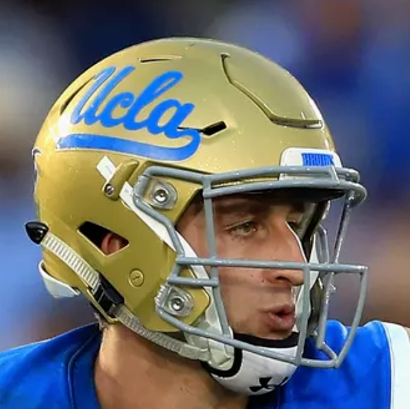
37 minutes ago, bowld said:
UCLA went from a grey face mask to gold and to me its an upgrade. Have to assume the 49ers would be the same
Just because it works for UCLA doesn't mean it would work for the 49ers.
That Light Blue is way less bold/contrasting than Red, and then you have to factor the 49ers helmet stripe in. This may have been an upgrade for the Bruins, but it does not work for San Fran unless you're doing a drastic redesign and getting rid of the helmet stripe altogether.-
1
-
1
-
-
25 minutes ago, Bomba Tomba said:
It's 2024, we can color facemasks now
It sucks why some teams still like to be stuck in the past because "muh tradishun"
And it's a subtle change that won't ruin a team's identity, in fact it also removes an unnecessary color from the overall palette of the uniform
The 49ers wore Red facemasks from '96-'08. It wasn't an improvement.
Some looks truly are timeless and don't need to be modernized. Here are two of them:
However, if you're asking for a future alternate, I'm sure you'll eventually get it, and this is what it would look like:
-
8
-


/cdn.vox-cdn.com/uploads/chorus_asset/file/21969586/1171384248.jpg.jpg)


:format(webp)/cdn.vox-cdn.com/uploads/chorus_image/image/66662683/626014060.jpg.0.jpg)

 would Denver switch to a white helmet? Good Christ is that an infuriatingly bad idea. This has been a blue helmet team for like half a century now, and even before that they never wore a white helmet.


/cdn.vox-cdn.com/uploads/chorus_image/image/71428667/usa_today_19063875.0.jpg)
:format(jpeg)/cdn.vox-cdn.com/uploads/chorus_image/image/55451023/56562425.0.jpg)


2024 NFL Changes
in Sports Logo News
Posted
"Each alternate helmet color must be tied to a specific optional uniform and cannot be mixed/matched with primary uniforms or mixed/matched with another optional uniform."
This 3rd-helmet rule may actually be a net-positive.
If the Jets can only wear the Black helmet with an Alternate uniform, it'll only be worn with the Black uniform, since the Sack Exchange home & away don't have Black in the uniform design.
No Black helmet should mean no Black pants are worn with the Sack Exchange home & away jerseys.
So, we should only ever see:
Green/Green/White
Green/Green/Green
Green/White/White
Green/White/Green
Black/Black/Black
..and their numerous sock color combos.
Assuming they can still wear the Black jersey as an alternate mix & match with the Green helmet, I suppose we could get:
Green/Black/White
Green/Black/Green
Green/Black/Black
...but those combos suck and are not historical, so maybe (hopefully) they'll not wear them.