


IceCap
-
Posts
32,589 -
Joined
-
Last visited
-
Days Won
304
Posts posted by IceCap
-
-
16 hours ago, spartacat_12 said:
Both ideas are capitalizing on the popularity of black, but one is much lazier in it's execution than the other.
That's true, but practically speaking in the market place they're one in the same. The Kings going with their Gretzky look set the stage for what the Stars, Lightning, and Senators eventually did, and it probably very much played into the Devils switching green out for black and the Whalers switching royal blue for navy and adding silver. From there everyone else was trendchasing.
-
 3
3
-
-
2 hours ago, spartacat_12 said:
I've never really considered teams doing complete rebrands that involved a change to black as 'BFBS'.
That doesn't change the fact that the Kings' switch to black and silver prompted a lot of other teams to adopt black-heavy uniforms or replace a colour in their scheme with black. Or that the next two expansion teams after that rebrand went all-out on black sweaters with metallic logos.
Maybe the Kings' 1988 rebrand doesn't fit your definition of bfbs but it started the trend in the NHL.
-
33 minutes ago, BBTV said:
The Devils change may have been the beginning of the bfbs era of pro sports. If not the beginning, then near it. The timeline doesn't match up exactly, but their garden-state neighbor Jets also unnecessarily added black.
The first "bfbs" thing in the NHL was the Minnesota North Stars adding black highlights to their home whites in 1981.
That being said it didn't really kick into high gear until 1988 when the Kings landed Gretzky and went full Raiders with a rebrand. Which is the same year the North Stars added the black highlights to their road greens.
By 1991 the North Stars had gone to black primaries very reminiscent of the Kings' black Gretzky sweaters and in 1992 Ottawa and Tampa Bay joined the league with black primaries. That's also the year the Devils switch out green for black. And while it's not strictly bfbs, 1992 was also the year the Whalers changed out their kelly green and royal blue unis for navy, green, and silver. Darkening a colour scheme was a trend that went hand in hand with bfbs.
So I'd say the Kings' Gretzky look kicked it off in the NHL, with the North Stars as a precursor.
-
1
-
-
2 minutes ago, DoctorWhom said:
Like I said, the rose tinted glasses for Mahomes is insane.

Have you forgotten about the Tyree catch?
The Butler Pick?
28-3?
Philly Special?
Yeah, so bland & boring.
Who the
 cares about the Patriots?
-
5
-
 7
7
-
-
Well that was some bull

Eagles got done dirty
-
2
-
-
2 hours ago, the admiral said:
I'm bumping up against No Politics, but believing Jordan was the best is right-coded while believing LeBron is the best is left-coded, which was always implicit until The Man Himself just straight-up said Jordan was better.
Anyone who tries to make Jordan/LeBron about politics is a G-ddamned moron.
18 hours ago, PittsburghSucks said:The Passenger rides again.
-
1
-
-
On 2/5/2023 at 4:14 AM, who do you think said:
Yay slacktivism!
How long did you think on this one? Did you finally post it after considering going with "virtue signalling" for an hour? Seems like you did.
-
3
-
-
ewwwwwwwwwww
-
3
-
-
1 hour ago, mafiaman said:
Seeing the Lakers in gold jerseys at the Celtics’ home venue makes me want to throw up. Ditto for Boston in black. Please, white jerseys vs. “Forum Blue” every time.
The Lakers' purple jerseys have dumb black side panels these days.
-
10
-
-
I'm only on board for neutral sight championship games if they put the AFL logo at centre field for the AFC Championship Game.
-
2
-
-
-
I watched about ten minutes of the first episode and I felt embarrassed for myself and everyone on the show.
-
4
-
-
In miss the orange NHL logo
-
8
-
 2
2
-
-
@ManillaToad proudly yawning in defence of bigotry
-
15
-
 1
1
-
-
57 minutes ago, Ridleylash said:
The Coyotes third may be underwhelming to some, but at least it's creative and taking bold risks.
lol
The moon captain patch is the only thing that works, and the cactus A patch kind of negates that.
The colours are baffling- didn't they just ditch the brick red and sand to go back to the 90s scheme?
The cactus pants are dumb.
The striping is... not great. It's like a KO version of the kachina and the way it's applied looks cheap. This isn't even an Adidas problem. Their stripes usually aren't so shoddy looking.
The side panel kachina is overkill.
The wordmark is the ultimate "its 4:45 on a Friday" show of "effort."
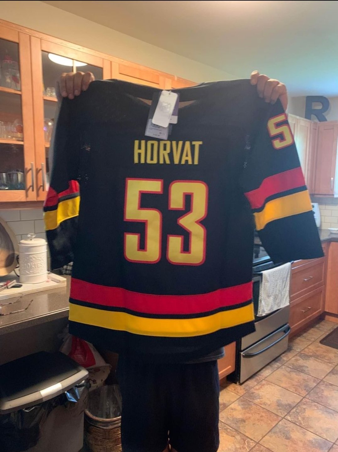
1 hour ago, kiwi_canadian said:More Canucks pics:

Maybe I'm missing something but I don't get the hate.
It looks like a fairly straightforward "mixing of eras" sweater.
-
3
-
-
1 hour ago, Sodboy13 said:
This really is simultaneously trying too hard and not trying hard enough. Just a mess of ideas shoved together.
https://twitter.com/ArizonaCoyotes/status/1615393751576510464?s=19
How embarrassing.
-
4
-
-
1 hour ago, Ridleylash said:
but at the end of the day the Howling logo is mostly associated with the lowest points in the franchise, aside from one season that was still marred by instability. The organization will probably want to distance themselves from that era as much as possible.
Like that era isn't still going on.
-
4
-
 1
1
-
-
2 hours ago, _RH_ said:
I guess the two-color scheme isn't terrible but IMO inferior to the green/orange. Interesting that after the revival of the popular Kachina logo theyd go with text - anything to make a buck, I suppose. IMO worst downgrade is the hem pattern- the original is just worlds better than this.
What a popcorn fart. And cheap looking. About par for this team though.
This shows another problem with the Coyotes' identity though. What's their main colour? The Rangers are a blue team. The Kings are a black team. The Coyotes are....????
-
4
-
-
This has been a marvellous Charger'ing
G-d I'm so glad I ditched this crap pile of a franchise
-
8
-
-
This has been a marvellous Charger'ing
-
1
-
-
As someone who rooted for this stupid team for years...
IT'S HAPPENING
-
5
-
-
The Bucs are gonna win the Super Bowl* and I'm gonna laugh
*probably not but it'd be funny
-
2
-
-
People defending the Buffaslug?
-
3
-
-
6 minutes ago, Carolingian Steamroller said:
The falcon's actually gold
-
2
-

 cares about the Patriots?


2022-2023 NHL Jersey Changes
in Sports Logo News
Posted
The Lightning have a bad history with alternate jerseys because they refuse to do the obvious thing. Back in their original set they could have gone with a blue alternate. When they did they made it a 90s monstrosity with sleeve lightning wave stripes and a rain pattern.
Then their Edge unis. Clearly what was needed was a more traditional alternate in blue. And we got that... with pointless piping and a dumb "BOLTS" wordmark.
Ok. They strip everything down to a faux-O6 look with blue as the primary. So maybe something in black? Ok. We get that... and it has dumb grey gradient sleeves and numbers that are hard to read from the stands.
The one time they did just the expected thing was when they recoloured the original jersey with blue as the primary for the RR, which was the alternate they should have had in the 90s and 00s all along. But of course that was a one and done.
This team just can't stop themselves from overthinking very basic assignments. And it leads to stuff that doesn't stand the test of time.