


IceCap
-
Posts
32,589 -
Joined
-
Last visited
-
Days Won
304
Posts posted by IceCap
-
-
1 hour ago, Cujo said:
I wouldn't hate this..

-
 14
14
-
 2
2
-
 3
3
-
 11
11
-
 1
1
-
-
OH MY
 ING G-D I'M SO HAPPY I WAS THERE LIVE FOR IT
GO LEAFS GO!!!!!!
-
4
-
4
-
-
1 hour ago, henburg said:
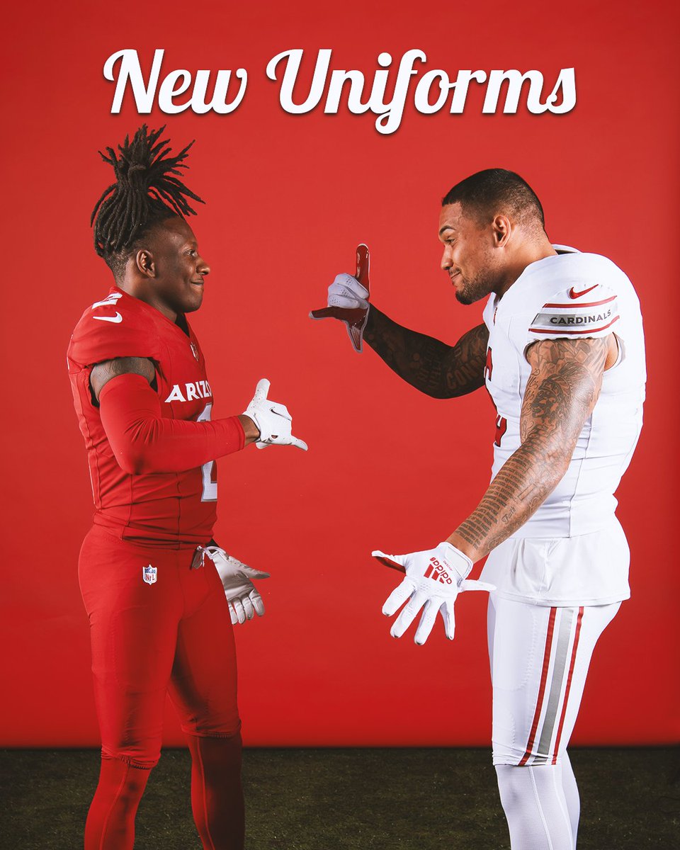
After sitting on these for a few days, it occured to me that the wordmarks were practically required for the Away and Alternate jerseys because without them, there's nothing that would indicate that they're for the Arizona Cardinals.
You know, aside from the Cardinals logos above the nameplates.
-
3
-
-
41 minutes ago, DCarp1231 said:
The Cardinals sleeve wordmark looks a lot better than the Lions.
They're both dumb
-
18
-
-
8 minutes ago, Carolingian Steamroller said:
One thing I really like about the introduction of silver into the Cardinals design is that they used a really reflective version.
A true silver, not grey.
What it means, is that with the right lighting, the silver can disappear against a white background, as it does on the white pants. See how the silver fades near the hip in the below:
Which makes that pair of pants look an awful lot like the early aughts style white pants:
Good use of color and material choice to evoke two eras of Cardinals football at the same time.G-d the sleeve wordmark is dumb
-
8
-
-
On 4/23/2023 at 9:46 AM, DCarp1231 said:
Turns out the Brady-era Patriots uniforms were an Adidas brain child from 2000.
Adidas ended up buying Reebok (and may have already done so by that point) and the Brady Pats look has all the hallmarks of the Reebok panel and piping looks so I consider them part of that trend.
-
1
-
-
Sex/Gender has been an option on message boards as long as I've been visiting them. I'm fine with modifying the field to have "Male," "Female," "Non-binary," and "Prefer Not to Say" options.
But I really don't think a pronouns field is necessary, or warranted.
-
1
-
-
As good a run as the Broncos had with the Cyber Horse 1) everything old is new again and 2) you can't stave that off with incompetence.
Denver won back to back Super Bowls in 1998 and 1999. Then they set the record for worst record for a defending champ in 2000 that stood until the Rams prolapsed in 2022. They won another when an all-time great defence carried the burnt out husk of Peyton Manning to a second title, but that was in 2015. It's been eight years and a parade of failed coaches and QBs, the last of which is on a team crippling contract if he can't turn his game around.
Sixteen years of nothing between 1999 and 2015. Eight more years of nothing since, and becoming the joke of the NFL thanks to Russell Wilson's LETS RIDE mantra and bad sandwich commercials. Sooner or later the ratio of bad football to good tips in the bad's favour. And then the classic brand, which is the opposite of the slick Cyber Horse/Nike panelled look, becomes appealing.
-
6
-
 1
1
-
-
4 minutes ago, BBTV said:
I think there may be a mix up - I think you're referring to Cujo's post?
Yep my mistake. Sorry!

-
15 hours ago, FiddySicks said:
I don’t think I’ll ever understand the love that old Broncos D horse logo gets.
I'm not a Broncos fan but I absolutely prefer the D to the Cyber Horse. I'll explain it the best I can.
So I wasted most of my life up until very recently as a Chargers fan (the first year of my "official" Bucs fandom saw them win a Super Bowl, which was clearly a sign from the football gods that I'd made the right decision).
As such I grew up despising the Broncos, but also kind of respecting them? Like how I HATE the Habs as a Leafs fan, but they're our oldest rivals. They can themselves but also ok, it would be pretty boring without them. That's the sort of feeling I had towards the Broncos.
Anyway that also came with a layer of AFL appreciation. And when you look at the original AFL/AFC teams... Denver feels like our Cowboys. They have a fanbase that's annoyingly larger than their home base. They're always promoted as a top team in prime time. It seems like people won't shut up about them even when they suck (Teebow anyone?) and they're an older, more traditional team in a western locale.
Simply put? The Cyber Horse and Nike's futuristic-for-1997 redesign doesn't fit them in my opinion. It's too out there, too modern. Sure it'd fit if they were a 1997 expansion team, but they're not.
I get the Super Bowl argument. I've seen Denver go 3-1 in Super Bowls in these uniforms/with this logo which is nothing to sneeze at. I get it. It just doesn't fit the "vibe" I get from the franchise though. The D/Horse, for all its awkwardness and association with face planting teams, does.
-
4
-
-
9 hours ago, BBTV said:
I had to fact check this because it sounds completely made up, but holy balls - it's true. It's probably not possible to look up, but I wonder if there's any other comp in terms of coach/qb turnover in such a relatively-short period of time.
John Elway was a terrible GM who lucked into Peyton Manning wanting to wind down his career in Denver over Glendale.
-
6
-
 1
1
-
-
15 minutes ago, MJWalker45 said:
I think the Texans are, but I thought Buffalo switched out under Nike.
No Buffalo's current look debuted in the final years of the Reebok deal.
But even if Houston and Buffalo's looks debuted under Reebok that's not what @BBTV is talking about, I don't think. It's not a strict "uniforms designed by Reebok," he's referencing a specific trend Reebok was at the front of in the 2000s- panels and piping. Atlanta, New England, Arizona, Minnesota, Cincinnati, Jacksonville, and Buffalo 02-10.
All of these Reebok looks have finally been replaced (Buffalo's was the first, with a more traditional Reebok design in 2011). Not all the replacements have been good. Atlanta's new unis are awful and Arizona's new set still has too many small little things that bother me.
Even still, Arizona's 05-22 unis were the last holdout of that style and they're thankfully gone.
-
7
-
-
32 minutes ago, MG3 said:
The red shirts need TV numbers
They do
-
That set will always be the Jake Plumber set to me
-
3
-
-
3 hours ago, CaliforniaGlowin said:
Every time I see the Cardinals uniform I will think of what could have been

For all of these uniforms' faults I'm glad they kept the team colours intact.
-
3
-
-
11 hours ago, AJM said:
Designer speak
It's a plague
-
1
-
-
Ok mod hat on.
TruColor has proven his bonafides as a trustworthy source time and again, and has ALWAYS walked the line between sharing news and not compromising his sources exceptionally well.
He's also one of the people to thank for our community being what it is today. Many people, myself included, found the CCSLC through his SSUR site back in the day.
In this case he passed along information from a source that was clearly lying to him. It's not his fault. We've all been duped before.
So let me make this clear. This will not became a "badger TruColor" thread. If it continues to trend in that direction it will be locked and the responsible parties will be disciplined.
Thank you all for your expected cooperation.
-
34
-
1
-
4
-
-
50 minutes ago, DCarp1231 said:
This is just saying you want the pre-05 uniforms with extra steps
Not exactly but close, yes
-
2
-
-
Changes I'd make...
Get rid of the ARIZONA on the red jerseys
Put white stripes on the red pants
Make the road striping red and black instead of silver and red
Replace the CARDINALS wordmark on the sleeves with the Arizona state flag
-
8
-
-
Just now, nuordr said:
I can understand your point about the alternate being different. But the home and road should at least be the same and unfortunately that is not the case with the Cardinals.
Counter-point- The Cards have a history of their red and white jerseys not being mirrors of each other
-
12
-
1
-
-
1 hour ago, chakfu said:
I thought the rumors of darkened red and use of orangey yellow were very plausible.
Plausible? Sure. Nike's talked teams into dumb ideas before.
But that's not what the Cards and Nike did. Sure we can see it happening, but it didn't.
And I hope this being such a high profile example of Reddit bull
gets people to finally realize that they're better off ignoring what comes out of that place uni and logo-wise.
-
2 hours ago, who do you think said:
Has it been observed/discussed around here that in the NBA (the league that the NHL has pissed all over itself trying to become for the last 30 years), the last three team relocations have all been to much smaller markets? Vancouver > Memphis, Charlotte > New Orleans, Seattle > OKC.
Winnipeg is like 12% of Atlanta in terms of population but the Jets are far more supported and financially successful than the Thrashers ever were.
The idea that the bigger the market the bigger the success is quickly losing currency, if it ever had any to begin with.
-
5
-
-
14 minutes ago, CaliforniaGlowin said:
I'm still shaking my head in disappointment. What could have been.
I'm very happy we didn't get that VT colour change
14 minutes ago, CaliforniaGlowin said:The first "reddit person" of course was wrong, but in the past week, two reddit people were calling this plain look with no color change. I didn't want to believe them.
On the whole Reddit's been a source of bs and disinformation by teenagers or adults with teenage sensibilities who get off on the idea of having inside info. Even if they don't actually have it.
-
2
-
-
6 minutes ago, Old School Fool said:
Team looks like Team is starting to become such an incredibly old and unoriginal take. I feel like this board should start taking measures against it or something. Yeah congratulations, they wear red and have stripes, unbelievable what a concept guys.
I'd rather ban Reddit and all Reddit-related discussions then ban a single sort of criticism that you personally find annoying.
-
6
-


 ING G-D I'M SO HAPPY I WAS THERE LIVE FOR IT


2022-23 NHL Season
in Sports In General
Posted
lol at the Lightning fan flipping off Alex Kerfoot