

habsfan1
-
Posts
18,465 -
Joined
-
Last visited
-
Days Won
1
Posts posted by habsfan1
-
-
4 minutes ago, ManillaToad said:
Great game
Great game if you're a Chiefs fan...
-
-
That was brutal.
-
16 hours ago, Morgan33 said:
Never said they did.
But if the team had stayed in Minnesota, they would have likely darkened their palette like just about every other team in the mid 90's... The additions of Black and Metallic Gold happened gradually and well before the team moved.Therefore, it would be disingenuous to call it a completely separate colour scheme.
I'm pretty sure Minnesota fans have a fondness for green and gold more than Dallas fans do.
The Wild are the ones that brought back a heritage jersey with a recolored version of their crest with the classic colors. A lot of fans still do love that scheme. I'm not against Minnesota having a green and gold full-time alternate that links back to their roots.
When the Stars were a part of the Winter Classic, what they decided to go with was a victory green and white jersey with brown gloves and beige pants.
-
 3
3
-
-
On 1/19/2024 at 4:34 PM, M4One said:
A ticket rep is not going to know what jersey the team might wear in the playoffs with half a season still left to play, so the doom and gloom over the return of the skate jersey is a little premature.
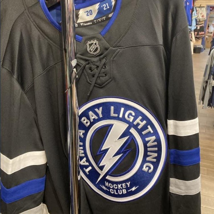
Any ways, here's Tampa Bay's Gasparilla jersey. Kind of wish they used that logo for an alternate jersey. Extra points for doing more than just slapping the logo on a practice jersey.

That's a fun jersey that gives a nod to the Bucs.
-
1 hour ago, tp49 said:
Patrick Roy returns to the NHL as head coach of the...New York Islanders.
In 5 days, he returns to Bell Center behind the Isles bench!
-
22 hours ago, Morgan33 said:
No matter how much people wish the team never moved from Minnesota to Dallas (I'm one of those people for the record), the Stars are still essentially a second-six franchise with a rich history in Green, Black and Gold. A history that includes a Stanley Cup Championship.
The Dallas Stars never won the Stanley Cup in North Stars green and gold.
They won the Cup in forest green, bronze, and black.
-
On 1/17/2024 at 2:13 PM, Anubis2051 said:
Their Neon is by far their best look:
Neon green is my favorite color. However, even though I think these Dallas Stars unis are really cool for special occasions, I don't think this is their best look ever. Their current jerseys with victory green and traditional stripes are the team's top set in their uniform history. What they're using now is the best fit for the regular home and roads. The bright neon colors shouldn't be overdone, for NHL teams to preserve the more standard aesthetics. For alternates, then can do whatever they want!
IMO, their 2nd best look was the 99 green ASG inspired look.
-
1
-
-
Nice win for the Lions. I wasn't expecting them to eliminate the former champs this early.
-
Last night's 30s Golden Knights vs 80s Flames was a gorgeous uniform match up.
-
6
-
 2
2
-
-
New Bolts 3rd...
-
3
-
 3
3
-
-
I AM THE TABLE
-
-
I don't watch the CFL much. But it's great that Montreal has a Championship title, after a long drought.
Tonight was a really cool moment.
-
The Texas Rangers have been uncursed.
-
2 hours ago, Germanshepherd said:
Well this sucks
It does suck. But other players have stepped up big time.
-
I feel really bad for Kirby Dach.
Even if he fully recovers for next season, it's hard to feel confident that he could play a full season, given his long history of being sidelined. That's a lot of time missed for a player who is only 22.
-
On 10/9/2023 at 2:27 PM, GFB said:
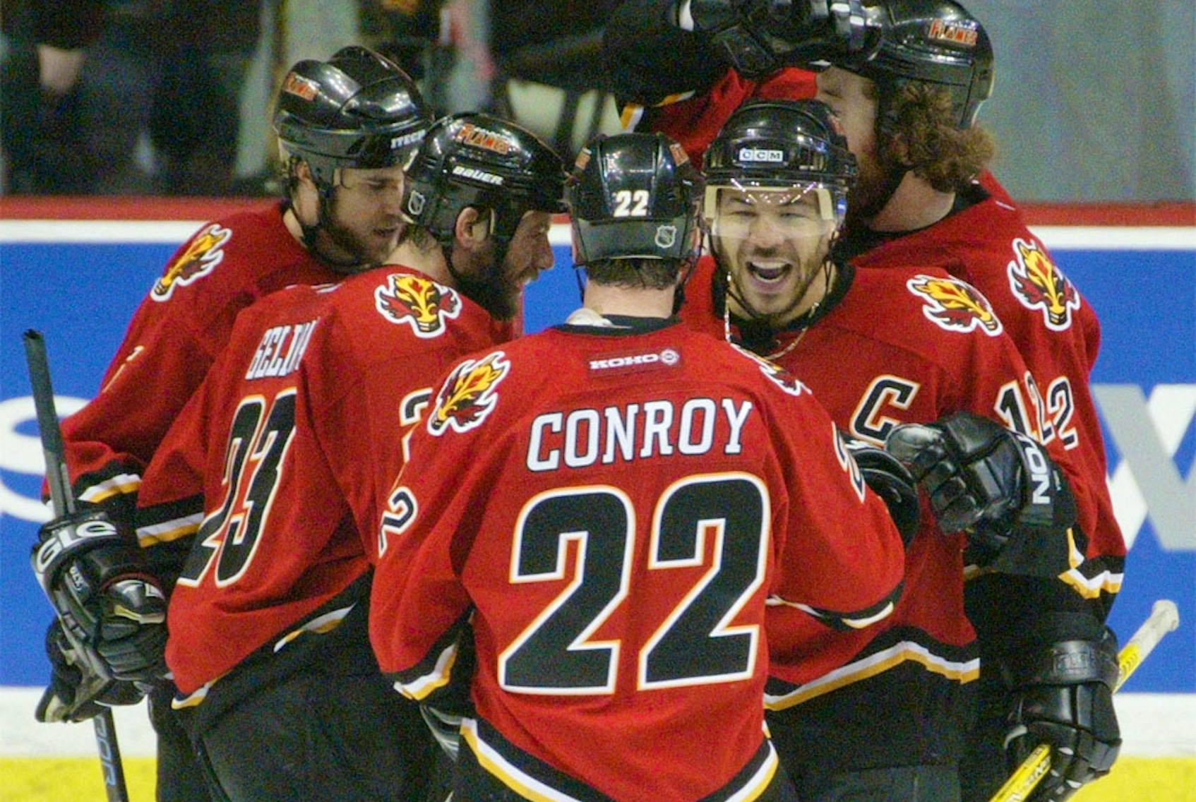
I will forever go to bat for this specific Flames uniform:
The colors are sharp and balanced. The sweater has this "charred" or "burned out" effect for a team named after fire. The uniform actually utilizes the yellow/white/black striping pattern found on the 90s set in a way that's actually appealing.
This is another good one from the black flaming C era.
The template fit wonderfully for a western canadian hockey team.
-
1
-
 1
1
-
 1
1
-
 1
1
-
-
On 10/5/2023 at 10:24 AM, nash61 said:
I love the new Flyers jerseys, until I get to the numbers. They are a number outline away from greatness.
For the home jersey, they made the arm numbers in the same style that they made the nameplates: black on white. They now have some sort of consistency with the black letters. They no longer wanted huge overlapping orange numbers with a black outline like they used to have. So single color smaller block numbers are the option they went with.
For the away jersey, I agree that a black outline around the arm numbers would look better. I would have been fine with keeping the home intact and to add the outline to only the road set digits.
-
There's always time to turn things around.
But so far, the 2023 NHL Draft has been the worst draft that I've ever experienced, as a Habs fan.
The several preaseason games haven't helped either of the Habs top prospects stand out as credible 1st and 5th overall picks.
-
I'm surprised it took this long for the Jets to use the RCAF jersey with their logo on it. The Manitoba Moose wore that powder blue heritage jersey a while back.
-
1
-
-
23 hours ago, Morgan33 said:
The colours might have been influenced by 90's colour fads individually, but collectively there hasn't been anything like them before or since. Other teams might have used purple and teal together but none of them could be mistaken for the Mighty Ducks. Even the shades of purple (Eggplant) and teal (Jade) were unique as was the decision to compliment them with such a small but effective amount of yellow. I would say their original uniforms have transcended 90's fads.
Why could it not work as well in 2023? Nostalgia has been the main driving force in NHL uniform design, since the aftermath of the Edge debacle, and it has been recently expanded to include the 90's. The Ducks current colours and logos look more dated with each passing season.They would have to come up with an excellent design for both the home and road that uses each color the right way, to make something visually appealing. To do what Vegas did with grey, gold, black, and red, but with the Mighty Ducks colors.
I think their 90s heritage jersey is magnificent as a special occasion uniform.
On the other hand, they would be replacing their championship colors that they've been using for almost as long as they wore teal/eggplant. And also, if nostalgia is a driving force, they might as well go all in and become Mighty again. Then again, maybe there's a generation gap between older fans and younger fans who grew up remembering the Ducks in black and bronze. But that's debatable.
Creating a concept in 90s colors that's better than the current jerseys can be done. But I honestly feel like it needs to be a bit more than just straight up the throwbacks. A few minor adjustments at least.
The Sabres new/old jerseys are top-tier. Something along those lines.
-
 1
1
-
-
Teal and eggplant screams 90s color fads to me. That scheme wouldn't work as well full-time in 2023 as it used to in 1996.
Black and orange for an Orange County team is a fine update for the Ducks brand. Black primary jerseys set them apart in a way from the Flyers who use the same colors.
-
2
-
 1
1
-
6
-
 2
2
-
 1
1
-
-
On 9/18/2023 at 2:47 PM, spartacat_12 said:
Some awful placement of the captains patches on the Ducks jerseys now that there's an ad & anniversary patch.
They really should've just swapped out one of the shoulder patches for the anniversary logo.
It's so awful that the entire left side is preserved for the advertisers ad. And everything else is thrown on whatever space remains on the right side. Because non-hockey related corporations are more important than what a team accomplishes throughout the course of decades.
Imagine how horrible it would have been for the Canadiens, had they celebrated their centennial anniversary this year, by slapping their 100th anniversary patch next to the Captain's C, so that the RBC patch could have all the visibility it needs. Like selling out the Montreal Forum for 70 years doesn't mean anything.
I'm glad ads were not introduced in 2009.
-
2
-
1
-


2023 NFL Regular Season Through Super Bowl LVIII
in Sports In General
Posted