

habsfan1
-
Posts
18,465 -
Joined
-
Last visited
-
Days Won
1
Posts posted by habsfan1
-
-
Can someone let me know when the new 2011-12 NHL jersey templates will be made?
-
These are the best uniforms the Vikings have ever worn:

I feel that way also. I just wish they would update the Viking head primary logo just like they updated everything else.
-
I support vintage white. Vintage white is awesome!
There, I said it.
-
i know this kind of gets mixed reviews from people but i think these are awesome.

Agreed, that logo is absolutely brillant! I didn't notice that he's using his amputated leg as a hockey stick until someone pointed it out. Everything about the logo is top notch!
-
For the most part, I feel that that's really stupid, but then I look at the roster of the Montreal Canadiens and I see names like Spacek, Plakanec, Markov, Kostitsyn, and something doesn't feel right.
Why not add Brian Gionta? He is the team captain and he's an American. Just give me someone who can aim at the net and score some goals and I'll be perfectly happy.
-
I think pro sports teams should reflect their hometowns. The Pittsburgh Pirates should be from Pittsburgh. The New York Yankees should be from New York.
What if no player in the MLB resides in Pittsburgh?
-
I really love the Jets double arm striped road jersey.
-
I think this

is a great logo
It shows you the nickname, an islander, and is still the only representation of what an islander is: a badass fisherman
It doesn't represent the city well, but that happens with a lot of good logos.
It represents the sport, with a hockey stick and net
It looks cool.
Put that on a normal-looking jersey for an Islanders minor league affiliate, and it would be a huge hit. Now it's far too tainted by those wave jerseys and the backlash
+1
-
This logo...

is much better suited for the club's primary logo than this...

The 35 point leaf is a nice alternate logo and I'm glad it stayed that way when the alternate was used. Maybe if the script wasn't off center and the lines were sleaker, my opinion would be different.
-
I think this look that the Islanders previously had was amazing.

It suited the team very well. The extra amount of orange used on those made the jerseys less boring in comparisson to their 1998-2007 look. Not taking anything away from their current look though. For some reason, I think both looks are equally good.
-
Is Nashville's new template going to be up anytime soon?
-
**Likes**

Alot of people wanted something more resemblant to the Hartford Whalers. But this is the minor leagues, save the Whalers logo for when they return to the NHL. This is a great logo for the team. As for being too cartoonish, I'm not going to fuss over that. Half the league has a cartoonish primary logo, many of which were more poorly designed than this one.
-
I think I'm in love...


-
A thing of beauty...

-
One of top 5 color combos in the NHL. The colors are fantastic...

-
-
^Nice Sig^
-Dan
Thanks. It shows that the Red Wings aren't despised in just one place.
-
Here's one...

-
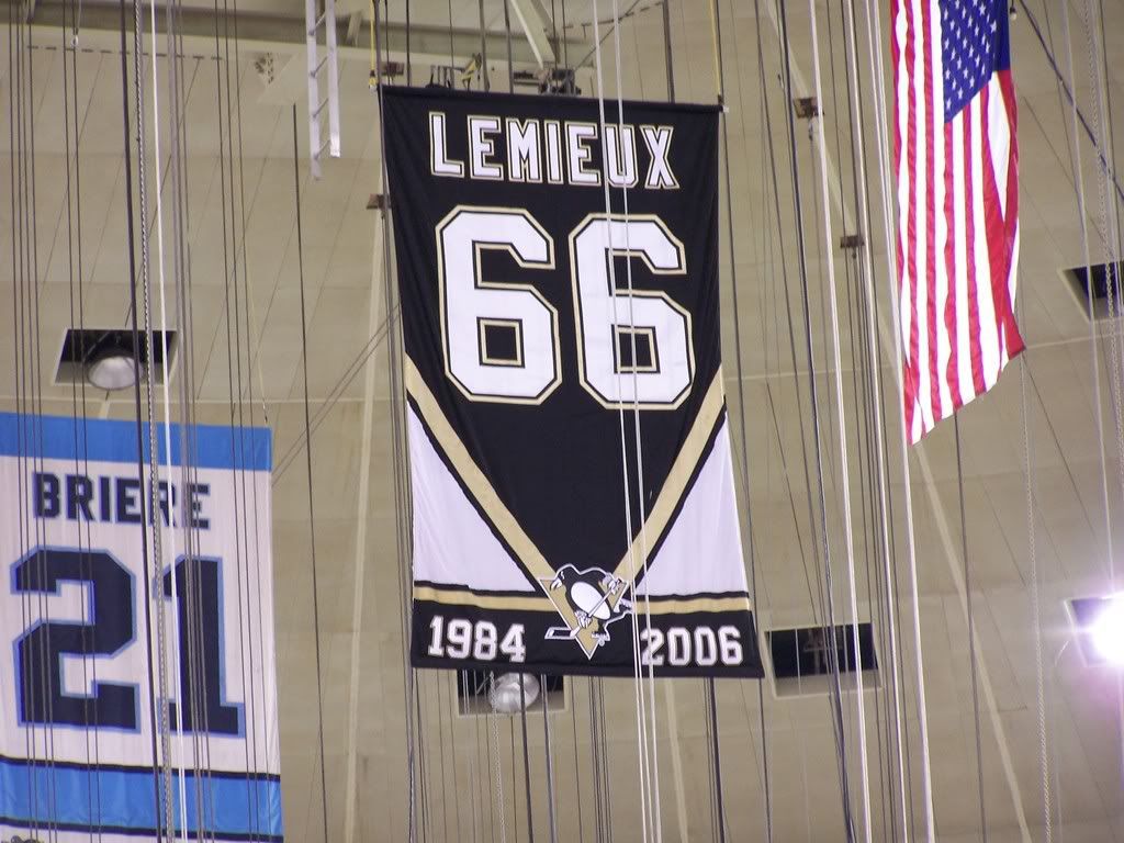
I like Lemieux's old banner more.

The black and gold is more modern but is way less representative of the majority of his career. He only wore the black and gold for 2 years after his return. His best years including his Stanley Cup runs were done in the old colors. The old banner was also more consistent with Michel Briere's #21. The new one looks nice but it's somewhat cheap. They could of just added an extra set of years below 1984-1997.
-
-
I'm live in a suburb of Montreal, only twenty minutes away by car. So I love the Habs and Alouettes. I don't have any other constant favorites when it comes to other sports though.
-


Unpopular Opinions
in Sports Logo General Discussion
Posted
This jersey is growing on me and I think it's not that bad...
It might be in the bottom 10 when it comes to ranking current NHL jerseys, but it sure is better than the whole Marlins rebrand. At least it's just an alternate.
I'm going to give it a chance.