


SportsFan12
-
Posts
2,508 -
Joined
-
Last visited
-
Days Won
13
Posts posted by SportsFan12
-
-
This is disgraceful. Stop listening to young players who have no knowledge or common sense about what looks good. And maybe stop wearing white at home for night games.
-
 2
2
-
 2
2
-
 1
1
-
-
6 minutes ago, kaleb_girod said:
My first time posting on here.
I feel like the Saints don’t get a ton of attention, at least as much as I think they should. As a life long Saints fan, our current state of uniforms kills me as much as it does y’all I’m sure. I hate how much we’ve become a mono-heavy team. Just like this week, it would’ve been perfect for us to go gold/black/gold against the Bears, but no of course we had to go all-black AGAIN. Idk what our hatred of the gold pants is, but it’s clearly our best look that hardly exists anymore… smh
Seems like the black on gold is only worn sparingly against the Bucs and Panthers, which sucks. I was really hoping they’d break it out against Chicago.
-
2
-
-
Saints in all-black yet again. They have not worn black on gold against Chicago since 2005. It would look so good.
-
 1
1
-
-
1 hour ago, Cujo said:
Ohh you're talking colors, not the actual uniform. But what other team wears hot green and WoLf GrAy?
Yeah. The blue takes up most of the uniform, so I'd rather that be a more interesting shade than what it is now. Sure, the green and gray add something, but they are mostly accent colors.
-
25 minutes ago, Cujo said:
At the time, these "lifeless" unis were a big upgrade from the dated gear Seattle was wearing prior.

Do you know the actual definition of unique?
I do. The slate blue was unique in this league. Navy blue is not. What part did I get wrong?
-
4
-
-
40 minutes ago, seasaltvanilla said:
Those slate blue Seahawk jerseys were some of the most lifeless in the league. Unique does not automatically mean good.
Their current navy isn’t unique or good.
-
2
-
 1
1
-
 1
1
-
-
I love seeing the Steelers in their standard home uniforms on Thursday night. Not many teams do this anymore. They are likely saving their Color Rush for the Week 14 TNF game against New England though (which may get flexed?).
Titans look sharp in this combo as always. Not sure what their organization has had against it for the past several years.
-
1
-
-
Double white pants is so underwhelming. Why are the Bucs no longer obsessed with their pewter pants?
-
1
-
-
On 11/2/2023 at 12:08 AM, Old School Fool said:
He pretty much summed up how I feel. When people say "It should be full time" I often wonder if they literally mean the exact look because that's not going to fly. Do I want the Bucs to wear orange more? Sure but how about we put orange with the current pewter look? How about the Eagles create a new kelly green look? The Browns went back to their classic look but you know what they did? They modified the look. That's what you should do. You wanna go forwards not backwards with aesthetics.
Many of the logos especially look far too outdated to just revert to for good. The Seahawks current logo is much nicer and more noticeable on the helmet for instance. And the Dolphins throwback logo is very outdated, as are Pat the Patriot and Bucco Bruce.
-
2
-
-
Say what you want about this look, the blue socks, etc. but this is gonna be a vibrant, visually striking game on Sunday night vs. the Bengals. I'll take this over the all-white snowflake nonsense any day.
-
9
-
-
YESSIR. Had a feeling we'd see this look after the win in the Oilers unis Sunday. I hope Pittsburgh doesn't wear Color Rush.
-
8
-
2
-
-
Imagine if the Raiders went with the silver number jersey tonight.
-
 3
3
-
-
I can live with the lighter Dolphins aqua since it sort of differentiates them from the other Florida team that already uses a darker shade. Yes, I know it’s teal, but it looks quite similar to Miami’s retro aqua.
Sure, their current uniforms could use some elements from the old ones, but the color alone is at least pretty unique.
-
1
-
-
34 minutes ago, Sport said:
It's the inevitable conclusion of mixing and matching disease. The Panthers did the same thing yesterday wearing their white pants with their dark jerseys. "Let's wear these pants and these jerseys because we can" with nobody there to say don't do that. Items never designed to be worn together now forced into the same look and, unsurprisingly, looks worse than if they'd gone with the uniform as it was designed and meant to be worn.
The funny thing to me is the Cowboys refuse for decades to wear anything with the white jersey other than the dumbest looking green silver pants, but will f*** the brand with the new white pants and white helmets with no thought at all. They can never just look good.
And then we have teams like the Cardinals who badly need to mix and match but refuse. They have a bad roster and a bad record but are simultaneously trying to establish an identity of solely monochrome uniforms that they refuse to deviate from for no reason at all.
-
3
-
-
1 hour ago, DCarp1231 said:
I’m fully expecting the Washington - New England game next week to be all white vs all blue
Probably, but Washington has lost the last couple in mono, so maybe they finally break out the white on burgundy.
-
The Commanders look brutal. And this what the Eagles save their green pants for…
-
4
-
-
It always bothers me when the Cowboys and Panthers wear white pants with their dark jerseys. Neither team has worn the dark jersey yet this season and they already feel the need to deviate from the standard silver pants.
-
4
-
-
This is a head-scratcher by the Browns. They haven’t worn white over brown since Week 5 of the 2021 season. It won’t look bad, but orange pants were the clear best choice for this matchup. I hate when teams have three separate pants color options like this. The best combos end up being worn far fewer times than they should.
-
4
-
-
4 hours ago, gothedistance said:
Jets in green pants with the white jerseys would've made NYJ vs NYG a great uniform matchup.
Woody Johnson is making the uniform choice. No wonder his teams have been bad.
This doesn’t necessarily mean he makes the decisions. Might just be reporting it. Either way, this team does a terrible job.
-
Who could've seen this coming?
-
1
-
1
-
 2
2
-
-
6 minutes ago, MCM0313 said:
Why? It’s their best non-throwback look! Yes, it’s color versus color, but tons of contrast. This game will look oodles better than one would reasonably expect from a Falcons-Titans game.
White over black would’ve looked perfectly fine for this matchup. It’s just not necessary for them to wear black jerseys, unless this Oiler blue is somehow way lighter than we thought.
-
1
-
-
15 minutes ago, DCarp1231 said:
I don’t want to see the death of color uniforms, but here we are-
Dallas
neverrarely wears the navy jersey and damn near exclusively wears white. Hell, we have yet to see it this season and we’re halfway in. There’s a real shot we may not see it at all.They’re wearing navy this Sunday and again at home Week 17 against the Lions.
-
1
-
-
Atlanta will go five straight games without wearing white. I find it quite odd that they seemingly went out of their way to request to wear black for this game.
Since this wasn't a mistake, it turns out that Week 13 is confirmed to be a Jets green jersey game.
-
Falcons confirmed black over white for their game against the Tennessee Oilers. Why?
Why is there a random color vs. color matchup every couple of years that makes no sense at all? Teams have worn light blue jerseys before and the road team always wears white. This is gonna look strange. I'm surprised the Titans are even okay with this.
-
2
-


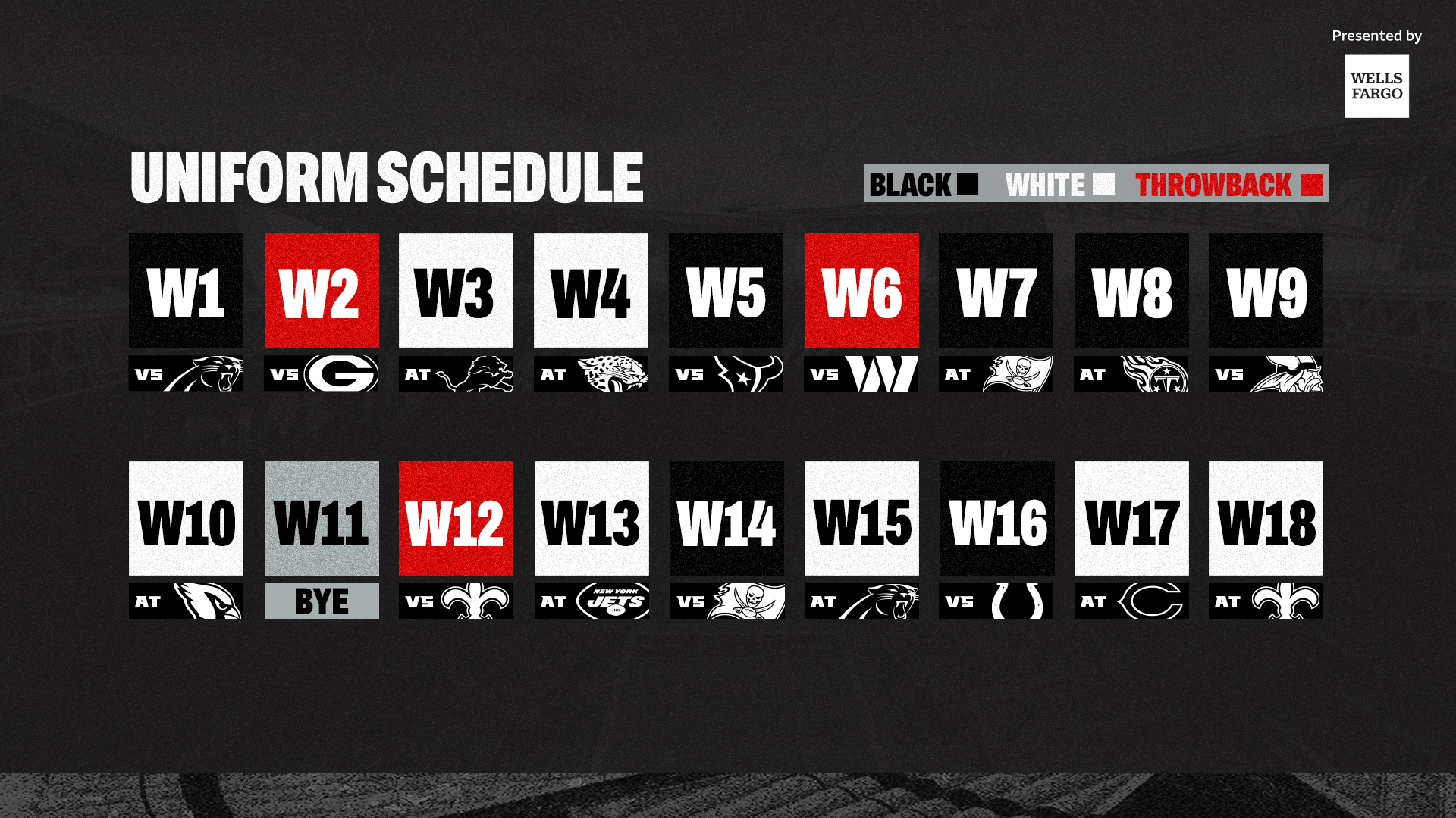
2023 NFL Season week by week uniform match-up combos: From HOF Game to Super Bowl LVIII
in Sports Logo News
Posted
Just an odd decision all around. Everyone loves the Chargers’ powder blues and the Jets are just gonna let them wear them in their home stadium in prime time. I don’t get it. And white over black in their minds is supposed to compete with the look as though it’s even comparable lol