


PaleVermilion81
-
Posts
1,342 -
Joined
-
Last visited
-
Days Won
3
Posts posted by PaleVermilion81
-
-
-
9 minutes ago, DNAsports said:
Legends never die.
Unless that legend is Harambe
-
 2
2
-
-
None of these people have any reason to complain. 2 weeks before the first ever Minnesota United playoff game, they replaced the grass, and then the day before the game a college football game was played on that field. Y'all are gonna be fine with the XFL
")
-
-
2 hours ago, LMU said:
That’s the plan for tonight. I only have access to a computer with paint so that’s a placeholder for the time being mainly to get the CSS code in place.
Really like the tweaks that have been made today! It has a really nice feel.
-
41 minutes ago, officeglenn said:
I took the above screenshot on a PC, but I've also viewed the boards on a Macbook and an iPad (with Chrome in all 3 instances) and I'm not getting the boldness.
It appears fixed now. Much have been some sort of issue with the code where it couldn't find the correct font, and the fallback font was more bold or something. Whew, glad it's normal!
-
Just now, officeglenn said:

I'm not getting the same boldness everywhere that you seem to be getting. I think the problem may be a browser setting on your end.
It may be a Mac thing then, because it happened on 2 different computers in 2 different browsers. Only factor that was the same was that they were Macs.
-
15 hours ago, LMU said:
The font is Roboto - the standard Android font. Like most people I don’t see what issue there is other than it being different.
In terms of colors, we can tinker with the background.
It's a very bold font. Feels like everything is screaming because of it. Using such a bold font for everything is too jarring and it removes visual hierarchy.
-
1 hour ago, BringBackTheVet said:
now that I've had time to view it on desktop more, I agree that it's really white. It lights up my whole room when viewd on my 27" monitor. Maybe the sides (around the actual posts) could be a shade darker? Maybe match the blue? Just something a little less bright.
I haven't noticed any issues with fonts. Can someone post a screen shot of the complaint? I'm just curious to see if I'm viewing it differently somehow. Everything looks fine to me.

-
Why does all the text appear bold? It was bold on my work computer in Safari, and it's bold on my home computer in Chrome. Really annoying.
-
8 minutes ago, rhiser@cox.net said:
Can anyone tell me what year the rams wore this uniform?
Photoshop 2016
-
9
-
-
Nope, they fixed it in Madden 16.
Edit: although they look way better without the stupid serifs!

-
1
-
-
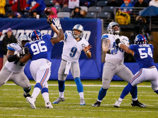
With the new Lions uniforms on the way, looks like these are now officially "rare matchups" as they only happened once. Lions at Giants with Giants in white pants, and new Dolphins' uniforms vs. Lions.

-
4
-
-
Wow, loving this thread! Keep posting your works, guys. Very inspiring to come here and see such quality fine art on display.
-
Ha, I tweeted at Sports Squatch not to follow me because their designs are stolen. That is how I heard about this guy. He randomly followed me on Twitter. He immediately blocked me lol.
-
A lot of these designs are stolen. Some I noticed right away as Geeky Jersey designs. Others I've seen are a lot of those NFL logos reimagined as Star Wars designs and such. I asked Geeky Jerseys (as well as Dave's Geeky Hockey on twitter), and was told they are trying to sort it out.
-
I love the Jaguars Bold Gold jerseys. I wish they would wear them full time for home games, but only with white pants and white socks. Get rid of the gold pants and black jerseys. (okay, so that last part isn't unpopular, just had to say it)
-
Saw this today on Behance & thought it looked familiar. https://www.behance.net/gallery/27966807/ROYAL-LIONS-FABRIANO-Identity


Looks like that dude may be making some serious cash off of it:
-
-
Which address? I don't know why you think they look bad, they are nice quality, not the quality of the NFL shop ones but still very nice
They look bad because I can tell just from their pictures they are fake. The quality of of construction may be nice, but the final product doesn't look like right.
-
I just received my first order from www.wholsalebusinesscn.net I am very happy with what I got for the price, I admit they are not 100% perfect but good enough for me check them out on the reddit page here: http://www.reddit.co...salebusinesscn/ and the review I did on my Youtube channel here: http://www.youtube.c...ws?feature=mhee
First, you typed the address in wrong

Second, most of those look really bad.


MLS Expansion Club St Louis City SC Unveils Name and Logo
in Sports Logo News
Posted
With McDonald's as their kit sponsor that'd be perfect. Nickname for the team could be the "Golden Arches".