


PaleVermilion81
-
Posts
1,342 -
Joined
-
Last visited
-
Days Won
3
Posts posted by PaleVermilion81
-
-
If MNUFC would've gone with black when they made the jump to MLS I'd be okay with it to a degree. I'm just annoyed that they've done nothing to establish an on field look in the MLS after having a consistent iconic NASL look for years. Every new dark kit is just a new direction. I actually loved the sash and would've been fine had they stayed with that. Then they went to 13 vertical gray stripes cuz reasons. Then they finally brought the wing back. Now they decide they want to be black with pinstripes? Ugh. I'm not at all a bitter fan
")
-
 2
2
-
-
Sigh. Minnesota, you suck. At least I can save money on a jersey this year.

-
 1
1
-
 1
1
-
-
20 minutes ago, DCarp1231 said:
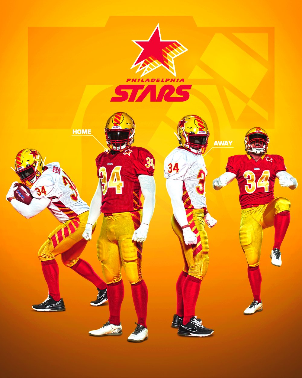
I want to agree with this. The only thing I have against it are the side panels. Which, should be moved to the the sleeves. Ironically, the Stars’ striping fits well with the Commanders identity more so than the Stars.
I've never been that opposed to side panels in theory personally. But just in general, as soon as I saw this I though the numbers and the uniformity between home/away was instantly better than Washington while having a similar color scheme.
-
1 hour ago, DCarp1231 said:
Helmet looks fantastic
That’s about it
Still a better uniform than the Commanders...
-
7
-
 2
2
-
-
Another MNUFC teaser. Really liking this color so far. Doesn't seem black, but a better version of the gray.
Edit: by better version I mean a dark, cool gray like in the NASL day. It doesn't seem actual black like other black jersey teams
-
3 minutes ago, gosioux76 said:
That's a gorgeous-looking bird. However, I have my doubts that the colors would translate as well to a football uniform. I'm willing to be proven wrong.
This is pretty close. Just add some yellow for the beak color.
-
3
-
-
Maybe we’ll get lucky and Synder will be forced to sell the team and the new owner will bring back proper uniforms.
-
3
-
-
Minnesota united tease. Looks like dark gray jersey, black cuffs/neck with thin blue line as well? Also looks like black shorts/socks but it could be lighting.
Edit: Also disappointed it is white numbers. Really wish they'd go light blue numbers on the dark jersey like in the NASL days.
-
2
-
-
Boselli had a short, 7 year career due to injuries. In those 7 years:
- 3× First-team All-Pro (1997–1999)
- 5× Pro Bowl (1996–2000)
- NFL Alumni Offensive Lineman of the Year (1998)
- NFL 1990s All-Decade Team
Had his career not been cut short, he would've been a no brainer HOF IMO
-
2
-
1 hour ago, FSUViking said:
I know people love to complain about literally everything in this sub......but what's wrong with that logo? Its fine. Who cares?
My first thoughts are that the content doesn't fit the frame. There is so much wasted space and nothing is done with intention. You can take the exact same content, re-arrange it to fit the frame, and it instantly reads better while adhering to the frame of the shield.
-
8
-
-
Another MNUFC hint that the new kit is gonna be black:
https://www.mnufc.com/news/mark-your-calendars-for-the-2022-kit-reveal
-
50 minutes ago, HopewellJones said:
Whenever they eventually rebrand, there's no way they don't include at least a little copper.
At the very least as part of an alt would be sweet.-
3
-
-
6 minutes ago, 4_tattoos said:
I could have sworn years ago we discovered (here on this forum) the Broncos stripe does not contain any clear portions in between each orange strip. Not talking about retail versions of the stripe decal that can be ordered online for your local team's helmets. I mean the version that is used on the Denver Broncos' actual helmets. It's all one stripe with orange and blue portions.
I remember this as well. I think you can see it on the front of the strip:
-
2
-
 1
1
-
-
14 minutes ago, Ted Cunningham said:
It's blue. It's dark, but it's blue. (HEX #03142E)
Definitely needs to be lighter.
-
6 minutes ago, DCarp1231 said:
This is 100% my favorite Cardinals redesign that I’ve seen. Using the state flag colors without being painfully obvious about using the state flag.
(fairly certain this is from someone on these boards, but I don’t know who)The people of Germany especially like it.
The concept itself is nice, I'd just prefer blue instead of black and the no white collar on red jersey.
-
1
-
1
-
 1
1
-
-
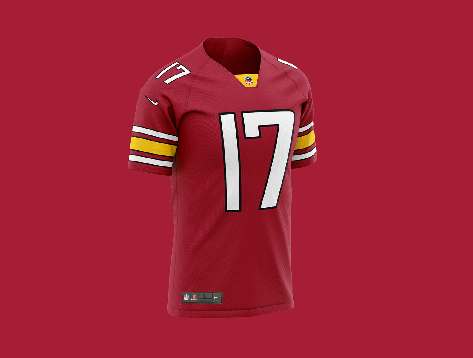
10 hours ago, DCarp1231 said:
Stumbled upon this Washington concept on Dribbble
Its laughable, but not surprising, how people not associated with the team can have better designs than the team’s actual final product
This red one would be perfect for the Cardinals. But my issue with the sleeve striping is that it's like the Steelers and Chiefs had a baby.
-
3
-
1
-
-
1 hour ago, Volt said:
If the Saints do a satin/matte White helmet to wear with their Color Rush alts....
*chef's kiss*Hopefully an alternate for Arizona means they're finally getting all new uniforms period. I can't believe Kyler would be going into this 3rd season still hating their uniforms.
Would be a treat to finally see Philly wearing the Kellys.
It would be nice if Carolina did a blue helmet instead of BFBS.
Cincy's gotta be the White Bengal Tiger gimmick.Is it BFBS if their primary uniforms are already black?
-
3
-
-
3 hours ago, officeglenn said:
Has anyone heard any more official dates from clubs for unveilings? I have Charlotte away on Feb. 17, SJ Quakes away on Feb. 18, and Columbus home on Feb. 19.
Minnesota is Feb 18 -
36 minutes ago, KitLeakBoi said:
Dallas: this pattern horizontally four times, getting a bit smaller height-wise as you go further down the shirt. The first one goes through the logo and crest and is slightly taller than the crest. Round collar with blue trim. Blue shoulder stripes.
Blue back.Fabric stripe up the sides and onto the sleeves is blue and back is red.
Any Minnesota United leaks?
-
2 minutes ago, oldschoolvikings said:
Monochrome is always bad.
Monochrome with matching solid socks is worse.
Monochrome with stripeless pants? That just checks all the garbage boxes.
Impressive.
They went full unitard. Never go full unitard.
-
12
-
-
Is this lazy photoshooting, or is the white jersey also going to pair with the black pants???
-
3
-
-
1 hour ago, tBBP said:
Cool gray and ice blue is a pretty decent color combo on its own, and I know the gray comes from MNU's NASL days, but their color scheme is far sharper without it (or at least relegating it to trim in their badge)--and I say this as someone with a bit more MNU gear in his closet than what should probably be legally allowed for a nonresident.

All that plus this: the team store at Allianz itself is literally called "Black and Blue":
Psst: it's MNUFC
Nobody calls them MNU here.
And the "Black & Blue" goes back to their NASL days and the Minnesota Black & Blue chant that started then.
-
43 minutes ago, Digby said:
that’s a good point but the Target circle does intersect with the dash in an odd way…IDK, something about the Minnesota color scheme doesn’t translate as well to the jerseys as I’d hoped. If the rumors turn out and they do ditch grey for black, I wouldn’t hate that.
They're using the wrong shade of grade is the problem. It's need to be darker and cooler, like their NASL days. The gray they're using now is just a flat gray.
-
4
-
-
The only good sash in the MLS recently
(totally kidding, but I actually really liked this kit and wish they would've kept the sash the next year and not gone with the vertical gray stripes)
-
2
-


/cdn.vox-cdn.com/uploads/chorus_asset/file/19654953/lg20151002_6383.jpg)

MLS Kits 2022
in Sports Logo News
Posted
At least SKC also sucks lol