


PaleVermilion81
-
Posts
1,342 -
Joined
-
Last visited
-
Days Won
3
Posts posted by PaleVermilion81
-
-
7 minutes ago, Indigo said:
My only thing with this premise is that they would need to make the cuffs on the white jersey teal to match. My OCD won't let this slide.
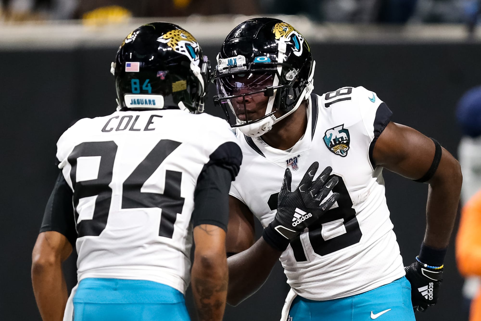
On here the cuffs and neck-stripe-thing match the pants, with just enough teal to not be confused with the Raiders.

Here, however, there is no teal on the white jersey except for the swoosh. The cuffs do not match the pants.
I'd say the cuffs do match the pants because: both the white jersey and teal pants have black cuffs/edges.
-
I'm totally fine with this look. It actually feels pretty close to their old away look with black pants (minus the number outlines) so for me it feels very Jaguars.
-
 1
1
-
 1
1
-
 2
2
-
-
44 minutes ago, Volt said:
Sorry, that was a typo. Should've said "not" instead of "now". Editing.
Whew
") had me worried haha
had me worried haha
-
1
-
-
7 minutes ago, Volt said:
This uniform would be an upgrade and it's a great example of how adding subtle Red detailing really adds a nice pop. I know the Nike haters will not agree with how it's implemented here and I understand that, but that's now how it has to be done. Good stuff.If that is how it has to be done, then it 100% should not be done.
-
4
-
-
1 hour ago, Pigskin12 said:
Are we really doing this? That is my point, that they should’ve just picked red because it doesn’t matter. All the other home teams this weekend wore their colors.
Yup-
 1
1
-
-
4 minutes ago, Pigskin12 said:
Alright Bucs, you’re now 1-2 in these white jerseys in the playoffs since that fluke Super Bowl win. Let’s wear some red in January going forward. Thanks.
Yup. The red would’ve definitely helped tonight. The white clearly threw them off.
-
1
-
 1
1
-
 2
2
-
-
Sigh. MNUFC with a white kit. Just for once I'd like them to have a consistent look for their kits. Every dark kit has been drastically different, and same with every light kit. Keep the blue. Cripes.
-
1
-
-
6 minutes ago, jags1828 said:
I hope the Jags don't go white/white/white in the Super Bowl. Hopefully the NFC team chooses to wear their white jerseys for the game.
They gotta go white/teal/black in the SB. It's such a good away look.
-
1
-
-
31 minutes ago, gosioux76 said:
I'm sure I just have to see the whole thing in real life, but the image above is where it seems like a mismatched kit.
It's possible it just look that way because I'm not seeing the white Adidas stripes on the shoulders, which could balance it out. But from this truncated view, it seems as if the striping and numbering on the shorts should be gold to match the jersey.
I think with the jersey having white numbers and white Adidas stripes it will look very nice. Just need to see a real picture of it all.
-
2
-
-
18 hours ago, Kramerica Industries said:
I was willing to let it slide on the basis of "superstition" last year, but they lost at home, in white, during the postseason. Wearing white, at home, AT NIGHT, in the playoffs after all of that is just garbage. As a fan, I'm definitely not a fan.
Considering they have a history of white at home, as not a fan (although I am a fan of Brady), I think at least from a visual standpoint this matchup will look good. I personally hate the Cowboys white uniforms with the 50 different blues and 10 different grays. I prefer Cowboys in their blue uniform because all the blues are, well, "uniform". Cowboys in blue over actual gray with Bucs in white over pewter I think is gonna be visually a better looking game.
This:
Looks better than this:
(in my opinion)-
17
-
-
Is that the first ever double orange on an MLS uniform? The number looks a light lighter than the stripes.
-
Please don't change the Ravens. They're just fine. And Nike will make it so much worse.
-
20
-
-
17 minutes ago, Indigo said:
The stripe on the red pants should either be solid burgundy or be outlined in burgundy. Yellow-on-white never looks good.
The last uniform shows that it can look good, as half of the yellow stripe was on white and plenty visible.
-
5
-
-
13 minutes ago, Indigo said:
The stripe on the red pants should either be solid burgundy or be outlined in burgundy. Yellow-on-white never looks good.
Gold on white I think is just fine, as it's more rich than yellow. A burgundy stripe wouldn't mesh well with the rest of the uniform IMO, as it would be very burgundy bottom heavy (burgundy socks, and yeah you could add stripes to the socks but we all know players wouldn't wear them right). Plus keeping it gold ties it in with the helmet.
-
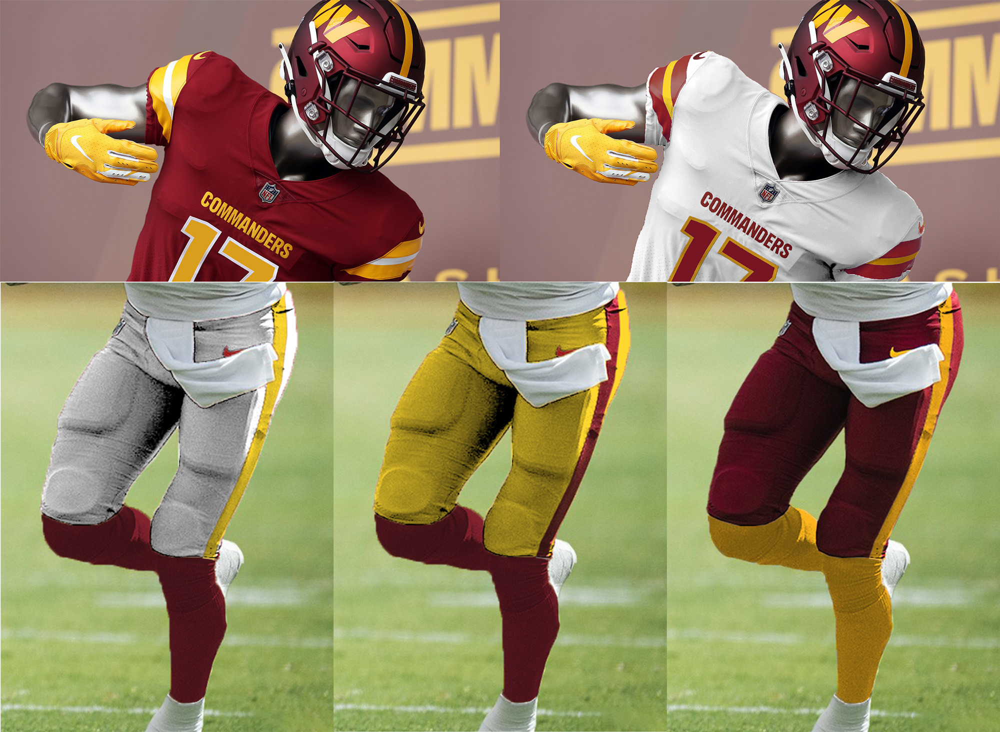
18 hours ago, flyersfan said:
The home look for Washington is a good one. I like the numbers, the helmet is awesome. Pants or Socks need some yellow, I would prefer the pants just to *be* yellow. (Or gold, whatever you want to call it)
The white uniform does not complement the burgundy in any way. The gradient gimmick is not good, and it does not complement the *really nice* helmet in any way.
The BFBS uniform is horrendous and unnecessary.
There's something to build off of, but like most other things coming out of Washington, its a disappointment.
My shameless plug. And I'm not saying the helmet and burgundy jersey are perfect, but they are definitely solid pieces you can build off of. Take the burgundy jersey, remove the lines above/below the word mark, make the numbers solid gold. And then base everything else off of that. 3 pants options (with a single stripe to match the helmet) but NEVER MONO, gold and burgundy socks that always contrast the pants.
-
13
-
-
23 minutes ago, Cujo said:
Looks like a fxccing scrimmage tonight
I recommend turning down the brightness
-
1
-
-
Sigh. They also have the armpit color too. I'm looking forward to being disappointed.
-
So is the 2023 Adidas to trend to have 3 stripes on the shoulders and then a big stripe on the side seam? Is that big stripe also on the shorts anyone know?
-
1
-
-
15 minutes ago, Pigskin12 said:
Teal would've been perfect though. But I guess that is in fact a small victory.
Oh yeah. White over teal is my favorite away look they have. Really wish they would've busted it out for primetime!
-
1
-
-
16 minutes ago, Pigskin12 said:
We are long overdue for an all-white vs. all-black matchup. Not many teams prefer to wear either of these combinations these days.
Honestly I was afraid the Jags were gonna go black pants, so I'll happily settle for all white vs all black instead of both teams in black pants.
-
18 hours ago, throwuascenario said:
Probably unpopular here, but I think the 49ers adding the third stripe to the sleeves was a huge downgrade.
it's not because they don't fit on the modern sleeves, they obviously do. The 2 stripes just matched the helmet and pants so perfectly. Especially on the white uniform, each element had the exact same stripe, it was perfectly balanced. Adding the third stripe back completely ruined that.
Consistency doesn't mean everything is exactly the same. Jersey having different stripes than the pants/helmets doesn't break consistency.
-
6
-
1
-
-
55 minutes ago, Pigskin12 said:
Even last year when they won it all, they were just 2-2 in white, including the Super Bowl. This year they wore bone twice and won both those games, but they've lost all five games in white this year. It's a bit of a coincidence overall, but I guess partly due to their lack of success this season.
I think you meant to say, "It's 100% coincidence and their uniform has zero impact on whether or not they win a game".
-
7
-
2
-
-
2 minutes ago, PERRIN said:
The Seahawks have used mono Wolf-Gray since the team's redesign a decade ago, and it looks miles better than the Lions' anthracite dumpster fire. It does wonders that it's light enough to look like white from a distance. I'd be willing to see the Seahawks ditch the white jerseys in favor of gray full time, I think this is an example of a non-white color done well. The Rams could learn a thing or too from this set. I'd vastly prefer to see the neon barf color rush get canned, but if this season is indeed the final year of Wolf Gray's tenure, it should at least go out with the respect it deserves.
It's the most unneeded secondary and doesn't deserve any respect beyond that. It doesn't even deserve the name "wolf gray", because that just makes it sound cooler than what it is: a light gray uniform that is almost indistinguishable from the white and half the time you have to squint at the TV to try to figure out if they're wearing white or light gray.-
4
-
1
-
-
33 minutes ago, Pigskin12 said:
Wasn't expecting to see black outside of London. This is disappointing but at least the pants are teal. Ravens need to wear purple pants.
There will be numerous teams wearing black in the 1pm window this Sunday: Panthers, Jets, Commanders, and Jaguars. The teal jerseys wouuld've been nice here. Hopefully Miami wears aqua jerseys vs. Houston to make up for it.
This is my favorite look of their current set. Glad they're busting it out again.
-
4
-
/cdn.vox-cdn.com/uploads/chorus_image/image/71685036/usa_today_19516902.0.jpg)


/cloudfront-us-east-1.images.arcpublishing.com/dmn/VBZU36GMSNECXLTLN6TMZCJ53I.jpg)

/cdn.vox-cdn.com/uploads/chorus_image/image/68473426/usa_today_15256203.0.jpg)

MLS kits 2023
in Sports Logo News
Posted
Wait until they hear about the companies that make the jerseys and sports apparel they all wear, and the smart phones they all use...