


PaleVermilion81
-
Posts
1,342 -
Joined
-
Last visited
-
Days Won
3
Posts posted by PaleVermilion81
-
-
Get ready for black alts if they're asking the fans lol.
-
 2
2
-
 3
3
-
-
2 hours ago, oldschoolvikings said:
May I present...

All mustard is a baaaad choice (although oddly in Madden I loved using the gold jersey with white pants and black socks against the right opponent lol)
-
3
-
-
4 hours ago, PERRIN said:
As long as the Commanders, Titans,
Rams, and Falcons are around, matchups like these will never crack the top 20 worst looking games. It's pretty bad, no doubt, but it's one quick fix away from being a decent matchup. If the Saints wear gold pants, it's fine. If the Saints wear gold pants AND the Ravens wear purple pants, it's gorgeous.Fixed. Rams are fine when no bone is involved.
-
2
-
 1
1
-
 3
3
-
-
3 hours ago, Carolingian Steamroller said:
I think most people would be content if the Texans just went with the red lids full time. Their set is maybe a tad bland in that it's navy over white like some other team but the font is solid, the sleeve design is nice. I might consider swapping the colors on the white pant stripe but I think the one they've had still works ok.
Maybe just rolling with the red helmet adds a little spice?I get wanting an update but I think if you've stumbled upon a modern classic right out the gate, there's no reason to change. Just ask Jacksonville and Carolina.
In fairness, the Jags were constantly tweaking their design right out of the gate.
-
4
-
-
8 minutes ago, PaleVermilion81 said:
I signed up again yesterday evening, but I'm still having ads appear. I sent a message to @CC97 but haven't seen any updates.
Looks fixed now. Thank you!
")
-
I signed up again yesterday evening, but I'm still having ads appear. I sent a message to @CC97 but haven't seen any updates.
-
28 minutes ago, Carolingian Steamroller said:
Fine I suppose.
My issue is the all navy. Bears have gotten smoked every time they've worn that set.Sounds like your issue is with the Bears then, not the uniform.
-
5
-
3
-
-
13 hours ago, Bathysphere said:
Shockingly the Bucs horrible, horrible unis lasted one year past their expiration date. Meaning that while the Jags and Browns took 3 years at the very most, maybe less, to regret their overhaul, for the Bucs it took them exactly four years to reconsider. I wonder what switch flipped then. Glad it did, in any case.Also, who can believe that we’re going into year 10 of those Vikings unis? They knocked it so hard out of the park that they could wear those for the next 20 years at least and I don’t think a single person would complain. Especially now that they brought back white on white

1) The Vikings numbers need fixing. I hate the Serif on the left and Sans Serif on the right. Just make them all Sans Serif.
2) The White on White look I actually hate with this set, because the striping patterns are mismatched. The purple jersey was design to go with the white pants, and white jersey design to go with the purple pants. But when it's white over white, you have essentially a purple/white/yellow sleeve stripe and a purple/yellow/purple pants stripe. Not that I want 2 sets of white pants, but it'd look better if they had white pants with a stripe that matches the white jersey. A minor gripe I admit, but I always notice it and it always bothers me.
But overall I agree. This is a great set and they shouldn't redesign again. I actually wish they would've kept the set before Reebok introduced the white side panels with yellow trim look. It was such a great, classic NFL uniform.
-
5
-
-
On 8/3/2022 at 2:53 PM, NFLfan10 said:
Boy does this team need yet another rebrand after this season. As if the HOF game wasn't already unwatchable, viewers now have to look at this:
Nah. This brand is just fine. Only change could be to maybe make the away numbers outlined in teal and have the NOB be just teal.
-
7
-
-
1 hour ago, Sec19Row53 said:
No, I meant tOSU. They will ALSO wear an all black uniform this year. Black is not a color found in the color scheme of either tOSU or the New Your Jets. If you are the Scarlet and Grey, or Big Green, how about you wear those colors?
Don't the Ohio State uniforms have black in the stripes?
-
1
-
-
10 minutes ago, CaliforniaGlowin said:
Any time frame on the Chargers alt? This season?
The Chargers are the perfect team to wear volt.
It was sarcasm based on a user who claimed to have insider info when the Chargers were releasing their new uniforms. They claimed they were purple, then when they released as powder blue tried to claim it looker periwinkle.
-
2
-
-
10 minutes ago, willforgetmylogin said:
Dog I've been right about everything so far but the Saints, and that was a last minute decision.
Sorry you want to be me.
Broncos = Wrong
Saints = Wrong
Cincy = Wrong
The stuff you have gotten right so far is stuff a lot of people were already guessing/wanting, so you get zero credit there.
-
6
-
-
3 minutes ago, guest23 said:
I would say it's visually repetitive as the logos occupy adjacent space and could often be viewed at the same time. To me, redundant would be to place one helmet decal on top of another.
Definition of redundant
1a : exceeding what is necessary or normal : superfluous. b : characterized by or containing an excess specifically : using more words than necessary.
-
On 6/13/2022 at 4:58 PM, willforgetmylogin said:
The Saints will have a white helmet this year they will pair with the CR. It is stupid clean.
Just quoting this to point out how much of a liar this person is
-
8
-
 1
1
-
 1
1
-
6
-
-
I actually love that helmet with that specific white uniform with gold numbers and black socks. That specific look I think is great for an alt uniform.
-
4
-
2
-
1
-
-
7 hours ago, sitboaf said:
This would be surprising. The Patriots have gone out of their way to avoid red ever since it was pointed out that our Revolutionary enemies, the British, wore red coats. We'll most likely see white Pat Patriot helmets over white & white.
True, because nobody realized this until 2011
 Or they stopped wearing red once the 1 helmet rule went in to place and couldn't wear the throwbacks anymore.
-
1
-
1
-
-
At this point I feel either this guy has to reveal his “sources” to the mod team or just be banned. He’s not adding anything but BS just to get a rise out of people.
-
10
-
-
If anybody is looking for some..."interesting"....reading...
-
1 hour ago, upperV03 said:
They’ll have the team and sponsor logos, just like the previous Parley/Primeblue kits.
Whew. I got nervous for a second.-
1
-
-
No logos?
-
1 minute ago, NFLfan10 said:
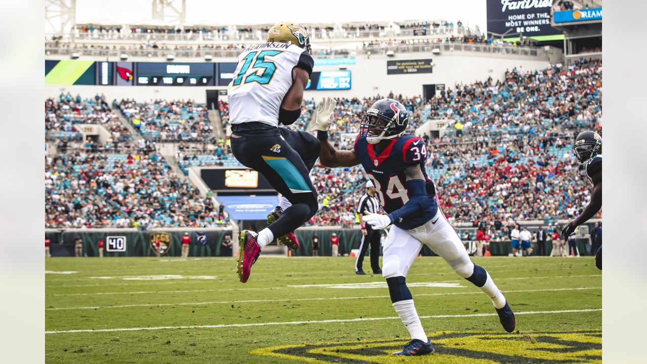
Teal socks too, and maybe some sort of stripe on the pants and sleeves. I honestly miss the color integration of these uniforms. Helmet aside, they at least had some personality and utilized some teal and gold:
Those away jerseys were honestly my favorite the Jaguars ever wore (definitely not favorite uniform though, as the helmet and pants sucked). #JaxJacked
-
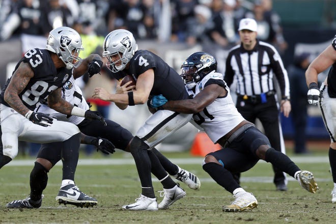
4 hours ago, Bathysphere said:
Given that we’ve never seen a team stray from their “official” home/away look in the hall of fame game, Im banking on this matchup right here.
Really not too horrid, just very greyscale. Almost like the Raiders lack of color makes the Jags tealless aways look less out of place. Regardless, just one more year of these unis for the Jags (bring me teal numbers, baby
 )
)
i can’t see than making a change next year. Not to their main uniforms. If anything they’ll add a throwback. -
1 hour ago, DCarp1231 said:
If Jacksonville doesn’t wear teal pants and black socks, this is 100% the worst looking game of the year already.
Just wait until the Commanders play the Titans.
-
1
-
2
-
-
I think if you gave some of these SGs the power that a lot of American soccer has they'd be just as "actively evil".
-
1
-


/cdn.vox-cdn.com/uploads/chorus_asset/file/19564522/1194764990.jpg.jpg)
2022 NFL Season week by week uniform match-up combos: From HOF Game to Super Bowl LVII
in Sports Logo News
Posted
I hate the Vikings color rush, simply because it doesn't fit the helmet. They should've made the horn also yellow. If they want to go full purple, their normal jersey and pants look so much better with their helmet.