


8BW14
-
Posts
1,367 -
Joined
-
Last visited
Posts posted by 8BW14
-
-
This is interesting. The concept of using two shades of blue along with orange is intriguing. I've never been a fan of the odd shade of sky/royal? blue the broncos used to use for their helmets, so I would prefer a navy blue helmet, but other than that it is a great outside of the box concept.
Also so I just went back through the pages of this thread and looked at some of your concepts again and for the most part they are spot on, I like your style.
-
 1
1
-
-
18 minutes ago, Waffles said:
Well-timed for the recent debate here on whether minor league clubs should be carbon copies of their parent club or have unique identities reflecting the community they play in, here's a team that has managed to incorporate both into their identity (very successfully, in my opinion):

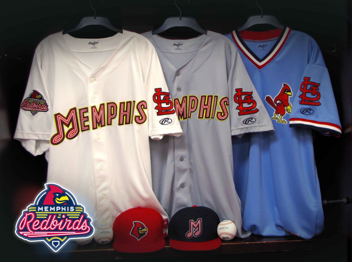
This is one of my favorite minor league rebrands in years.
I agree. These are really sharp and I love the neon sign effect.
-
1
-
-
38 minutes ago, Dolphins Dynasty said:
I don't like it as the primary cap insignia, but I like it enough to stay in their set... maybe as an alternate logo. Make the "O's" the primary insignia, and I'm all good.
The O's logo isn't all that great either if you ask me but I do agree that cartoon bird logo could have a place in the the Orioles' look but maybe as a sleeve patch or something since that tends to be a place where teams put their more unique logos
-
2
-
-
I'm surprised this is unpopular actually, but I hate the orioles cartoon bird hat. It's gimmicky and amateurish to me. They should be using the realistic bird and/or a B monogram on their caps.
-
3
-
-
I don't think either of these look right:


Wow. You're right. That's just not right. Mark McGwire looks very odd in blue.

Unused Logos and Uniforms
in Sports Logo General Discussion
Posted
I actually really like the middle one. I think the Blues script is really nice and I love the B. I even like the color scheme. I think if it was recolored to blue and yellow it would make for a nice alternate.