


8BW14
-
Posts
1,367 -
Joined
-
Last visited
Posts posted by 8BW14
-
-
8 minutes ago, gosioux76 said:
This is the prevailing sentiment here in the St. Louis area, and I find it fascinating. The Cardinals have been one of baseball's most successful franchises, yet the prospect of two consecutive seasons seems to have spurred a revolt. Seats are empty. Sports talk radio is talking about the Cardinals having a tarnished brand. It's quite head-spinning.
I mean, on the one hand, there are dozens of fanbases that would like to have a team with the record of success the Cardinals have had over time. On the other hand, I can't fault fans for applying pressure on a club to keep those standards high. They're used to success here and won't accept anything less. I think that's fair.
It's just interesting, especially when you consider that, just down the street is the St. Louis Blues, which missed the playoffs for two straight years, has nowhere near the Cardinals' record of success, yet fans seem to think, "eh, they'll figure it out."
Apologies for any unintended generalizations here. As someone who lives here, but isn't a fan of the local teams, it's an interesting thing to watch play out.
I’m being hyperbolic to a degree. Speaking for myself, I’m tired of management and ownership being content with just being good enough to limp into the playoffs and string fans along. 85 wins and a chance isn’t good enough. The last time the Cardinals won, they had GUYS, Pujols, Molina, Chris Carpenter, prime Wainwright and a manager who was actually the manager, not a puppet for an ever increasingly looking incompetent front office. Mediocre players and the “Cardinal Way” isn’t good enough. Moneyball can win a lot of games, but it won’t win you playoff series. Have the A’s ever won anything with it?
Why are the Cardinals developing all of these guys who flop when they debut and flourish with other teams. Maybe they’re great at identifying talent, but they can’t develop it. Hindsight is 20/20, but damn, besides Goldy and Arenado, the Cardinals have wiffed on a ton of trades and signings in Mozailek’s tenure as GM. They traded away Zach Gallen, Sandy Alcantra, Randy Arozarena, Tyler O’Neill and let Montgomery and Hicks walk. They act like they’re still the smartest guy in the room when everyone else has moved beyond them. They’re pissing on fans and telling us it’s raining. Things don’t really change and they tell fans to expect different results. I’m ready to trade Goldy and Arenado, burn it down and start over. I want fans to stop going because they’ve had enough of being kinda good usually.
-
 1
1
-
-
The Cardinals suck. Sell the team. Fire everybody and get bad. It’s time. Their “strategy” is outdated and flawed. If they want to win on a budget they need better leadership and management. It’s time for half empty stadiums and 95 losses for a couple years.
-
3 minutes ago, TBGKon said:
Seattle has had TV numbers not outlined on their current uniforms as well. Its nothing new.
I know, and it was a dumb decision then too. It’s over thought. Either outline neither or both.
-
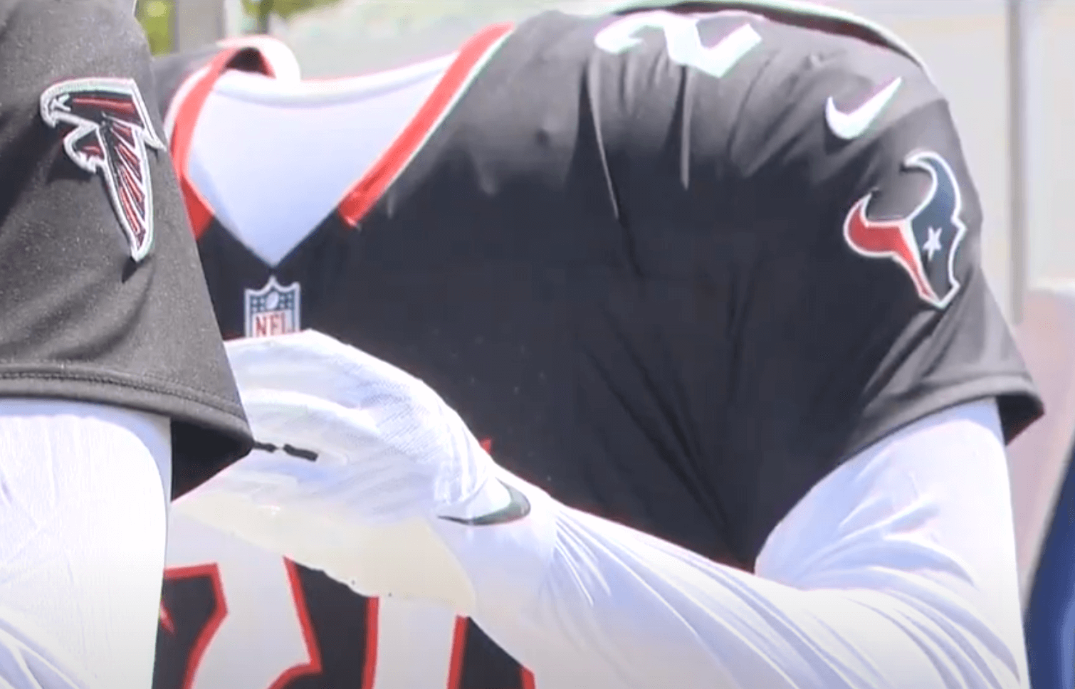
Just noticed a curious thing about the Texans new home jersey, which is relatively simple and inoffensive, except for one baffling detail:

The enlarged photo from Uni Watch apparently shows the TV numbers have no outline. Ugh, why? Who thinks this :censored: is okay? Sometimes the simplest solution really is the best one. Just outline them.
I can’t wait to hear the contrived, convoluted reasoning for this decision.
-
7
-
-
18 minutes ago, ruttep said:
This is a lateral move, at best.
Side by side, I miss the outgoing uniforms even more. Template/cut changes had eroded them over the years, but on the whole, I think this is a significant downgrade
-
2
-
 1
1
-
 1
1
-
 6
6
-
-
That reveal video is something. I thought I was watching a Ford Bronco commercial.
Knee-jerk reaction: I don’t like it. I don’t think the overall uniform is horrible, but I don’t like it. To me, it’s says Boise St. Broncos more than Denver Broncos. It’s very collegiate in my opinion and NFL design has already moved past this style. It feels like it’s in the same vein as 2013? Jags and 2017? Titans, albeit better. I truly, truly hate the white helmet, especially paired with the navy jersey. Speaking of helmets, the navy finish sucks. I’m so tired of satin helmets. I liked the very subtle metallic gloss of the previous helmet. Better that what I expected I guess, but not good.
-
7
-
-
31 minutes ago, Brave-Bird 08 said:
Everyone give this baby one last good look (always loved it and will never apologize for it, just didn't mold well onto modern templates)
Same. I think many of us around here won’t appreciate what we had until it’s gone. The same can be said for the Texans
-
All of the triangles is the Broncos design tells me that whoever was pushing this redesign did not understand the assignment. Say what you will about the outgoing uniforms, but those were a cohesive whole. The logo is dynamic. The curves convey speed, power and grace of a bronco and it carries over into the striping of the jersey and pants.
They new uniforms apparently emphasize snow-capped mountains. There are triangles everywhere. Straight lines, hard edges, mountains. The last time I checked, the team was still called the Broncos. What are they doing? It doesn’t have to have a “theme” or tell a story about #Colorado. They’ll be back to something reminiscent of either of their previous uniforms in 5 years.-
15
-
 3
3
-
-
The Texans did not need to change. I’ve been saying that the whole time. These new uniforms are trying way too hard. They had a good thing going and effed the whole thing up.
The Broncos jerseys are nice enough, but I have a feeling the uniforms, in their entirety are going to be a mess.
I’m going to miss the old number font. I think that could have stayed around.
I’ll start riots if they actually have a white helmet. Why? Both the robo-horse and D horse are made for blue helmets. All of their significant history has happened in blue helmets.
Who makes these decisions? Why is good taste and common sense so hard to come by? It shouldn’t be that hard. Social media is the bane of having nice things.-
5
-
2
-
-
Lions critique:
Nailed the home combo. I love the new stripes.
nitpicks:
Detroit is too big on the white jersey
Silver would have been better for the facemasks. That was my favorite thing about the last uniforms.
Do not like:
plain blue and white pants. They really don’t even need them. The blue pants should have black/silver stripes to match the blue helmet. Silver is the only correct decision.
The the black/blue alt is actually really sharp, but on principle I cannot support it for the Detroit Lions.
Still a major improvement over the previous uniforms.
-
6
-
1
-
-
I guess I’m in the minority who likes the silver face mask for the Lions. Blue is just too loud.
-
1
-
-
I think Utah Coyotes has a nice ring to it. The name works for the locale. They could tweak the logo and colors, if they want something new and fresh. I’m not an NHL fan so maybe there’s too much baggage that I'm not fully aware of with the name to keep it?
There’s also the issue that most of the good names are taken at this point. Grizzlies or Raptors is obviously out of the question. Bighorns might be cool if, but maybe it’s too close to the LA Rams. Elk would be awesome too, but it’s being used in the CFL. Maybe Pronghorns or mule deer might be a direction they could go if they’re dead-set on ditching coyotes.
-
One good thing that’s come out of this Nike uniform fiasco is the fact that the Cardinals alternates are delayed until June. The gray jerseys still do not match the pants. Why is that so hard? It looks so Busch league, like they’re reusing old pants or ordered from two different suppliers. The jerseys are an unpleasant color, too. It’s a weird blue-silver and it’s shiny like cheap sublimated travel-ball jerseys. How much “innovation” did we really need in baseball uniforms? What a mess.
-
6
-
-
First time I saw it I thought my tv’s color was going bad. Don’t like it.
-
1
-
-
Well the number font sucks and the numbers should be red, but I was expecting far worse. Definitely not an upgrade but, so far, not the colossal disaster I was expecting.
-
5
-
-
43 minutes ago, BBTV said:
He can't have Pete Carrol. I want Pete Carrol. Jerry Jones will have to fight me for him, and I'm fairly certain I'd win that one.
Fight to the death between the gorillas? Loser gets Mike McCarthy and has to train a new gorilla?
-
I think Jerry Jones is too proud and stubborn to fire Mike McCarthy. I’m also not 100 % sure I think he should, but if he does, Jerry needs to check his ego and get a “big personality guy”. No more lap dogs. I want Pete Carrol or Jim Harbaugh or Mike Tomlin, if he’s available. They need someone who can light a spark. Jason Garret and Mike McCarthy are just boring as hell, uninspiring. There’s too much talent on the roster to keep doing the same thing over and over and hoping for better luck next time.
-
Glad I chose to spend one last day hunting deer instead of watching the cowboys crap the bed. It’s easier this way. I hate that I love them.
-
I like it. I’m not sure they should have dumped the box, but It’s definitely the Honda “H”.
-
7
-
-
The grass isn’t always greener. The Texans and Broncos are about to show all of you who have been clamoring for new uniforms to be careful what you wish for because you just might get it. I don’t love either team’s uniforms. I’d change some things for both, but I’d gladly take either of those looks over what I’m afraid we are going to see come April. We’re about to get some 2015 Browns and gold-helmet Jags crap shoveled our way.
-
8
-
-
I’m firmly in the black helmet for the Falcons camp, also not a big fan of silver/gray for them. Gimme a red or black jersey, but I think ATL looks best in black lids.
-
2
-
-
Michigan and Washington both failed a very easy assignment. The blue pants are fine for a game against Rutgers or Indiana in October, but yellow is the only option for the Natty. U-Dub isn’t as egregious but the correct answer was blue over yellow vs. white over purple.
#disappointed-
13
-
2
-
-
7 hours ago, BBTV said:
That’s an offensive off sides? On a guard? Lol ok. Dallas is doing a good enough job whooping the Eagles without that, thx.
Though if that’s a 1st, the turnover doesn’t happen, so kinda important. There’s no universe in which that was offensive offsides, other than Goodell wants to kill the push.
This Cowboys fan agrees with you. I didn’t see it. The guard’s helmet was even with the center’s, if not slightly behind. It definitely wasn’t egregious like the KC offsides. There were a lot of bad calls and missed calls in the game. Just take solace in the fact that the Cowboys will commit a series of unimaginably stupid mistakes against the Bucs and lose in the first round . I have no hope.
-
A few days late to the party here, but I just wanted to say I thought Oregon looked bad in the Civil War. Either green or yellow pants would have been a better option. Also green vs orange is a pretty jarring matchup. I can’t imagine that’s easy on colorblind eyes or people watching without sunglasses on.
-
3
-


:format(jpeg)/cdn.vox-cdn.com/uploads/chorus_image/image/48650395/GettyImages-1497208.0.jpg)

MLB 2024 Uniform/Logo Changes
in Sports Logo News
Posted
Don’t love “The Lou”. I’d also like to see more blue, maybe a blue hat with a red brim. The STL font needs to either be on both the jersey and the hat or neither. I do like the wavy pinstripes. Overall, not bad, could be better. I’m not sure if I’d rather see white or red pants