


8BW14
-
Posts
1,367 -
Joined
-
Last visited
Posts posted by 8BW14
-
-
The Texans uniforms get me vote for being very good, red alt helmet and color rush non-withstanding. @Bmac took the words right out of my mouth. That is the correct opinion regarding the Texans. Everyone wishing for something new won’t appreciate what we have until it’s gone
-
 6
6
-
-
As a rural resident and a deer hunter, I’m going to nitpick your flag. Your antlers are wrong, those are elk antlers. With the correct antlers, it’s an absolute homerun
-
 1
1
-
-
Giants look like they should, but I prefer them in gray pants. Not crazy about the Jets alt, reminds me of a ND Shamrock Series uniform. The 49ers gold uniform doesn’t look bad here, but it might be a bit much IRL
-
1
-
-
Illinois needs to flip the stripe colors, put a script back on the helmet, add pants stripes and change the numbers on the jerseys to white on blue and blue on white. Done.
-
3
-
-
Detroit looks great. The dark blue alt is an interesting choice, but it works. I think white numbers on the black jersey might be better for the Saints. I’d also ditch the gold outline on the white jersey numbers too.
-
I hope Notre Dame leave UA just so they can have bigger numbers on their football uniforms. Why are the numbers so small on UA’s football uniforms? The UA number font is too skinny too.
-
1
-
 1
1
-
-
1 minute ago, HOOVER said:
Natives. Originals. Americans.
All would have been better than Commanders.
Washington Americans has a nice ring to it. I think a turkey would be cool logo/mascot to go along with it. They’re as American as it gets and they’re some mean SOB’s.
-
4
-
 1
1
-
-
26 minutes ago, MJWalker45 said:
I think that ship has sailed and they don't need to go back. The only way for it to work is to get approval from Native American groups and they would still look at Warriors as a way of placing them in a box.
You mean COL Rock?
Redwolves or 32's would be a great way to move forward. With 32's you just need the colors to stay burgundy and gold, and your mascot choices are endless.

An updated version of something like this, and a W on his chest would be a great start.
The old-timely football guy is cool and I don’t hate the idea of 32’s, but I don’t see how that would ever fly in the same league as the 49ers.
-
1
-
-
I don’t like the Commanders name, but I highly doubt it’s going anywhere. I’ll always stump for Redwolves or WFT. Going back to the classic uniforms with a white/gold stripe and new, better W on the helmet would be good enough for me at this point
-
1
-
-
OK State looks great. Only a minor nitpick, because the block numbers are perfectly serviceable, maybe a # font matching the wordmark would be nice. Also, I’ve never really liked Pistol Pete on the helmet. They really only need OSU and the cowboys script IMO. Also, also, I’m OVER matte and satin helmet finishes. I’d kill for a nice high-gloss black helmet, it’s such a sharp look. Still, these uniforms are pretty good. Huge upgrade
-
2
-
-
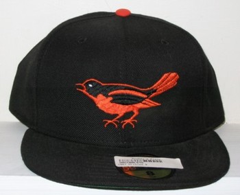
I also prefer the full bodied birds to the cartoon bird. I think my favorite is the original bird though. It’s just simple enough and has that old-timey charm:
-
3
-
-
Top left isn’t bad, but bottom is far and away the winner. Bottom left isn’t bad but it’s a little too cute for my taste.
-
4
-
-
Where’s the mike Shannon memorial patch gonna go? Son of a :censored:, this team just continues to disappoint me this season
-
2
-
-
Mother:censored:er. That’s gross. :censored:. :censored:. :censored:. Glad Yadi and Albert never had to wear that
 ontheir sleeves. Hopefully they take the money from the god damn ad and buy some better :censored:ing pitchers
-
1
-
 1
1
-
 1
1
-
-
Forget I about those Vegas jerseys. I feel like if that could translate to football fabrics it would have. Where’s the dazzle on those GT uniforms? Is it the pants? I’d love the see the Niners and Panthers back in shiny pants, but I think the fact that we haven’t seen something like that implies they can’t get the material to a place where they want it. I don’t wanna sound like a Nike Stan here. and maybe I’m naive, and they just don’t wanna do it but I think that would be a big deal for the teams with silver/gold helmets to have state of the art shiny pants. Right now, if it’s important enough to them, they’re still wearing the same pants I wore in high school in 2009 which is fine if that’s what they want, but those things were hot and heavy and did not wick moisture at all.
-
True, but that’s a different application. It’s used only as trim on those hockey uniforms. Football uniforms are super tight and super stretchy. I think if they could make it super light and stretchy we’d see it on high level football uniforms.
-
3
-
-
7 minutes ago, HOOVER said:
Look, some of the hate for Nike is warranted, but show me another uniform manufacturer, in any sport, that is still using dazzle fabric.
I agree. I gotta think they have been working on something, but for whatever reason the performance isn’t there. If they had cracked the code to make shiny fabric moisture wicking and lightweight on the same level as contemporary matte fabrics, Nike or anyone else who made the innovation would be pushing the hell out of it.
-
Houston should be wearing this full time if they want to use more red:
*note the bonus use of the correct socks with the blue pants
Something about the red helmet just feels off to me. I don’t like the finish, it’s too orangey but besides that, it’s just doesn’t look right to me for reasons I can’t really articulate.-
8
-
 2
2
-
-
Perfect. It doesn’t get better than this for the Cowboys. Metallic blue and royal blue is the only correct answer.
-
1
-
 1
1
-
-
31 minutes ago, WSU151 said:
Shorts would probably have worked with a jersey that didn’t have as much going on. Bigger wordmark was definitely needed.
Yeah if the shoulder loops were erased we could have a bigger wordmark. Maybe keep the double “loop” look going just on the armhole trim. I think there’s something there anyway.
-
4
-
-
I’ve always thought the Rockets should roll with red and white. No black, no silver/gray, just red and white. Probably an unpopular opinion but I think these:
without the black drop shadow and modern tailoring would be really sharp. I love the shorts.
-
6
-
-
Uniforms are great, no real complaints there. I really love the cap logo. My one critique is concerning the pronghorn logo. It’s a little too illustrative for a sports logo. It’s more reminiscent of a Dept of Natural Resources logo. I think trying for something more stylized like the Milwaukee Bucks or this Fairfield Stags might be more appropriate
-
3
-
-
20 minutes ago, MJWalker45 said:
Just a full switch to jelly green with the current template would be the best option for Philly. Because if they dig into new logos who knows what will get approved?
Yeah I’d be okay with that. The logo never needs to change. I’d rather see Philly ditch the black and charcoal and ride with midnight green and silver. That would probably necessitate more than tweaks to the uniforms, though.
-
4
-
-
I think the Texans and Ravens both look pretty good, not perfect. I’d like to see the eagles make a change, but they’re also in the “careful what you wish for” category for me. I can be content with those looks if it means we don’t get a Nike makeover with all sorts of weird unnecessary details that overshadow the good parts.
-
7
-


 ontheir sleeves. Hopefully they take the money from the god damn ad and buy some better :censored:ing pitchers


MLB 2023 Uniform/Logo Changes
in Sports Logo News
Posted
Slugger Bird is great. I’d love to see a version with the new bird on the sleeve…oh wait, nevermind.