


8BW14
-
Posts
1,367 -
Joined
-
Last visited
Posts posted by 8BW14
-
-
Fun fact: the Cardinals have blown 24!!!! saves this year. They’re 45-57. If they could have managed not to
 the bed half of those games, they would be 57-45. That would put them in first place. Oli sucks and the pitching sucks. I’m looking forward to the trade deadline so I can officially concede the season and move on to my emotionally abusive relationship with the Cowboys.
-
The Broncos white helmet falls into the same category as the Lions blue helmet: totally unnecessary and looks weird within the context of the rest of the uniform/team brand. On its own it’s a sharp helmet I guess, but it looks like it belongs on a bookshelf or a desk.
-
 18
18
-
 1
1
-
-
That looks :censored:in stupid
-
3
-
-
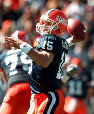
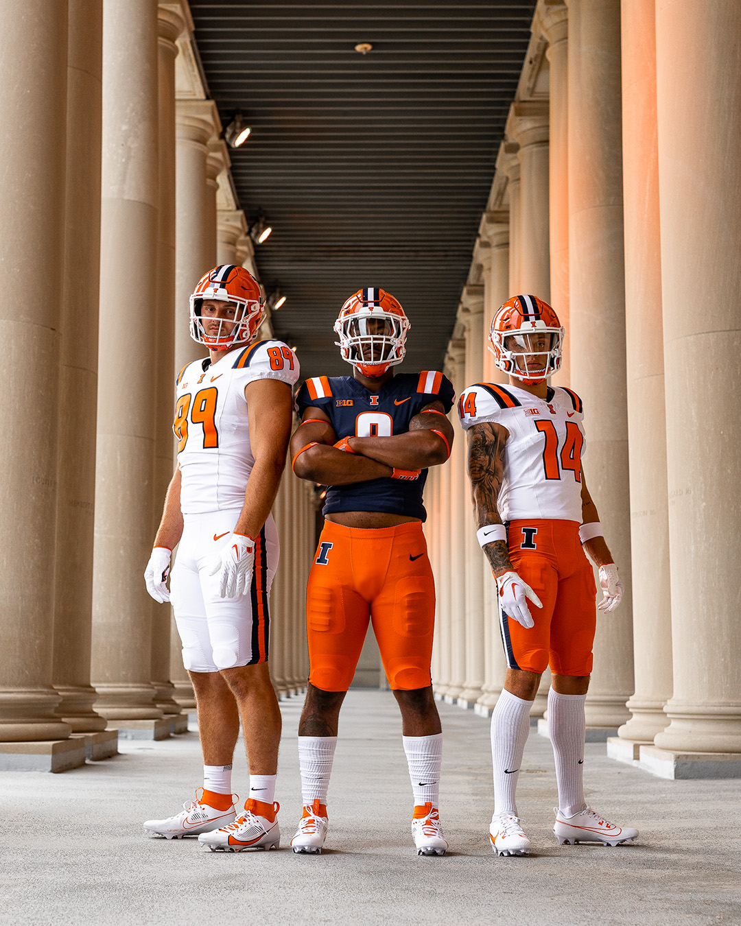
Illinois should essentially look like this forever:

The new jerseys suck (The helmet and pants are cool)
-
10
-
-
I think my biggest issue with these uniforms is that they feel very “team builder”. The last two uniforms had some custom touches like the vertical tonal stripes. The new ones look like a catalog order. The helmet and pants rock, but the jersey really feels so out of place to me. Illinois should be simple, but this is generic.
-
1
-
-
12 minutes ago, nuordr said:
Putting the stripes on the shoulders actually helps to differentiate them from Syracuse along with not coloring the collar.
Still way too similar. Single layer numbers (blue on the white jersey) and stripe-less jerseys would look more like Illinois differentiate them from Syracuse.
-
Just now, buckeye said:
Illinois continues to Syracuse it up
Yikes. Not what I was expecting and hoping for. Do not get the UCLA stripes. Erase those and they would be great. Now they looks like Syracuse.
-
OSU’s gray jersey looks really sharp. They nailed those. Love the red numbers
-
3
-
-
Beating the dead horse: The black trim sucks. The colts should not be wearing black. Who still thinks making stuff black is cool? This is low rent college and high school stuff.
A blue helmet with a double stripe would have been awesome and I wouldn’t even mind the monochrome because it would have been intentionally done as a one-off alternate, separate, but obviously related to the regular uniforms. Bonus: a blue helmet could have been worn with the throwback back uniforms. It’s not hard. Why is it so difficult and who is the black for?
-
9
-
-
The Seahawks throwback could so easily be adapted to contemporary standards in the same way as the Vikings and Chargers uniforms. Just use the new logo, ditch the collar stripes, use the current number font and match the pants stripes to the sleeves and voila. I’d probably ditch the bird from the sleeves but maybe not? Either blue/green combo would work for me, but I think I might prefer the throwback colors.
-
6
-
-
2 hours ago, Sec19Row53 said:
How is that arrangement viewed by the average fan?
This average fan thinks the cardinals management relies too heavily on analytics and a “moneyball” type of approach. They put too much value on sabrmetric-type stats from players who can win lots of games over the course of a long season, but those guys can’t win important games when they really matter. I think the cardinals need to take a long hard look at how they assess talent and value players. I wouldn’t mind seeing a new guy with a fresh perspective take over, but that won’t happen. If/when Mo moves on, the cardinals will promote from within and nothing will change because they’re so far up their own “Cardinal Way” ass.
-
21 hours ago, Sec19Row53 said:
Happy Brewer fan here.
I still fear the Cardinals, but Oli is growing on me

You must have been a big Mike Matheny fan too. Cripes. I can’t decide if I want them to get their :censored: together and win like 12 in a row or just put me out of my misery and lose 12 straight.
-
Not much to complain about here. I really love your Maryland look. The only thing I don’t really like is the maroon Rutgers alternate. Unless there’s some historical reference I’m not aware of, I think black would be better than double red.
-
NL looks like they’re wearing slacks.
 . Gray pants would have been miles better. Better yet, bring back the individual players’ uniforms.
-
7
-
-
The Chicago race will definitely get eyeballs out of curiosity. NASCAR is not F1. I used to be the biggest nascar fan in the world, but I’ve fallen off as my favorite drivers as a kid retired and they’ve changed so many rules. I’ll agree that nascar is generally not good on road courses and this course does not look conducive to big heavy “stock” cars. This Chicago street race will be the first race I’ll tune in to this season just to see the spectacle, but I don't expect to see good racing. If we get anything more than a 200 mile parade, I’ll be surprised. Reeks of “Steve Buschemi with a skateboard and backwards hat.”
-
On 6/21/2023 at 9:52 AM, TrueYankee26 said:
I saw a house with a Packers logo painted on the garage door.
In Illinois.
I wouldn’t say that was out of place at all. Downstate, packers fans are pretty much 1:1 with bears fans in my experience.
-
That Lions helmet is sharp, but it just doesn’t look like it belongs on an NFL field. Looks like one of those merch helmets a dude would put in his man cave or behind his desk at work.
-
13
-
 2
2
-
-
I like it. Fauxback-y and contemporary. The sublimated details are thoughtful, although they will disappear on TV or from the stands. Coulda been worse.
edit: also, pillbox hats would have been awesome, but they probably wouldn’t sell as well.
-
4
-
-
Yeah I agree with @GFB . The plain blue helmet, paired with the throwback uniforms would be a really sharp look. That would make too much sense and not be #
 . No cap
-
3
-
-
I don’t know what I was expecting to get from the Lions but I’m disappointed. The logo’s awkward on the helmet and pairing it with the graphite uniform is an interesting choice. Moral of the story: alternate helmets suck
-
4
-
1
-
-
I actually think black/blue/black with blue socks could look really sharp for Carolina, just not with their current uniforms. They should stick with silver helmets and pants. If they want to rework everything, it would be a great scaffolding to build on.
-
41 minutes ago, GriffinM6 said:
I think it's a good start. The green and blue definitely need more contrast though. I'd make the green darker since it's the main color. The sun could also spare to be a little smaller. As of right now, I think it takes up way too much space.
Darker green, brighter blue, smaller sun. Also another idea that includes the Illinois river as a diagonal stripe. Not sure how I feel about that one. I think the IL river needs to be included but I don’t love the execution. Maybe I need to go back to the drawing board?
-
Illinois is looking into a adopting a new state flag design and I had a few spare minutes at work yesterday and came up with this:
The sun/star has 21 points because Illinois was the 21st state to join the Union. The blue borders on the left, bottom, and right sides represent the Mississippi, Ohio, and Wabash rivers respectively and the upper right corner represents Lake Michigan. The green background is for Illinois’ forests and fields and the gold, not only represents the sun, but also the grain harvested from the fields in the fall. Illinois’ lifeblood is its lands and waters. They support pretty much all industry and commerce in the state. Out-of-staters and the majority of the population in the Chicago area tend to forget anything but Chicago exists in Illinois and I wanted to create a flag that represents the whole state, not just the NE corner.
My wife liked the symbolism but told me she thought it was an ugly flag. Any thoughts would be appreciated. love to submit a design if/when the state asks for input from its residents.
edit: just realized the flag is pretty similar to @NicDB’s Wisconsin flag. I wasn’t consciously thinking of it when I came up with the IL flag, but it was obviously rolling around in my mind somewhere. Didn’t intend to step on any of those ideas. Illinois and Wisconsin have a lot of similarities.
-
2
-
-
Revolutionaries is a bit of a mouthful but it’s not bad. It’s too long for uniforms, but Revs is a good shorthand. Generals would have been a layup, though. In fact, before all this came up, I didn’t even know GW was the Colonials. I guess I always assumed they were the Generals.
-
3
-
 the bed half of those games, they would be 57-45. That would put them in first place. Oli sucks and the pitching sucks. I’m looking forward to the trade deadline so I can officially concede the season and move on to my emotionally abusive relationship with the Cowboys.


/cdn.vox-cdn.com/uploads/chorus_image/image/71291653/usa_today_16818944.0.jpg)


College Football 2023
in Sports Logo News
Posted
Tradition be damned. Please fix the stripe on the white pants Miami!