


8BW14
-
Posts
1,371 -
Joined
-
Last visited
Posts posted by 8BW14
-
-
This is :censored:ing stupid. All they needed to do was slap a W and a stripe on the helmets. Hell, throw commanders on the jerseys so people will buy new ones if they must. JFC, I don’t even get excited for this :censored: anymore because I know it’s just gonna piss me off. I don’t care what the helmets and pants look like. The jerseys are dog :censored:, even the burgundy one, by association.
-
 1
1
-
-
3 hours ago, oldschoolvikings said:
Yeah, I don't love that logo... never have.
How about this one?

definitely works better than the flaming T, which I have to admit, is a guilty pleasure of mine. -
I didn’t think I would like the forward number placement, but the more I see it the more I like it. Along with the bigger sponsors, I think it allows for some more design on the side panel of the cars. Overall I think the new car looks sharp, but the rear end looks a little stubby.
The old fart in me isn’t crazy about some of the “innovation” on the new car, but I get it, gotta stay with the times.-
2
-
-
Love the Jets concept, nice update of an old look. I love the color balance of the Titans uniforms but the super traditional Oilers-esque striping clashes with the flaming logo. That’s my only nitpick
-
Got a couple new ones today. The first one is the Seattle Seahawks. I think their current uniforms are starting to look a bit dated so I whipped up a new set:
mono-blue remains the primary home uniform and I kept the number font around, minus the outline. Obviously the striping is based on the logo and the pant stripe only wraps around one leg. It’s a little out there but thats kinda Seattle’s MO at this point.
I’ve also got a concept for the Washington Football team too. I kept the basic look of the logos, but went even simpler, more classic-football.
I didn’t want to do too much because Washington has worn pretty much the same thing for a long time and I think they have even built some equity into the WFT brand in the last two years. The only real departure from the classic uniforms is the addition of the double stripe to the helmet. The leather helmet returns for the alternate uniform with the W on the sleeves.
Let me know what you think. Feedback is always welcome
-
2
-
-
52 minutes ago, DCarp1231 said:
What? There’s literally proof of the asymmetrical stripe
That’s what I’m seeing. It looks like a “distressed” white/gold stripe to me too. I guess we’ll find out in a month
edit: watched it again. It’s definitely a gold stripe with some glare from the window
-
5
-
-
All the talk about honor, tradition, legacy doesn’t really jive with the visuals we get from the teasers. The uniforms look like they will be trendy garbage and none of the names really click for me.
WFT has some equity at this point, they should have cleaned up the logos and made some tweaks to the uniforms and called it a day. That would feel like a new era of the franchise. Whatever the new name is, paired with the apparently modern uniforms will feel like something else and I think that’s the wrong direction.
-
5
-
-
I’m actually pretty disappointed it’s not Redwolves. I thought that name had a lot of promise. Honestly, Washington Football Team is probably better than anything else they have come up with at this point. They’ve developed an identity around that IMO. The logo package is pretty weak but the name is unique and plays on the long history of the team. This new look appears to have some trendy stuff going on. I would have leaned into the longevity and history of the franchise instead of what appears to be a pretty big departure visually
-
5
-
-
20 minutes ago, Discrim said:
As JaguarGator9 would say, welcome to Dumb Decisions... I'd thought the ref misspoke when he said Dallas had taken that timeout. Seriously, why?
No idea. He did was terrible in Green Bay for years and now in Dallas, too. His mismanagement cost the Cowboys a chance be to challenge for a fumble and get the ball back with a minute? or so left to tie the game*
How does a guy get to be a head coach in the NFL with such a poor understanding of how to use his time outs and manage the clock at the end of games?
*The Cowboys stepped on their own dicks plenty in this game, but there’s always something with this team.
-
1
-
-
Mike McCarthy has to be the worst clock/timeout management coach I’ve seen in my life.
-
2
-
-
Double post
-
I thought the Colts looked really good yesterday, maybe even better than the primary uniforms. I think the single stripe in the pants is perfect. I especially liked the look on a few of the players who were wearing black shoes.
-
2
-
-
I don’t like LSU’s white helmet and pants. Objectively it’s not bad, but I don’t like the striping and it’s unnecessary and is inferior to their regular yellow helmets and pants.
-
45 minutes ago, IceCap said:2 hours ago, DG_ThenNowForever said:
Yeah...what a genius.
Look, I’m not defending the other nonsense the guy has been spewing the last couple days, I’m just saying that whether he’s vaccinated or not does not make him stupid. His reasoning and behavior is bizarre to say the least. He’s a weird guy and maybe saying he’s very intelligent is an overstatement but I don’t think it’s fair to say the guy’s stupid. I think he’s a smart guy with a HUGE ego, who can’t handle being questioned or criticized. So he got cute with the media and it has bitten him in the ass. Is he an A-hole who uses big words to show you that he’s better than you? Yea definitely. He definitely lacks the self awareness to admit he screwed up, so instead of just being honest, he’s trying to thesaurus his way out of the mess he created and he ends up looking even more like a d-bag.
-
5
-
-
Part of me wants to defend Aaron Rodgers for not getting vaccinated because obviously the guys is very intelligent and it didn’t make his decision to forgo the vaccine lightly and he’s not obligated to let anyone, let alone the media know his vaccine status. He knew that if it came out that he hadn’t been vaccinated, there would be a :censored:storm like the one we are currently witnessing. On the other hand, rules is rules, even if they’re not particularly logical. On the other-other hand, I’ve never liked Rodgers. I’ve always thought he was selfish and thought of himself as being smarter than everyone else he was dealing with. The way he has navigated this whole debacles kinda embarrassing for him and just confirms for me that he is an ass.
To me, the issue isn’t whether he chose to be vaccinated or not, the issue is that it’s been handled poorly by Rodgers and the Packers and apparently the NFL. They would have known he hadn’t been vaccinated and was violating their COVID protocols on a daily basis.
-
I don’t watch much AL baseball, so I just noticed this the other night:
The Piping doesn’t match and it looks Busch league. Either spring for a second pair of white pants with blue piping to pair with the orange tops or, better yet, just wear your white jerseys that match the pants.
-
2
-
-
Don’t like Oregon’s winged helmets or Apple Green color. This helmet and shade of green is what the Ducks should be wearing:
The O is instantly recognizable and the Mallard head iridescent green is just clever enough. The next version of the green jersey was better but this helmet is perfect.
-
5
-
-
The missed PI call was final nail in the coffin , but geezus, the Cowboys missed a field goal and an extra point, and turned the Bucs over 4!!!! times and only turned one? of those into a touchdown. They stepped on their own dicks a few times and came away with field goals instead of touchdowns. The Cowboys should have won relatively easily, honestly. Same old story, can’t get out of their own way.
-
2
-
-
I think this is relatively unpopular around here; I hate Ole Miss’s powder blue helmets and jerseys. Can’t hold a candle to the navy blue helmet and jersey with gray pants. Thats a classic football uniform.
The helmet is fine as a throwback but the powder blue jerseys is out of place and ugly.
-
2
-
-
I’m a broken record on this topic, but the Giants only need one pair of pants and those pants should be gray. Not the current/most recent gray pants, but these bad boys that reflect the helmet stripe and have the perfect “old-school” look:
-
27
-
-
1 hour ago, guest23 said:
I think it's a nice cleaned up design but I get too much of a ole miss vibe from the gray pants/white jersey and given miss' past association with the confederacy I would go a different direction.
Or you could just see it for what it is as a nice looking football uniform that has absolutely nothing to do with Ole Miss or the freaking Confederacy. It’s not that deep.
-
8
-
-
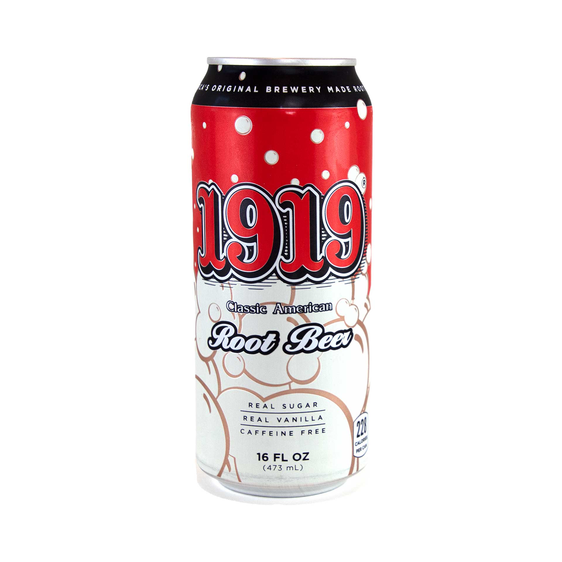
On 4/24/2021 at 10:19 PM, DNAsports said:
Bought a can of this on Thursday at a local soda store-
Never seen a can of that before but a local bar/restaurant has the stuff on tap and it’s some of the best root beer I’ve ever had.
-
3
-
-
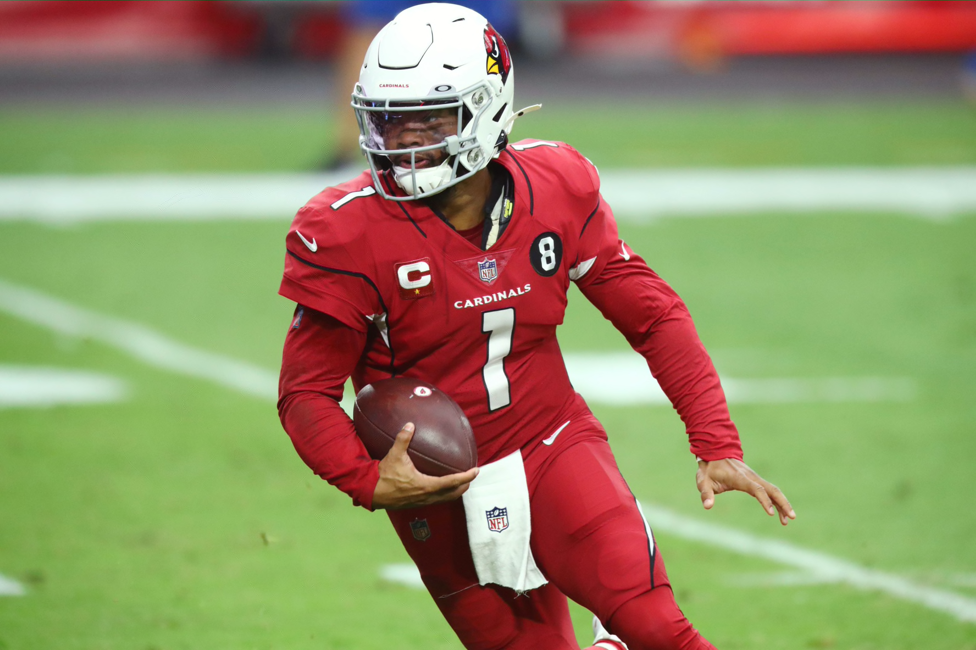
1 hour ago, Cujo said:
Need somebody to explain to me how a grey facemask works with this uniform
The Cardinals’ problem is more like the jersey and pants don’t work with the helmet. They should be wearing something super clean and traditional that doesn’t clash with the gray facemask.
-
2
-
-
Second attempt at updating Washington: this time I went with the Redwolves nickname that’s been floated around. I actually think it makes a lot of sense, so I thought I’d whip up a logo/uniform concept
The look stays pretty true to what the team has traditionally worn, with some minor tweaks. I don’t think I love the yellow jersey, but I wanted to stay away from black and throwbacks are probably off-limits. I’d love to hear everyone’s thoughts on the Redwolves and Bengals. Thanks again for taking the time to have a look.-
8
-


Washington Commanders to debut new NFL identity
in Sports Logo News
Posted
Yuck. I am so tired of the gimmicky helmet finishes. Is it too much to ask to keep that beautiful metallic burgundy helmet? Apparently it is and that black uniform is ridiculous. I guess that means we’ll be seeing college style alternate helmets in the NFL from now on.