


Dalcowboyfan92
-
Posts
1,839 -
Joined
-
Last visited
Posts posted by Dalcowboyfan92
-
-
All the old banners seemed to have been lost to the sands of time, I was wanting to get my old banner in a smaller form, but now I have no other option if I want to keep using it. Thankfully, the thread where the original post is still there...
I decided, however, to swap in a whole new set of images, since it's been a little over 5 years since it got a refresh.
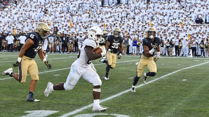
Second from Left: http://www.college-sports-journal.com/wp-content/uploads/2018/09/LehighNavyTDRun2018.jpg.
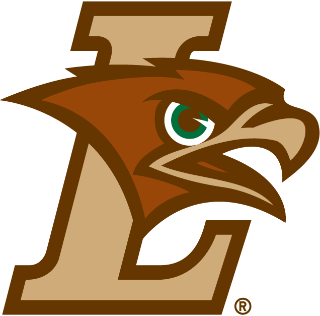
Center Logo: http://content.sportslogos.net/logos/32/727/full/6915.png
Second from Right: https://lehighsports.com/images/2017/11/4/Dominick_Bragalone_0491.jpg?width=1920&quality=80&format=jpg
Far Right: https://www.trbimg.com/img-581561ce/turbine/mc-fordham-lehigh-college-football-1029-20161029
Where I come from...we are are serious Lehigh
Colors are brown and light brown
Thanks in advance, man. You're the best.
-
2 hours ago, JQK said:

Since they're going to use their yellow horned helmets, I don't think we will see option #3.
-
5 minutes ago, RayFinkle said:
Uggghhhhh. Awful matchup. Sooooooo sick of this blue bullsheet in the endzones. C'mon AFC!!
Maybe the Rams will roll out yellow endzones; one can hope.
-
 2
2
-
-

I don't associate Joey Bats with the "Graphite Jays" set at all.
-
3
-
-
I feel like the field could have small conference logos on the 20 yardline. An AFC logo facing the Patriots bench, and the NFC logo facing the Falcons bench.
-
2
-
-
Maybe if they do make the conference endzone logos black and gold; do you think Carolina would roll out an electric blue endzone with a black script? (Basically swapping the endzone colors.)
-
It's going to take some getting used to; but the forum skin looks okay to me.
It all blends together well in my opinion.
-
I was curious of this myselfThat second field; why did the Pittsburgh field workers put a Dolphins "wordmark" on the field at Three Rivers? A rather curious decision.
Ditto. Very unusual indeed.
You would think; with Pittsburgh on the doorstep playing for a chance to go to their first ever Super Bowl/World Championship they'd not change the field up.
(I am not sure but I don't think the Steelers ever made it to a NFL Championship Game pre-merger.)
-
That second field; why did the Pittsburgh field workers put a Dolphins "wordmark" on the field at Three Rivers? A rather curious decision.
-
It was a few pages back and some were discussing the old Capitals logo and color scheme (the eagle and blue, black and gold).
I never liked that scheme or that logo. At all. Call me cheesy but if you're playing in the US Capital; you need to have the colors of the national flag in your color scheme. (Outside of the Redskins.)
-
Not sure if this is an unpopular opinion, but I do like the new Clippers script logo. The logo leaves a lot to be desired though.
-
Definitely one of the best, and not a bad game between them. XIII is up there with the best Super Bowl games ever. Uni matchup classic as well. It would be nice to see a Dallas-Pittsburgh Super Bowl 50.
LOL, it probably will happen. They met in Super Bowl X (10) and XXX (30); the odd numbered "10" Super Bowls. They'll meet in Super Bowl 50 (L) judging by these two previous times.
-
Super Bowl XXX Update

It turns out they painted the team boxes for Super Bowl XXX as well. I had to change the numbers on this field, I added a dark patch along the sidelines, and I had to make the Cowboys wordmark taller and wider.
That is a beaut of a field. Dallas v. Pittsburgh is right up there in terms of best uniform matchups in a championship game in professional sports.
-
1
-
-
I don't see what others see in Sam Hornish Jr. as a NASCAR Sprint Cup driver and how he still has potential.
I think he's an absolute terrible driver and shouldn't be racing in the Sprint Cup series. He's missing something to really compete.
-
Super Bowl XXXVI Update

Changed the numbers and helmets for this field also.
They went with the flag in the footballs for this game instead of the team logos, to match the patriotic theme.
Had 9/11 not happened and the patriotic theme, we would've seen the logos within the footballs on the sidelines.
-
This field is a freaking train wreck; plain and simple. Nothing works, nothing the NFL can do to fix it. It's really nobody's fault extensively; since you have two teams with stupid endzone designs. Which just so happen to be #1 seeds in their respective conference.
-
The Seahawks swapping team logo and conference logo bugged me to no end last year, and it's bugging me to no end this year too.
It looks so stupid the way they're doing it.
-
I figured I'd post this here since it regards my concept for Super Bowl XLIX.
I was just on NFL.com and I was shocked to see my concept for Super Bowl XLIX (or a thumbnail at least) on the site. For some reason they don't have a picture of Jeremy Hill so they replaced his face with a football field. This was just on the main page if you scroll down.

I just need a double check on this to make sure I'm not seeing things or if something weird is going on with my computer.
Either way its pretty cool (well for me).
It appears to be you, because I just checked NFL.com's main site and Jeremy Hill has a "mugshot" player picture where you found the field picture.
-
Not sure what kind of unpopular opinion this is, but I hate the Cowboys "Double Star" uniform they used (for the 75th NFL anniversary and several Thanksgiving Day games). I much preferred the 1960s throwbacks.

-
1
-
-
Another theory for why the Seahawks endzone had the NFC logo on the left side of the endzone may have to do with the way the field had been put together all year, and this year for the Jets and Giants. I think maybe 12 of the 16 games had the conference logo on the left sides of the endzone, and it seems they are doing the same thing this year.
I don't understand that to be honest. It ends up making the field look so awkward because of the fact the stadium had done stuff like that before.
-
This was created by user andycumbee19. Here is the thread for proof.
-
Wait, are you going to finish all the alternate SB fields before you upload them to this thread pittpack?
-
You know what I think could work? Having the team text scripts in gold in the endzone.
It sounds okay on paper, but I wonder how it'd work in practice.
-
Do one with Dallas as the NFC Champion, because I do wonder if they'd go with the helmet logo and not just the star. (Madden NFL had Dallas using a helmet logo if they were in the Super Bowl).
And I'm not saying Dallas just because I want to see them in the Super Bowl...

Silent's New Space-Saving Sports Signatures - All Sports Championships & "Where I Come From" (Inter Miami, Nashville SC, and Both XFL Added)
in Concepts
Posted
Thanks man, it looks great! I want to give you credit, where credit is due, but if I do so, I'm in violation of the new forum signature rules.
So, I hope a hyperlink would suffice.")

Keep up the good work, as always!")