


upperV03
-
Posts
6,365 -
Joined
-
Last visited
-
Days Won
44
Posts posted by upperV03
-
-
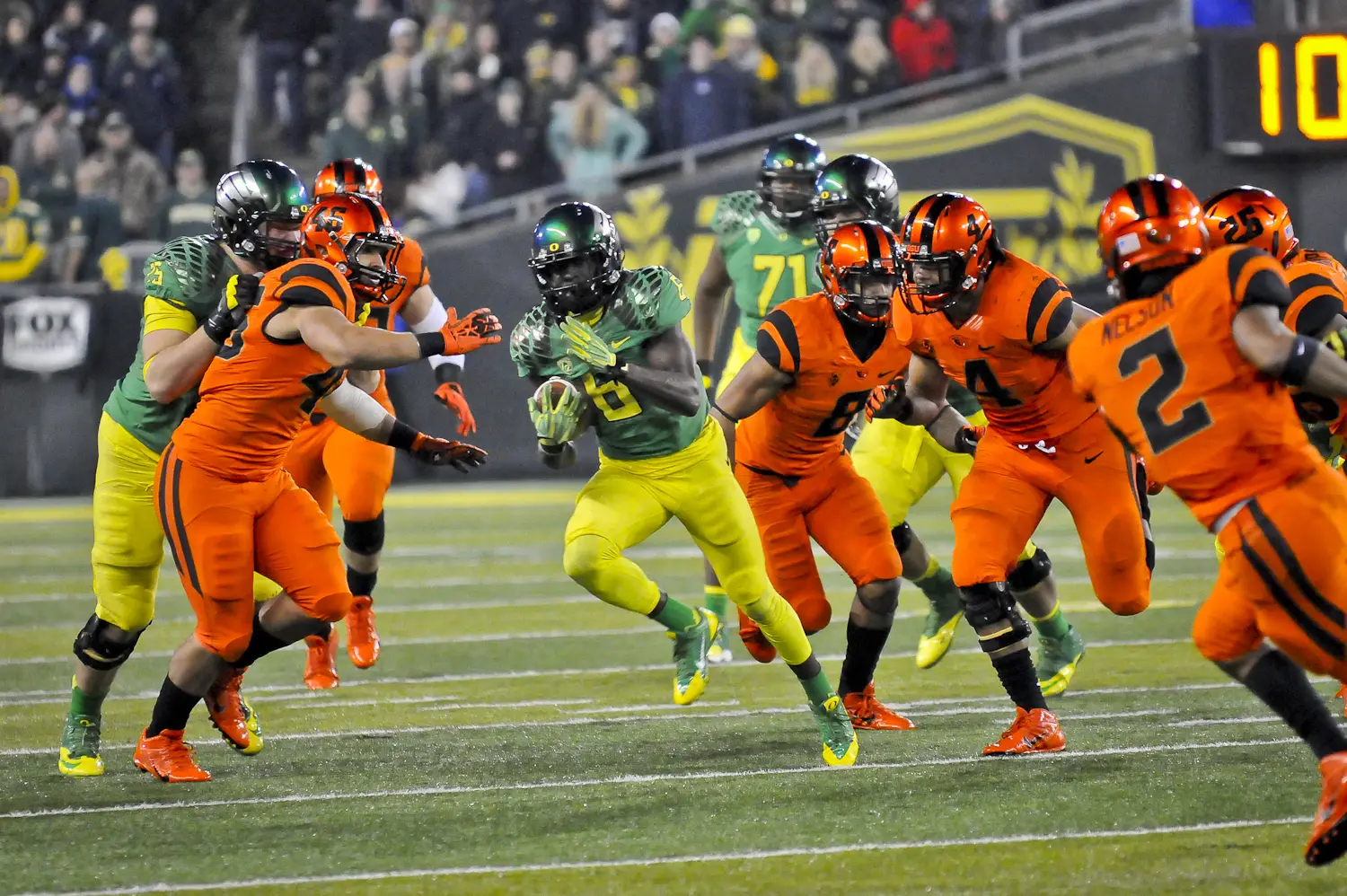
The Ducks are breaking out their chrome helmets with nightmare green wings and pairing them with the yellow jerseys and pants for Friday’s rivalry game against the Beavs:
This is a really sharp combo, and actually one we’ve never seen before with prior uniform sets. They’ve worn silver carbon fiber helmets with yellow in the past, but they’ve never worn chrome helmets with yellow jerseys. I’m pleasantly surprised to see the Ducks go with yellow like they did in 2018, as it sets up another color vs. color affair with the Beavs. Really excited to see this combo in action, and I’ll be curious to see if OSU goes with their standard all-black set or black/orange/orange.
Edit- It looks like the Beavers will actually be breaking out their orange set:

This will be a very bright and colorful game, similar to the 2013 matchup but without any of the Ducks’ apple green. Will definitely give off a highlighter vibe on the field, but I’m excited to see it.
-
 3
3
-
-
Colorado going with the classic gold/white/black again at USC:
-
1
-
-
This Friday is the annual rivalry game between Oregon and Oregon State, which always has the potential to be one of the brighter and more colorful matchups of the year. Last year’s matchup was a fairly tame mono-green vs. mono-cream matchup, while two years ago we had a color vs. color affair with the visiting Ducks in all-yellow against the Beavs in all-black:
Over the years there have been some very colorful matchups, including three years in a row from 2012-2014:
This year the Ducks are once again the road team, meaning we’ll likely see them in either white or yellow against the Beavs in either black or orange. I’d love to see another color vs. color matchup, but I’m not really counting on it happening this year. I think there’s a chance that the Ducks go with yellow jerseys, but probably more likely that they’ll just stick with white. I also think there’s a small chance that the Beavs go with their orange set since this is their last scheduled home game of the season and they’ve worn all-black in the previous two, but I would not be surprised at all to see them just stick with the black. For the Ducks, my casual guess is that they’ll reprise the yellow/white/yellow combo that they wore against USC last year, but possibly with the alternate white jerseys with iridescent numbers and dark green accents.
-
1
-
-
51 minutes ago, j'villejags said:
Uniform reveals have gotten so stale over the years, so it was nice to actually feel some excitement about one again. Only wish they would've saved the look for a night game. Hopefully this is a sign of things to come from them!
Worth mentioning that this game was originally scheduled for last night, so the plan was for them to be worn for a night game. I do wish we could’ve seen them under the lights, but they still look absolutely gorgeous even in the overcast Eugene skies today. I truly believe these are the best one-off uniforms (excluding throwbacks) that they’ve ever worn. Certainly not the best uniform in general, but I think they’re the most thoughtfully and meticulously designed one-offs they’ve ever had. The details are absolutely spectacular, and the design as a whole is just special IMO. Here are some good pics from the game:
I’ve said before that I really like their current regular set, but I definitely do hope to see some more flashiness like these Ohana uniforms with their next set. Just find a good balance between the simplicity of their current regular set and the flashiness of these Ohana uniforms.-
3
-
-
Arizona going white/white/navy at UW:
Not completely sure if this is their uniform graphic for this week or not (pretty sure it is), but it looks like the Beavs will be in their standard all-black set vs. Cal:-
1
-
-
Utah will finally be opening their season this weekend against USC and will be wearing all-black, replacing players’ last names with these seven words:
Washington will also be going all-black, debuting their new alternates against Arizona:
-
2
-
-
2 hours ago, kb105 said:
Are the little details in the stripe supposed to be flying ducks, or is it more associated with Polynesian culture. Just curious because it reminds me of the flying ducks that they have throughout their football facility.
All of the details and patterning are related to Polynesian culture, though I do agree there’s a slight passing resemblance to the flying ducks at first glance. Here’s a nice little graphic showing what all of the patterns mean:
-
1
-
-
1 hour ago, upperV03 said:
And now here are the still shots of the Ducks’ new alternate uniform:
In addition to the patterned wings, the helmets have a patterned center stripe and a subtle sparkle finish. The jerseys have the same number font as the regular set, but with a different perforation pattern. Also notable is that this is a slightly different version of the Vapor Fusion template, with horizontal seams on the shoulders instead of the ‘V’ shaped seams.One more feature on the new Oregon uniforms; the pants have some nice detailing in the side panels:
-
2
-
-
And now here are the still shots of the Ducks’ new alternate uniform:
In addition to the patterned wings, the helmets have a patterned center stripe and a subtle sparkle finish. The jerseys have the same number font as the regular set, but with a different perforation pattern. Also notable is that this is a slightly different version of the Vapor Fusion template, with horizontal seams on the shoulders instead of the ‘V’ shaped seams.
-
7
-
-
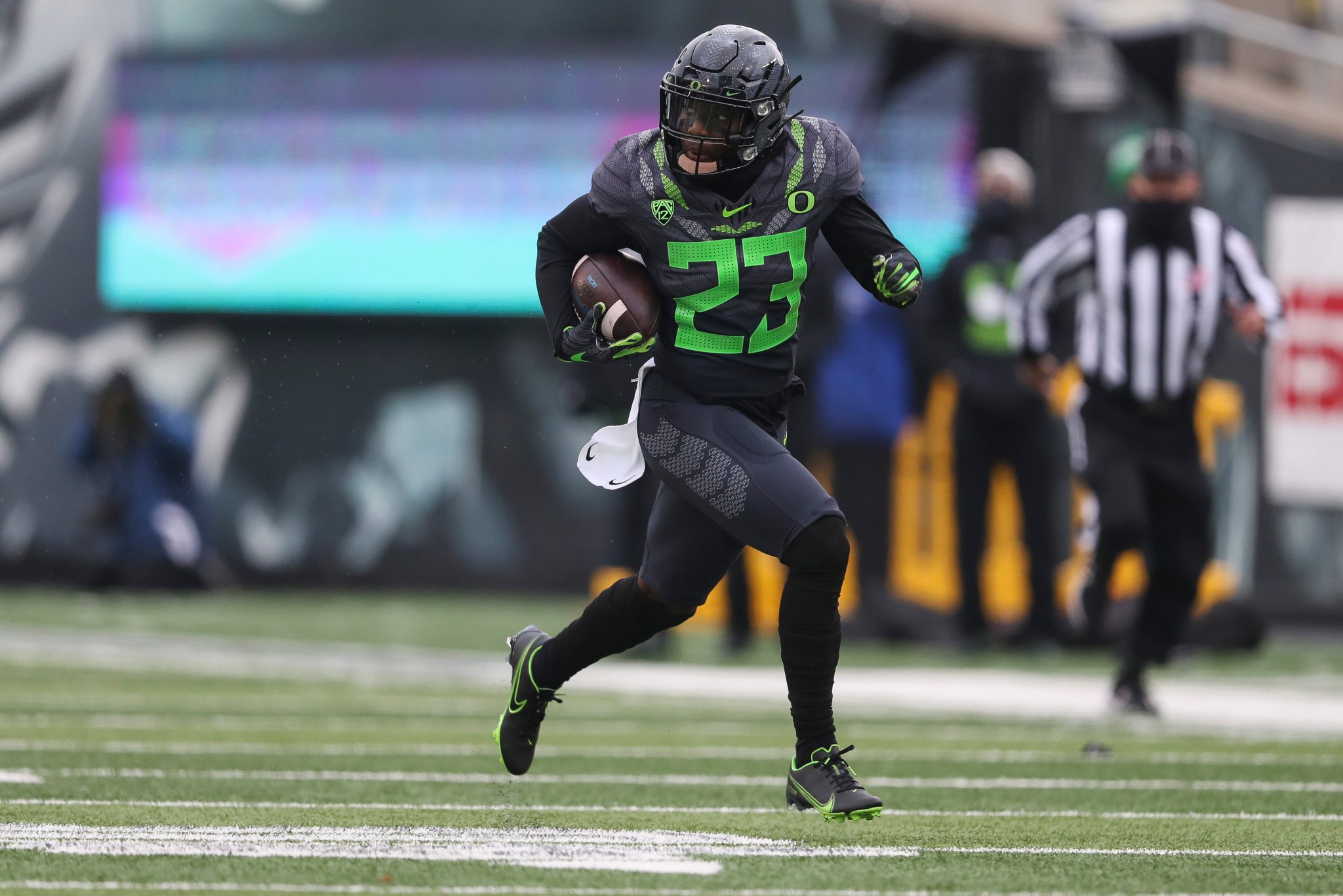
Here’s Oregon’s new “Ohana” alternate uniform honoring the extensive history and influence of Polynesians and Polynesian culture in the program:
The jerseys feature a tonal graphic pattern as well as a neon green and gray stylized Lai design around the shoulders and neck. The helmets are black with dark gray wings with the same tonal pattern as the jerseys. These were actually designed in collaboration with Hawaiian brand Sig Zane Designs, and I absolutely love all of the thought and attention to detail that was put into the different patterns that are incorporated into the design. Overall, these are a really fantastic one-off IMO. The neon green isn’t my favorite, but it was the right choice for this uniform and it really pops against the black and with the different Polynesian-inspired patterns and details.
-
7
-
-
Wazzu going gray/white/gray at Stanford:
I’m really happy to see them go with a gray-heavy combo to contrast the Cardinal and white of Stanford. I do wish the gray helmets had crimson decals with this combo, though.
-
1
-
-
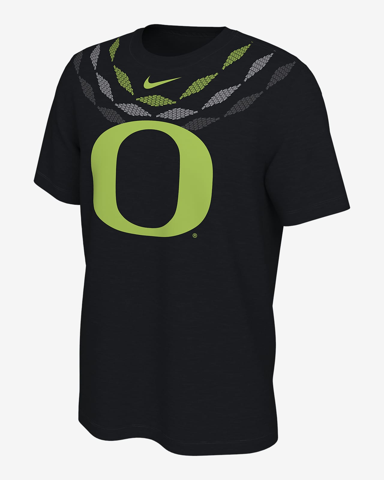
The Ducks have released their new “Ohana” collection to go along with the new black and neon green alternate uniform that will be unveiled later this week:
I would not be surprised if the jerseys end up having a similar shoulder design to this shirt:
As I said before, “Ohana” means family in Hawaiian and Samoan. This collection and upcoming alternate uniform seem to be a tribute to the strong Polynesian history and influence in the program, from legends of the program like Haloti Ngata, Marcus Mariota, and Penei Sewell, to current Polynesian players and current Associate Head Coach Joe Salave’a (the one modeling the retail products). The neon green isn’t my favorite, but I’m excited to see what the uniform ends up looking like. I hope to either see the shoulder design from that shirt and/or the pattern that’s featured in the other retail products.
-
1
-
-
35 minutes ago, j'villejags said:
I've loved their uniforms but they officially jumped the shark for me in 2015. In the past, mixing and matching with so many of their looks tied the colors and finishes all together. With the black jersey for example -- the black, silver, and yellow allowed you to wear a black helmet, yellow helmet, gray helmet, chrome helmet, or even the carbon helmet with that jersey. You could also wear black pants, yellow pants, or gray pants with that jersey. It gave them legitimate options for mixing and matching without looking like they are slapping random pieces together (M&MFM&MS
 ) or needing to go straight monochrome every week. Each combination looked intentional and I think that separated them from most the pretenders who have tried to emulate them since.
Their look now is good in its own way, as it was probably time to tone down how busy their previous sets were. While I think Oregon should still be mixing and matching, I don't think all of the new combinations work being mixed and matched all that much due to the simplicity of colors used. Here, the green is the only color on the jersey, but is not visible anywhere else. Yellow is prominent on the helmet and pants, but not on the jersey. Silver is featured on the helmet but is not used elsewhere on any of their uniforms.
Why even have a helmet with silver wings in this set when silver/gray is no longer used on their jerseys or pants? The wings on the yellow lid should be nightmare green and only worn with the nightmare green, yellow, and those alternate white jerseys. Nightmare green wings (and maybe a matching facemask) would've looked so much better here.
I know chrome has been overplayed but I miss the flash of chrome from Oregon. But even when they wear chrome lids now, it doesn't really match any of the combinations due to the lack of gray/silver on all of the uniforms. The helmet worn against Washington is probably my favorite helmet of theirs currently but they don't really have a set to properly wear with it. Wearing it with either white set is their best bet. The Rose Bowl lid almost works with the nightmare green wings but it still looks a bit out of place to me against the dull shade of green. (Nothing flashy about their nightmare green set.)
When they piece the uniform together as intended below, it looks great for the most part. The extent of their mixing and matching should be to find their best kelly sets, their best nightmare sets, their best yellow sets, etc. and roll with it.
The yellow helmets need to be able to be worn with the apple green jerseys since yellow/apple green/yellow is their best overall combo and is their “traditional” look, so nightmare green wings and face masks really wouldn’t work there. Same thing as if they made the wings on the yellow helmets apple green, then the yellow helmets couldn’t be worn with the nightmare green. That’s why I think the silver wings were the best choice because they’re a neutral color and still allow the yellow helmets to be worn with either shade of green, as well as both white jerseys. I do think adding a small touch of silver to both green jerseys (perhaps as a number outline and/or the swoosh) would be a good way to better tie in the yellow helmets, though. As for the example of the yellow/white/yellow combo that they wore last year, I actually thought that was maybe the best combo they wore last year, or at least right up there with the yellow/nightmare/yellow. The yellow helmets had apple green decals with that combo, and personally I think that’s all that was needed to tie the look together. A yellow outline around the numbers would make that specific combo a bit more cohesive, but I don’t think that’s really a necessity with this current set. Moving forward I would like them to take their current set and just expand upon what they already have. Frankly I don’t think I’d change any of their helmets, or at least not the yellow, apple green, or nightmare green helmets. I would be in favor of adding a wing pattern back to the shoulders of all of the jerseys, preferably in a tonal application like on the 2015 RB jerseys (and I’d be fine with silver wings on one or both of the white jerseys). I’d add contrasting number outlines as well. Silver outlines on the numbers of both green jerseys as well as the numbers of the yellow jerseys, and yellow outlines on the numbers of both white jerseys (or at least the one with apple green accents - I’d be okay with silver number outlines on the one with the dark green accents and iridescent numbers). I really think that’s all that’s needed to make the perfect Oregon set, taking inspiration from what they have now as well as their most successful looks from the Mariota era.
-
2
-
-
The Ducks will be in apple green/white/white at Wazzu:
This is the same combo that they wore at ASU last season (which was a loss), with the only difference being the new cleats and the lack of the CFB150 patch. I was hoping for apple/white/apple with yellow helmet decals, but this is still a really sharp and crisp combo and should contrast nicely with WSU’s all-crimson. I would’ve liked to have seen green tights and socks to better balance the look from head to toe, but there’s still a small chance that they could end up doing that.
-
1
-
-
Just as they did in every road game last year, the Beavers will be in black/cream/cream at UW:
-
1
-
-
Arizona going white/navy/white (not the throwbacks, though) with red facemasks and gloves against USC:
-
1
-
-
23 minutes ago, dannykraft said:
My main problem with Oregon is that since 2015, maybe 16 they really just haven't looked that good. Oregon is the one team I love changing every week since that's their thing but these uniforms now just look so uninspired and they're repeating combos regularly now. It just feels half-a** now.
2016 was definitely a rough year in terms of uniforms (and in terms of the play on the field) because it was just all over the place with a bunch of one-offs and a lack of a consistent design direction. 2017 was better, but still sort of a mishmash of different pieces. Although the 2018 set had its issues (numbers that were too large and an insistence on mono combos), that really was the start of the Ducks getting back on track. Last year’s set fixed the issues of the 2018 set, and was essentially getting back to the basics, while also retaining some flashy elements like the winged helmets and the unique number treatment. I suspect the next set will be a bit flashier and more experimental, but the current set was/is a necessary retreat back to something simpler and more cohesive IMO. Last year they actually wore 12 different combos in 14 games, and they were all what I would describe as “good” combos (some better than others, but all good). Last year they essentially rebuilt their uniform foundation, with tasteful mixing and matching and a set that was fairly simple and cohesive. It may not be everyone’s cup of tea, but I can tell you that for most Ducks fans we are pretty satisfied with the current direction, with the hope that they’ll build on the current set and get back to something that’s not as barebones but that is still cohesive and unified. Just for fun, here’s a chart showing all the combos worn last season:
Now I will say I absolutely agree with @oldschoolvikings that they need to focus more on the apple green and yellow, and wear the dark green or black sparingly in comparison. I don’t agree that they should get rid of those colors altogether, though.
-
1
-
-
11 minutes ago, dannykraft said:
Win a natty then you can talk
") Go bucks
Go bucks
I mean yeah, I don’t necessarily disagree, but that really has nothing to do with my response to @FSUViking. Anyways, see you guys in Columbus next fall (hopefully). Disappointed we couldn’t play you guys this year.
-
2
-
-
@FSUViking Someone’s still a little butthurt from that 2015 beat down it seems, lol.
Anyways, that’s all I’m gonna say on the matter.
Back on topic, Wazzu will be going all-crimson against the Ducks on Saturday:We could have a pretty Christmasy-looking matchup if the Ducks go with apple green helmets and/or pants with the apple green-accented white jerseys.
-
8
-
-
Colorado going with the classic gold/white/black at Stanford:
-
1
-
-
Flashing back to Saturday, I thought the Ducks looked really sharp in their yellow helmets and dark green jerseys and pants. Like I said when the combo was released, it wasn’t as good as the yellow/nightmare/yellow combo that they wore against Cal last year, but it was still a really nice look, especially with the players wearing yellow gloves and accessories to complement the helmets. I would’ve liked to have seen yellow socks and tights as well to better balance the look from head to toe, but overall I thought it was a successful combo to open the season with.
Looking ahead to this Saturday’s primetime matchup at Wazzu, several players are breaking in the new apple green cleats in practice this week, meaning that the team will be in the apple green-accented white jerseys. If I had to venture a guess, I’d say we’ll see a repeat of either of these combos from last year:
Between those two I’d say the green/white/green seems more likely, and they could always wear green gloves and have yellow decals on the helmets to make it a bit different from last year. Of course there’s always a possibility that there’ll be something new (like a new helmet) or that they’ll go with something other than these two combos, but at the very least I think it’s safe to say that we can expect to see the white jerseys with the apple green accents.
-
1
-
-
After having their season opener against Arizona cancelled, Utah will be on the road at UCLA this week and will be in black/white/black:
-
I’ve mentioned a couple times lately that the Ducks will likely have a new black/neon green alternate uniform this year, as one of this season’s cleat colorways is black/neon green. Now there is a new product available on Nike.com with that same color scheme, likely the coaches polo that will go along with the new alternate uniform:
“Ohana” appears on the back of the shirt and also on the small tag on the left sleeve. It means family in Hawaiian, Samoan, etc. The Ducks have a pretty extensive history with Polynesian players in the program, namely Haloti Ngata, Penei Sewell, and most famously Marcus Mariota. That is the likely inspiration here, so it’ll be interesting to see how it’s incorporated into the uniform. Chances are “Ohana” will appear somewhere on the uniform, even if just on the inside collar. There also appears to be some sort of pattern inside the ‘O’ on the small tag on the left sleeve of the polo, so that could be another feature. Expect the uniform to be worn against UCLA on Friday the 20th, with the unveiling coming earlier that week.
-
5 minutes ago, colinturner95 said:
It feels like a good attempt with the nightmare green, but I don't think it works. Go with apple green as the primary shade of green and just go to black as an alternate.
I would choose the nightmare green over black any day of the week, and I think most other Ducks fans would likely agree. They certainly don’t need both, which it seems like they might this year if they really do have a new black alternate in the works. Going forward they should definitely choose one and stick with it, but my vote would be for the nightmare green. I’d be fine with black, though, again just as long as they pick one. The apple green is and should continue to be the primary shade of green, and should be worn more frequently than it has been the last couple seasons.
-
1
-


/cdn.vox-cdn.com/uploads/chorus_image/image/3876147/156910389.0.jpg)


College Football 2020
in Sports Logo News
Posted
It’s worked pretty damn well in basketball: