


Victormrey
-
Posts
1,109 -
Joined
-
Last visited
-
Days Won
4
Posts posted by Victormrey
-
-
Your new presentation style definitely gives a more professional look to your designs, well done for that and for the solid sets you're pulling off!
I'd love to see the Red Sox's main designs with the old-school stirrups

-
 3
3
-
-
Nice start!
The D'Backs set looks really solid, I think this is the colourway they should go for. I like the retro-modern approach you've used for the Cooperstown Collection, I think the idea is more interesting than what Nike planned.
I can't wait to see the 29 remaining designs!
-
3
-
-
-
8 hours ago, PascalHugo said:

None of the 2...
The solution is in another blank point on the map, to the west ...
Le Mans?
-
2 hours ago, Pharos04 said:
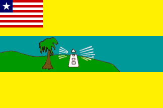
I had an edit to my post that I accidentally deleted but I want to expand upon it and I think it was briefly mentioned but can we discuss Liberia's County flags please. it's like MSPaint overload here
Even in MS Paint people can do better designs!
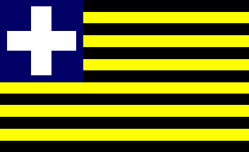
I just don't know the reason why they look so bad. What amazes me the most is that Maryland, the 2nd flag on the bottom, was an independent state from 1830 to 1857, and of course, they had their own flag.
They went from this... To this
-
I don't comment very often, but man, your concepts are stunning and very realistic. Keep up the good work!
For the Avant Lyonnais, could I suggest (as a Renault owner) trying the Renault Sport yellow for the third kit?
-
On 2017-4-30 at 5:54 PM, KRZYBDGRZ said:
One of the most poorly executed flags c'mon Yugoslavia!

Still better than the flag used by the GRAPO (a former terrorist organization from Spain):

-
For those soccer fans, I've made in Paint the three main templates Adidas will be using:


-
1
-
-
Nice to see a thread like this!
Some of my fav flags (in no particular order):
St. Lucia

Spanish Empire / Burgundy Cross

Ohio

New Mexico:

Phoenix, AZ

-
As requested by @KittSmith_95 (in other thread) I'm uploading here the base of the soccer template I use for my designs. I hope it's useful!


-
Hi! First of all, hello to everybody. This is my very first post.
As a Paint user, I decided to upload the adidas 2016 soccer template I use for my designs.
Hope it helps.

-
1
-


MLB x NIKE, TAKE II
in Concepts
Posted
I think the Tigers have one of those timeless looks, but I absolutely dig the double piping and the use of orange. Great work for the Astros as well!