

AnPheitseog
-
Posts
4,301 -
Joined
-
Last visited
-
Days Won
1
Posts posted by AnPheitseog
-
-
I really like the black script. I am also a fan of the front number being a different color than number on the back like the Dodgers. But I prefer the cartoon bird. It's just really original and has been the O's logo for all 3 of their World Series wins. But the realistic bird wasn't bad at all.
I honestly prefer the Orange script, but would love to see that come back as an alt jersey, with or without the realistic bird cap, preferably with.
I just dunno where it would fit into the jersey rotation though.
-
This hat doesn't get enough love when it comes to the Best Hat in the MLB discussion
I'm not sure I'd go as far as to say it's the best, but it deserves to be in the conversation. And I can't emphasize enough how much better it looks compared to the alternate hat with the white outline around the logo

only pirates hat i will ever own, because that is the only hat needed.
then again, potentially imight go for the sunday hat, but never that alt crap outline
-
I really dislike paneled caps, like the Orioles home cap. I've never really liked any of them, be it the Orioles, Blue Jays, Padres, Expos, whomever. It just kind of has an amateur or little-league look to it. In every case, I feel the teams' solid caps always look better.
I agree... usually. I did buy a white-paneled New Hampshire Primaries cap last year.
honestly, and this could be my O's bias.
I really, really like the Orioles home white paneled caps. But all the other teams that have tried, failed. And should be just for the O's, no one else.
-
Not bad....still wish they went with Morgantown as an identifier rather than West Virginia, since the name West Viriginia is used in the Sally League.
The incorporation of blue and gold of WVU with the primary black is nice.
Not to mention, said team is also with the pirates, making two pirates MiLB teams hav eht name West Virginia
That said, I really like these jerseys.
-
 1
1
-
-
For maximum hilarity, I'm hoping the Texas teams play the full schedule, so that standings in the other three divisions will be normal, but in the Special Snowflake Division, standings will be determined by points percentage. Most likely, though, it'll be 68 games for the Stars and Rampage, too, and the playoffs will be top 4 in each division, no crossovers.
and in terms of saving money on travel, thisll be the best bet as well.
-
AHL alignment is set for next year:
East
Atlantic: Bridgeport, Hartford, Hershey, Lehigh Valley, Portland Pirates, Providence, Springfield, W-B/S
North: Albany, Binghamton, Rochester, St. John’s, Syracuse, Toronto, Utica
West
Central: Charlotte, Chicago, Grand Rapids, Iowa, Lake Erie, Manitoba, Milwaukee, Rockford
Pacific: Bakersfield, Ontario, San Antonio, San Diego, San Jose, Stockton, Texas
Do the two teams in Texas get the special snowflake schedule, or do they have to play full slates like everyone else?
I honestly think everyone is going to play the same number of games with this alignment.
6*10 games=60
and have the Pacific teams play 4 against 4 teams, making them to 76(which i think is the AHL schedule).
-
I like how some NHL teams have and had in the past home and road uniforms that don't match. Apparantly I'm one of the few.
They add more character to the team.
That's why they have Alternate uniforms.
And?
The early 2000s Ottawa Senators distinctly stand out to me because half the time they wore the 3D logo and half the time they wore the 2D logo. The Habs are another great example because their uniforms are so historic.
The mismatched look worked for the Senators. That set was a million times better than what they wear now.
I have to disagree. I HATED their 3D logo jerseys, and the current number/letter font is also a lot better. Just my opinion, but while I really liked the original Sens jerseys, I have never understood the love for their 3D black alternate or red home from that era. Also, aside from it being a template jersey, I don't understand the hatred for their current set.
I honestly love that black alt, and the red jersey as well.
I just think, especially in the case of the black jersey, that the 2d logo would have made it a lot, lot better
also, anything is better than the current crap
-
For me, the Bucs ares like the Sabres now old thirds
A lot of great, great ideas that look terrible when put together
-
Habs don't have lace collars now, and having one of the most classic looks in the league
I honestly like the laces, but do think that they are becoming overused, honestly.
Another original six team who doesn't use them currently.

I'm very traditional-minded about most things. But I just think they're overused these days.
Haven't used them since the mid-60s....
They are not being overused.
Still, they are considered classic uniforms(point a)
Also, of the 30 teams in the LNH/NHL
14 Teams use laces on their home/away jerseys
5 more use them for the third jersey, bringing the total to 18
The 11 teams that do not have a lace jersey?
Chicago(Original 6)
Detroit(Original 6)
Edmonton(Canadian)
Florida
Los Angeles
Montréal(Canadian, Original 6)
Nashville
New Jersey
Pittsburgh(First Expansion)
Vancouver(Canadian)
Washington(First Expansion)
-
Habs don't have lace collars now, and having one of the most classic looks in the league
I honestly like the laces, but do think that they are becoming overused, honestly.
-
We don't need the all black uniform with the Capitol Building logo on the front, no thanks. (And ps, I'd wear the white jerseys at home)
Why not?

I love this look too.
I actually really like the Capitals' Edge jerseys as well. Modern uniforms done right.
I much prefer this to the eagle, but wouldnt mind them returning to their 2000-2007 set
(from nhluniforms.com)
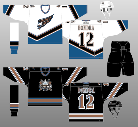
blah blah blah two different logos jersey designs it looks good together
-
I like the wavy numbers, Honestly.
-
Just out of curiosity, which would you rather have; AHL or OHL? I don't recall ever hearing your take on the situation.
I can't really say until I've experienced the OHL. I've always felt that OHL will be better supported in Hamilton, because ultimately, it is still Leafs country. Having the Habs' affiliate here made it hard to draw Leafs fans to support the team, and having an affiliation at all made it hard to really adopt the team as Hamilton's.
However, in speaking with fans, they seem to be disappointed that they're disappointed that pro hockey is leaving. As much as it was not supported, it was awesome to see guys like Dan Cleary, Ty Conklin, Jason Chimera, Francois Beauchemin, Jaroslav Halak, Carey Price, P.K. Subban, Max Pacioretty, David Desharnais, Dustin Tokarski, and Devan Dubnyk before they became household names in the NHL. The professionalism of it will be missed, but new opportunities will be embraced.
Check back with me after next season to see which one I prefer.
Im a marlies fan, but im really gonna miss the bulldogs
-
I like these:
It's a downgrade from what they had pre-edge and nowhere near as good as they have now, but I liked the idea of an NHL team trying the collegiate route with their jerseys. Of course, they screwed up the home jersey when the Edge system first came out with too much black and not enough green, so that kinda made that set D.O.A. even with the alternate/eventual away to try and save things a bit.
If you added something to the set, i could live with the wordmark
Ie, thicker waist stripes, or a shoulder yoke or just something
-
This opinion is SERIOUSLY unpopular I know:
I loved the NFL's Reebok Jerseys. I don't know if it was the nylon fabric that the used to make them, or if it was the stretchy collar that had an NFL EQUIPMENT symbol on the front of it. Of course you cant forget that blue tag on the bottom of the jersey that had Reebok and then "Name" and "#". Even though you had to wear some kind of undershirt in cooler weather because of all the ventilation holes, I still think that they are much better than the new style of jerseys. (the ones made by Nike)
that's unpopular?
I 100% agree, besides the fact i always wear something underneath when i wear a jersey.
-
You wonder if this is unpopular? Anything blue and orange is miles ahead of that black crap they used to wear...I dont know if this is unpopular but
this
is waaaaaaaaaaaaaaaaaaaaaayyyyyyyyyyyyy better than this, even if it was BFBS
the grey/silver script looks terrible, and makes the entire think look horrid.
still think their grey/white/now gone cream/sky white looks best though
What is sky white?
I think he is referring to the snow whites:
Oops, my mistake. I was referring to these jerseys.
And (to the general thread) make the script orange, and the current blue alt is better than BFBS jersey.
wouldnt mind(if alts have to be had) seeing the BFBS script on an orange jersey
also would look good on grey.
-
You wonder if this is unpopular? Anything blue and orange is miles ahead of that black crap they used to wear...I dont know if this is unpopular but
this

is waaaaaaaaaaaaaaaaaaaaaayyyyyyyyyyyyy better than this, even if it was BFBS

the grey/silver script looks terrible, and makes the entire think look horrid.
still think their grey/white/now gone cream/sky white looks best though
-
I dont know if this is unpopular but
this
is waaaaaaaaaaaaaaaaaaaaaayyyyyyyyyyyyy better than this, even if it was BFBS
-
I like properly worn stirrups, but nothing else. And by proper, i mean so that you can barely see the sanitary.
-
The Tacoma Rainiers, Seattle Mariners triple-A affiliate, have made an (unexpected?) uniform change.
The full rundown here: http://www.milb.com/content/page.jsp?ymd=20150306&content_id=111556470&fext=.jsp&sid=t529&vkey=
Solid choice to go with the "R," it's been an iconic mark for quite sometime, despite it being pretty much limited to the "Rainiers" wordmark for most of the past.
The red alternate top is gorgeous, the road jersey is meh, and the BP hat is a head-scratcher. I like the idea there, but hate how big and awkward it looks in the picture of the hat itself in the team store online.
Edit: And what's this with two different number fonts?

With the whole blue/red regular/alt unis they seem more like a Rangers minor league team than a Mariners team.
Best thing for them to do is look like a Rainiers team, rather than anything else.
-
Too many teams have Red as their primary colors.
Agreed. Though I give TFC a pass for multiple reasons...
- Raptors are the only other Toronto club featuring red & that may change soon,
- TFC's unofficial nickname are Reds, the unis are very popular with Liverpool-ManU-Arsenal among others of which many TFC fans are supporters of; it makes the team feel official,
- Canada, we can get away with it better for Canadian branding.
Also the red on the city flag, not to mention the provincial flag.
-
Not sure if unpopular, but I prefer NOB for basketball and hockey and us football to be below the number, but prefer none/on top for baseball.
-
Im becoming okay with the idea of sleeved basketball jerseys, especially if they're done right and tastefully, and yes those can exist.
-
(grumble grumble i prefer that the jammed would have stayed)
It is a really nice logo, for a team that shouldn't exist.


Minor League Hockey Shake-up...coming
in Sports In General
Posted
I'm getting seriously annoyed by the ahl. Might just go watch the CHL and Nhl exclusively.