

AnPheitseog
-
Posts
4,301 -
Joined
-
Last visited
-
Days Won
1
Posts posted by AnPheitseog
-
-
1 hour ago, Ferdinand Cesarano said:
Maybe a stupid question: how do I see my private messages in the mobile interface?
Three bars, and then the letter icon.
-
I'll be honest. I click on the ads at the top sometimes, depending if i like it. Example, the kitbag ad i just clicked on. The ones on bottom, i don't even look at.
-
2 minutes ago, insert name said:
I've said this before but I still believe the Mets were the only team to make black work.
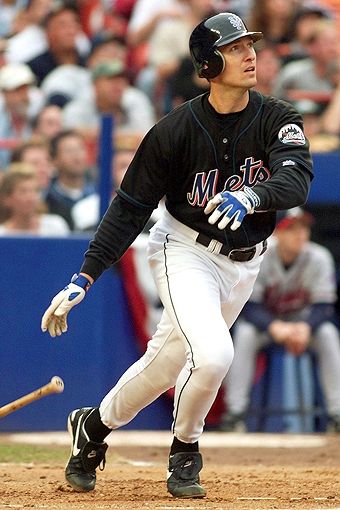
Also, I don't know if it's because people didn't like it or MLB teams just don't wanna wear them anymore but some teams need to bring back vest uniforms because they looked good.


Especially the Pirates.

Pirates need to do it asap.
-
 1
1
-
-
40 minutes ago, lopernv said:
Can we not report posts anymore? There are some spam topics in the GD section.
At least in phone, there is a flag that you can select.
-
As much as I hate it, I don't see much point in complaining anymore. The only thing that'll happen is all to 68, and then the snowflakes will want 54
-
Pretty sure that it has been stated, but it annoys/confuses me that I keep thinking a members + rating is their post count.
-
5 hours ago, Chewbacca said:
With this new update, I went to quickly edit a post I made to add something and it asked me to give a reason for editing. Mind if I ask why a reason is now required? I would appreciate it if a mod or two explained that.
It isn't required, just an option. Reasons in general let people know what happened, I.e. if you forgot to put a link in.
-
2 hours ago, Gothamite said:
That is
 ed up.
I'm an extremely casual fan of one of those less-valued AHL fans, and I'm outraged. I can only wonder what people who actually actively follow a team think.
My two teams are in the Eastern conference now, so doesn't matter as much. If they were still in the West, if be furious. Wouldn't be as bad if they were contained in one division, but they aren't.
-
I will wait until everything is done, but i logged in for the first time on my computer and blech
-
Ill wait, but I dunno if it is my comfort or bad but ill get used to it
-
After a full season, I think the browns have a good uniform set, given proper combinations.
The only change stopping it from being great is the browns pant stripe, and would be one of the best if the Cleveland was shrunk.
-
1
-
-
Maryland gets a pass, considering how much the state as a whole uses it in sports. Not to mention a fantastic flag.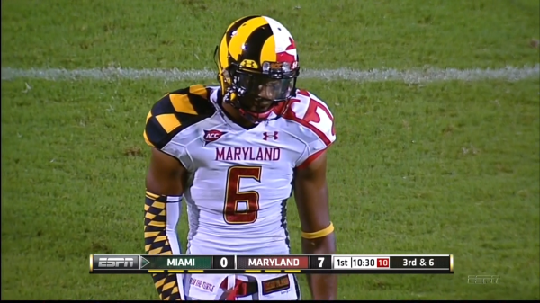
Love both of these, the Maryland one may be my favorite College Alternate of all time.
Never, ever dress like a flag.
I like the idea behind Maryland's flag uniforms, but the asymmetry kills it. Put the yellow/black shoulders on the same side as the red/white half of the helmet and vice versa and it looks about 10x better. Put red/white and yellow/black--together on the helmet and shoulders--on both sides, and it looks about 100x better.
As for the Eagles throwbacks? They're not bad for a one-off uniform each season.
I 100% agree with this. It also has the benefit, you know, is more closely looking like the flag it is aiming to resemble.
-
Maryland gets a pass, considering how much the state as a whole uses it in sports. Not to mention a fantastic flag.Love both of these, the Maryland one may be my favorite College Alternate of all time.
Never, ever dress like a flag.
-
1
-
-
Thinking about the Chiefs rebrand again, and how many teams have red or blue in their colour scheme(or both).
Every team has red or blue, besides the Knights.
-
Fifa 16 has Marseille numbers blue and white, instead or blue and gold
Also the keeper jerseys have the roundel logo, rather than the normal one.
Those bastards how could they!?
This thread is entitled "
Inaccurate colors/uniforms in video games that should know better"In keeping with this spirit, I posted an "inaccurate colors:uniforms"(OM numbers, goalkeeper logo) which is "in video games that should know better"(FIFA 16) so your aggressive attitude is quite surprising and unwelcome.
-
Fifa 16 has Marseille numbers blue and white, instead or blue and gold
Also the keeper jerseys have the roundel logo, rather than the normal one.
-
I loved their old colours, honestly.
Not a fan of red white and blue for them, especially since now Buffalo, Rochester, and Syracuse all have red. And rwb for the Bisons and Chiefs.
-
THIS is the best uni in Sharks history imo:
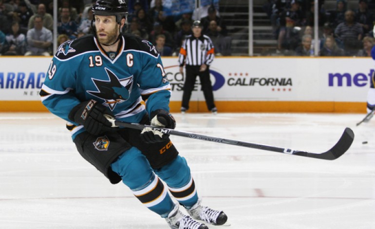
I agree. I'll never understand why people hate the use of orange in the Sharks' color scheme so much. I think it looked great on these uniforms.
take off the front numbers and I agree 100%
Keep them, and im very likely convinced
-
I have no problem with teams wearing alternate uniforms in the playoffs.
I hope the Wild never stop...
in which case i still hold that the wild should make them the primary jersey.
not opposed to that idea, by the way.
-
I like the Calgary Flames' current branding.
Even the flags?
even though i konw it is bad aesthetically, the flags are my personal favourite part and a guilty pleasure. looking for an a-flames one just for the NYS and USA flags
-
They've definitely had more than one terrible jersey. Their first edge-set road sweater was AWFUL. And so was the mustard yellow sweater...
In my opinion, the Predators have only had one terrible jerseys, and the rest have been good, with an almost fantastic current set. I just wish there was a blue third, and the white piping and yellow/blue things by it disappeared.The problem is that the whole idea of the Perds embracing yellow is that it's become their whole rallying point: they're The Yellow Team. If they were to wear it on the road, that'd be great, but it would have to be their home uniform as well. That would be interesting for one team to have only one uniform. Maybe wear the yellow helmets on the road so as not to clash with dark helmets (but not Dark Helmet) and wear the blue helmets at home against the visiting team's white.
I know some Preds fans wouldn't mind that. From a marketing standpoint, though, I doubt the team would ever go to a single sweater for both home and away.
Yep. Wear gold on the road in place of white, and wear navy at home. I know it diminishes the team's ownership of yellow/gold, but big picture? The Preds would still have a very unique set, and the yellow would still be a huge part of that.You're thinking yellow-vs-color matchups, Cap? I'm so there.
It would detract from Nashville's gold identity, but a some of the fans wouldn't mind it too much if they made navy the home color (assuming a strong presence of gold as a secondary on the home). Marketing it right would be crucial by the team, though. Some sort of "We're taking Gold on the road" campaign.
The whole set was a train wreck from day 1... The yellow helmets just add the bold and underline.
Now that I've seen more of them, I'd rather wear the navy helmets at home and gold on the road. I strongly disagree that the set is a trainwreck, though. The previous set, now that was an unfocused 90's remnant nightmare.
The mustard alt is the one i was referring to with the terrible. the edge set was bad, yes, nit not awful. also not as bad at the leafs post edge set, or the pens, or the sens, or tampa, or a couple others.
-
The problem is that the whole idea of the Perds embracing yellow is that it's become their whole rallying point: they're The Yellow Team. If they were to wear it on the road, that'd be great, but it would have to be their home uniform as well. That would be interesting for one team to have only one uniform. Maybe wear the yellow helmets on the road so as not to clash with dark helmets (but not Dark Helmet) and wear the blue helmets at home against the visiting team's white.
I know some Preds fans wouldn't mind that. From a marketing standpoint, though, I doubt the team would ever go to a single sweater for both home and away.
You're thinking yellow-vs-color matchups, Cap? I'm so there.
Yep. Wear gold on the road in place of white, and wear navy at home. I know it diminishes the team's ownership of yellow/gold, but big picture? The Preds would still have a very unique set, and the yellow would still be a huge part of that.
It would detract from Nashville's gold identity, but a some of the fans wouldn't mind it too much if they made navy the home color (assuming a strong presence of gold as a secondary on the home). Marketing it right would be crucial by the team, though. Some sort of "We're taking Gold on the road" campaign.
The whole set was a train wreck from day 1... The yellow helmets just add the bold and underline.
Now that I've seen more of them, I'd rather wear the navy helmets at home and gold on the road. I strongly disagree that the set is a trainwreck, though. The previous set, now that was an unfocused 90's remnant nightmare.
In my opinion, the Predators have only had one terrible jerseys, and the rest have been good, with an almost fantastic current set. I just wish there was a blue third, and the white piping and yellow/blue things by it disappeared.
-
Including myself. I love my Bisons, I love my Marlies, I love my Keys, and not because they are the minor league affiliate of a team i care about. I want my major teams affilates to do well, but not at the expense of my teams.Neulion did a pretty decent job with USL-1 back in the day, so it might well be quality.
Believe it or not, some people actually enjoy minor-league sports, especially if they don't live directly in a major-league market.
EDIT: my point was, that the price that Neulion charges is insane, not that their service is bad and is something i would like to have, but not at that price
Right there with you. I'm pulling for the local AHL Gulls all the way even though I'm a Sharks fan. Once the players move up, well then they're just Ducks, whom are the enemy.
I get what you're saying, but it still seems awkward to cheer for your hated rival's prospects. Most Gulls fans will probably root for the Ducks too. The Gulls even wear the Ducks logo on their shoulders.
The thing is, you arent cheering for Ducks prospects(in this example), you are cheering for your hometown team, the San Diego Gulls(who just happen to be affilated with the Ducks)
-
1
-
-
Don't know how unpopular this is, but I really like the San Diego Chargers number font
I'll take it a step farther, I like their uniforms.
the only parts that annoy me: I prefer powder blue as primary, wish they had a helmet stripe, and a different coloured collar. Besides that, really good and even with it.

 ed up.
Minor League Hockey Shake-up...coming
in Sports In General
Posted
Royal Farms Arena sits 11k, about the same, if not bigger, than some AHL arenas.