

AnPheitseog
-
Posts
4,301 -
Joined
-
Last visited
-
Days Won
1
Posts posted by AnPheitseog
-
-
2 hours ago, smzimbabwe said:
I said there were exceptions, people just getting into the sport were one of them. People who switch to their local team because it's local are disloyal to their original team, and I don't like that. When MLS was founded, I became a New England Revolution fan for a myriad of reasons. When Seattle got a team, I stayed with the Revolution, I showed no disloyalty or change of heart. My friend was a Chicago Blackhawks fan, when Anaheim got a team, he chose to root for them, even over Chicago, because his mom and some family lived there. I questioned this and we had several arguments about this.
So rather, you'd have people be disloyal to their hometown?
City loyalties should always reign supreme to team.
Whatever non Buffalo teams I follow go away as soon as Buffalo gets a team. So raptors? I'll stop cheering for them as soon as buffalo gets a team, because city ties are more important than teams. Same with baseball.
-
 1
1
-
-
40 minutes ago, Cosmic said:
For around the last week, I can't read notifications or (as I just found out) sign in on Chrome for Android. Three different devices are having the same problem, on wi-fi and mobile data. They're all up-to-date AFAIK. When I click on the three lines in the upper right corner, the screen dims like it normally does, but nothing ever pops up. I can use the other buttons at the top; it's just the important one that's the problem.
Anyone else?
you have to swipe left from the right edge of your screen, and that'll all show up.
I HATE it, and consider it a bad feature but it's all there.
-
4
-
-
25 minutes ago, jlnhlfan said:
He's the team's mascot!
he's the Expos mascot, who was adopted by the habs when the expos left.
-
3 hours ago, panthers_2012 said:
I'm warming up to this new format but the one think I don't like is on the mobile version, you lose how many post each member has.
which is, at least to me, more important information that total likes.
-
1
-
-
On 07/08/2017 at 2:31 PM, Cardsblues02 said:
My unpopular opinion is that the Kansas City Royals having black caps and uniforms in the mid 2000s was good. The uniforms may not have been the best things ever, but of all the black craze in the in the 90s and 2000s, they were certainly some of the best of the black uniforms used by MLB teams.
Much better than the other teams take on black (As, Rangers, Mets, Reds)
Weird, because I adore the Mets black. Absolute favourite cap, and just looks fantastic to me.
-
I wish there was more blue like before.
-
1
-
-
2 hours ago, DG_Now said:
Really? If you don't mind me asking, where you a teenager or older in the 90s?
Because if you were a 10-year-old buying baseball cards in 1991, there really was no bigger baseball star than Ken Griffey Jr. And when the M's changed their logo from the block S to the nautical theme, it was like a whole new franchise joined the league.
For me, living in New York, Griffey was a transcendent star who elevated an entire franchise. The Reds, on the other hand, were Pete Rose/Paul Sabo/Eric Davis.
(I'm now aging myself)
Nope, born 92.
So I was 7-8 when he came to the Reds, which would mark the time that I really started paying attention/able to pay attention to baseball.
-
On 03/08/2017 at 10:00 AM, DG_Now said:
Yeah, but can you remember a single thing he did there?
Nine seasons! I can't believe it.
To me, when someone says his name I think of the Reds, not the Mariners.
-
The way minor league sports naming has been going, it would be preferable to have clones.
And I've said many times that I hate clones too.
-
3
-
-
On 12/07/2017 at 11:08 PM, MJWalker45 said:

 AAA All Star Game has team uniforms with International or Pacific Coast on the jerseys and team specific caps. I'd almost prefer they copy the majors instead.
This is recent. At least, the AAA game in 2012 had teams wearing their own jerseys. Lots of alternates, but all were team jerseys. Buffalo specific Derby jerseys though.
-
Looks like Columbia wants to be like South Africa with their flag.
-
23 hours ago, OnWis97 said:
I tend to agree. They had two iterations of pinstripes broken up by the very non-traditional 1970s-1980s pullover and elastic waist trend (though the first couple of years did have gray roads and buttons). Up through a few years ago, that era seems like the anomaly.
And while I don't always associate on-field success with best choice of uniform it is worth pointing out that they wore pinstripes for all three World Series appearances and most of their existence. Non-pinstripe years top out at mediocre.
I honestly think the twins should be pinstripes home and away.
-
3
-
-
4 hours ago, Magic Dynasty said:
I like the Reds with black. It really helps with the definition, as opposed to simply red-white. I also like the drop shadows.
However, this comes with one condition: the Reds use it sparingly, like how they use it right now. The 90s/2000s look overdid on the black, and I didn't like it. Get rid of the black bill on the road cap, and their set is perfect.
I like the black bill on the road. Should I, probably not, but I do.
I like the idea of teams having a home and road hat, and other teams it being the same one for both.
-
1
-
-
Looking like this in unpopular.
I prefer the reebook era NFL jerseys(packers, and what the Falcons and panthers) just left, compared to the current ones.
-
3
-
-
52 minutes ago, SFGiants58 said:
I wish the White Sox would have one alternate uniform with the full "White Sox" name on it, preferably based on either of these uniforms (1942, 1987-90):


Putting either one of those uniforms in the black/grey/white color scheme would be fantastic.
I'd say put the right on a black jersey, with a silver and white script.
Would be nice to see. I LOVE their homes/aways, but agree with you.
Kick their current throwback third to the curb please.
-
3
-
-
1 hour ago, insert name said:
This is the cap the Indians should be embracing. If they started using this as a primary cap, there would be zero complains.
I'd have a complaint.
Indians should have a red bill at home.
-
1
-
-
1 hour ago, Ben in LA said:
I wish the Dodgers would have a set schedule of when they'll wear their road primaries and their alternates. When I head to Dodger Stadium South this year I want to be wearing the same road uniform that's being worn on the field. Sure, the Padres have a lot of uniforms, but at least the fans know when they'll be worn.
Oh, and I prefer the Los Angeles script.
Judging by how they seem to operate, it'll be the alternate, unless it isnt.
-
I will take this chance to be thankful of a board update. There is now a choice on mobile to delete the previous draft, ending the whole issue of cant delete an old draft
-
On 27/12/2016 at 10:29 PM, Sodboy13 said:
I agree with you that the tacky, overdone Brandiosity that seems to be overtaking Minor League Baseball is, on the whole, a loss for good design and branding. Yet there are some recent examples in the affiliated minors that show a competent, unique identity that eschews the kitchen sink approach can still occur in the morass of forced wackiness. I am not 100% opposed to minor league clubs copying the parent's identity, so long as some character unique to the farm team is implemented. I think the South Bend Cubs did this very well. Going to hockey, because I'm much more familiar with its lower tiers, the old Iowa Stars of the AHL tweaked a major-league identity to the point where they were dressing better than their parent club; the current Iowa Wild are a shining example of a team that couldn't be bothered to do anything but change the location name on the logos. And slapping the Rockford IceHogs' cartoon pig on the front of a Chicago Blackhawks jersey is incongruous as all get-out.
At risk of derailing, this has to be said.
Utica Comets
St John Ice Caps
Stockton Heat
SBS Penguins
Bridgeport Sound tigers
Manitoba Moose
And others (can't recall of memory) just pop their logo on front of the jersey and call it a day.
Excusing the Toronto Marlies on this because that's their history even before the AHL, being very close to the Leafs.
-
1 hour ago, ZionEagle said:
Unpopular Opinion: I actually liked the Buffaslug.
Go ahead, you all can kill me now...
Honestly, I liked the jersey. Logo not so much, but I would have been happy with them putting some version calling it a day. Would have been, and should have been, replaced by now but wouldn't have been terrible.
-
1
-
-
5 hours ago, the admiral said:
Those were terrible, at least for Buffalo. I might not have minded the template for some expansion team, but Buffalo should look traditional. It's a traditional place.
UNPOPULAR OPINION: bring back NHL refs in neckties under v-neck sweaters!
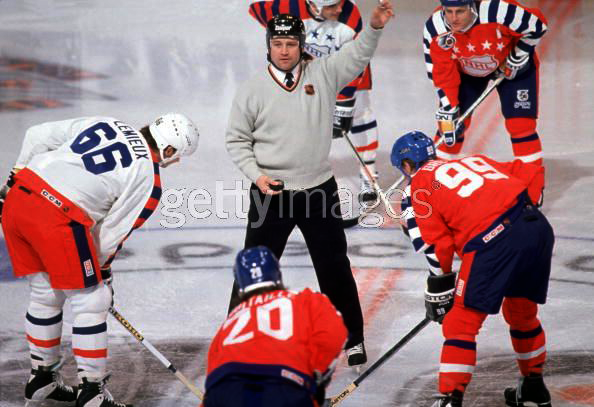
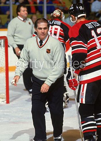
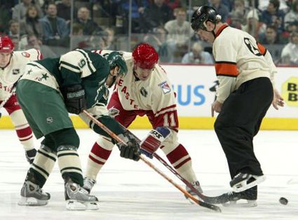
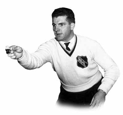
Not just because there's something humorously genteel about it, but also because it would give each of the four leagues a distinct visual identity for its officials. Football refs would have the zebra stripes, umpires would, well, look like umpires, NHL refs would have ties and v-necks, and NBA refs would have those ugly grey shirts.
I never knew they they did this, but looks fantastic and needs to return.
-
1
-
-
On 16/12/2016 at 7:13 AM, Ben in LA said:
Even though they're decals, I doubt the league would allow that.
League might not have a problem, but I'm sure the equipment managers would.
Would be a pain switching back and forth week after week, even taking into consideration back to back road/home games.
-
14 hours ago, BrianLion said:
That uniform fits the bland, wordmark helmet IMO.
However, I think the 1981 set is beautiful and much more evocative of a bengal tiger theme.


At this point, looking at the 1981 jerseys, a best case scenario would be make the shoulder caps(let's not kid ourselves, they're not sleeves) tiger pattern and the numbers on the shoulder.
Keep the rest the same and you'll have a fantastic modern Bengals jersey.
-
1
-
-
On 03/09/2016 at 1:50 AM, Griffinmarlins said:
Another garbage post I would love if the mods can delete because of the mobile system bugs.


Unpopular Opinions
in Sports Logo General Discussion
Posted
IM rooting for a team/coporation if you prefer that represents my hometown.
Im an expat Now. Lived in pittsburgh, lived in VA. Doesnt change the fact that my teams are form my city, not the one I live in but the one that's my home.
Do you have these personal ties, no.
But for those of us that do? More important than a sense of loyalty to a team is a loyalty to a city.