


DCarp1231
-
Posts
9,443 -
Joined
-
Last visited
-
Days Won
142
Posts posted by DCarp1231
-
-
Fully expecting clip art wings, desert heat gradient, and a collage of state flag art project uniforms for the Cardinals
-
 1
1
-
-
Just experienced the “default” wonky site. Everything went back to normal after a few hours
-
 1
1
-
-
19 minutes ago, Tracy Jordan said:
I'm already preparing to be disappointed by a new Cardinals uniform and then immediately feeling nostalgic for the current look. I'd rather have mediocre uniforms over whatever horrible concoction Nike has probably come up with.

One can only dream they take the Vikings approach
Going from this-
To this-
-
14
-
-
10 minutes ago, dont care said:
Because if there is one thing Arizona is known for is it’s mountains, and not one of the most identifiable flags in the country.
Sure, but it still sucks on the uniforms.
Put in on the bumper of the helmet only and call it a day.
-
2
-
 5
5
-
-
A desert mountain range on the Cardinals sleeves would be a better design choice than anything state flag related
-
2
-
2
-
-
14 minutes ago, MCM0313 said:
I’m aware of the Seahawks’ excessive sublimation; I like it on the numerals, dislike it on the uniform striping, and am kind of neutral on the helmet. If the Cardinals were to utilize sublimation, they should pick only one uniform element, and I think the numbers would be the best choice.
Sure they could do sublimation, but try a pattern that isn’t the state flag.
-
23 minutes ago, MJWalker45 said:
It's the same for all the people that want to add the Maryland flag to the Ravens. I like it for the Cardinals since they had the flags on the sleeves when they moved, but it seems forced every time I see it on the Ravens.
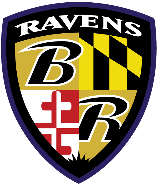
To be fair, this logo is present on the Ravens uniform-
However, most iterations of Cardinals and Ravens concepts rely way too heavily on state flags.
-
4
-
-
3 minutes ago, MCM0313 said:
I like how the Seahawks do the sublimated patterns on their numerals. I think it works much better than trying to sublimate striping. And we know, if they redesign, the Cards are gonna find a way to cram the Arizona flag in there. This is the least-obtrusive option.
The Seahawks also utilize a completely unnecessary sublimated helmet stripe
The least obtrusive option for the Cardinals is to not use the flag at all.
-
1
-
-
5 minutes ago, MCM0313 said:
TV numbers on the red jersey, cardinal head on the white jersey. Sublimate the flag pattern into the numerals only. Use a very simple and consistent striping pattern. If you’re feeling bold, substitute cream for white. Done.
Say /sarcasm right now
-
1
-
 1
1
-
 1
1
-
-
All this Ravens talk got me thinking…
This was a visually pleasing game
-
8
-
1
-
-
I would be interested in a “BOO!” reaction
-
4 minutes ago, guest23 said:
Best cards uniform that they should use as a basis for a redesign.
How exactly would they cram the numbers, cardinal, and state flag onto the sleeves? With today’s uniform trends, they’d likely only pick one of those elements.
-
6
-
-
Turns out the NFL knew about Alvin Kamara’s wrongdoings but still allowed him to play at the Pro Bowl
-
 1
1
-
-
This is 100% my favorite Cardinals redesign that I’ve seen. Using the state flag colors without being painfully obvious about using the state flag.
(fairly certain this is from someone on these boards, but I don’t know who)-
7
-
 2
2
-
5
-
-
The last thing I wanna see on a Cardinals uniform is a state flag. Find other ways to implement the colors into the uniform.
-
5
-
-
Two Notes-
Lovie Smith is in serious final talks to be hired as the HC of the Texans
Alvin Kamara was arrested for assault after today’s Pro Bowl
-
2
-
-
I’d rather teams have more facemask options than helmet options
-
8
-
1
-
-
32 minutes ago, ramsjetsthunder said:
I was doing a league rank of every uniform today and this occurred to me. Am I correct that the Patriots are the only team in the league with only 2 uni combos? (Standard home and away)*
*At least, until their Red throwbacks debut
Chiefs. Unless you count their all red look as a third combo
-
Not mine, but a coworker’s unpopular opinion-
“The Packers colors suck”
(He’s a Packers fan)
-
1
-
-
Something similar to this would be nice for the Panthers
-
9
-
-
32 minutes ago, WSU151 said:
Welp
I stand firm on my burgundy jersey statement
The player’s opinion statement… not so much
-
1
-
-
12 minutes ago, BJ Sands said:
So you’re saying this, the Raiders and the Cowboys are the worst?
Yes. The Steelers too.
Bears- Grey
Raiders- Black
Cowboys- Navy Blue
Steelers- Grey
-
2
-
-
Just now, HailGoldPants said:
I actually take solace in those being the alternates. The white alt was in the teaser video, and I was scared that that was going to be the regular away jersey.
Truthfully speaking, I’d be okay with the white alt as the regular away, but only if it was just a modern take on these-
-
4
-
-
1 minute ago, MJD7 said:
This is probably a hot take around here, but I honestly think a black alternate like this could work really well for Washington, if executed properly (which I admit is a big if). The color scheme is really works for it. Unfortunately, although I really like the burgundy numbers on the black base, it could potentially run into some legibility issues. The gold outline might help, though.
What really scares me, though, is the white jersey, seemingly restricted to burgundy & black with no gold to be seen. All I can hope for at this point is that jersey isn’t the primary away option, and is just an alternate, like that mockup has it.
If those jerseys are indeed accurate representations, I wouldn’t be surprised if there’s burgundy, white, black, and white(alt) pants. My dream scenario for pants however is burgundy, white, gold, and black or white alt pants.
-
1
-


 However, most iterations of Cardinals and Ravens concepts rely way too heavily on state flags.


2021 NFL Season - Adults Arguing About Matt Stafford
in Sports In General
Posted
Apparently to the NFL, tanking at the owner’s request is more severe than sexual harassment by the owner
https://www.cbssports.com/nfl/news/brian-flores-lawsuit-dolphins-stephen-ross-could-lose-team-if-tanking-allegations-proven-true-per-report/amp/