


DCarp1231
-
Posts
9,445 -
Joined
-
Last visited
-
Days Won
142
Posts posted by DCarp1231
-
-
Indiana is incredible work!
Might just be my favorite so far… until you get to Maryland

-
 1
1
-
-
On 4/3/2022 at 11:25 PM, Wildcomet said:
I think you ended up in a good spot for your Pittsburg redo. I'll admit the 70's style isn't my personal favorite in general and you've definitely hit that, but this is well executed and fits the franchise well.
Thank you!
Onto the next team-
This time I went way out west… into the NFC West!
San Francisco 49ers

Gone is black with a heavier emphasis on the main colors of red and gold.
I prefer the top option, but wanted to see how people felt about the bottom option as it mimics the correct 49ers jersey striping
C&C appreciated as always!
-
3
-
-
Love the melding of eras. Nicely done!
Second red helmet is my favorite
-
1 minute ago, LAWeaver said:
I did the same thing last week. The cola tasted flat, but the vanilla wasn't too bad.
Yeah, was not a huge fan of the regular Nitro. Vanilla was steps ahead.
-
1
-
-
Love the update!
Only change I’d suggest is the number font. Even replicating the throwback font onto the primary jerseys would work.
-
1
-
-
11 hours ago, jaytavo305 said:
I like the first one in an alternate 70s universe
10 hours ago, LA Fakers+ LA Snippers said:You could use the top option as a secondary to the circle in the first post. Not a fan of the last two. I see what you were trying to go for, but that effect doesn’t really work out in practice.
Thank you for the feedback!
Here’s the Primary, Secondary, and Wordmark for the Steelers-Primary- Slightly bolder “P” is the only change
Secondary- More evenly spaced steel sunrise
Wordmark- Mimics the secondary
PITTSBURGH STEELERS
This entire set developed into a very retro-70s identity for the Steelers. Which, works well in my opinion as I wanted Pittsburgh to take on a new identity that still felt classic. Overall, I’m pretty happy with the outcome!
C&C appreciated as always!
-
4
-
-
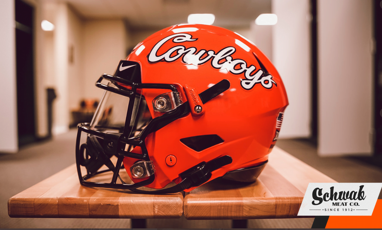
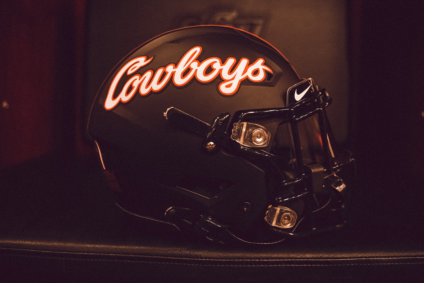
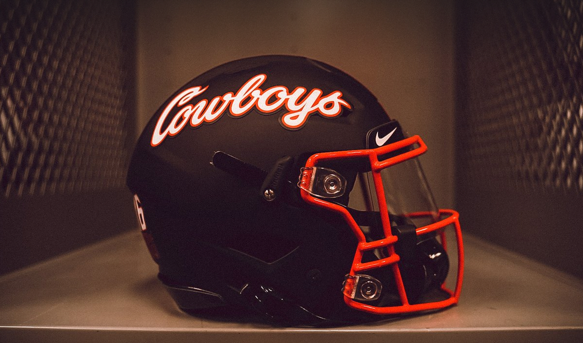
IMO, the best helmet(s) in College Football belong to Oklahoma State with their Cowboys script helmets
-
4
-
 3
3
-
-
-
Three more drastic changes to Pittsburgh-
These options omit silver in favor of emphasizing the diamond colors. Personally, my favorite is the second option
C&C appreciated as always!
-
2
-
-
Eagles uniforms would be Top 10 if they used a better font
-
2
-
-
On 3/31/2022 at 9:44 AM, LA Fakers+ LA Snippers said:
I think B is the best option here. You'd have to adjust the curvature of C for it to look like a football.
On 3/31/2022 at 11:16 AM, Wildcomet said:Of these four D would be my preferred choice. The blue and green don't work great when contacting each other in my opinion so I think generally having a yellow or white in between them works better. The thicker striping helps and I like there being a gap between the outer rings and the G. In all the others the G is right up against the edge of the circle.
With B, I would consider adding a gap between the G and the blue ring, and making the part of the G that goes in go a little further in.
My main critique on C (I appreciate you trying it) is that the G is at a different angle than your seams indicate the rest of the logo would be, so the implied perspective is a bit jarring. I think if you either kept the G level like the seams are, or adjusted the seams and the perspective to align with the angled G (this may take more effort though), it would work better.
Thank you as always for the feedback!
I’ve decided to roll with Option B with the slight adjustment of adding space between the blue and G. While it’s not the approach I was going for initially, it’s likely the best to not stray too far from the original and current logo. I also updated the wordmark. Scrapping the horrendous stencil font.
Onto the next team-
Again, one of those franchises that I’ve always felt needed a little update as I’ve never really been a fan of the identity.
Pittsburgh Steelers
First and foremost, I understand the significance of the current logo. As that may be, I still don’t like it. The team needs something new while remaining classic. The two constants throughout these options are replacing the “Steelers” with a “P” as well as removing the stars in favor of stripes. “Steel Sunrise” I’ll call it.
Option A- Retains the roundel, placing the “P” up at the top with the Steel Sunrise. Circle is white.
Options B1 & B2- Effectively the same, with B2 sporting a bolder “P”. Again, Steel Sunrise at the bottom, all enclosed in a Keystone shape.
C&C appreciated as always!
-
1
-
-
-
7 hours ago, LA Fakers+ LA Snippers said:
Option A keeps the similarity stripe-wise to the current logo. I think if you add blue, make the logo more circlular and change the stripes on it, that’s one too many changes.
4 hours ago, Wildcomet said:I like where you've landed with the Texans. It helps connect it with Houston in a better way I feel than the bull logo does.
As someone who does like the Packers logo, I think adding the dark blue could work and connect different eras of the team's history. If the goal is to get the team into a roundel style logo, I think maybe taking inspiration from the viewpoint looking at the end of a football instead of the current logo's side profile view could be a way to make it work a bit better. Putting notions of tradition aside, the things I noticed for these round G logos are that there is a pretty good amount of negative space inside of the G right now, and the G itself is looking a little plain and generic. Shaping the G in someway to hint at the end of a football may help to give the G some character like the H/T in your Texans logo have and fill the space a bit better.
Thanks for the input!
Here’s 3 more options to go along with the original (A)
B- Middle ground between the roundel and current logo shape
C- Attempt at mimicking the seams of a football as seen from a frontal view, as well as slightly rotating the “G”
D- The same as a previous option, but the striping is thicker
C&C appreciated as always!
-
1
-
-
8 minutes ago, Sec19Row53 said:
You seem to be doing change for the sake of change.
Yes, exactly. As I said on the first page, personally I’ve never been a fan of the Packers identity. Logo and all.
I’d rather Green Bay have a roundel logo. That’s all there is to it.
-
1
-
-
22 minutes ago, LA Fakers+ LA Snippers said:
Option B is sort of awkward-looking. The “B” is too blocky to fit in the circle, it looks like something on Cartoon Network. Option A is the way to go.
Yeah, the more I looked at the “GB” it reminded me of the Warner Bros logo.
Now, I’m placing Option A against a new Option B-
For the new B, I wanted to retain the new “G” and mimic the collar striping on the current uniforms
-
5 hours ago, ramsjetsthunder said:
I wouldn't mind orange in their color scheme, would separate them from the other red, white, and blue teams
4 hours ago, LA Fakers+ LA Snippers said:Having orange in the color scheme gives it not only a rustic Texas vibe (team name) but also somehow feels NASA-ish (city location). Absolutely perfect.
Exactly what I was going for! Honestly, I may come back to the design for some touch ups, but overall I’m satisfied with the outcome.
Now for the next team.
Coming in at 103 years young, a lot of history behind the franchise and aiming to take on a fresh new look-
The…
Green Bay Packers
Truth be told, I’ve never been a fan of the Packers’ current identity.
For this new look, I wanted the logo to utilize the three base colors from team’s history. Dark Green, Dark Blue, and Yellow.
Next, I created two different logos. That’s where I need help figuring out if either of these are the right choice or if I should go back to the drawing board
C&C appreciated as always!
-
Big win for the Nationals. Love the uniform
-
On 3/27/2022 at 11:24 AM, LA Fakers+ LA Snippers said:
The shortened version is the way to go! It both gives off space capsule/rocket vibes, but you can clearly see the H and T representing the team. You probably need to drop he silver, beacuse, as you said, that creeps into Pats territory.
I feel pretty good about the Texans now.
I think this morphed into more of a new primary logo as time has gone on-
-
2
-
 1
1
-
-
10 hours ago, LA Fakers+ LA Snippers said:
The gradients look pretty good. I think the best is the navy one that uses the orange tail, as red just blends in with the H.
Okay, so I like where this is going. Kept the solid orange, no interlocking and testing out inclusion of silver. However, it may be hovering into Patriots territory.
Another idea I had was reforming the rocket into a lunar module by shortening the H and T tail.
These past few attempts are to tie in the Texans with the Astros and Rockets as spaced themed.
-
 1
1
-
-
On 3/24/2022 at 10:12 PM, tigers said:
For the win.
Would the T being red make it look like a flame at the bottom?
Titled 45°, no interlocking, making the H cross and T cross one in the same, T tail red
Here’s some variations that include interlocking, varying “flame” colors, as well as color scheme variations-
I feel like I may be onto something with including tan/sand
This one was to see how well orange would fit into the scheme. Unsure at this point
I know gradient can be a sin, but wanted to see if it could make the “flame” pop
Tried out a “rustic” color scheme with the next two. Definitely at the bottom, but figured I’d give it a shot.
C&C appreciated as always!
-
2
-
-
Are we ever going to stop posting pictures of players immediately after they sign with or get trade to a new team? It doesn’t make any sense. Especially if said player still has years left to play, like Von Miller and Russell Wilson
-
4
-
1
-
-
2 hours ago, tigers said:
Well make the bottom smaller or the top larger.
I like the second one, but maybe the ends of the T's upwards?
I think the H T would look spectacular in the star, stuff the Cowboys.
1 hour ago, Philly's Phinest said:Looking through all the iterations, I keep coming back to this one. I'm not getting "I" vibes from the "T" - I think it's a clear "T", but I do think there's something about it that I just can't put my finger on. Maybe some spacing between the H and the T and some intersection. I actually dig it more when it's compressed like this as opposed to being elongated.
Plus, a new direction. Trying out an attempt at an abstract space shuttle look. Should I thin out the spacing between the H? Not sure what to do with the T either.
C&C welcome!
-
4
-
-
Not really feeling the sublimated flag pattern. The set could do well on its own without it.
Overall, Cardinals look good!
-
15 hours ago, tigers said:
Quick mock up of what i was inferring too.
The problem with that is, the “T” looks more like an “I”
Two more tries at the logo-
-
5
-


/cdn.vox-cdn.com/uploads/chorus_image/image/67753654/Cowboys_helmet.0.jpeg)


MLB 2022 Uniform/Logo Changes
in Sports Logo News
Posted
Still a firm believer that Tampa Bay should fully embrace being the (Sun) Rays