


DCarp1231
-
Posts
9,445 -
Joined
-
Last visited
-
Days Won
142
Posts posted by DCarp1231
-
-
Most, if not all, NFL teams look better with solid socks* instead of striped socks
*- when not paired with same color pants
-
 4
4
-
-
6 hours ago, Cujo said:
Idk which thread to throw this in, but these playing card graphics from the Draft are top-tier


Love the generic dudes for Washington, New Orleans, Giants, Kansas City, and others
-
2
-
 1
1
-
-
Only 4 QBs picked in the first 3 rounds is ridiculous considering previous years of 4 QBs drafted in the 1st Round alone
-
9 hours ago, LA Fakers+ LA Snippers said:
Don’t know about the bevel, but the shorter w with the helmet stripe looks nice. (you got the stripe color mixed up)
It was sort of intentional to swap the stripes. While I know it’s mixed up, I figured it’s better to showcase the middle stripe as white as it’s meant to resemble the Washington Monument. Then again, the monument itself isn’t totally white so I might play around with that.
-
1
-
-
More variations-
-
2
-
-
1 hour ago, ramsjetsthunder said:
I like seeing the helmet stripe back. Try a solid outline on the roundel
Thanks for the feedback!
Solid roundel didn’t really look right.
Here’s some more options-
-
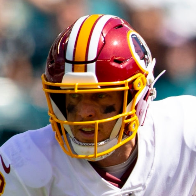
Here’s the next team-
A team that very recently and very unfortunately, crapped the bed with their rebrand.
Washington Commanders
Not sure how I feel about the roundel portion. I thought about making it solid white or gold, but wanted to replicate the striping of the logo.
C&C appreciated as always
-
1
-
-
22 hours ago, ZapRowsdower8 said:
Loving this whole series! Incredible work. Very much looking forward to Pennsylvania and Oregon.
Any thought about including a reference to Maine's most famous export, Stephen King, on their plate? A small red balloon floating past the top of the lighthouse perhaps?
I second this idea
-
CFL has some rules updates for the upcoming season-
Biggest Changes:
• Two QBs on the field at same time
• Hashmarks will now be 9 yards apart as opposed to 17 yards
The rest:
https://www.cfl.ca/2022/04/27/rule-changes-build-on-strengths-of-the-cfl-game/
-
Carolina would look a lot better removing the sleeve logos and moving the numbers onto the sleeves
-
10
-
-
4 minutes ago, guest23 said:
I'm confused with this statement because they brought this logo to the fans and they rejected it swiftly and loudly hence the moniker "the one-day logo". Also from what I remember it was unveiled with a red mask at the press conference.
-
16
-
-
Imagine if they said “we listened to the fans…” and brought this beauty back
-
2
-
 1
1
-
7
-
 1
1
-
-
Great job on the Bears!
What would the set look like with the 1936 helmets they’ve used the past few seasons?
-
Remember that time the league decided to put the Super Bowl outside at MetLife?
I think the NFL learned that unless the stadium is in Florida or California, there’s zero chance an outdoor Super Bowl happens.
-
4 minutes ago, Jezus_Ghoti said:
3 stripes! Finally.
-
4
-
-
-
I’d imagine if Seattle is bringing back the throwback, they’ll shift the shade of the helmet so it can be worn with the wolf grey alternate as well
-
An update to the New York Jets-
Anything I was trying just wasn’t working. So, I went the simpler route and tried my best to give the current eclipse/football logo an update while still trying to feel classic to the Jets franchise-
C&C appreciated as always!
-
2
-
-
2 hours ago, LA Fakers+ LA Snippers said:
I like the idea, but was very hard for me to see the NY, even though I was told it was there. It would like be even harder for a casual to notice, as it would just be some squiggly lines to them. Maybe close the ellipse and put the NY inside of it?
PS. Great job on San Francisco.
Yeah, I definitely struggled a bit coming up with something that worked. I wanted to try something that felt different yet stayed true to a NY team.
I’ll work on it over the weekend to try to find some good ground.
As always, thank you for your input! It’s always appreciated
-
1
-
-
If there’s no other comments on SF, I’ll move onto the next team-
Back east with this one…
New York Jets
I wanted to incorporate a different approach to the “NY” monograms that have been made so popular by present and past New York teams as well as featuring pilot wings instead of more commonly use jet imagery.
C&C welcome as always!
-
4
-
-
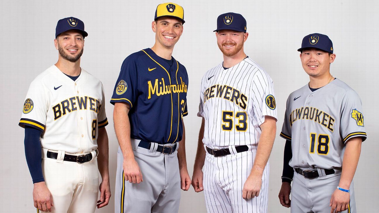
1 hour ago, LA Fakers+ LA Snippers said:
Lose the headspoon and pinstripes on the white (or the white altogether) and Milwaukee has a Top 3 set
-
Pinstripes are the worst possible element a team could apply to their uniforms. They make the uniform look incredibly cluttered and muddled.
-
2
-
1
-
 1
1
-
-
I like it. Not really feeling the 3 though. Could’ve been executed a bit better
-
On 4/8/2022 at 8:28 AM, Philly's Phinest said:
From a consistency standpoint, that second one is right in line with their current striping, but I do prefer the top option. I love the incorporation of the silver and I think that font is spot on. Would be interesting to see overall what a set would look like with a red, gold and silver scheme for the Niners. As always - great work here.
Thank you for the kind words and your feedback!
Here’s the logo with the new wordmark-
-
3
-


New CFL Uniforms & Logos 2023
in Sports Logo News
Posted
These are great, but not a fan of the front number. Especially considering how close in proximity it is to the sleeve numbers