


DCarp1231
-
Posts
9,450 -
Joined
-
Last visited
-
Days Won
142
Posts posted by DCarp1231
-
-
The re-introduction of silver pants does elevate their current look. At the very least, it’s Top 15.
-
 2
2
-
-
32 minutes ago, ManillaToad said:
What does the roundel do for you that the eMb doesn't?
The “interlocking” halves of the roundel separated by the white stripe. I love that.
-
4
-
-
I don’t like the Expos main logo

but the roundel was promising
-
 1
1
-
 1
1
-
-
Colorado is still my favorite
San Diego has the preliminary second spot
-
3 hours ago, dont care said:
That’s the same guy? They look nothing alike, I honestly thought that was a bald white guy on bowman’s car.
I mean, the show is from 2000 and comic book characters routinely go through changes almost every year.
-
22 minutes ago, dont care said:
Am I the only one who doesn’t know who “Static” is? Looking at the cartoon he looks like a mix between lex Luther and dr. Doom.
Introduced in the early 90s, he became popular due to the success of popular early 2000s animated series, Static Shock.
-
1
-
-
Ally’s partnership with DC Comics and Milestone giving Alex Bowman a paint scheme that feature’s the comic book hero, Static-
-
They could’ve at least tried a silhouette of Paul Revere riding his horse logo
-
Worst case scenario is the Jazz winning a title with these before they can get rid of them and opting not to trash them because “good luck” or whatever horrendous superstitious excuse they’d use
-
2
-
-
1 minute ago, BBTV said:
Got it. Seems like a lot of effort, especially if typing it on mobile. Surely there's some emoji or something that could accomplish the same... but then again, I'm old(ish).
I’ve done it quite a lot. Usually, it’s just easier to drop this meme to get the point across-
(titled mocking SpongeBob)
-
4
-
-
9 minutes ago, BBTV said:
I'm old(ish). Can someone explain WhAt ThIs WrItInG mEaNs?
It’s meant to portray mocking
-
6
-
-
For as much as I want that jersey to be the Cowboys primary white, I cannot stand how the star touches the blue sleeve cap
-
1
-
-
26 minutes ago, WSU151 said:
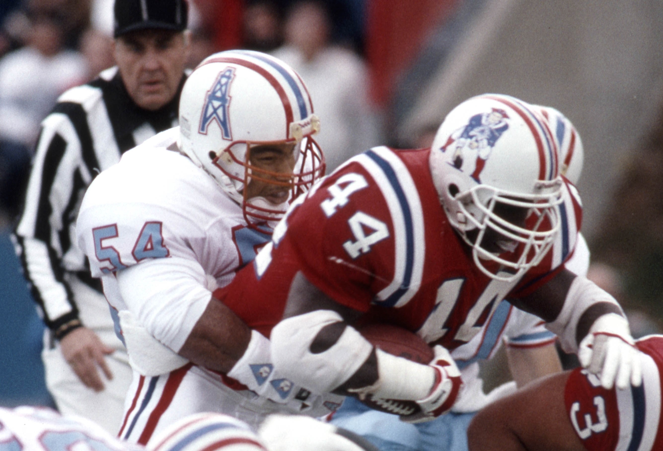
The Oilers' derrick (and similarly, the Roughnecks XFL logo) is nearly the exact same shape as Pat Patriot (Pat might even be more horizontal), and nearly everyone thought it was fantastic and want it too return, too. In this photo, Pat covers far more of the side of the helmet, which is actually a good thing.
So the Pat Patriots are just Oilers Condensed
-
3
-
-
2 hours ago, throwuascenario said:
Now that the TV numbers aren't required, that point is moot. Any team that puts them on the sleeves is choosing to do so. When the numbers are already on the jersey two other times.
This point makes no sense. I mean, the Saints have a gold helmet. Does that make it redundant for them to have gold anywhere on their jerseys? What about pants stripes matching the helmet stripes? Why do you need the same striping pattern in two places? It's their logo, it should be prominent. And even if you want to say it being redundant is a valid reason not to use it on the sleeves, numbers are even more redundant. At least you have to travel to a different piece of equipment to find the logo. The numbers already exist multiple other, massive places on the jerseys. They also just aren't a good shape for the space.
I think the argument works somewhat if you're advocating for sleeve stripes. They aren't redundant and look good most of the time. But numbers on the sleeve add no team branding, look bad, and are even more redundant than the logo.
If I’m reading all this correctly, you seem to want blank uniforms. Solid colors and no differentiating designs.
Either you’re really grasping at straws or you’re in the midst of an existential crisis.
-
2
-
1
-
-
5 hours ago, throwuascenario said:
I don't get how it's redudant to have the logo on the sleeves just because it's on the helmet. It doesn't appear anywhere else on the jersey. The numbers are already in two other places on the jersey alone. Someone who's a number like 88 would have 8 8's on their jersey. That's not redundant?
Other than numbers being required on a jersey.
So no, having eight 8s on a jersey isn’t redundant. They’ve relaxed some rules where four of the 8s aren’t required. Still not redundant with what’s left, because it’s required. Logos on jerseys are most definitely not required. So yes, it is redundant for logos to appear on both helmet and jersey.
-
1
-
-
Toledo’s new uniforms just look like “what would happen if Michigan State used Michigan colors?”
-
3
-
-
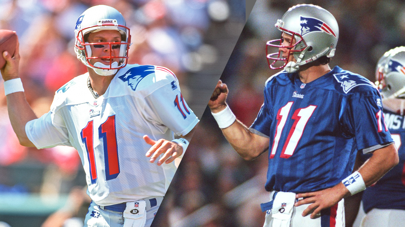
The only thing I don’t like about the Bledsoe-era uniforms is the lame sublimated flag stripes on the jersey torso. They would’ve been better off utilizing it on the sleeves.
-
1
-
-
Not sure how true this is, but supposedly the Jazz wanted to roll with a black and white color scheme, but Nike said no due to the Nets and Spurs identities. Nike then forced the Jazz to add a third color. Which is why there is yellow. They then added the throwback jersey and will petition Nike for a new uniform set by the 2023-24 season.
-
-
12
-
 3
3
-
-
Dan Snyder is out here court-dodging a federal case.
He worked with the NFL, to conduct a “shadow probe” in a effort to hide and bury findings from an internal investigation.
This scum of a human should be exiled from ever owning a professional sports team, let alone a business of any magnitude.
-
4
-
-
-
3
-
9
-
-
Iowa State helmet wall-
-
2
-
-
The
Commanders32s mishandling of contract extension talks with star WR Terry McLaurin is nothing new. It’s perfectly summarizes this franchise’s reign under Snyder. They don’t know how to keep talent around. All these things are handed to them, but yet they can’t even gather the courage to stick their hands out and say “thank you” -
9 minutes ago, ptaylor said:
I can't decide whether to respond to you with "source?" or just give a laughing emoji.....
The source is “Trust Me Bro”
-
 2
2
-
7
-


NFL 2022 Changes
in Sports Logo News
Posted
Anniversary patches for Washington-