


Tigers6884
-
Posts
1,950 -
Joined
-
Last visited
-
Days Won
2
Posts posted by Tigers6884
-
-
Robert Parish, a.k.a The Chief, who played a grand total of two seasons with the Hornets. I was tempted to post a picture of him in a Bulls uniform, but he actually won a championship while playing for Chicago during the '96-'97 season.

He actually played for Charlotte in this game:
Not really a wrong uniform, but one of the earlier games with the home team in alts with the road team in white.
Magic at Hornets 1994.

-
Right team, wrong era:

-
$$$$$$$*gag*

-
*Sobs uncontrollably*David Price:

-
While I do like the current Dolphins logo, I think that if the team actually played well before they changed to it, it would be getting the Robo Penguin treatment today.
-
How do the Athletics look better than the Tigers?The current Pirates look is top 5 in the MLB. Even with them wearing that black alt All the time and having the camo jersey. If they changed those two things only Oakland, Yankees and Cardinals would look better than them.
-
I not only like, but adore the Brewers current identity. Some people may call their current color scheme boring, but I believe it suits them much better than the old blue and yellow. I also think that this would make a perfect cap logo for the Brew Crew:

(I might have to work on a concept soon)
-
 2
2
-
-
I don't associate those uniforms with a bad era of Orioles baseball, they make me think of Cal Ripken Jr.'s Iron Man consecutive games streak and his awesome home run in the 2001 All Star Game.
-
I love this uniform and the realistic bird logo for the Orioles:

-
1
-
-
If you're on a mobile device like I am, simply copy the url of the photo and paste it in betweenHow do i post a photo
For example,
_https://sullybaseball.files.wordpress.com/2014/01/sh-tycobb.jpg_
becomes
(Take out the underscores)
-
I don't think the Vancouver Canucks have ever had a great logo in their history. The current orca logo is alright, but does nothing to represent Canucks (I honestly thought a Canuck was a type of whale until I finally looked up what the word means). The flying skate was way too wacky and colorful (red, yellow, orange, and black is a bit excessive for a color scheme). The stick-in-rink logo is boring as hell (don't try to convince me that it's classic, it doesn't represent a Canuck either). Johnny Canuck is alright, because it at least does its job of representing the team name, but I don't think it could work full time on an NHL jersey.
I think it may be time for Vancouver's NHL franchise to rebrand itself (maybe they could resurrect the Millionaires name and logo).
-
Hey guys, their new jerseys were unveiled today!!!I'm still looking forward to seeing Arizona's new uniforms. Hopefully we'll see a new unveiling not long after that.

-
1
-
-
Braves legend Warren Spahn:


-
Right team, wrong era:

-
What we've established is, Will Clark in anything other than a Giants uniform doesn't look right.
-
I don't see the Yankees uniform you are referring to, but my pick would have to be this:
-
Will Clark:


-
Christy Mathewson:

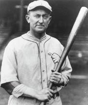
Ty Cobb:
Hank Greenberg:

-
I feel like I'm one of the few that's absolutely hated everything the Anaheim Ducks have worn since 2006.
Trust me, you aren't.
-
To be honest, I think this uniform looks like it was created in MS Paint.
Maybe a year or 2 at most but I don't see it lasting longer really than it did, the wave number and name is just so damn goofy and the striping looks like a drunk child drew it, I just hate how there's no consistency to the thickness of the stripes.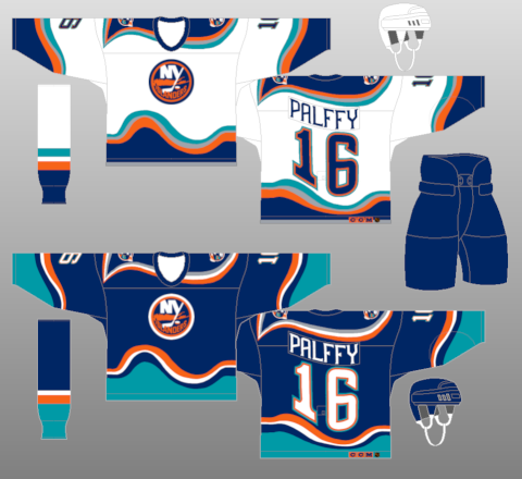
If the Islanders had used this 1997-98 style uni originally in 1995 without the Gorton's Fisherman logo in the middle, it would have been very well received and lasted a few years longer.
Also the blues changed their uniforms to have regular numbers the same year the islanders did for the 97-98 season.
-
I don't like soccer.I don't like collared soccer jerseys.
At all.
At all.
*grabs shield*
-
1
-
-
I don't care for Johnny Canuck at all.
Its an alright logo, but anything's better than the stupid stick-in-rink (yes, even the orca is better).
-
I love that everyone wears 42 on Jackie Robinson Day (today).
-
4
-
-
I hate the Cleveland Oranges' new uniforms.

Players in the "wrong" uniforms
in Sports Logo General Discussion
Posted