


Tigers6884
-
Posts
1,950 -
Joined
-
Last visited
-
Days Won
2
Posts posted by Tigers6884
-
-
While I was at the Detroit Tigers game I saw a guy wearing the ugliest counterfeit Matt Stafford jersey. The shade of blue was way to light and I almost had to slap my brother after he suggested that color had "faded" from being a few years old (it was a "Reebok" jersey supposedly from before the NFL made the switch to
Nike as the official jersey manufacturers.) -
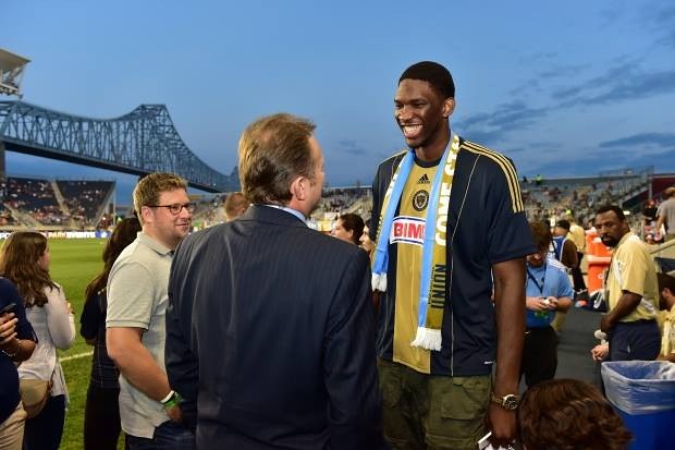
Joel Embiid - though it may be a minute before you see him in any type of jersey soon.
Is that Seth Rogan?
We might need to start a thread called "Celebrities in the wrong places", and base it off of this topic.
-
I love the Jaguars New uniforms. The helmet might take some time to get used to, but the jerseys are absolutely beautiful. In fact, I think the new uniforms are miles better than the old ones.
-
 1
1
-
-
I think that this uniform could've been beautiful if it didn't have the god awful diagonal stripe.


-
1
-
-
How do you add the voting options on polls? Do you just add them after posting a topic?
-
I don't think Dallas should change their color scheme and get rid of the silver-green for a basic silver. It's iconic to the Cowboys. Sure it may "be awkward with their uniforms", but it's as iconic as the star on top of those silver-green helmets.
It's as iconic as the annual disappointment that is being a fan of a losing team! (I'm joking, after all, I am a Lions fan)

-
From what I read about Tom Glavine, he was considered as much of a hockey prospect as he was a baseball prospect. The hockey career he might have had....

-
David Price:

I believe that should actually be posted in "Players in the right uniform".

-
Oklahoma State has the best modern uniforms in college football.
Thank god that you didn't say Oregon. Yuck.
-
Yogi Berra in an Astros uniform:

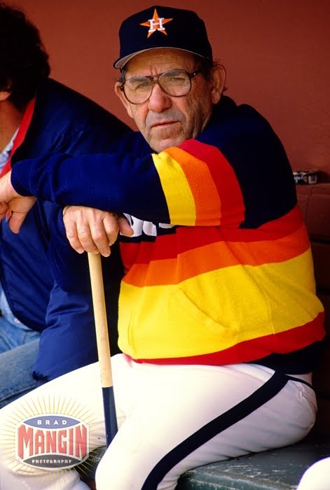
Doesn't a Rainbow guts era Astros uniform look wrong on just about anybody? It's so ugly that it's beautiful in some bizarre way!
-
I think that this is an underrated logo that the Brewers should bring back as a sleeve patch on their navy blue jerseys (in the modern color scheme, of course):

And I do not only think that the Ball-In-Glove logo is a beautiful logo, I think that it's one of the best logos in the history of Major League Baseball.
-
2
-
-
I know people say that a Brewers jersey is the wrong one for Hank Aaron, but thinking about how much he meant to Milwaukee during his years as a Milwaukee Brave, I think it's kinda cool that he got to finish his career in the city in which he began it.
-
1
-
-
I like that the Cubs are wearing ten throwback uniforms this season.
-
I also like the logo of the former Boston Braves, which is the logo that I'm now using as my profile picture.
-
I am probably the only person who likes this logo, therefor making my liking of it a very unpopular opinion.

-
(long-time reader, first time poster)
A few of my unpopular opinions:
1) I LOVED those bright red alternate uniforms the Twins wore in the late 90's. I thought they were perfect for the super-drab Metrodome.

Oooo baby...
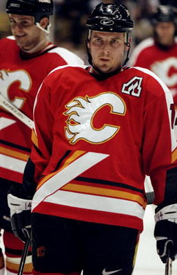
2) I'm a big Bruins fan. From what I can tell, everybody in Boston loved the Winter Classic jersey. I liked the idea, but the spoked-B was so goofy that I just can't get on board. Now, a Bruins look that I loved, and would scrap the current alternate for in a heartbeat:
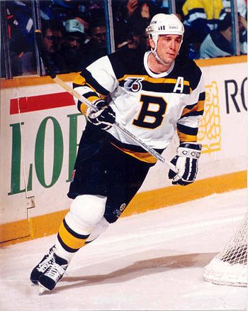
I don't even care about the lack of the spoked-B.
3) Notre Dame's pants are hideous. I don't care that they're more gold than they used to be, they're awful.
It's like my opinions came to life and spawned another person. I agree with all that you said.
-
Way off topic, but I think it's kinda funny that someone named "King of Rings" uses the Hartford Whalers logo as their profile picture. He must mean Avco World Trophies (Hartford won one), not Stanley Cup rings.
-
In my very honest opinion, this is the best logo the Diamondbacks have ever used:

And this is the best logo the Texas Rangers have ever used:

Of course, I might just be saying that because two of my favorite baseball players of all time wore them (The Big Unit with the D-Backs, The Ryan Express with the Rangers).

-
1
-
-
I can't think of a worse fate to have lol.
Being stuck in a nearly falling apart stadium like the Montreal Expos were forced to do until they moved to Washington.
-
It's not really a logo or uniform change, but I'm getting ready to go to the Toledo Mud Hens game tomorrow, in which they'll wear the Ghostbusters jerseys they revealed a couple months ago.
-
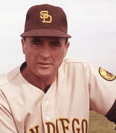
Those are the only brown and yellow Padres uniforms I find acceptable.Unpopular? I don't know. But these is not only the padres best look, its in the top 25 best uniforms in MLB history.

-
I miss the Mets black
Whenever I see those, the first thought that pops into my mind is Mike Piazza's post 9/11 home run.
-
1
-
-
Perhaps they're trying to look like the criminals they are. (Really bad joke)
But i think the fans are trying to look like pirates !?I think the Oakland Raiders should ditch the pirate theme, and adopt the demonic rebel theme associated with many of their costumed fans.
-
Hey, look at that! Phantom and I agree on something!
Well, at least you admitted that's an unpopular opinion. Baseball needs to mandate that stirrups, 5" cut, be worn at all times. Hopefully, that will be worked in the CBA and things will start evolving from there.I've said this before, but I think stirrups in baseball look stupid. They're a bygone relic from another time and I don't want them to come back.


Unpopular Opinions
in Sports Logo General Discussion
Posted