


FinsUp1214
-
Posts
3,005 -
Joined
-
Last visited
-
Days Won
13
Posts posted by FinsUp1214
-
-
The Bees did update/clean up the logo (as well as introducing a new number font to match the wordmark) recently. I can't remember if it was last season or two seasons ago, but that was an official change.
Here's a look at the new numbers, fairly subtle but noticeable when compared to the wordmark:

-
9 hours ago, Ferdinand Cesarano said:
Right, an "SL" cap with the halo worked in would be a good idea.
Of course, Salt Lake don't even use their great "SL" logo on their caps normally, which is crazy. They have a great monogram, that they use on various materials and apparel.

That monogram would be a perfect cap logo. Yet they inexplicably use graphic bee logo on the cap.

The bee logo is cute enough.

But, when seen from a distance, it looks like nothing at all. So, unlike the graphic logos of the Orioles and the Blue Jays, this bee logo doesn't belong on the cap. The uniforms would be perfect with an "SL" cap.
I frequently argue that a minor-league team should look like its parent club; but I have to admit that Salt Lake look very good in their own style and colour scheme. Even still, seeing the name "Salt Lake" spelt out in Angels letters and colours is just so satisfying. If that sort of thing were the norm, then I could more easily swallow the separate identities of some minor-league teams. Also, those separate identities would be less annoying if more minor-league teams had names and uniforms as sharp and dignified as Salt Lake's.
I'm in agreement with you from top to bottom!
I feel like the Bees are very close to nailing it. I own a black cap with the "SL", and it's beautiful. Really all they need to do altogether in my book is make the "SL" cap primary, and keep the Bee to sleeves-only all across the board. Then they've got it. Otherwise, as it stands, they're stuck in "Oh, Almost!" territory.
-
 3
3
-
-
The Salt Lake Bees will be doing a one-off "Angels Night" on July 15th vs. Sacramento. They are apparently honoring the 15th anniversary of the Angels' World Series title with Angels inspired uniforms and a replica championship ring giveaway.

I would've liked to see how an "SL" with a halo could've worked on the cap instead, and that unfinished photoshop job is pretty funny (see pants stripe), but other than that, this isn't too bad for a one-off. I think the fans will really like it; because of their long-standing affiliation here, there's TONS of Angels fans in both the Salt Lake and Utah Valley areas, so I'm sure this will strike a chord with them.
Its also kinda funny that it's against Sacramento - a Giants affiliate.

-
It could be that it's because I love the company's branding altogether, but I've always been a huge fan of the New York Red Bulls identity. Love the crest, love the kits, and even love the big dueling bulls on the front.
Now all they they need is a second or third kit design modeled after the can, and they're set.
-
1
-
-
9 hours ago, Ted Cunningham said:
Really unpopular opinion: This is the best the Patriots have ever looked. I would change the pants stripe (as I think the stripes within the stripe which mimic the logo are a little too busy) to something simpler. Otherwise, that's it. The contrasting numbers and grey facemask MAKE this uniform for me.
I mocked it up on a modern template just to get a better feel for it if it existed today:
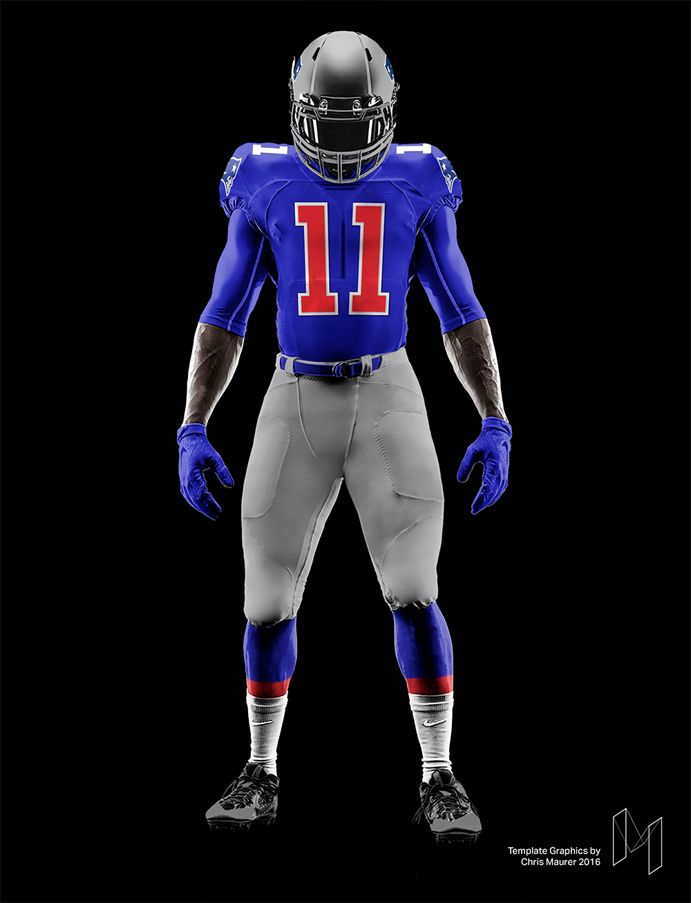
Thats beautiful! They technically could throwback to it as it doesn't violate the one-helmet rule....#wishfulthinking
-
3
-
-
2 hours ago, MCM0313 said:
Not crazy at all! The Pats ended the '93 season on a hot streak just as I was gaining interest in football. That, plus their young star QB, plus their logo, plus the fact that I had played a year of flag football in '92 for a team called the Patriots (when I went back in '94 they had become the Cowboys though), led to the Pats being my first favorite NFL team. I rooted for them during their 1994 playoff season, in which Bledsoe set a new record for single-season pass attempts IIRC, and then during their Super Bowl loss to Green Bay.
I remember trying to find NES games where I could play as the Pats. I borrowed John Elway's Quarterback from a friend but didn't like the generic red-vs.-blue gameplay or the lack of team and player names. I rented Tecmo Super Bowl and was amazed that it had all 28 teams AND their helmets AND real players! Then I got Madden '95 for Game Gear and my family got a computer for which I got Football Pro, then FBPro '95, then '96, and enjoyed playing with the uniform editors and play editors.
To complete the '90s-ness, I also had a Patriots Starter jacket, in which my bowl cut and I were professionally photographed sitting back-to-back with my next-door neighbor and flag football teammate in his Cowboys Starter jacket.
This is one of the most 90's posts I've ever read, and I love it! Bowl cuts unite!

-
3
-
-
25 minutes ago, MCM0313 said:
Freaking love the "'Murica" pants stripe on those. It's like a non-sucky version of the Sixers' star-spangled unis from the same era.
That's probably my favorite part of the whole thing. It should've survived a whole lot longer than it did. I also like how the helmet looks with a gray face mask better than red as well.
I'll admit too, there's this sort of psychological thing with the royal blue 90's Patriots in general for me; as a young elementary school kid, Drew Bledsoe was one of my favorite players (along with Steve Young and later Peyton Manning). So naturally of course as a kid, I rooted a little for the Patriots. But then Bledsoe left, and then everything with spygate/imperial empire/deflategate and Brady and Belichick being terribly unlikeable happened and the dynasty navy Patriots are now a team I just can't stand. Thus, the idea of the Patriots and Flying Elvis in royal blue remind me of a long-ago team I used to like and a player I rooted for as a kid (and still like) rather than a team I frankly despise now. Sounds weird, but that's how it works in my head.
It's not crazy, it's just sports
-
3
-
-
Two random ones:
1) Of all the Flying Elvis uniforms, this one looks best to me (even with the mismatched number color):

P.S. on that one: Flying Elvis is better in royal blue than navy to me.
2) There hasn't been a single Carolina Panthers concept that I've ever seen that has actually been an improvement. I'm especially not fond of the idea that constantly gets floated around of them in a black helmet. They're one of the best looking teams in football as is, and you're better off tweaking things around with them than doing something drastic.
-
3
-
-
27 minutes ago, WSU151 said:
Way too much going on in that primary logo..
Took nearly the exact words right out of my mouth. The canaligator is just fine in and of itself, it definitely doesn't need the buildings at all.
-
1
-
-
4 hours ago, MCM0313 said:
At least they can adopt these as throwbacks even with the one-helmet rule. Haven't seen any evidence that they want to, but at least it's possible.
I hope they do somewhere down the road. I miss that look a lot.
If they were to go back to them full-time, I'd want the current logo to stay. But everything else can come right back just as it was.
-
1
-
-
On this episode of "right team, wrong uniform", we twist the plot with one that looks quite wrong, but should've been right all along:

Stupid mid-00's piping fad!
-
7
-
-
Apologies if this one is already posted somewhere, but this one caught my attention:

I find it funny too considering both teams are the ones I harp on most in the league for "Arena League-looking datedness". I'd nearly forgotten Arizona had held on a year longer than Atlanta before giving in to the pipingfest themselves.
-
3
-
-
It's weird, if I'm not mistaken Bagwell played just as long in brick/tan/black as he did in navy and gold, but the latter just looks 10x more "right" to me. It's the first uniform I see when I think of him.
-
1
-
-
On 1/19/2017 at 6:24 PM, chrispw12 said:
From 2000 last year for Suns, first for Raptors
Man, I miss these. I miss the NBA on NBC just as much.
-
2
-
-
2 hours ago, MarsHotel said:
Here's another. Giants and Chargers 2005. Only time this one happened:

Love it. That's absolutely beautiful.
-
4
-
-
7 minutes ago, the admiral said:
That Chargers uniform is a pair of socks away from perfection. If they had yellow in the stripes to better match the shoulder hoops, 10/10 no question.
I hadn't ever thought of that, but a million times yes. Absolutely.
-
Not intending to further the Chargers discussion - I actually forgot about it till I came to post this - but this is one of my favorite Super Bowl matchups ever:

-
1
-
-
35 minutes ago, MCM0313 said:
As I mentioned before, I feel like lightning bolts look better against a dark background, as if against the night sky. I like the Chargers' current color scheme but think they could do better with the uniforms.
Thats one of the two biggest reasons why I prefer both the Fouts set and the Seau set over the originals. The Seau set especially was very good for helping the bolts stand out and seem bolder. There's nothing boring about it when the bolts jump off the uniform like that.
The second reason is I just don't think powder blue and gold look all that great together. It's a preference thing for me, but two bright colors competing for attention like that just bug the crap out of me.
-
2
-
-
Down East shows Brandiose is, contrary to my fears, still capable of a very good identity when they aren't trying to do something bat-crap insane.
MiLB needs more of this, and less Jumbo Rumble Shrimp Cake Ponies!
-
3
-
-
The Raiders logo is an interesting case for me. I see where they could clean things up and would be perfectly fine with them doing so (as long as they don't change a thing on the uniforms), but at the same time I kind of like the uber-vintage rendering. It evokes this sort of old-school hard-nosed feel that, no matter how good or bad the Raiders ever are, is undeniably part of their brand and history.
So I guess what I'm saying is I understand if they were to clean the Raider up, but if in 2043 the logo still remains untouched, I'll be perfectly fine with it considering it evokes the gritty old-school brand of Raiders football so well.
-
8
-
-
-
Wow, I'd completely forgotten Vince played for Phoenix. I suppose then that to me, the Suns are the "most wrong".
-
1
-
-
The Revs logo kinda reeks of mid-90's Film Production logo, BUT I do think if they sharpened it up and filled up the paint strokes, it would be pretty solid.
-
2
-
-
On 12/4/2016 at 9:32 AM, Magic Dynasty said:
Here's a prototype Bucs road uniform for their inaugural year. Can anyone get a close-up of the logo on the sleeve?

That's actually really, really good. I'd personally get rid of the white outline in between the red and orange on the numbers, but other than that, this is pretty solid. That extra bit of red everywhere accents well with the orange.
-
3
-


Minor/Independent/Collegiate League Baseball Logo/Uniform Changes
in Sports Logo News
Posted
Yes on the "oh, almost" part! It really seems that way for Utah teams across the board. I'd throw RSL in there too. I think they're close, but not right on. I do think the Bees are the best looking team in the state for sure though.
I could get behind the Bees working in a slight amount of red if done tastefully; maybe baseball's very own early 90's Canucks? I always loved that look, and if the Bees worked a balance of black first, gold second, and red trim, it could certainly work. Otherwise, Pirates-ish as it may be, as-is would be the next best thing.
Oh, and I'm stoked Gulls night is coming back. I got me a Gulls shirt last year and love it!