


FinsUp1214
-
Posts
3,005 -
Joined
-
Last visited
-
Days Won
13
Posts posted by FinsUp1214
-
-
I LOVE Wisconsin's "motion W". It's iconic, instantly recognizable, and a strong mark in my opinion (and precisely why I never ever mixed them up with Nebraska in football).
I also absolutely love how it looks on a football helmet:

I'm a sucker for logos that mesh with helmet top contours, a la the 90's-00's Jaguars. It doesn't line up absolutely perfectly of course, but it's close enough that it looks really sleek to me. One of my favorite helmets in the nation.
-
 7
7
-
-
1 hour ago, SilverBullet1929 said:
Can someone please link me to where it says it's required for minor league teams to have logos that look like early 90's Saturday morning cartoon characters?
Yeah it's not required, but it also makes sense considering the target market. Every team seems to include during identity reveals how they wanted to "market to kids and families" or something similarly delivered (while it may not always be those words, it's the same idea). And the most effective way to market to kids is with cartoons and/or whimsy.
I'm not saying it should be the rule, but it's not something I'm shocked or appalled by either. It comes with the territory you're marketing to, and has for years.
-
Fond Du Lac Dock Spiders.
What a freakin' mouthful. Spiders would've sufficed just fine. At least the logos are fairly good.
-
3
-
-
11 hours ago, The Mojo Maniac said:
Egads...you're right!


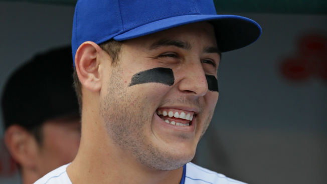
And this one looks even more so like Rizzo, if you ask me:

-
32 minutes ago, coco1997 said:
I live in Chicago. A volunteer where I work made it and brought it in. Sounds like she did a crappy job.
As I said earlier in the thread: the closer you get to New Orleans, the better the cake
")
The great ones have tons of flavor, between the cinnamon and the sugar/frosting. I always thought of them as more festive cinnamon rolls on steroids.
-
2
-
-
32 minutes ago, the admiral said:
CCSLC's answer to Pete Maravich over here.
Haha! ? Even my sock color of choice is grey, too!
-
Looking at all those King Cake pictures makes me really miss them. Utah definitely doesn't have them.
 I remember a friend of mine who lived near Gulfport used to get really good ones at a place in Picayune, MS (right by the MS/LA border on the way to New Orleans). I wish I could remember what the name of it was, but dang. The nearer you got to New Orleans, the better the cake it seemed. The ones I had in Slidell were pretty good, but we just got them at Rouse's Market. There were, in retrospect, probably better places I could've gone
Anyways, letting the identity sit another day...and I'll be honest, I still love the logos and colors (and I did buy a cap last night; the one with just the baby head and crown). I do still hate the name and think the uniforms could use a fair bit of work (that road wordmark could do without the beads hanging from it, for starters). But all in all, the logos and colors do more to salvage what it can out of the identity than the Jumbo Shrimp or Firefrogs do. Of Brandiose's projects this summer - when you take names out of the equation completely - I think New Orleans' is one of the more favorable. No, it doesn't make up for the name; only a different name can do that. But it is something positive to me out of a negative.
-
So one of my close friends from New Orleans just posted an article about the name change on Facebook with the caption "I can't even say anything about this". And that's not even close to what I've read on the team's Facebook page already!
Social media is NOT being kind to Baby Cakes at all.
-
1
-
-
1 minute ago, Sodboy13 said:
And a "Baby Cake" isn't an actual thing, right? Aren't they King Cakes?
Correct. The babies themselves are referred to as "King Cake Babies".
-
1
-
-

Alright....I'm really "ack!" with the name, but there's actually a lot of good in this package aside from the name, in my mind.
The colors are spot on. I hope was hoping if they did go "Baby Cakes", that the colorway would be Mardi Gras influenced, or else it'd flat out not work. So that's a plus. The other color plus? Using all three Mardi Gras colors as accents rather than one a primary and the other two secondary. They look great against navy, and I think that sort of color delegation was brilliant.
The logos (again, we're talking strictly logos here without regard to name) all convey some sort of New Orleans/SE Louisiana imagery and look more to be a complete, cohesive package in the same class as Brandiose's past winners. Between the beads, baby, crown, colors, King Cake, pelican, etc., this really looks like New Orleans. This is certainly a much, much better effort by Brandiose than Jacksonville and the like.
Yes, the name stinks. Absolutely stinks. I'll probably want to think of them as "New Orleans Baseball Club" or even still the "Zephyrs" anyway. But in my mind and having lived in the area before, everything else in the package wins. I'll be buying a cap soon.
-
3
-
-
I've been all excited for New Orleans' reveal in the last few minutes, only to realize I have my time zones mixed up and that Louisiana is one hour difference from Utah, not two. Still excited for 4:30 here, then!
Having formerly lived in the outer New Orleans area (in Slidell), I'm paying special attention to this one. I've always loved the area, have a sort of "home team" anticipation towards this reveal, and hope the hopefully-still-Zephyrs nail it.
Unless they go with Red Eyes, which I think is the worst name in the list, I think there's some good that could be made out of the remaining names. Zephyrs is ideal of course, and I'm crossing fingers and toes for it, but I could genuinely see something decent made out of Tailgators or Night Owls. Even Baby Cakes could at least produce a fun little bat-wielding baby! (I stretched that last one a bit...trying to think positive here!
)
-
I think the thing that ended up downing the 90's Brewers sets was that it needed some sort of nod to brewing in their imagery in order to be "enough" after departing from the ball-in-glove. As it was, though the "MB" and script had Germanic influence to fit Milwaukee, that was really all it had going for it and it just wasn't enough to make a successful identity out of. It's a shame too, because I actually really liked the colors and text. I even kinda liked the "MB". It just seriously needed the barrelman on the sleeves or even a hint of barley somewhere. If it had either-or-both, I really think it would've propelled it from a decent identity to an awesome one. That's not to say every team has to have something in their identity that literally ties to their nickname - the Giants, among others, do just fine - but in the Brewers case having departed from an iconic logo, that's exactly what was needed to, I guess, "make up for it".
Thats why I think (admittedly, unpopularly haha) this current set succeeds in my opinion; that little bit of barley in the identity nods to the industry just enough to make the identity seem complete. It fills the void the 90's identity always had.
-
3
-
-
3 minutes ago, dont care said:
I don't think anyone is associated with that being their "right" uniform
I don't know, that's honestly the uniform I see first when I think of Carlos Delgado.

-
3
-
-
I always thought it was kind of neat when a team would share a name with their affiliate, but make their own identity out of it. The old Provo Angels were a great example of that:

Not saying it was a perfect uniform - I wouldn't have had both "Provo" and "Angels" on the jersey, for starters - but I do like that they did their own thing with the name rather than wearing a letter-modified copy of (then) Anaheim's uniform.
Infact, they've looked more like the Angels since becoming the Orem Owlz* than they ever did as the Provo Angels.
*Yes, ridiculous name, I know. Not every Utahan is keen on the state's "Z" obsession.
-
It's okay, but I think Mets colors would have been better. RWB seems like an odd choice.
-
1
-
-
15 minutes ago, Thaumatrope said:
If I had to come up with a timeline for the descent of Brandiose, I'd have to go with the Reading Fightin' Phils. I feel like it represents a tipping point from producing brands with an array of well integrated logos (see Blue Wahoos, Flying Tigers, or the tragically short-lived Fresno Grizzlies identity) to a "kitchen sink" mentality where no idea is too ridiculous or off-the-cuff to be integrated into a brand. From the Fightin' Phils we move to identities like the Stockton Ports and the WBS Rail Riders where the number unrelated logos mushrooms to absurd proportions. Over the last couple years we've seen the number of logos per brand shrink while the overall quality has diminished. Where a goofy logo may have once filled out a brand package as a supporting design, Brandiose's latest projects have cut straight to the outlandish (see Shuckers, Jumbo Shrimp, Fire Frogs, etc.).
I think you're right on the Reading point. That was, actually, the first time a Brandiose project came out where I thought "okay, this is a bit much, guys." It really does seem to be the start of the descent when you look at their timeline.
-
2
-
-
I'd always been a huge Brandiose fan from the start, having loved the Lakeland Flying Tigers, Frisco Roughriders, and Spokane Indians identities among others. But I do feel they've come to a point where their, I guess, "shtick" is running out. It was all great and fresh at the start, but now that it's been a solid few years and many, many teams later, their products seem more spawned out of desperate brainstorming than brilliant creativity.
The Lakeland Flying Tigers are a polished, sharp, cohesive, and professionally fun identity with purpose; the Jacksonville Jumbo Shrimp are merely an overwhimsical cry for attention.
-
5
-
-
On 9/28/2016 at 11:16 PM, johnnysama said:

Only one pic, but in the 1995-96 season, the original Minnesota Timberwolves getup met the new Seattle Supersonics (pictured here) uni/logo set, and the first-year Vancouver Grizzlies and Toronto Raptors. I do not have any pics for the other two matchups.
Beautiful matchup. And I think it got even better after Minnesota changed.
-
Couldn't have said it better, Gothamite. I too love a little goofiness and whimsy in the minor leagues, but ditching "Suns" for "Jumbo Shrimp" is Ballmer-crazy.
Back to Lynchburg...I can't help but look at that whole identity - especially the primary and the wordmark - and think "football". It all looks better suited for a football identity than it does a baseball one. Not saying you need a neon hillcat swinging a bat, but these just for some reason don't look like they "fit".
Cool colors and not bad marks, but as a whole for what it is, I don't think this to be one of Brandiose's better jobs. There's much better directions they could've taken with that wordmark especially.
-
2
-
-
On today's episode of "Things I Unpopularly Love But Don't Know What to Say To Defend It":

I love this uniform, and think it's by far the best the Brewers have ever looked. My reasoning really does amount to, simply, "I just love how it all looks and prefer it". Though the ball-in-glove is a good logo and clever, I do also think it's really overrated and I don't really want to see it replace this set. I won't go so far as to say it'd be a bad idea because if it's what the fans overwhelmingly want, then that's that. But should this eventually go by the wayside, I'll definitely be one of the handful to really miss it.
-
7
-
-
On 6/9/2013 at 9:46 PM, billman29 said:
1999-2002

This one's still my all-time favorite. Just seeing these make me feel like a kid again.
-
1
-
-
Luis Aparicio with the Red Sox is weird:

To me, he's one of those guys that has two "right" uniforms (White Sox first, Orioles second). The Red Sox, not so much.
-
This cap:

Is wayyyyyy better than this cap:

And while I'm still thinking of the A's - although these are indeed the wrong colors for them - thier first Kansas City uniforms were absolutely beautiful:

-
A Greg Maddux Padres double-whammy:
This set:

AND the '84 throwbacks:

-
2
-


Unpopular Opinions
in Sports Logo General Discussion
Posted
To be honest, I'd love it just as much with your propositions! I do love it all just as it is now, but I think those changes would look really great also. Dropping the shadow would still maintain the idea and concept, which is honestly the thing I love about it most rather than its specific composition.