


FinsUp1214
-
Posts
3,001 -
Joined
-
Last visited
-
Days Won
13
Posts posted by FinsUp1214
-
-
With all due respect to Fraser Davidson and his magical assembly line of graphic glory, I don't want every team's logo to look as if it were released nowadays.
I'm with you there. I like looking at a league or even a division, and seeing balance between design of old and design of now. It's one of the things that intrigues me most about design in sports; it's truly a neat thing that, save a few exceptions, two opposites don't collide, but rather mesh. Seeing an old man in hiked up dress pants and overalls walking with a guy in American Eagle stuff and sunglasses can be a bit of a strange sight and not really fit together, yet a Mariners/Tigers game just looks awesome sometimes. Sports design as a whole is awesome for that reason.
-
 1
1
-
-
Horace Grant - Magic
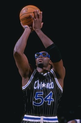
This looks completly normal to me. Here in Orlando during Grant's tenure with the team (especially during our '95 Finals run) the motto, "Its Gotta be the Goggles", was widespread througout the city on billboards and t-shirts. Horace was definitely a fan favorite. I think Horace Grant with both the Chicago Bulls ('87-'94) and Orlando Magic ('94-'99 & '01-'02) are the "right" uniforms.
This is the jersey that looks "wrong" for Horace...

I was about to respond the same. To me, Grant looks right with both Chicago and Orlando, just a little more right with Chicago. He's kinda like Robert Horry or something, where both the Rockets and Lakers look right for him, but (and this is only because of my age - I'm sure others older than me would swap it) the Lakers just look a little more right.
-
I know I keep posting here haha, but I keep thinking of more!
Honestly, I feel the Brewers look the best they've ever looked right now. I absolutely love the concept behind the branding, as I think it's much stronger and has more thought to it than many give it credit for. Every mark looks to me like it could easily pass for branding on a beer label or can, and it helps matters too that I feel navy and that shade of gold just look beautiful together. The only things left they could do to perfect the set would be to put "Milwaukee" on the roads and make the "barrel man" a sleeve patch on each uniform. Other than that, I absolutely love them and don't really understand the flak it gets at times. Just because the ball-in-glove logo holds so much sentiment (and rightfully earned, though I still think it an inferior mark to anything they've got now) doesn't make what they have now bad, especially where the current identity embraces the name a whole lot better.
It's not to say the ball-in-glove is bad - it's a good, clever logo - but in my eyes, something came along later in this current identity that was just better. Had they never dropped the ball-in-glove, I probably wouldn't want it to change. But it did change, and they did eventually adopt something even better and much more representative of the name, so I prefer the latter. Just my opinion, though.
*straps up, braces for impact*

-
2
-
-
As did I, but it didn't help that their rivals alsp used the same colors (plus yellow).I'm sure Andrei Kirilenko won't either. on an unrelated note: I really liked those Jazz uniforms.
I don't recall the Lakers busting out double blue a decade ago!
I'm just messing, as far as rivals are concerned (where the feeling of both teams towards each other is mutual), Denver's probably it. But I'd bet my life savings that most Jazz fans hate the Lakers much more than they hate the Nuggets. I think KJZZ (Jazz TV channel) ran a poll last season about the which team Jazz fans hated most, and the Lakers came out on top. The Nuggets, Blazers, Rockets, and Bulls were the others, I think.
-
The 99-08 bird was my personal favorite. I liked the cream-ish beak and highlights better with the orange and black than the grey of the 09-11 one, and it looked a little better balanced than it also. I always thought the 09-11 bird almost looked like it was going to fall over or something. Just kind of looked awkward.
That's how they often look.
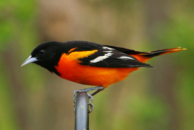


I understand where you're coming from, but the difference there on the pictures is that you can see what it's standing on. You know it's standing, so it looks more natural. On the cap, however, it's got nothing to stand on shown, so he looks more like he just let go and is about to free-fall. Though the 99-08 bird still doesn't have what he's standing on shown, the flat feet still look more like it's standing and is more natural-looking and balanced to me personally. Though the 09-11 bird is still a technically accurate rendering of an oriole, I just felt personally the 99-08 rendering was better suited for a ball cap.
-
The 99-08 bird was my personal favorite. I liked the cream-ish beak and highlights better with the orange and black than the grey of the 09-11 one, and it looked a little better balanced than it also. I always thought the 09-11 bird almost looked like it was going to fall over or something. Just kind of looked awkward.
-
I love this uniform and the realistic bird logo for the Orioles:

I always loved that uniform too, from head to toe. It's the Orioles look I grew up with. I do love the cartoon bird (I'm a sucker for cartoon/mascot logos), so I'm not upset at all that it's back, but I loved the realistic bird and that particular uniform set just as much.
-
I really dislike paneled caps, like the Orioles home cap. I've never really liked any of them, be it the Orioles, Blue Jays, Padres, Expos, whomever. It just kind of has an amateur or little-league look to it. In every case, I feel the teams' solid caps always look better.
-
I actually really like the Lightning's uniforms. Granted, I don't consider them "ideal" Lightning uniforms (that would be something closer to the '04 cup set with a better logo), but they're still nice uniforms in my opinion. And I really have no trouble telling them apart from the Maple Leafs. The bolt down the pant legs, the single stripe usage rather than double, and the logo are differences enough for me.
-
I see your Ewing in Sonics and raise you:
Wowza, that's a bizarro matchup if I ever saw one. I can't recall if the timelines matched up right for this to happen, but Ewing (Magic) vs. Jordan (Wizards) would probably be equally as weird.
-
I'm with you, I actually really like the helmets. I'm not a fan of the facemask (should be black or pewter), but the design of the helmet itself is great. The oversized flag works really, really well. It's everything from the neck down that is the Bucs' problem.I'm a classic guy, but I love the Buccaneers helmets. There's just something about them that dosen't seem to work for any other team.

Pair this helmet (w/ a black facemask) with the previous set, and you've got perfection.
-
1
-
-
Greenberg is fine with the Pirates. I believe he even won an MVP with them.Hank Greenberg:

Actually, he only played one season with them (his very last, in 1947). Both of his MVP's were in Detroit.
-
I feel like I'm one of the few that's absolutely hated everything the Anaheim Ducks have worn since 2006. Partly because I was such a huge fan of the Mighty Duck era sets, but mostly because it just flat out never has looked good. The wordmark logo was a joke and looked terribly awkward on the uniform, the "D" on it's own, though a slight upgrade, still isn't a good solution, the number font is a fat train wreck...it's just all been a mess. They've been the worst looking team in the league for nearly a decade now.
I'd prefer they just go right back to everything pre-2006 (that's probably an unpopular opinion as well), but at the very least, just scrap the whole identity, detonate it in some far off desert somewhere, and start completely fresh. I'm sure there's thousands of better options a designer could come up with than what they've got now.
-
You're definitely not the only one. I've never liked those at all. The logo (as well as its' current update) has always looked ugly and weak, and needs to be shot back in time to the Ford administration where it belongs.I must be the only one who doesn't like these. Yeah, the primary jerseys aren't great, but this is incredibly dated and should not become the permanent jersey.

A spin-off unpopular opinion, but I don't like the Caps' current uniforms, either. Give me the 90's eagle and colors a million times over (much stronger logo and a more unique color scheme that still fit extremely well with the identity). In a league that's got a lot of red-white-blue going on as is, blue-black-bronze was a very good scheme to help Washington stand out. Now they're "just another RWB team" once again.
-
1
-
-
Watching Blackhawks-Predators reminded me of how much I really dislike yellow or gold as a primary uniform color. Just about the only one I like is the Lakers. Other than that? I can't say I really like another yellow/gold uniform.
It's a great accent color, but I find it too garish for my taste to be something primary.
-
I don't really like the template the Warriors use. I feel like if they were going to hearken back to the Rick Barry sets, they need to be on a more classic uniform style for it to work. It's not that the current template is overly modern, but it's just a bit too modern for it to pair with that classic kind of crest well. If they took the crest and put on something similar to the Barry sets, then we're looking at a winner. As it is, I just don't feel it meshes very well.
To me, it's got the same effect as if you were to take the current updated Bruins logo and put it on a template like what the Kings wear, or the Panthers. They're not necessarily trotting out in spacesuits at all, but the style still just doesn't look right.
-
I honestly don't remember if this was posted and I don't care to go through 208 pages to find out:

For some reason, Maris as a Cardinal never seemed that weird to me. I think of him as a Cardinal second right behind a Yankee. The Indians and A's are much more jarring to me.
Then again, when you watch *61 and see how poorly he was treated in New York, coupled with the fact that he was a mid-westerner and was much more happier and at home in St. Louis, you kinda get the feeling that a Cards uniform was the right uniform for him all along, he just didn't get to don it until the end of his career and after his prime.
-
"Break someone's clavicle, on 3. Ready? 1-2-3 BREAK SOMEONE'S CLAVICLE!"
"Phil, I gotta talk to you about that. You shouldn't wish an injury on a player!"
"Well, that's what the medic is for. Otherwise, he's just sitting around."
-
His body's not a W, his beard makes it look like one.
I think that's kind of the point, though, honestly. I feel like it was designed that way to look like a W. It's hard for me to believe it'd just be something coincidental.
-
Another unpopular opinion of mine: I absolutely LOVE this logo and its blue-black-bronze or gold predecessors -

I actually used it as an example for one of my Graphic Design class assignments recently. I love how nearly every aspect of the logo has a great forward motion and line direction (the subject of the assignment), and has great flow. It seems that everything but the Wizard's back leg is pointing forwards, which really gives the logo great (and fitting) movement. The recent tweaks and recoloring to it make the middle portion of the logo look almost like a portion of an abstract USA or DC flag, too. The moon could be filled in (I admit that the basketball pattern there, as well as the basketball the Wizard is holding is a little redundant), but aside from that, I really have always loved this logo and am sad to see that it's taking a back seat to (in my opinion) more inferior logos.
-
1
-
-
I never liked the old Hornets' fleur-de-bee at all. It just seemed like a really forced logo. I get that it "made sense" with it being in homage to New Orleans and all, but there's a difference between effectively celebrating your location in a logo, and forcibly pushing your location in a logo. Cramming a hornet into a fleur-de-lis shape, in my opinion, falls into the latter (especially considering how unnatural it looked).
Besides, I always thought the modernized Hugo was a MUCH better logo and should've been featured a lot more than it was. Probably an unpopular opinion in and of itself, come to think of it

UPDATING VINTAGE LOGOS
in Concepts
Posted
Yep, I'm 99% certain that's the Utes. Not sure when it was used though.
Anyways, fantastic work, ren! I really admire your stuff. As a fan of classic logos myself, it's a thrill to see a lot of these updated. You definitely have a fan and follower here!