


DTConcepts
-
Posts
2,806 -
Joined
-
Last visited
-
Days Won
4
Posts posted by DTConcepts
-
-

Oof. These are bad, even by one-off standards.
-
I don't understand the hate for the Flyers’ contrasting nameplates. I always thought they were a charming little quirk.
-
 7
7
-
 1
1
-
 1
1
-
 2
2
-
-
The League has unveiled this year's Stadium Series logo:
The colors definitely pop, and the handwritten font is an interesting choice. No word on jerseys yet.
-
5
-
-
Agreed. I just wish they'd get on with the inevitable jersey ad reveal so it at least looks awkward for a reason.
-
The Toronto Planets of Roller Hockey International have gotta be in the conversation here.
-
Those aren't bad in a vacuum, but they are certainly very dull no matter what.
-
5 minutes ago, BBTV said:
If 19 and 02 are in separate blocks, I think you could get away with nineteen two and it's just as valid as any other way of saying it.
if you said this in regular conversation i would have to ask you to clarify what you meant
-
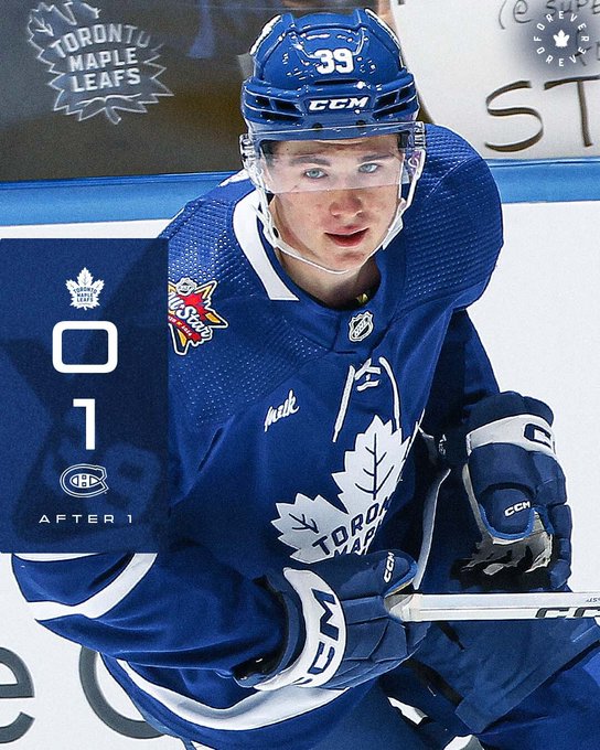
On 10/11/2023 at 10:12 PM, JohnnyCowboy5 said:
All star patch on shoulder
The ASG patch looks more like a jersey ad than the actual ad itself.
-
2
-
 3
3
-
-
12 hours ago, DG_ThenNowForever said:
am i crazy or does their logo evolution read as "plop"
-
7
-
1
-
-
The Oilers and Flames have unveiled their Heritage Classic uniforms.
-
4
-
-
1 hour ago, JohnnyCowboy5 said:
black socks
-
1
-
 1
1
-
 2
2
-
-
Those are fantastic. Only tweak I'd make would be to add a smidge of color to the collar lining. They hit the alternate out of the park.
-
3
-
 1
1
-
-
I just wish they would put the flags on the arms.
-
 1
1
-
-
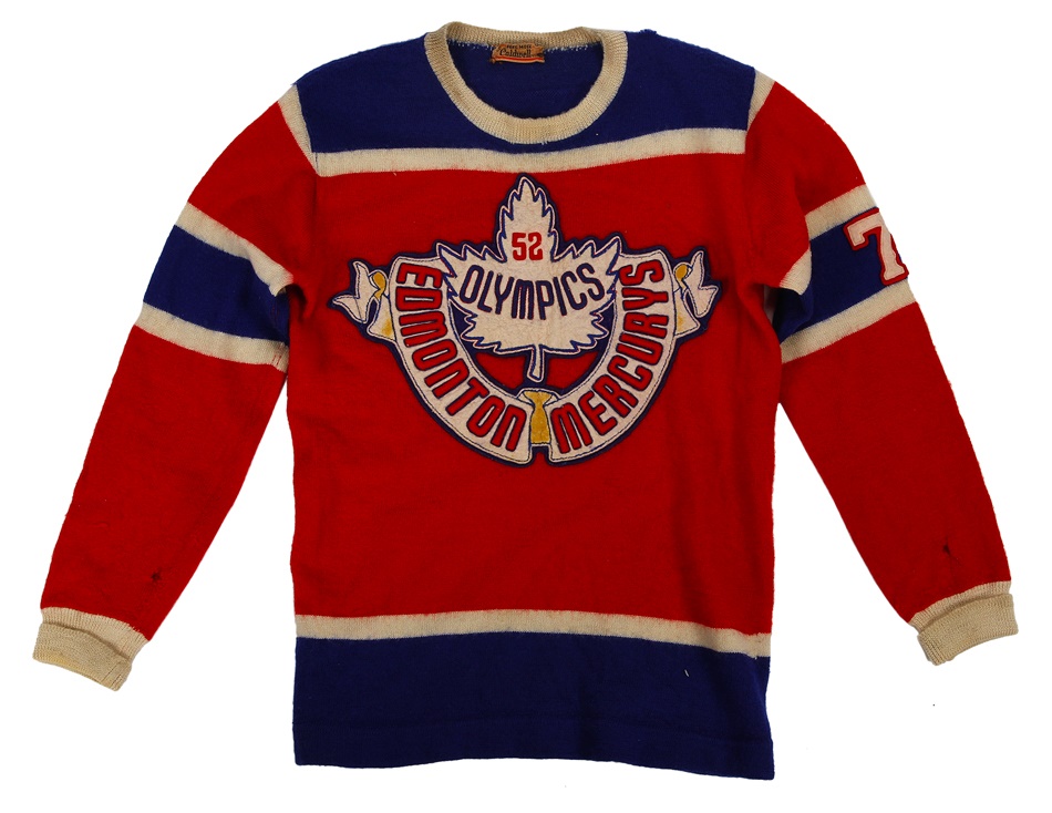
8 minutes ago, ruttep said:
Huh. Is that Oilers logo a callback to any previous hockey team in Edmonton?
The 1952 Edmonton Mercurys. A ragtag group of amateur hockey players from Edmonton who won gold in the 1952 Olympics.
They were the last Canadian team to win Olympic gold until 2002.
I think it's a good look for the Oilers to lean on, as it certainly lends itself well to their own identity. Excited to see what Calgary will look like.
-
1
-
-
3 hours ago, PlayGloria said:
CBJ needs a complete overhaul. There is just nothing about their identity that resonates with me.
Agreed. It's all been downhill since they took Stinger off the shoulders.
-
6
-
-
I think that black works better with Dallas than it it did with Minnesota. The North Stars' black-infused jerseys don't look bad per se, but the added color feels unnecessary to me. The North Stars' identity is anchored by its bright, saturated color scheme, and the black detracts from that a bit imo. Makes the jerseys feel a little busier than they need to be.
-
5
-
-
The captains patches on the new jersey will be set inside a silhouette of the state of Minnesota, Icethetics reports.
I'm glad to see them leaning into the 'State of Hockey' identity. Pretty neat imo.
-
11
-
1
-
-
On 8/8/2023 at 4:05 PM, GriffinM6 said:
I am so jealous.
On 8/15/2023 at 2:28 PM, tigerslionspistonshabs said:Wow
Don’t be too jealous. It arrived and the crest is halfway peeled off.
Bought some fabric glue the other day, hopefully it’ll seal it back down.
-
 2
2
-
-
Another $50 Depop score!
-
3
-
 1
1
-
-
Am I the only one who thinks the Panthers' current look is the best one they've had?
-
10
-
3
-
-
just because it has a skinny serif font and a sunburst doesn't mean it's factory pomo
-
1
-
-
I think the implication is that the Bruins will be unveiling a new alternate/centennial jersey with the crest, not replacing the current one.
-
1 hour ago, heavybass said:
That guy guzzles a lot of soda though in practice and potentially shortening his life span
-
If hot dog eating isn't your thing, Nathan's also put on a lemonade chugging contest. Competitive chugger, amateur rapper, professional YouTuber and das boot enthusiast BadlandsChugs took home the title this year.
Much more palatable (pun intended) than professional hot dog guzzling imo. Downing a gallon of lemonade in just over 20 seconds is much more impressive than cramming 60 water-soaked hot dogs down your throat if you ask me. Still kind of nasty, though.
-
1
-


PWHL Branding and Uniforms 2023-24
in Sports Logo News
Posted
My conspiracy theory is that they had logos, jerseys, and brands all ready to go, but after seeing the public's response to the leak they scrambled by tossing each city's name on to the jerseys they had prepared.