


DTConcepts
-
Posts
2,806 -
Joined
-
Last visited
-
Days Won
4
Posts posted by DTConcepts
-
-
1 hour ago, adsarebad said:
20 years ago.... the NHL went to dark jerseys for the home team, white for the visitor.

A date which will live in infamy ..
we're talking about hockey jerseys here, not 9/11. c'mon now.
-
 1
1
-
 6
6
-
 1
1
-
-
9 hours ago, BuckDancer said:
Heterosexuality is adaptive. It is our evolutionary match. Homosexuality is not, It is a marker of civilizational declension. Read John Glubbs essay The Fate of Empires where he explains that all empires/civilizations follow almost the exact same blueprint when they enter the period of decline in their civilizational cycle. These same markers almost always become prominent with few exceptions.
Just saw two women holding hands. It’s over. The west has fallen.
-
5
-
10
-
3
-
-
2 hours ago, PlayGloria said:
Ok. I mean, you can say that, but sexuality is literally the only thing that makes the LGBTQ community a community. Just because you spin it into "acknowledging a group that’s historically been vilified" doesn't mean it isn't about sexuality. It's literally 100000% about sexuality. If it wasn't, there would be no group to acknowledge.
The T in LGBT literally has nothing to do with sexuality but alright.I mean, whether contemporary LGBTQ identity intrinsically has to do with sexuality is kind of irrelevant. Sex and sexuality (or the lack thereof) are arguably just as central to the human experience as race and gender are. Sexuality, race, and gender are unchangeable aspects of human identity that transcend culture, nationality, etc. Is it not worth celebrating and honoring all the things that make us human?
To bring it all back to the warmup jerseys, I think the league’s decision is a disappointing one — even from an aesthetic standpoint. I mean, look at the warmup jerseys produced by the Canucks, Kraken, Coyotes, etc. that went out of their way to honor local artists and extend each team’s brand. I think it’s a shame that teams won’t be able to put those causes and artists on the biggest pedestal in the hockey world.
-
12
-
 1
1
-
-
i swear, nobody hates the nhl more than the people who run it.
-
2
-
 1
1
-
3
-
-
8 hours ago, Chromatic said:
This is like the polar opposite of an unpopular opinion. Those uniforms are beloved.
hot take but i think these jerseys look pretty good tbh
/s
-
5
-
1
-
1
-
-
4 hours ago, habsfan1 said:
-
14 minutes ago, Ark said:
Interesting, looking back there aren’t that many teams with bad uniforms that lifted the Cup I wonder if there is an association between bad uniforms and being a bad franchise
It's probably because for most of the sport's history, hockey jerseys have been pretty traditional design-wise. Aside from a few exceptions like the Canucks' Flying V jerseys or the Rangers' 70s sweaters, generally "bad" jerseys really only started cropping up in the 1990s and onward, and even still, those "bad" jerseys have always been outnumbered by the more traditional ones. Not to mention the subjectivity that comes with what makes a jersey or franchise "good" or "bad."
I'd say it's probably an inherent sampling bias.
-
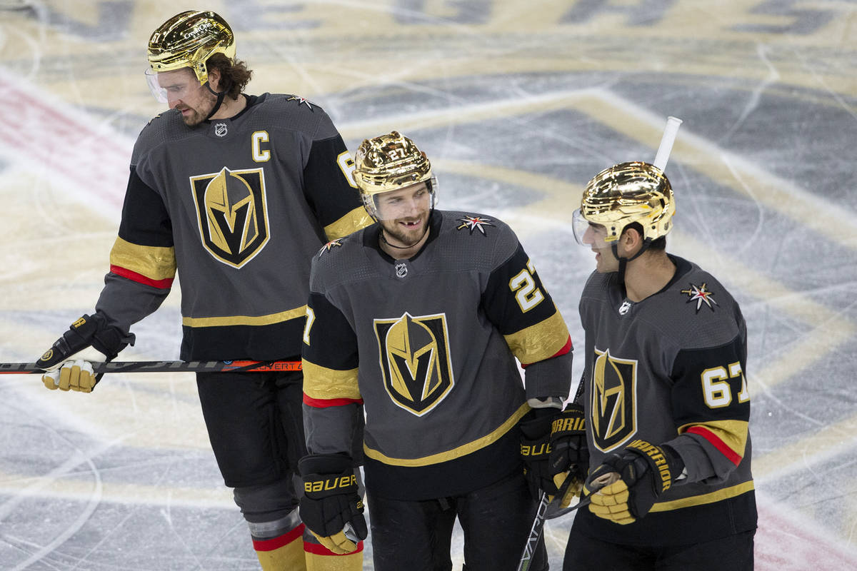
i think i'd like the grey jerseys a lot more if they stopped wearing them with those stupid golden helmets.
-
4
-
 2
2
-
-
11 hours ago, chcarlson23 said:
I’m very happy that a lot of the crappy state flags are being changed. It’s an exciting time as an amateur vexillologist. But there seems to be a lot of people who still prefer terribly designed flags that match a ton of other states in the union. I just don’t understand the push back on it…
I’m glad you think you flag represents you, but it’s failing when I can’t tell if it’s Michigan’s or Vermont’s or Kansas’s flag. So where ya from bud? I’m fairly certain no one is going to confuse Colorado and New Mexico by their state flags, and that’s exactly the point.
I know everyone won’t have the same design sense, and some people just can’t understand design, but like what reason do these states have to not pass these changes through?
Generally speaking, the seals that adorn most of these flags make lots of nods to local history, industry, politics, and community that a lot of folks don't want to lose. After reading the comments under that Maine article, it also seems that there are lots of people who think that legislators focusing on flags rather than, well, legislation is a waste of time. I'd imagine that feeling is replicable across the country.
-
1
-
-
22 hours ago, CS85 said:
The Utah Quiverfulls, the mascots are a polygamous creep with 20 kids via 3 wives.
Also let's not forget the State Cooking Pot - The Dutch Oven. There's some potential there.i like the sound of the Salt Lake Soakers tbh
-
 1
1
-
2
-
1
-
-
-
I think the 'R' logo is 100% worth salvaging, especially the idea of working the silhouette of a mountain into the lettering. The ball fits the space as-is, but I'd suggest shrinking its size by about 10%. I also think the overall shape of the 'R' would be improved if the mountain silhouette at the bottom was made of hard angles instead of flowing curves.
It's a critique I have of the main logo, too. The current silhouette looks more like Denver Intl. Airport than the Rocky Mountains themselves, and I truthfully thought you intended it that way upon first glance. The Rocky Mountains are, well, rocky, and are much sharper and angular than most other North American mountains. I think representing that would benefit the overall look, at least in the main logo. The photo below kind of shows what I'm trying to say, at least in regards to the DIA/mountains comparison.
That said, all the designs are really well done as-is. Your reasoning behind the design choices is also really thought out, and shows the effort you're putting in here. I'm excited to see what the next update will be!
-
2
-
-
This year's final has solidified my opinion that the new SCF patch is a huge upgrade from the last. It's sleeker, more timeless, and would fit well on any team in the league's jersey. The fact that the design got rid of the "STANLEY CUP FINAL" text and still communicates the same message only makes it feel more elegant and prestigious, imo. Great design.
-
4
-
1
-
-
I got this brand new Adidas Nashville Predators jersey for $25 off Depop the other day.
Not my favorite jersey by any stretch, but it was too good of a deal to pass up!
-
2
-
-
The league also announced that four teams will be participating in next year's Stadium Series. The Devils will host the Flyers at MetLife Stadium for the first game, while the Islanders and Rangers will square off the following night. It's worth noting that the Devils, Islanders, and Rangers were the first teams to participate in the Stadium Series ten years ago.
Have to wonder if the event logo will follow the Heritage Classic's lead and make a bunch of nods to the inaugural game held in (roughly) the same location a decade ago. It'll also be interesting to see if Lou Lamoriello refuses to let the Islanders wear modernized jerseys for the event like he did with the Devils in 2014.
-
I don't understand how there are people dunking on the Canucks for having no identity of their own while simultaneously trashing the only logo they've stuck with for more than 20 years.
-
5
-
-
Just now, FiddySicks said:
These are both correct simultaneously. It’s MADDENING.
-
2
-
-
8 minutes ago, LMU said:
i feel like them cheaping out on labor is more important than cheaping out on marketing but alright
-
4
-
-
1 hour ago, Glover said:
I moved to the area in 2014 and it was a good fanbase, but tickets could be had for $30-$50 in the secondary market depending on opponent and day of the week. After the Finals appearance? It was like $90 per ticket for a Tuesday night game.
It's a bad thing that regular fans could go to the SCF instead of rich people with $500+ to blow?
-
On 5/10/2023 at 7:50 PM, BadSeed84 said:
Can we all just agree this was the peak of commercials?

where are the gorgeous woman in this commercial?? how come we have to see a bunch of fat slobs in their underwear????
of course you'll over exaggerate my criticism to that, but it still sucks.
obvious /s
-
33 minutes ago, BadSeed84 said:
No, instead of gorgeous woman we have to see fat slobs now in Gatorade (and other) commercials.
Of course you'll over exaggerate people's criticism to that, but it still sucks.
this guy's never seen a carl's jr./hardees commercial
-
3
-
-
On 5/4/2023 at 4:36 PM, Bruhammydude said:
I wish they could still run commercials like this today, its sad that we can't do that anymore as a society
THE WOKE MOB WON'T LET PEPSI BROADCAST SOFTCORE PORN DURING THE SUPER BOWL!!!!! THE WEST HAS FALLEN!!!!!! WE LIVE IN A SOCIETY
-
6
-
2
-
 1
1
-
-
22 minutes ago, WSU151 said:
Why would the Sabres be wearing the Buffaslug and not the Goat?
fair point, got me there. i guess i associate their success more with ryan miller and those late Y2K-era teams. the goathead is still not as good as their royal blue look.
11 minutes ago, AFirestormToPurify said:Winning?


they wore them for their one and only stanley cup finals appearance so yeah?
-
1
-
-
3 minutes ago, Ridleylash said:
I mean, personally I just think looking like the team that won 3 Stanley Cups is probably a better idea than trying to throw Scouts and Rockies striping into your identity, when both of those teams are associated with literally nothing but failure.
Personally, I don't think teams should shun parts of their history just because they weren't successful at the time. The New Jersey Devils would not exist were it not for the Scouts and Rockies, no matter how successful or unsuccessful those teams were, and that should be recognized.
If teams only stuck with their winning looks, the Sabres would still be wearing the Buffaslug, the Senators would be forever using their toga jerseys, and the Ducks would still have a wordmark logo.


/arc-anglerfish-arc2-prod-dmn.s3.amazonaws.com/public/CVGN3Q6I2G5O5YPTEBKRVNHKVU.jpg)


2023-24 NHL Jersey Changes
in Sports Logo News
Posted
i mean... points for trying