


DTConcepts
-
Posts
2,809 -
Joined
-
Last visited
-
Days Won
4
Posts posted by DTConcepts
-
-
Onto the next one with the New York Islanders!

This design is my attempt at Long-Islanding the team's maligned Brooklyn jerseys. The four stripes obviously stick around, but everything else is changed. The name and number font are made more traditional while still being modern, the NY logo is tweaked to the modernized version, a recolored lighthouse finds a home on the shoulders, and the overall color scheme is changed to match the team's brand. I played around with using blue and white versions of this jersey, but I liked how the orange popped against the blue, so I stuck with it.
Thoughts? Comments? Concerns?
-
 6
6
-
-
The Flames vs. Coyotes uniform matchup last night got me feeling some type of way...
-
1
-
 1
1
-
 1
1
-
-
Up next is the Arizona Coyotes!
Both of the Coyotes' historical alternates have been sharp departures from the team's brand -- one modern and one on peyote. Rather than being experimental like those jerseys, I wanted this design to feel like a natural extension of the Coyotes' current brand. Resultingly, the design balances traditional design norms with the out-of-the-box identity the Coyotes have. The striping pattern is traditional, the kachina pattern is reigned in, the base is purple, and the lizard returns in a balance between existing design standards and the Yotes' identity.
-
7
-
-
4 hours ago, spartacat_12 said:
That's definitely a popular opinion among a group of Sens fans. Back when the AHL team was in Binghamton they used a similar design for a few of their jerseys.
I've said it a few times on here, but I'm not a huge fan of putting more emphasis on gold. Even though Ottawa had the design first, the sparkly gold stripes with laurels seems a bit derivative of Vegas's brand, especially since both teams use a gold-helmeted ancient warrior as their logo.
The Sens should use gold as a tertiary color, not secondary. Not to plug myself too hard, but this concept I made a few months ago is what I think the Senators should be wearing.
-
2
-
 1
1
-
-
Correct me if I'm wrong, but I think the Pens' WC jersey is the first to use a squared version of the vintage-style shoulder yoke introduced by the Stars a few years ago.
Excited to see what these look like with the full uniform.
-
1 hour ago, Ridleylash said:
The Sens' RR looks deeply unimpressive; it's the kind of tat you'd see people wearing in Chel because they think it makes them look cool.
I still maintain they should've gone with either a red or white version of this if they wanted to homage the 2000's;
This might belong in the unpopular opinion thread, but these jerseys should be the basis for the Sens' identity. (Albeit with the 2d Centurion logo)
-
6
-
-
The touch of white on the pants shows how badly the jersey needs some white piping. It's not bad as-is, but another white stroke would perfect it.
-
1
-
-
20 hours ago, johne9109 said:
While this looks really cool; only change I would propose is using the darker blue like the Avs reverse retro. It just feels like it fits their branding more
Not a bad idea at all. I gave it a shot, and I think it looks fantastic.
Great suggestion. What do you think?
-
4
-
1
-
1
-
-
Starting us off is my hometown team, the Colorado Avalanche!
This jersey is primarily inspired by two things: The old Colorado Rockies' uniforms and the Avs' second Reverse Retro. While the Avalanche's current alternate is perfectly serviceable, I'd really like to see the team lean more into the state flag imagery, which is what I did here. The team's current mountain striping takes a more traditional pattern here, acting as a modernized version of the Rockies' old jerseys. The Colorado State Motto adorns the inside of the collar, reading "NIL SINE NUMINE" — or "NOTHING WITHOUT PROVIDENCE."
What are your thoughts? Any changes or tweaks I should make?
-
6
-
1
-
-
Hey all! Welcome back to another hockey series of mine. In an attempt to kickstart my creative juices, I've spent the last couple weeks sporadically designing alternate jerseys for all 32 NHL teams. Each post will feature a different team's jersey in no particular order, along with design rationale to explain why I made the design choices I did. I'll be posting them here as I complete them, with this first post acting as a sort of hub for the series. The list below will be updated with direct links to each team's jersey as I complete them.
Atlantic Division
Boston Bruins - Buffalo Sabres - Detroit Red Wings - Florida Panthers - Montreal Canadiens - Ottawa Senators - Tampa Bay Lightning - Toronto Maple Leafs
Metropolitan Division
Carolina Hurricanes - Columbus Blue Jackets - New Jersey Devils - New York Islanders - New York Rangers - Philadelphia Flyers - Pittsburgh Penguins - Washington Capitals
Central Division
Arizona Coyotes - Chicago Blackhawks - Colorado Avalanche (V2)- Dallas Stars - Minnesota Wild - Nashville Predators - St. Louis Blues - Winnipeg Jets
Pacific Division
Anaheim Ducks - Calgary Flames - Edmonton Oilers - Los Angeles Kings - San Jose Sharks - Seattle Kraken - Vancouver Canucks - Vegas Golden Knights
Thanks for reading through this big, long intro post. Without further ado, let's get into the series!
-
2 hours ago, B-mer said:
The cream gloves keep it from being a perfect 10/10. They don't mesh well with the bright yellow cuffs, imo.
-
Good lord, these are gorgeous.
-
7
-
1
-
-
In retrospect it's a little weird that the Sharks went with a white RR jersey. I feel like a team that brands itself around the color teal should've worn a teal jersey.
-
1
-
-
Jersey designs aside, the unveiling videos Adidas put out for the Winter Classic jerseys are really cool. Much better production than what they did for the Reverse Retros.
-
1
-
-
22 minutes ago, TheRealPepman said:
Why did adidas let this happen?
"Well it's a Reverse Retro, we gotta reverse something!" - Adidas hockey designers, probably
-
1
-
 2
2
-
-
Is it just me or is there a big lack of RR vs. RR matchups this year?
-
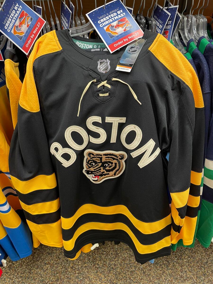
Per Uni-Watch, the Bruins' Winter Classic jersey has leaked:
-
6
-
1
-
-
Truth be told, I don't hate the navy/white lettering on the Panthers' RR. I did some quick mockups of other colorways, though, and I think red/yellow would've looked really sharp.
-
3
-
1
-
-
4 hours ago, IceCap said:
The one thing I'd have liked to have seen would have been the lighthouse logo on the shoulders. But otherwise it's a pretty good looking sweater.
I can't understand calling the Fisherman 2.0 a good sweater when it has design flaws like this:
The whole thing feels like a half-baked attempt to balance '90s nostalgia with Lou Lamoriello's deep-rooted disdain for fun. The result is a jersey that just feels boring, cheap, and half-assed.
-
6
-
 1
1
-
-
4 hours ago, IceCap said:
I get that. They could have made the base aqua or orange or even black if they wanted to mix it with its own era or others but... the way I see it? The RR look is supposed to be the Fisherman mixed with the classic identity. Or in otherwords "what if the Fisherman was more traditionally styled?"
Maybe that's not what people want out of that identity, but I get the intention.
The Islanders' fisherman RR is the only RR that completely disregarded the striping patterns of the jersey it was based on. No other team in either iteration of the RR program changed the striping of their jersey like the Isles did. Plenty of teams tweaked small elements of old jerseys, sure, but nobody else decided to scrap the source material as hard as the Isles. I don't think it's unreasonable to say the Islanders didn't do a Reverse Retro as much as they did an entirely new jersey that just doesn't feel like the fisherman.
20 minutes ago, M4One said:I expect the striping pattern to be the same, or at the very least, as close as possible to the original. The waist stripes look absolutely nothing like the original. I don't think the sleeve stripes are even similar and the yoke doesn't look right either. What colours they use or how they are used is not the problem. These two jerseys do not look alike.
Couldn't have said it better myself. NHLUniforms.com says that "the degree of difficulty in re-creating [the fisherman]" might be why it doesn't look the same, but I call BS. If Adidas can perfectly translate the Lightning's storm uniform to their template, elongated yokes and all, they 100% could've done the same with the fisherman.
-
5
-
-
On 11/14/2022 at 4:56 PM, tigers said:
So if we are all touchy, feely, and worried about everyone else's injustices then these mascots / emblems represent someone's tragic and gruesome downfall in a part of French history.
i can understand why the inhabitants of the current french republic don't care much for the former inhabitants of the french monarchy, but that's just me i guess.
-
4
-
-
20 hours ago, VikWings said:
Along those same lines, for some reason I love black and white with just a smidge of a 3rd brighter color.
I agree. Which is why I think these jerseys really weren't all that bad:
They weren't great by any means, but they made sense as an alternate and looked pretty clean on the ice.
-
3
-
1
-
 1
1
-
-
Man, the shoulder piping and nameplates on these look awful.
-
2
-
1
-
-
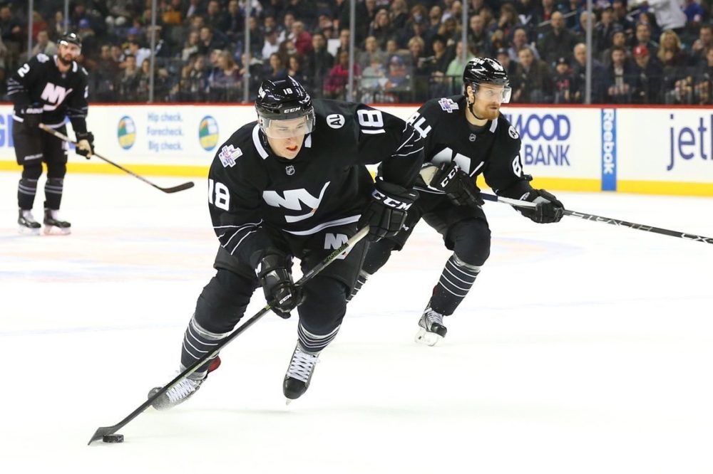
As an Islanders fan, the team’s sock striping has always bugged me. The socks don’t match the jersey striping, they don’t match each other, and they stick out like a sore thumb once you notice them.
-
3
-
1
-


:format(jpeg)/cdn.vox-cdn.com/uploads/chorus_image/image/52663083/623535160.0.jpg)


/cdn.vox-cdn.com/uploads/chorus_image/image/66721974/728301.jpg.0.jpg)
2022-2023 NHL Jersey Changes
in Sports Logo News
Posted
The Devils are going all-in with their Reverse Retro branding and it's gorgeous.