


Crabcake
-
Posts
4,101 -
Joined
-
Last visited
-
Days Won
1
Posts posted by Crabcake
-
-
Rams O-Line is straight-up costing them the game right now. Or, more accurately, the Bengals’ D-Line is winning them the game. Rams can’t run the ball or protect Stafford; pretty hard to win when you can’t do either.
-
 1
1
-
-
Rams are pissing this game away good lord. Got about 60 years of bad luck that’s swinging the other way for Cincy right now.
-
On 2/6/2022 at 11:16 PM, DCarp1231 said:
Stumbled upon this Washington concept on Dribbble
Its laughable, but not surprising, how people not associated with the team can have better designs than the team’s actual final product

The fact that we’re (rightfully) lauding this as so much better than the final product is laughable. If the actual team released this we would be at their throats. This is boring, college-style 4/10 at best, and most of that would depend on the pants and helmet.
It is honestly staggering how bad the actual, real-life uniforms are. Anybody who pays money for those things is a grade A sucker.
-
5
-
-
15 hours ago, Sport said:
The dislike button was made for takes like this. If you can’t tell the difference between Baker Mayfield and Joe Burrow then I can’t explain it to you.As someone who is rooting hard for Burrow and Co. to lose on Sunday… yeah. Joe Burrow is what Baker Mayfield wishes he was. There aren’t a lot of quarterbacks in the NFL I would take over Lamar Jackson… and I’m not saying I definitely would take Burrow over him. But I’m not rejecting it out of hand. Offer me Baker for Lamar and I’m laughing you out of the room.
-
1
-
-
Not sure how unpopular this qualifies as, but regardless: after a quick skim of GUD, I’ve come to the conclusion that the football Cardinals have never had a good uniform.
-
7
-
-
I saw some moron on bleacher report (I know, it’s redundant) comment that Lovie Smith was one of the worst head coaches of all time. I know he wasn’t great, but he got to a Super Bowl with Rex Grossman. That immediately puts him in the below-average tier at worst, which would skyrocket him above guys like Hue Jackson and Adam Gase.
-
4
-
 1
1
-
-
4 minutes ago, Blindsay said:
How can I react to a post on mobile? Every time I click on an emoji it just shows who reacted with that specific emoji.
There should be a blank space just to the right of any reactions that are on a post. Click on that and it should bring up all the reaction options. It’ll be in the same spot even if there isn’t any previous reactions on a post.
-
2
-
 1
1
-
-
7 hours ago, TruColor said:
I'm hearing from the Cardinals message board I'm on that the Cardinals are indeed getting new alt helmets - supposedly being delivered this Wednesday to the Cards' HQ.
What I've been able to put together, is that they *might* be Black, with Red facemasks. To be used with the Color Rush and Black alt jerseys.
I shouldn’t be surprised, but I still am that they manage to keep digging in their heels on what was easily the worst look in the NFL until some football team in the nation’s capital (who shall remain nameless, irony very much intended) decided to puke out a 0/10 set.
I’m not sure how to fix the Cardinals besides just giving them plain red and white jerseys with single color block numbers like they’ve done in the past (read: the most boring football uniform possible), but they need a change in the worst way possible. And now is the perfect time to change, because no matter what they put out, it can’t be the worst set in the league.
EDIT: In agreement with my Unpopular Opinions post, after a quick skim of GUD I’ve come to the conclusion that the Cardinals have never actually had a good uniform in their history going forward from like 1970 when football uniforms could be more than just a single color block number on a solid color jersey. So yeah, not even what I outlined above would work. It would take the Cardinals from 31st in the league to maybe 28th just based on sheer boringness.
-
4
-
1
-
-
1 hour ago, Red Comet said:
They should make it a flag football game and put it on Nickelodeon. Kids would watch that, right?
Honestly, I’d be more likely to watch that over the current pro bowl. A 1% chance of me tuning in is better than a 0% chance.
-
2
-
-
1 hour ago, DG_ThenNowForever said:
I'm salty because in my heart, it should have been the Bills and it might never be their turn.
Go Rams. Go bone. Go dope uniforms. Go OBJ and Aaron Donald.
I also am rooting for the Rams. It was fun when the Bengals were knocking out the Snatit and the Chiefs but now the realization that they might actually win the dang thing has hit and there’s no way I’m rooting for a division rival to win the Super Bowl, even if it’s the division rival I have the least animosity towards.
-
1
-
 1
1
-
-
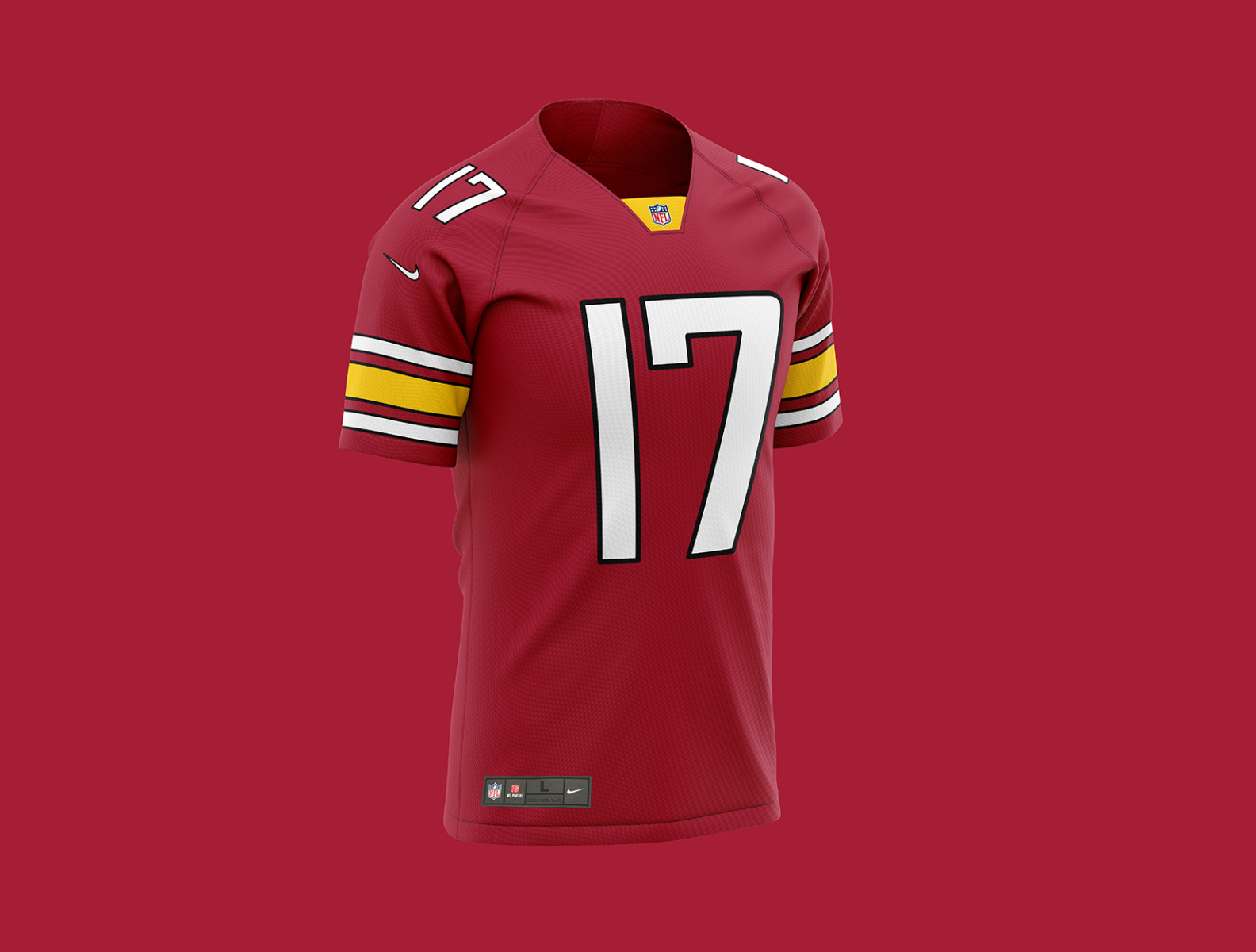
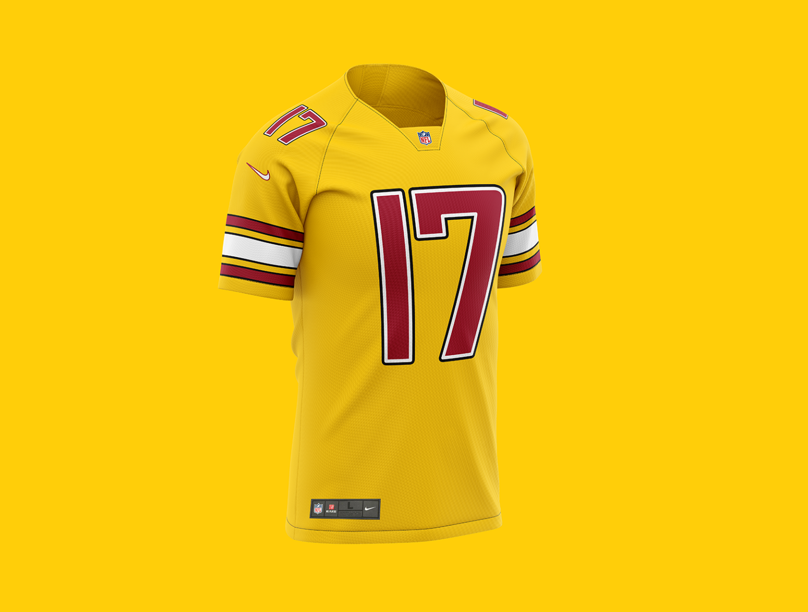
36 minutes ago, DCarp1231 said:
Washington’s design process-
The burgundy helmet
The rest of the set
And the best part is the burgundy helmet is a 6-7/10 at best lol
-
7
-
-
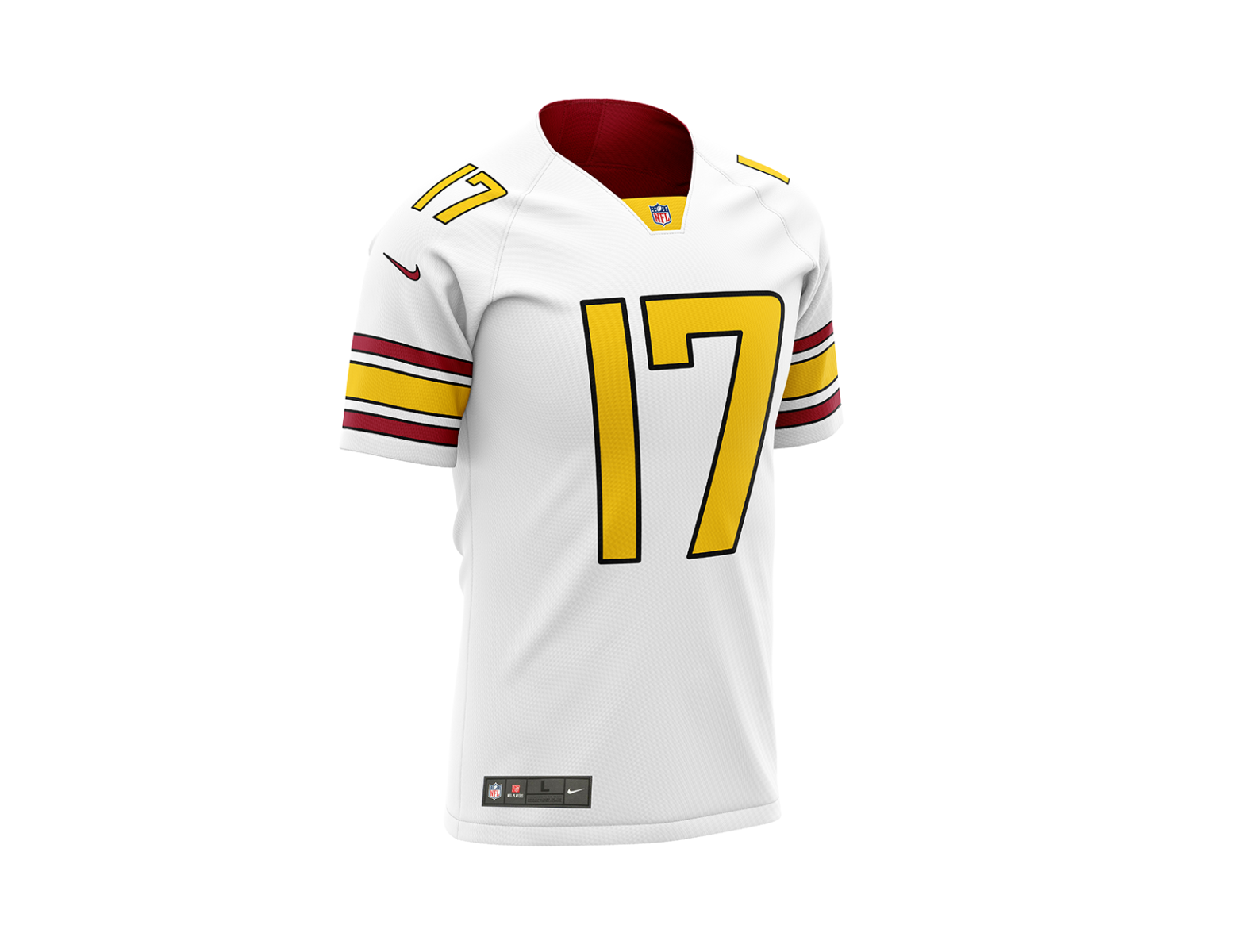
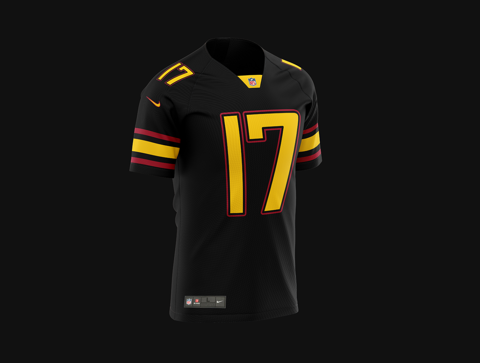
15 minutes ago, DCarp1231 said:
The burgundy helmet and jersey are probably the only two salvageable things about this.
The white jersey is fine. I just hope it gets paired more with burgundy pants and the possible gold pants more often than white pants. At least that way, the more evenly distributed color throughout.
The black uniform just sucks from head to toe. The helmet is horrendous. The team should just done two gold stripes, the “W” on one side and numbers on the other. Th base of the jersey is whatever. They easily could’ve done gold/burgundy/gold sleeve stripes with stars above.
I’m not giving it an F, but holy lord does this set need proper care and affection after the 2026 season.
I’m not sure how any Washington football away jersey that doesn’t contain a trace of gold can be considered “fine.”
-
5
-
-
Man, rereading this thread and seeing all the misplaced Washington-related optimism is hilarious in hindsight.
-
3
-
-
I’m more and more baffled every time I look at these uniforms. They took a 90-year old team rocking one of the most iconic sports looks in history and turned them into trend-chasing Arena-football Nike-fied 0/10 garbage. Unbelievable.
Then again, it honestly is the perfect microcosm for Dan Snyder’s reign as owner, so maybe it’s not all bad. No wait, it is all bad. Every single thing about this redesign is bad.
-
16
-
-
4 hours ago, Germanshepherd said:
The more I sit with this the more this becomes my least favorite set in the NFL.
At least when the Titans wear light blue pants, Falcons don’t go monochrome and the Jaguars emphasize teal, the colors make the sets tolerable and I still like all their helmet logos.
This only has 1 combo I can tolerate (Burgundy/White/Burgundy, unless gold pants are actually a tangible thing), a helmet with a crappy logo with a terrifying alternative option and pants and socks with the least personality in the NFL.
I just can’t see how it’s not 32nd out of 32. The Jags’ are oppressively boring, but even that is better than garbage. The Titans’ are awful, even without monochrome, but as was pointed out earlier, I think a lot of the dissatisfaction with the Titans uniforms come from how much of a missed opportunity they are. I don’t think the Falcons’ are all that terrible. The Jets look like a DIII school but again are more of a fault of being oppressively boring, and I’ll take that over a legit 0/10 set every time. I think the only set in the entire league that comes close is the Cardinals, but even with how overdesigned and overpiped those are, they at least don’t take a dump on team tradition and everything a football uniform should be.
My current bottom 5 rankings (whole uniform set, so helmets included; based on the combo the team wears most often):
28. Jets
29. Titans
30. Jags
31. Cardinals32.
32sFootball TeamRedWolvesSnydersCommanders-
4
-
-
On 1/31/2022 at 8:32 PM, DEAD! said:
Soldier Field
Late but an instant POTD nomination from me
-
4
-
-
That black uniform easily is the worst uniform in the league. Like, it’s not even close. Nothing even approaches its zip code of awfulness (yes, that includes the bone). The BFBS-ness of it and the awful number font would be bad enough, but then add on to it the lines on the nameplate; stripeless, logoless (I think, someone correct me if I’m wrong) black yoga pants; and easily the worst, silliest, impossible-to-take-seriously helmet in the league’s history. It looks like it was designed by a toddler who had a blank black helmet and a bunch of stickers to put wherever they wanted.
I could write manifestos on why these suck so much. And for a team with all that tradition, too. Good job changing the one thing about your team that wasn’t completely depressing. I feel bad for my DMV friends who actually root for this team.
-
15
-
-
9 minutes ago, DG_ThenNowForever said:
The Lamar slander then and thereafter has always been nonsense. People even discounted his MVP!
Lamar should have been #1, even with everything we knew then. Guy looked like Michael Vick at Louisville and has been terrific ever since.
God, that is so refreshing to hear. I forget when I spend too much time away from this place that 90% of the posters here are very reasonable and level-headed. Team subreddits and Instagram fan pages are cesspools.
-
6
-
-
9 hours ago, DG_ThenNowForever said:
I thought the Browns were pretty clear about wanting to lose games for a season or two there. The problem is telling that out loud to Hue Jackson when he was perfectly able to put up 0-fers all on his own.
Also, laughing that all they got from that losing was Baker Mayfield.
Reminder that Baker Mayfield was so bad this season he convinced everyone Odell was washed, the same Odell who is the WR2 on a Super Bowl team whose WR1 just happens to be the best offensive player in the league this season.
Never forget the amount of people who said before the season (and probably are still saying it) that Baker > Lamar.
-
2
-
-
4 minutes ago, DTConcepts said:
I mean, to be fair, there's literally nothing more generic than being called the "Football Team"
True, but in this case it was so generic it made them stand out even more amongst the Big 4. I’m not saying I didn’t laugh every time I heard someone say “the Football Team” as opposed to “the Ravens” or something Ike that, so I understand the need to change. But Warriors was not the answer.
-
6
-
-
Warriors also is about as generic as you can get for a name and immediately would cause them to suffer from Texas Rangers syndrome, i.e. your team name having a much stronger public association with an entirely different franchise.
As several have pointed out, all they had to do was slap Commanders on the WFT uniforms and slap the W on the helmets instead of the numbers. Done, dusted, easy 10/10 uniforms.
The days of us arguing whether white-over-white, white-over-burgundy, or white-over-gold was the best/most proper Washington road look seem very quaint now.
-
12
-
-
Remember when someone posted that video of the players saying how clean the jersey was and how awesome they were? I’d bet my life they were saying that in response to the black jersey.
Truly amazing how every single thing about this unveiling sucks. Commanders is a solid D+/C- sports name and it somehow managed to be the best thing about this set. The burgundy uniform is the best jersey and it still sucks what with the weird number font and oversized word mark.
This is eerily similar to the Browns rebrand of a few years ago, when an NFL team steeped in tradition who have sucked for the better part of 20 years decide to change the one thing about them that didn’t suck. Only, with
Danny BoyMr. Snyder at the helm, he almost certainly doesn’t have the awareness or read of the room to fix the uniforms after 5 years.-
6
-
-
5 minutes ago, Rockstar Matt said:
49ers need to move on from Jimmy G. He cost them the Super Bowl in 2019 and cost them tonight.
Free Deebo.
-
1
-
-
I’d hate to see Aaron Donald and Jalen Ramsey get rings, but man watching Donald and Miller tee off on that Bengals O-Line will be fun. I wanna see double digit sacks.
-
1
-


2021 NFL Season - Adults Arguing About Matt Stafford
in Sports In General
Posted
Kupp dragged the Rams offense kicking and screaming to the end zone there