


kolob
-
Posts
2,661 -
Joined
-
Last visited
-
Days Won
8
Posts posted by kolob
-
-
12 hours ago, andregunts said:
Is this the first year since forever that no team had an over haul of their uniform set?
The last year that didn't have a new logo or significant change was the 1998-99 season ... aaaaaaand I refuse to acknowledge that was "FOREVER" ago.
-
 6
6
-
-
20 minutes ago, Geoff said:
God I love realignment. I've missed the crazy crap like this.
So where does the AAC go now?
This kills the Army to AAC talk (which was just online chatter and not gonna happen). UAB seemed a lock so I think they're still in it.
I know the Sun Belt is being aggressive and supposedly one of the schools they're looking at could be holding out for the AAC. Could that be JMU?
I kind of feel like the AAC could easily die, especially if Memphis and either SMU, Tulane or Tulsa jump to the Big XII. I feel like that could cause a merger with Conference USA with the remaining schools or the AAC could kill Conference USA by raiding them for schools?
-
18 hours ago, Dilbert said:
At this point to me its not an if but when the A's move to Las Vegas. Supposedly according to local insiders and politicos there are three sites mentioned for a possible ballpark: South end of strip near Mandalay Bay, Las Vegas Festival Grounds, and The Rio Hotel & Casino.
Though they havent officially named any sites specifically, the A's should announce potential sites after the postseason
I think my favorite plan is the Mandalay Bay site, because of it's easy access from I-15 and 215. The Rio isn't bad. But, the Festival Grounds has potential, especially if A's ownership wants to develop the area. There's a lot of need near the Festival Grounds.
I am excited. I hope the A's make the jump.
-
On 9/10/2021 at 6:56 PM, Geoff said:
You think $1M is a lot of money in this situation?
Heck, I'll pay 20% tithing for the next two years to help get BYU into the Big XII quicker.
-
1
-
-
15 hours ago, gothedistance said:
The color purple was perfect for Utah. I don't think the other colors match the place.
Green very much matches Utah (resident here). But, honestly, I think Jazz fans are largely indifferent to the team’s identity crisis because the navy blue feels like a muted purple and the red rock jerseys represent the state where as the TEAM colors are more associated with NOLA still.-
4
-
-
It sounds like that Suns Azteca jersey isn't set to be released anytime soon. They're doing market research I guess?
-
1
-
-
On 8/22/2021 at 11:35 PM, GDAWG said:
(With the Oakland A's stadium situation likely ending one way or another soon) I wonder what happens first? The Coyotes getting a new venue or the Rays in MLB?
I feel like this needs to be added to the Vegas sportsbooks.
-
11 hours ago, Old School Fool said:
The Raptors and Knicks played each other on November 1, 1996 and wore throwback uniforms for the 50th Anniversary of the NBA. They will play each other again on November 1st in 2021 for the 75th Anniversary. I can't help but think that was intentional.
It 100% was. I am hoping the Raptors play in Husky throwbacks, but seeing that the NBA likes to screw things up it'll probably be their Team Mashup jersey.
-
1
-
-
6 hours ago, LAL_GOAT_17X said:
its seems the Lakers won’t have the Wish ad patch for next season hope they keep em like that ad patch less
we can hope … but … it won’t happen. -
4 hours ago, LA Fakers+ LA Snippers said:
Look at the ad on the Celtics. Either that’s Vista Print’s old logo, or it’s just taking up more space on the jersey.
Doing a 30-second Google search, um ... I know nothing about that logo? They've had three logos since 1995 and nothing like that. I wonder if it's a fauxback logo just for the throwback? Which is half cool, half disappointing and all the way wrong.
-
1
-
-
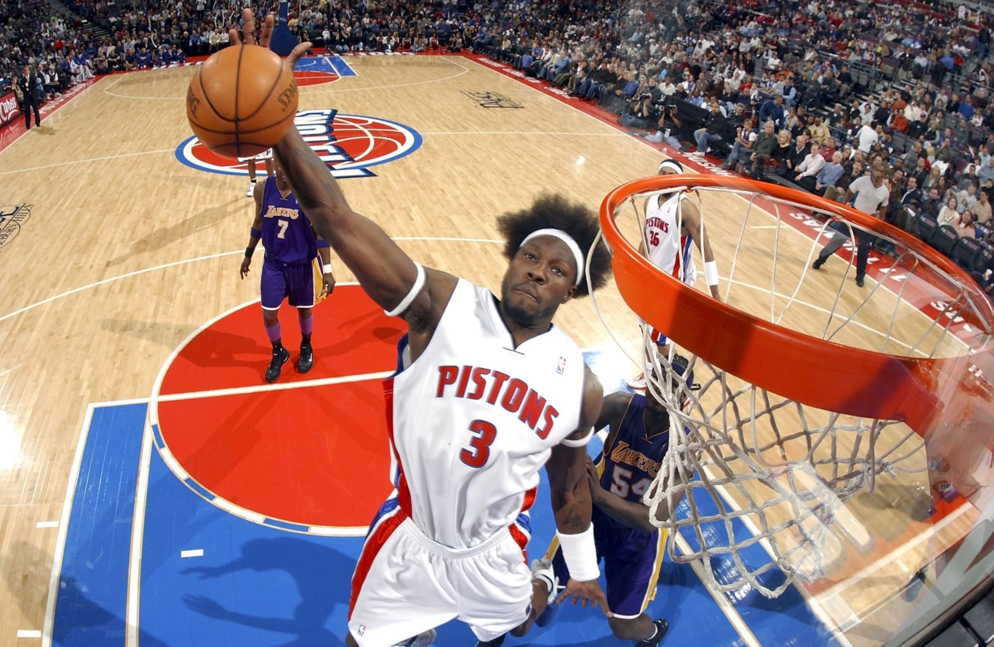
1 hour ago, flyersfan said:
I actually kinda like the Pistons new home court. The wordmark on the baseline should have a red outline, and the paint should be red. Otherwise, I like it. The oversized logo in the background I like, it brings both a color balance and its just, good. I imagine some other teams could create a design like that as well.
I think the Jazz could pull something like that off with their basketball logo. Maybe even the Pacers? But, I agree with you ... I kinda like it.
-
5
-
-
8 minutes ago, Bmac said:
Which jersey was that?
This fugly thing.

-
4
-
-
So here are the tweets directly from the Knicks and Celtics announcing those jerseys. It looks like it's just the Celtics, Knicks and Warriors doing the "Classic" since they started in 1947.
-
3
-
-
3 hours ago, projectjohn said:
Why do I like that Primary Court? I know I shouldn't, especially when the only court the Pistons should have is this ...
-
4
-
-
1 hour ago, gosioux76 said:
The Classic Edition line already existed, but only for a limited number of teams: Lakers (powder blue), Nets (Drazen Petrovic tye-dye) and Grizzlies (initial Memphis designs) were among the teams that had them last year.
I wonder if it's only a three-teams-a-year kind of thing and these are the three for 2021-22?
I think what @jb1322is alluding to, is that Classic Edition was supposedly not happening in lieu of the City/Mashup(?) Edition because of the 75th anniversary. Who knows? Maybe it's just for the teams just celebrating their 75th anniversaries?
-
6
-
-
1 hour ago, McCall said:
They will never NOT be the Big Ten.
Exactly, they'll just have awkwardly dumb logo with a 6 looking like a 0.
-
I like the logo treatment. I am glad the jersey logo isn't the diamond logo.
-
4
-
-
Are Oklahoma State or Texas Tech really THAT attractive to the PAC-12? I just don't see that happening.
Now on the other hand, I could totally see a new conference emerge, perhaps a revived SWAC with a mix of XII and AAC members.
-
1
-
-
26 minutes ago, O.C.D said:
The NBA really went all in on being the fun uniform league. 3 out of 4 years a team has won the title in a random alt?
Since the Nike switch I'm only counting 2 of 4 with Toronto and Milwaukee. I'd argue that Milwaukee's isn't a random alt, since they've had a similar black alt since 2015.
That said ... the only jerseys teams should wear in the playoffs (and especially The Finals) are the Association, Icon and Statement.
-
9
-
-
2 hours ago, -Akronite- said:
While it's still BFBS, the previous black set was superior IMO. The cream pops and the deer head with the numbers in the antlers works better than most logo jerseys.
Should've just worn their home whites but whatever.
I came to make the same observation about this Statement jersey. There was no need to get rid of it, other than to get rid of it.
-
3
-
-
21 hours ago, Froob said:
I gotta believe NBA can’t botch 75 worse than NFL did 100
oh yeah … they’re totally not going to botch it …
-
3
-
-
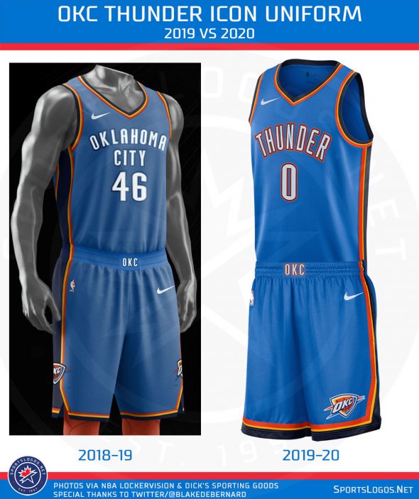
On 7/17/2021 at 1:20 AM, _DietDrPepper_ said:
They didn’t just take it, they somehow made it worse. Replace the word Warriors with Thunder on that uniform and it would instantly become the best OKC uniform ever, by a landslide.
They made it even worse a couple years ago with this subtle change …-
1
-
-
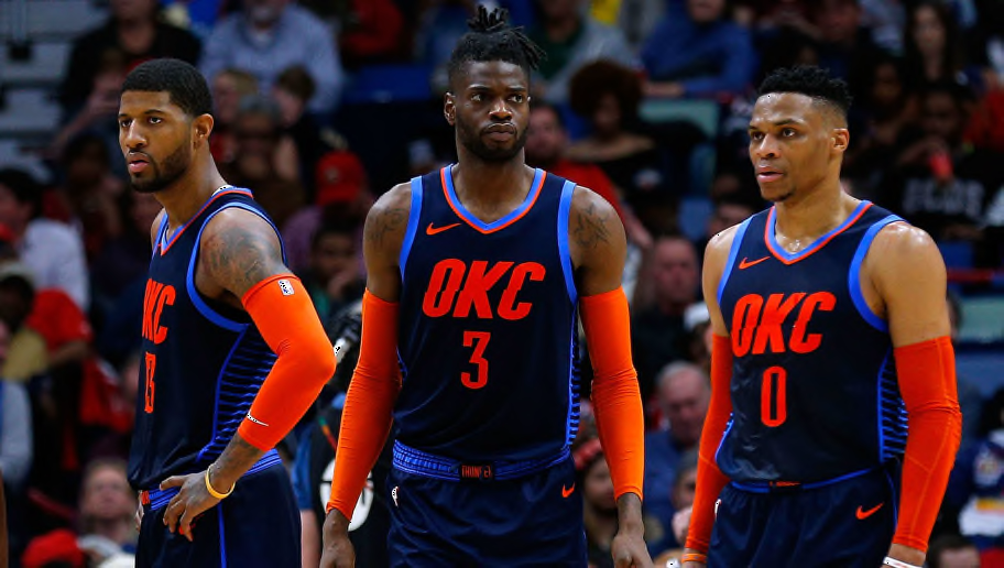
On 7/15/2021 at 1:33 PM, Shadojoker said:
Nets uniforms are so plain it's ridiculous they have gone this long without a rebrand. Same for OKC. Especially since they both have such a good brand to build off of.
I can't give you OKC. The logo is soooo ... clip arty. I like the colors, but that's the only thing they go going for them. Basing something off their Statement Jerseys over the past couple of years would be a good direction.
-
6
-
-
On 6/8/2021 at 8:13 PM, ltjets21 said:
The Clippers and Nets city jerseys are both equally the worst uniforms I have ever set my eyes on.
The Knicks have entered the chat.
-
22
-


2021-22 NBA Changes
in Sports Logo News
Posted
They played on it against the Jazz a couple nights ago, I'm sure it will since the Mixtape jerseys lean heavy toward that design.