


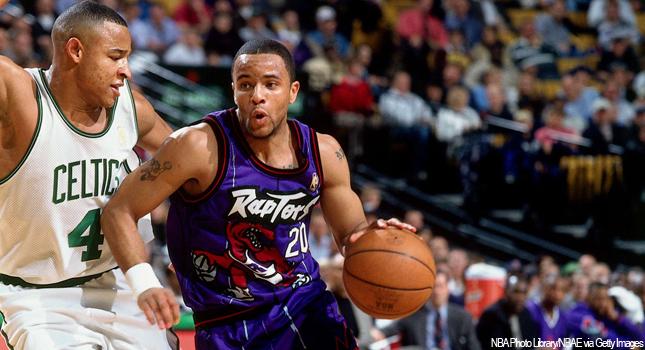
sky1324
-
Posts
2,415 -
Joined
-
Last visited
-
Days Won
4
Posts posted by sky1324
-
-
19 minutes ago, Brian in Boston said:
Technically, there have been five: the three you cited, and today's Dodgers and Twins franchises.
Brooklyn / Los Angeles
City of Brooklyn (1890-1897)
City of New York (1898-1955)
City of Los Angeles (1956-present)
Washington / Minnesota
Washington, D.C. (1901-1960)
City of Bloomington (1961-1981)
City of Minneapolis (1982-present)
If we're splitting hairs like that, than the Braves should have four cities: Boston, Milwaukee, Atlanta, and Cumberland, their new home. I know you're joking, but for accuracy's sake I'll chime in.
-
12 minutes ago, _DietDrPepper_ said:
The reason it was unpainted think was because the Rams had a home game that week as well, on Monday night. I think they're next home game will return to colored end zones.
That does make sense. Still no excuse for a team like the Panthers to get rid of theirs, such a worse look.
-
When will teams learn that painted endzones will always look better than unpainted ones? There's no reason for the Chargers to use unpainted ones, especially when they started the year with painted ones and it looked gorgeous.
-
I don't like pinstriped uniforms for the most part. In baseball they just look ugly and crowd the jersey without adding much, the only way pinstripes look good is if they're spaced out.

This includes the Yankees, who I think have some of the overrated jerseys in any sport ever. The Tigers' home jersey is a better version of the Yankees'. It also includes the Magic, who have never looked good in pinstripes. Pretty much every team that wears pinstripes would be improved by getting rid of them.
-
 3
3
-
-
Yeah, there's no way they use gold like that. I bet you could replace that with silver (and maybe remove the red) and get a closer look to what will probably happen.
-
17 hours ago, CaliforniaGlowin said:
Central Baptist College women's soccer
-
7 hours ago, GDAWG said:
the NBA might consider it and the two new NBA teams will probably be Seattle and Las Vegas, which is what I don't want but it's inevitable that the NBA is next for Vegas after NHL and NFL.
Certainly Seattle, with KeyArena being rebuilt (and I believe having a basketball configuration, correct me if I'm wrong) it's basically a matter of which Seattle businessman wants to pay the most. It's a given that when NBA expansion happens Seattle will be one of the two, the only question is who's the other one. As you said my money's on Vegas, sadly, but Kansas City, Louisville, and possibly Anaheim or another west coast city to hopefully get Minnesota into the East with their Great Lakes brethren.
As for the NHL, if Florida keeps heading down this path they'll be the second Sun Belt team gone to Canada, this time to Quebec. The Coyotes seem to be in more danger immediately, however, and moving them to the Central with Dallas makes me think Houston is the prime relocation spot. I wouldn't mind, Phoenix has been a disaster for a while and while losing the Kachinas will be rough, the team and league would be better off for it. Just my two cents, however.
-
17 hours ago, Sodboy13 said:
Hey, in these Unprecedented Times, we're all having a little trouble with the ol' landlord, aren't we?
On 9/4/2020 at 8:14 PM, QCS said:An incompetent organization?
-
Man, I really hate the trend of unpainted end zones and I hate that the Panthers got rid of the black. I hope we return to the old style that we had, it never should've changed.
-
55 minutes ago, TrueYankee26 said:
Denver is also the first to come back from multiple 3-1 deficits in the NBA playoffs.
Doc Rivers was already the only coach to blow multiple 3-1 leads (2003 Magic vs Pistons, 2015 Clippers vs Rockets) and now he has blown THREE.
I believe he has 23% of all blown 3-1 leads, according to r/NBA. Impressively bad.
-
12 minutes ago, GriffinM6 said:
The commentators for the App State - Charlotte game are saying that Charlotte is wearing illegal uniforms because of the pale gold numbers on white jerseys. Maybe they should come join this board.
While green numbers probably would've been better, I can still clearly see the gold ones from the footage I watched on Twitter. Not great but still readable.
-
2
-
-
37 minutes ago, Krz said:
The jerseys are fine, but why are they standing waist deep in water to announce them?
The Appalachians have a ton of natural creeks that are popular places to visit and swim. I assume this a nod to that.
-
1
-
-
29 minutes ago, TarPitHeels said:
Is that the fist of communism?
What? No, it's the black power fist. It's a common symbol of resistance/uprising.
-
I posted it in the NHL Changes thread and I'll say it again here: there is not a single hockey jersey with diagonal text that wouldn't be improved by placing the crest on the front instead.
-
2
-
-
Team named Carp? Good. Team named Sky Carp? Bad.
-
Surprisingly, I don't hate it. The blue uniform with orange pants looks really good (though the pants could use a stripe) but that all-white is a little rough. It really needs a stripe on the pants and some orange on the sides.
-
2
-
-
18 minutes ago, Friedrich Stuart Macbeth said:
Is there any reason to not pay players on time?
An incompetent organization?
-
I couldn't say for certain, but my Top 5 is probably this, unordered: Colorado, New Mexico, Texas, California, Alaska. Honorable mention to DC, as well.
Maryland's flag would be great if it wasn't for the fact that the Crossland Banner was used by Maryland Confederates, and it's also ugly as sin. A focus on the Calvert banner, the gold and black diagonal pattern, would be the direction to go in. I wish so many states would overhaul their flags, there's so much potential to be had.
-
1
-
-
1 hour ago, SFGiants58 said:
I’d add pinstripes to the shorts and maybe have a “Hornets” wordmark on the purple alternate. Then again, a “Hornets” wordmark on a teal Carolina Cougars homage city jersey would be better.
Agreed on shorts pinstripes, maybe on the purple's wordmark, but a teal Cougars fauxback would be sick. It's not like the team is actually interested in repping the city, so paying homage to the Cougars (which the Bobcats did, iirc) would be neat.
-
1
-
-
Only one is currently the alternate, but they've all been used in years past, so here:
This is the best the Charlotte Hornets will ever look. Their modern look simply pales in comparison. Literally the only thing I would change is removing the unbalanced collar (which I thought Nike did), everything else is perfect. Best part about these jerseys? None of them say Hornets. They all know what city they play for.
-
3
-
-
Of those five, bottom left is my favorite, followed by top left. I don't care for the top right, the bottom middle's asymmetry bothers me, and the bottom right is too complex, just a magnolia flower will get the point across better,
-
Anybody know what Red Bull uses for their location names? For example, what font "New York" is in this logo?
-
I like the Strikes name suggested, but I decided to go with a different one for my own submission. I chose "Planetarians", or people who work at planetariums, because Lynn Planetarium is the only one in the Charlotte area and its uniqueness and educational/merchandising opportunities are make it something Gastonia could really own.
-
1
-
-
Another thing about the badge that really bothers me is the outline: it's very nice, up until the two sides meet at the bottom: instead of continuing with the rounded corners they have for every other curve, it meets in a point, the only pointy bit on the crest. I'm almost positive we'll see this team get overhauled before too long, hopefully by a team that actually knows what they're doing.
-
1
-


NAFA Project | MIA, CHI, SA, DET updates added 1/19
in Concepts
Posted
I think that they're fine as they are, but if you're unhappy with them then the right choice is to move them. I can't really give you ideas for those cities, but whatever you do make will be good, that's for sure.