


sky1324
-
Posts
2,431 -
Joined
-
Last visited
-
Days Won
4
Posts posted by sky1324
-
-
55 minutes ago, TrueYankee26 said:
Denver is also the first to come back from multiple 3-1 deficits in the NBA playoffs.
Doc Rivers was already the only coach to blow multiple 3-1 leads (2003 Magic vs Pistons, 2015 Clippers vs Rockets) and now he has blown THREE.
I believe he has 23% of all blown 3-1 leads, according to r/NBA. Impressively bad.
-
12 minutes ago, GriffinM6 said:
The commentators for the App State - Charlotte game are saying that Charlotte is wearing illegal uniforms because of the pale gold numbers on white jerseys. Maybe they should come join this board.
While green numbers probably would've been better, I can still clearly see the gold ones from the footage I watched on Twitter. Not great but still readable.
-
 2
2
-
-
37 minutes ago, Krz said:
The jerseys are fine, but why are they standing waist deep in water to announce them?
The Appalachians have a ton of natural creeks that are popular places to visit and swim. I assume this a nod to that.
-
1
-
-
29 minutes ago, TarPitHeels said:
Is that the fist of communism?
What? No, it's the black power fist. It's a common symbol of resistance/uprising.
-
I posted it in the NHL Changes thread and I'll say it again here: there is not a single hockey jersey with diagonal text that wouldn't be improved by placing the crest on the front instead.
-
2
-
-
Team named Carp? Good. Team named Sky Carp? Bad.
-
Surprisingly, I don't hate it. The blue uniform with orange pants looks really good (though the pants could use a stripe) but that all-white is a little rough. It really needs a stripe on the pants and some orange on the sides.
-
2
-
-
18 minutes ago, Friedrich Stuart Macbeth said:
Is there any reason to not pay players on time?
An incompetent organization?
-
I couldn't say for certain, but my Top 5 is probably this, unordered: Colorado, New Mexico, Texas, California, Alaska. Honorable mention to DC, as well.
Maryland's flag would be great if it wasn't for the fact that the Crossland Banner was used by Maryland Confederates, and it's also ugly as sin. A focus on the Calvert banner, the gold and black diagonal pattern, would be the direction to go in. I wish so many states would overhaul their flags, there's so much potential to be had.
-
1
-
-
Of those five, bottom left is my favorite, followed by top left. I don't care for the top right, the bottom middle's asymmetry bothers me, and the bottom right is too complex, just a magnolia flower will get the point across better,
-
Anybody know what Red Bull uses for their location names? For example, what font "New York" is in this logo?

-
I like the Strikes name suggested, but I decided to go with a different one for my own submission. I chose "Planetarians", or people who work at planetariums, because Lynn Planetarium is the only one in the Charlotte area and its uniqueness and educational/merchandising opportunities are make it something Gastonia could really own.
-
1
-
-
Another thing about the badge that really bothers me is the outline: it's very nice, up until the two sides meet at the bottom: instead of continuing with the rounded corners they have for every other curve, it meets in a point, the only pointy bit on the crest. I'm almost positive we'll see this team get overhauled before too long, hopefully by a team that actually knows what they're doing.
-
1
-
-
14 minutes ago, sportsfan7 said:
Plus, it is, somehow, the official US motto
Replacing the much more fitting "E Pluribus Unum" in the '50s because we had to be the good Christians facing those evil godless Commies. It can still be found on the Great Seal of the US and on coins. There's a motto I wouldn't mind on flags, it's awesome and perfectly fitting for America.
-
4
-
-
8 minutes ago, Dynasty said:
Okay, why does "In God We Trust" need to be on the flag?
Because it's Mississippi and this was their compromise for getting rid of the literal Confederate battle flag on the old one.
-
3
-
-
I want to like bottom-middle, but something about the colors and balance is off for me. Top-middle is my favorite, that splash of gold just makes it pop for me. It's stupid to have "In God We Trust" on the flag, but I'll take it since it meant replacing their old flag. I would've taken "state seal on blue field" over their old one, but the fact that it will most likely look good is reassuring.
-
3 minutes ago, Gothamite said:
Minneapolis City has been on a tear since then, really having fun with it.
Even the almighty Creamer got into it:
-
6
-
-
Just now, Digby said:
I've been seeing that style left and right in social graphics. It's still bad, but we're not exactly pulling from the well of originality here.
Also this is their home kit? Seriously?
Minneapolis City's home kit, yes, but the team using the colors is Minneapolis City Futures, their youth team. I think the main things that connect the two are the colors which are nearly identical, which isn't uncommon, but it's the use of the exact same font as well that pushes it over.
-
2
-
-
1 minute ago, Digby said:
What is MPLS City Futures?
The colors part is pretty bad. But otherwise this is what happens when everyone decides that only three possible soccer team names are acceptable, plus just going for the safe uber-hip type treatment that's everywhere right now.
Minneapolis City's youth team. I think it's more than just the colors, it's the font and style that combine to make this more than a coincidence for me. Yeah the filled/outline text thing is popular, but has any other team recently used it?
-
3 minutes ago, Gothamite said:
Whoops, St. Louis.
Oh man, that's far too close to be coincidence. Same colors, same font, same outline/fill style, oh no. MLS better get on this real quick, MPLS City might have a decent lawsuit to file. I like the Thieves nickname, though.
-
3
-
-
2 minutes ago, -kj said:
I suspect @Gothamite will get around to it.
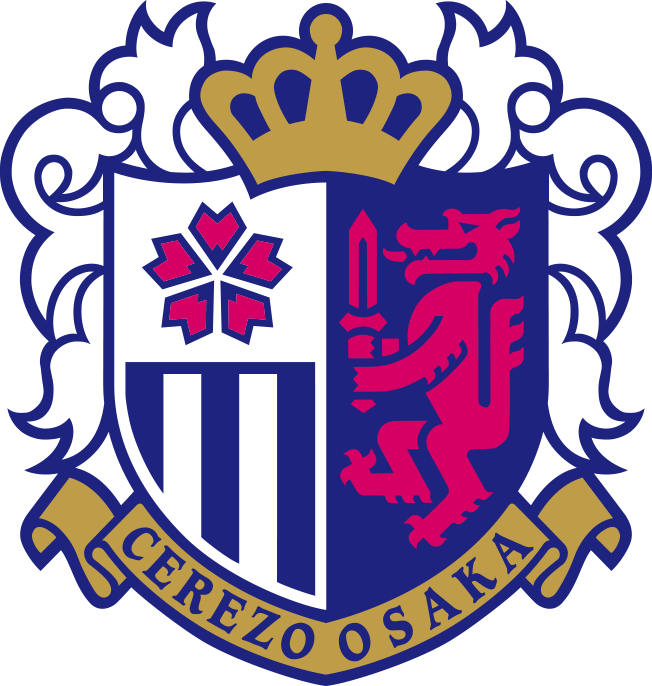
I don't mind the magenta and navy idea... just don't tell me it's red.Oh, and complete aside, but I went to a Cerezo Osaka game a few years ago and had a great time. Also, despite Wikipedia showing it as an old crest, the team website still shows "Cerezo Osaka" on their crest.
Just checked, it's true.
In what some could call fate, it seems that Cerezo stylizes their name as Cerezo OSAKA, connecting the two teams further. If STL CITY SC balances magenta with navy like Cerezo does, they'll be a very good-looking team, but by introducing yellow and gray I'm worried they'll throw it all off.
-
7 minutes ago, Maroon said:
The arch is immediately recognizable, and if you know the St. Louis flag the rivers make a lot of sense.
Agreed that the floating SC ain't great.
The arch is very noticeable (should be yellow but I digress), but I have to disagree with you on the rivers.
In the crest, the rivers are straight lines that run parallel to the arch and perpendicular to it, but on the flag, the rivers are wavy (defining them as rivers) and meet at a single, defined point to suggestion confluence (the fleur-de-lis).
The crest, to me, doesn't suggest rivers, it suggest the crossbar of an A and some lines that look like New Mexico United. I have to be told that those are rivers, and I still don't see it. That's an example of failed symbolism, because they tried to get a little too cutesy with it and ended up confusing the viewer.
-
7
-
-
22 minutes ago, Berlin Wall said:
My first impression was, that it looks like a good logo for a J-League club. Later I noticed, it's the colours of Cerezo Osaka.
Let's not drag Cerezo into this, their crest is actually well-made.
What's funny is Cerezo is my favorite J-League team, specifically because of their crest and colors. But they actually know how to balance it and didn't shove yellow and gray into the scheme as well. That crest isn't even good for J-League, those are either great or qualify for the "so bad it's good" exception. St. Louis CITY Soccer Club's crest doesn't look good, and I can't imagine how they'll incorporate yellow into the palette without minimizing magenta or having it clash hard. Maybe it'll be a blue kit with magenta/yellow striping?
-
3
-
-
37 minutes ago, KJTALBOT said:
MOD EDIT: Not getting into that here.
MOD EDIT: Not getting into that here.


NFL Fields - 2024 UFL Fields
in Concepts
Posted
Man, I really hate the trend of unpainted end zones and I hate that the Panthers got rid of the black. I hope we return to the old style that we had, it never should've changed.