


sky1324
-
Posts
2,429 -
Joined
-
Last visited
-
Days Won
4
Posts posted by sky1324
-
-
Try having the ears point up a little more - reference how the current Panthers and Jags logos feature the ears curving down and up, like real cats do.
-
 1
1
-
-
I agree, and I'll take it a step further: I can only think of three (maybe four) teams that should be wearing gray pants: Lions, Raiders, Cowboys, and maybe the Patriots. I prefer the Pat Patriot look with white pants, but if they keep the silver helmet, then gray pants would be nice. No other team should be wearing gray pants, not the Giants, not the Panthers, not the Falcons. White just looks better.
-
1
-
-
5 minutes ago, DNAsports said:
If Stafford can manage to get the Rams to the Super Bowl and win (which is doable this year) I would argue this is will end up being his right uniform
I have nothing against Stafford, but I hope to god that he doesn't win a Super Bowl in these uniforms because I don't want to ever have to see these uniforms again.
-
3
-
-
9 minutes ago, MJWalker45 said:
So everyone's wearing the diamond plate swoosh this year or just league champs?
Every team, for the league's 75th anniversary.
-
1
-
-
That is incredible. Brilliant.
-
I like what you've done with both Atlanta and Tennessee here. Not sure I see the need for navy pants for the Titans, but that's ultimately not a big deal. I still think Atlanta's number font is ridiculously ugly, but at least it's not the Titans' real-life garbage. Great work here, looking forward to the next team.
-
5
-
-
15 minutes ago, ZapRowsdower8 said:
Why are the eyes green and not Carolina blue?
The panther statues outside the stadium, known as "Indomitable Spirit", have green eyes.

-
1
-
-
Panthers looked decent, definitely some kinks to work out. Darnold looked serviceable-to-good, which is honestly all we need him to be. Looking forward to this season!
-
1
-
-
Oh yeah. that's a lot better. It really makes it seem like the panther is moving forward, instead of retreating his face into his neck. Excellent work.
-
2
-
-
Yeah, better. I think the lack of more definition between the jaw and neck makes the panther look kinda fat, which is not what you want in a sports logo.
-
I think the neck should be shrunk a bit and I'd say to keep the whiskers as the same color on both sides (white).
-
1
-
-
There it is! I really like what you've got here. Great work!
-
1
-
-
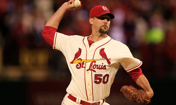
I'd say St. Louis has a great cream jersey as well:
-
3
-
-
Definitely an improvement! I think H-Town mentioned this earlier in the thread, but the shape of the neck is bothering me.
If you compare the line of motion from the original to your logo, you see a clear difference in the way your eye moves through the logo. Football logos, because they go on helmets, tend to use a very straight line - the motion moves clearly, usually from left to right, sometimes going up or down depending on the logo. None of them move as yours does - first up then to the right. If you drew a vertical line through the line of motion, it would never intersect itself (with one Rams-shaped exception). Your logo breaks that rule - the line of motion would be intersected by a vertical line. I understand why you've shaped the neck like this, but at that point it begins to work less and less as a football logo. Certainly not bad, but possibly more fitting for hockey than football.
-
1
-
-
The biggest problem I have with the logo is that the motion of the logo goes up instead of forward like the current one does. The silver outline isn't my favorite either, I'd make it blue or white. I think the top of the nose should follow the curve of the jaw a little better as well. Overall it's solid, can't say I'd prefer it over our current logo, but it's definitely good.
-
2
-
-
Yeah, not a fan of navy/white for the Cowboys. The Cowboys need to keep the navy/silver, make a white version of it, and call it a day. The Color Rush jersey sucks too.
-
1
-
-
Ah yes, the famous Charlotte-Salt Lake City connection.
-
1
-
-
One would hope for more inspired striping, but that's so funny to me. Hopefully this means the logo is gonna stick around for a while, haha.
-
The only difference between their normal jerseys and the 2019 "throwbacks" is a gray facemask. The OP is still true, however - the Chiefs have never worn a third jersey outside of anniversary throwbacks.
-
5
-
-
Another unlucky break for Cam. The man should still be on the Panthers, but the team screwed up his recovery and screwed him long-term. I hope he finds a job, but I'm worried his days in the NFL are coming to a close. What a shame.
-
5
-
-
A new Perrin series, exciting! Let's see what we got here:
BUF - Love what you've done here, no complaints!
MIA - I like the primary set, the two alts feel unnecessary, but they're solid enough.
NE - I don't really like the numbers on the white jersey, it feels too busy. Definitely an improvement with everything else.
NYJ - No black. No thanks. Some teams don't need alternates. Everything else is nice.
-
1
-
-
 this. I understand that teams lost money because of the pandemic. So did most of us! This is greed, plain and simple. I fully expected it, but I was hoping that somehow it wouldn't happen. Mad respect to any team that says screw it and just throws their own logo on the patch.
-
2
-
-
24 minutes ago, MCM0313 said:
Nah, that’s offensive to...elves?
Oh man, good one! Peak comedy, right here.
-
19
-
-
Yeah, I'm not a fan of the Browns' throwbacks. Helmet feels too bright without the brown stripe, there's just a ton of white since everything except the helmet is white, it's just not for me. That number font is great, though.
-
8
-


 this. I understand that teams lost money because of the pandemic. So did most of us! This is greed, plain and simple. I fully expected it, but I was hoping that somehow it wouldn't happen. Mad respect to any team that says
Many sport logos : Visit & CC my website
in Concepts
Posted
Definite upgrade on the ear! I prefer the one on the right, personally. I'd also add some more black to the back of the logo so that it follows the curve of the blue stroke more.