


WBeltz
-
Posts
894 -
Joined
-
Last visited
-
Days Won
1
Posts posted by WBeltz
-
-
Under Armour did it. They fixed the green jersey. And ya know, they could pair this with the gold/mustard pants and it would look perfect
-
8 hours ago, Chawls said:
Unfortunately, the Oilers throwback game against the Texans is not in Houston.
Tennessee tryna get that Dirty Dom heat.
-
 1
1
-
-
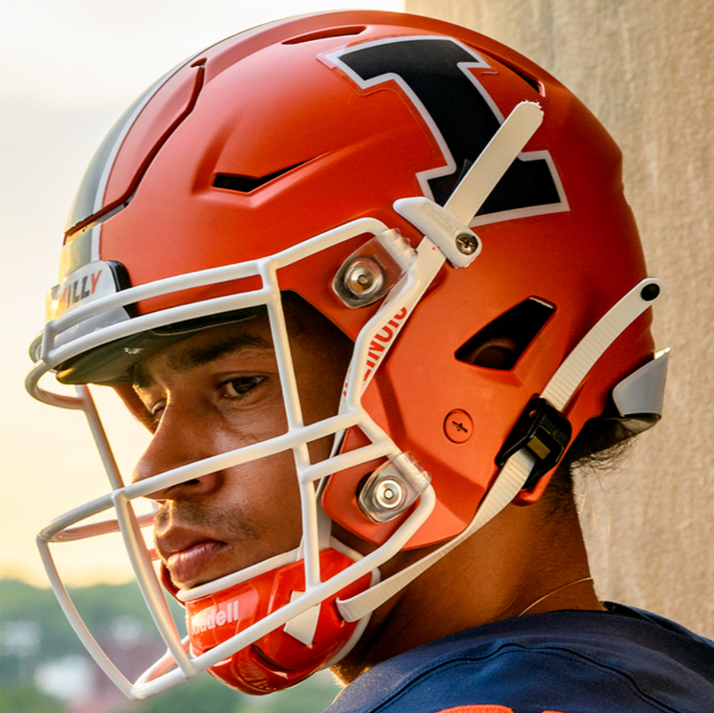
3 hours ago, GFB said:
I realize I'm late to the Illinois vs. Syracuse debate, but the difference between the two schools should not be which school wears vertical stripes and which school wears horizontal stripes; it should be which school has a logo on the helmet and which school does not (or simply numbers).
Syracuse:

Illinois:
Wait, you mean Syracuse hasn’t always worn the “S” on their helmet???
-
28 minutes ago, solvetica said:
Dear lord
Why not showcase your actual colors, instead of a mishmash of this nonsense? Literally every other school is in their colors except Minnesota.
-
5
-
-
I think if they removed the stripes they’d be sufficient. In all the time I’ve watched Illinois as an Iowa fan is that they were very straightforward. I don’t mind the UCLA stripes, but I think it’s not their thing to wear.
-
1
-
-
1 hour ago, Ark said:
Washington Football Team is probably their best option.
I never had an issue with Washington Football Team, and I actually liked it because it was one the nose (of course they’re a football team) and I think it was a different in terms of North American sports naming conventions and it felt unique and different. The uniforms maybe should’ve had a shift due to three looking the same as the prior name, but I was fine with the numbers on helmets, and the consistency of the look.
-
6
-
 2
2
-
-
These aren’t as bad as I thought they would be but at the same time still very very bad
-
Does anyone know why they went BSN? Like was their deal up and they didn’t have time to get a new supplier immediately? Was it for being able to pick what they wanted? I guess I’m confused why a school that has done pretty well over the last 4ish years is being relegated to having this kind of a uniform issue.
-
1
-
-
My hope is they do what Miami is doing and have an “away” set of throwbacks down the line, so they can wear the home set and away set like the Dolphins do.
-
7
-
-
Napoli only have the MSC logo on the front is much nicer that what they’ve had prior.
-
It’s definitely interesting. I agree the solid colored back is lame but at lease this fits with what I would say a 3rd kit is. Hopefully more teams reveal one this year or next.
-
2 hours ago, gosioux76 said:
It's pretty bad.
From what I understood those are different than what’s being teased, those are the 4th of July warmups
-
1
-
-
Can a team pick a halfway unique color scheme? I get there’s a limit (or limitations) but black and red doesn’t scream San Diego (outside of SDSU). Give it beach vibes with light blue, tan, and green for the ocean, or do orange, Houston and NYCFC are the only teams that use orange in any kind of capacity as a full time color or trim. Just anyhting that is at least going to stick out.
-
5
-
 1
1
-
-
I just think it’s weird that quote came out what 2, 3 years ago and no other team has pushed for a third kit. Some teams would benefit greatly from it (like Seattle & Portland) but i could see many teams getting them. So is it just they need to ask Adidas?
-
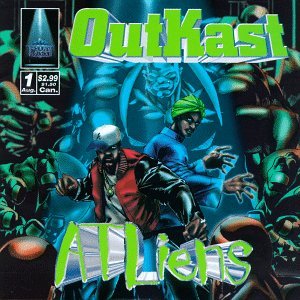
54 minutes ago, ATLJ said:
Per this Tweet by Doug Roberson of the AJC, Atlanta United will be getting 3rd kits in August:
Atlanta United has put up advertising / street art in town indicating it will be in collaboration with AIE (Atlanta Influences Everything) that suggests the direction the 3rd kits will go:
For reference, the colors appear to be influenced by Outkast's ATLiens album cover.
So is this a part of that whole 100,000 units of jerseys sold or is it because Atlanta is by far and away one of the more popular MLS teams? Because it’s mind boggling to me that Portland, LAFC, Austin and other teams aren’t getting 3rd kits seeing how successful they are/the number of jerseys sold to qualify for this.
-
2
-
-
1 hour ago, Pigskin12 said:
I thought that might be an indication that it will be a white throwback, but then I realized this is the cover photo on the team Twitter page:
https://twitter.com/Buccaneers/header_photo
I also don't think they would do white when everyone has been referring to them as the "Creamsicles".
Then again, this team is obsessed with white. Could they maybe be pull a Dolphins and do a white version and a color version of the throwbacks (and ditch the pointless pewter alternate to make room for it)?
Unpopular opinion: I like the pewter alts
-
4
-
-
56 minutes ago, Digby said:
This discussion is even more confounding now that we have a new set of Canada men's team kits -- they've just updated the red, white, and black teamwear catalog options from the old outdated shirt model to the newest one. Now there's a candidate for "just give the men what you gave the women".
It is interesting that the men and women teams don’t share jerseys. I know that the USW and the USM did not until recently, but the men having literal team wear and the women getting bespoke kits is embarrassing to say the least. I hope the Nike deal runs out so they can go to Adidas or another brand who will at least give them more creativity.
-
1
-
-
Looks like Houston’s reveal was JJ Watt going into the Ring of Honor. No uniform elements.
-
1
-
 1
1
-
-
San Diego Dads AC
-
Also with Messi joining Miami, any odds that they do tonal pink stripes ala Argentina for a home kit next year

-
18 hours ago, officeglenn said:
Delayed CF Montréal primary kit spotted for sale ahead of official launch -- pics confirm earlier leaks:
I don’t mind it still. Wish that the stripes were a bit darker, but it’s still significantly better than the black kits last year.
-
Surprised City didn’t wear their new kits for this.
-
1 hour ago, MJWalker45 said:
https://twitter.com/footballshirt/status/1664785133482954752?s=20
Inter will wear Paramount + for the Champions League final.
So the final will literally be a promotion of the service that is used to stream the final?
kinda dumb
-
16 hours ago, tscuzzy said:
Don't forget the Colorado Rapids!
Underutilized color scheme in sports for sure.
Burgundy and Light BLue are pretty common across soccer, Aston Villa, Burnley, and I'm pretty sure there are a few others across different European Leagues. Although in OTHER sports yeah under utilized.


MLS kits 2023
in Sports Logo News
Posted
NYRB have unveiled a new third kit. It’s interesting enough, if not a headache to look at. MLS did not news drop it, but this would be the 2nd of 4 teams getting thirds correct? Toronto and NYRB and Atlanta are, so who’s the last one?